Free Alternatives to Akzidenz-Grotesk for Editorial
Looking for a free sans serif font for editorial projects? Akzidenz-Grotesk by Berthold is a popular choice, but its licensing cost can be prohibitive. We've curated 4 free alternatives that work well in editorial contexts. We've identified 3 that are especially well-suited for this context. Each alternative is scored by visual similarity and contextual relevance, and ships under an open-source license for both personal and commercial use.
Top Picks
Comparison Table
| Font | Relevance ⓘ
How well this alternative fits the specific context (use-case or trait) of this page. Score 0–100 based on matching keywords, industries, and font characteristics. Alternatives scoring 25+ are highlighted.
| Similarity ⓘ
How visually similar this free font is to the premium original. Score 0–100 based on x-height, width, stroke contrast, use-case overlap, and language coverage.
Learn more → | Weights | Variable | License | Source |
|---|---|---|---|---|---|---|
| Inter | 28 | 82% | Variable | Yes | OFL-1.1 | Google Fonts ↗ |
| Source Sans Pro | 28 | 75% | Variable | Yes | OFL-1.1 | Google Fonts ↗ |
| Familjen Grotesk | 27 | 72% | Variable | Yes | OFL-1.1 | Google Fonts ↗ |
| Roboto | 8 | 78% | Variable | Yes | Apache-2.0 | Google Fonts ↗ |
Most Relevant (3)

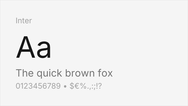
[Google Fonts] · OFL-1.1 · Variable
Modern interpretation capturing the neutral essence with digital optimization
Why it matches: Inter captures Akzidenz-Grotesk's neutral, functional character while optimizing for digital screens. Both share similar x-height, stroke consistency, and understated personality. While Inter lacks the historical quirks, it offers the same professional utility and clean aesthetic that makes Akzidenz-Grotesk appealing.
corporate identityeditorial designweb applicationsUI design


[Google Fonts] · OFL-1.1 · Variable
Clean neo-grotesque with comparable professional utility
Why it matches: Source Sans Pro offers similar professional utility with clean, neutral letterforms. While lacking Akzidenz-Grotesk's historical character, it provides comparable functionality for corporate and editorial contexts. The coordination with Source Serif Pro enables versatile typographic systems.
government websitesdocumentationcorporate communicationseditorial
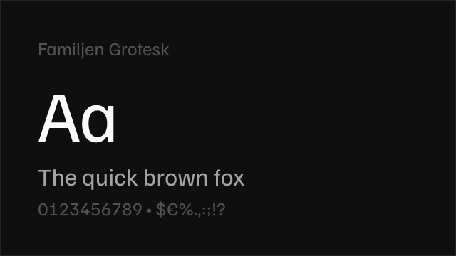
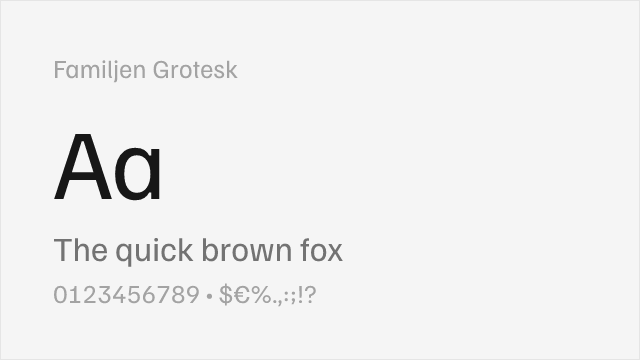
[Google Fonts] · OFL-1.1 · Variable
Variable neo-grotesque with contemporary refinements and Swedish design sensibility
Why it matches: Familjen Grotesk shares Akzidenz-Grotesk's neo-grotesque foundation with clean, neutral letterforms optimized for professional use. Both feature similar proportions and understated personality. Familjen Grotesk's variable font support and true italics add modern flexibility while maintaining the neutral, functional character that defines the grotesque tradition.
editorial designbranding systemsweb interfacesprofessional communications
Other Alternatives (1)
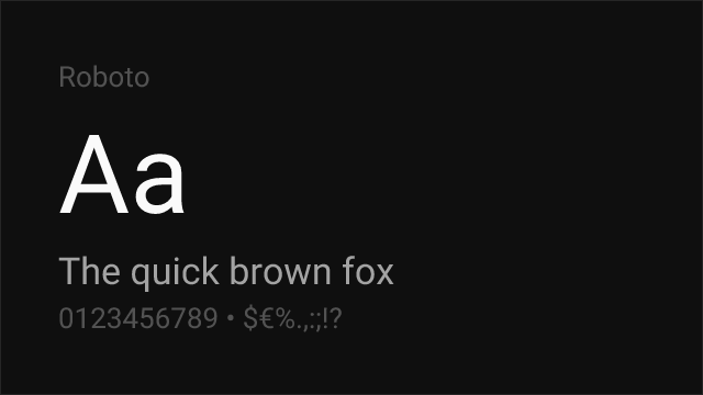
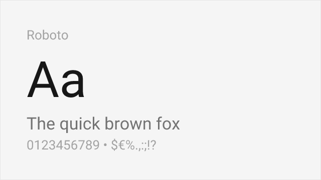
[Google Fonts] · Apache-2.0 · Variable
Similar industrial character with contemporary refinements
Why it matches: Roboto shares Akzidenz-Grotesk's industrial, functional character with similar emphasis on clarity and neutrality. While more refined than the historical original, Roboto maintains the pragmatic, workmanlike quality that defines grotesque typography. Its comprehensive weight range suits similar applications.
digital interfacescross-platform designtechnical documentationmobile apps