Free Alternatives to Appeal for Editorial
Looking for a free serif font for editorial projects? Appeal by WeType is a popular choice, but its licensing cost can be prohibitive. We've curated 8 free alternatives that work well in editorial contexts. We've identified 8 that are especially well-suited for this context. Each alternative is scored by visual similarity and contextual relevance, and ships under an open-source license for both personal and commercial use.
Top Picks
Comparison Table
| Font | Relevance ⓘ
How well this alternative fits the specific context (use-case or trait) of this page. Score 0–100 based on matching keywords, industries, and font characteristics. Alternatives scoring 25+ are highlighted.
| Similarity ⓘ
How visually similar this free font is to the premium original. Score 0–100 based on x-height, width, stroke contrast, use-case overlap, and language coverage.
Learn more → | Weights | Variable | License | Source |
|---|---|---|---|---|---|---|
| EB Garamond | 64 | 80% | Variable | Yes | OFL-1.1 | Google Fonts ↗ |
| Crimson Pro | 64 | 78% | Variable | Yes | OFL-1.1 | Google Fonts ↗ |
| Alegreya | 63 | 71% | Variable | Yes | OFL-1.1 | Google Fonts ↗ |
| Average | 55 | 68% | 1 | No | OFL-1.1 | Google Fonts ↗ |
| Lora | 44 | 77% | Variable | Yes | OFL-1.1 | Google Fonts ↗ |
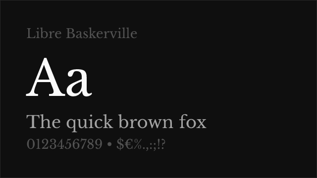
| Libre Baskerville | 43 | 74% | 2 | No | OFL-1.1 | Google Fonts ↗ |
| Cormorant Garamond | 43 | 72% | 5 | No | OFL-1.1 | Google Fonts ↗ |
| Source Serif Pro | 36 | 75% | Variable | Yes | OFL-1.1 | Google Fonts ↗ |
All Alternatives (8)


Scholarly revival of Claude Garamont's originals with meticulous historical accuracy


Renaissance-inspired text serif with variable weight and comprehensive features
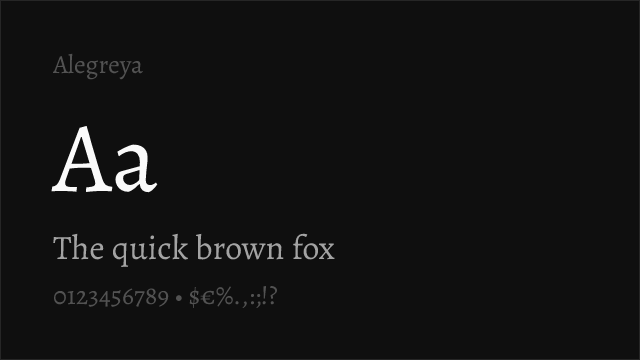
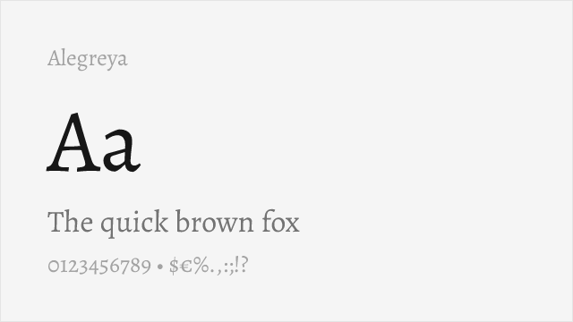
Calligraphic serif family with small caps, variable support, and dynamic character
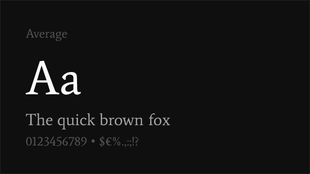

Measured text serif design synthesizing classical serif traditions


Calligraphy-influenced serif with variable support and warm reading character

Optimized for body text on screen with traditional transitional proportions


High-contrast display Garamond with dramatic presence and variable support
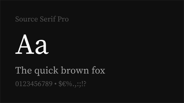

Adobe's transitional serif with optical sizing and reliable cross-platform rendering