Free Alternatives to Concourse for Web Design
Looking for a free sans serif font for web design projects? Concourse by MB Type is a popular choice, but its licensing cost can be prohibitive. We've curated 3 free alternatives that work well in web design contexts. Each alternative is scored by visual similarity and contextual relevance, and ships under an open-source license for both personal and commercial use.
Top Picks
Comparison Table
| Font | Relevance ⓘ
How well this alternative fits the specific context (use-case or trait) of this page. Score 0–100 based on matching keywords, industries, and font characteristics. Alternatives scoring 25+ are highlighted.
| Similarity ⓘ
How visually similar this free font is to the premium original. Score 0–100 based on x-height, width, stroke contrast, use-case overlap, and language coverage.
Learn more → | Weights | Variable | License | Source |
|---|---|---|---|---|---|---|
| Inter | 23 | 74% | Variable | Yes | OFL-1.1 | Google Fonts ↗ |
| Work Sans | 15 | 70% | Variable | Yes | OFL-1.1 | Google Fonts ↗ |
| DM Sans | 15 | 66% | Variable | Yes | OFL-1.1 | Google Fonts ↗ |
All Alternatives (3)

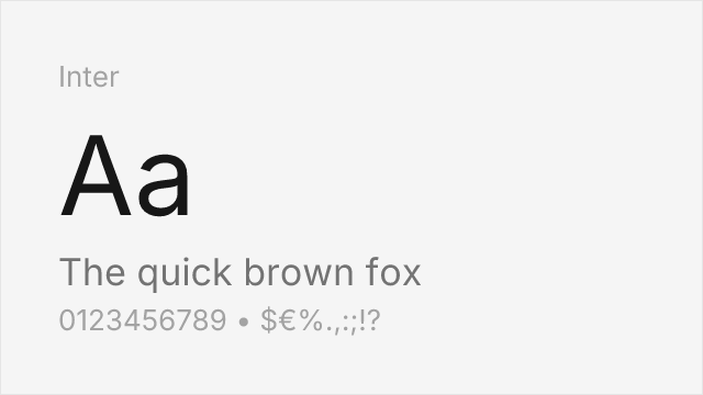
Modern humanist sans built for screens with an even larger weight range (100-900 variable). Inter matches Concourse's readability-first philosophy but was designed for UI, not documents — slightly tighter spacing


American gothic-influenced sans with similar neutral professionalism and a generous x-height. Wider proportions than Concourse, which makes it less space-efficient but equally readable


Google's geometric-humanist hybrid with low contrast and open apertures. Shares Concourse's restraint but leans geometric where Concourse leans humanist — a different flavor of the same quiet competence