 Install FontSwap
Font Inspiration
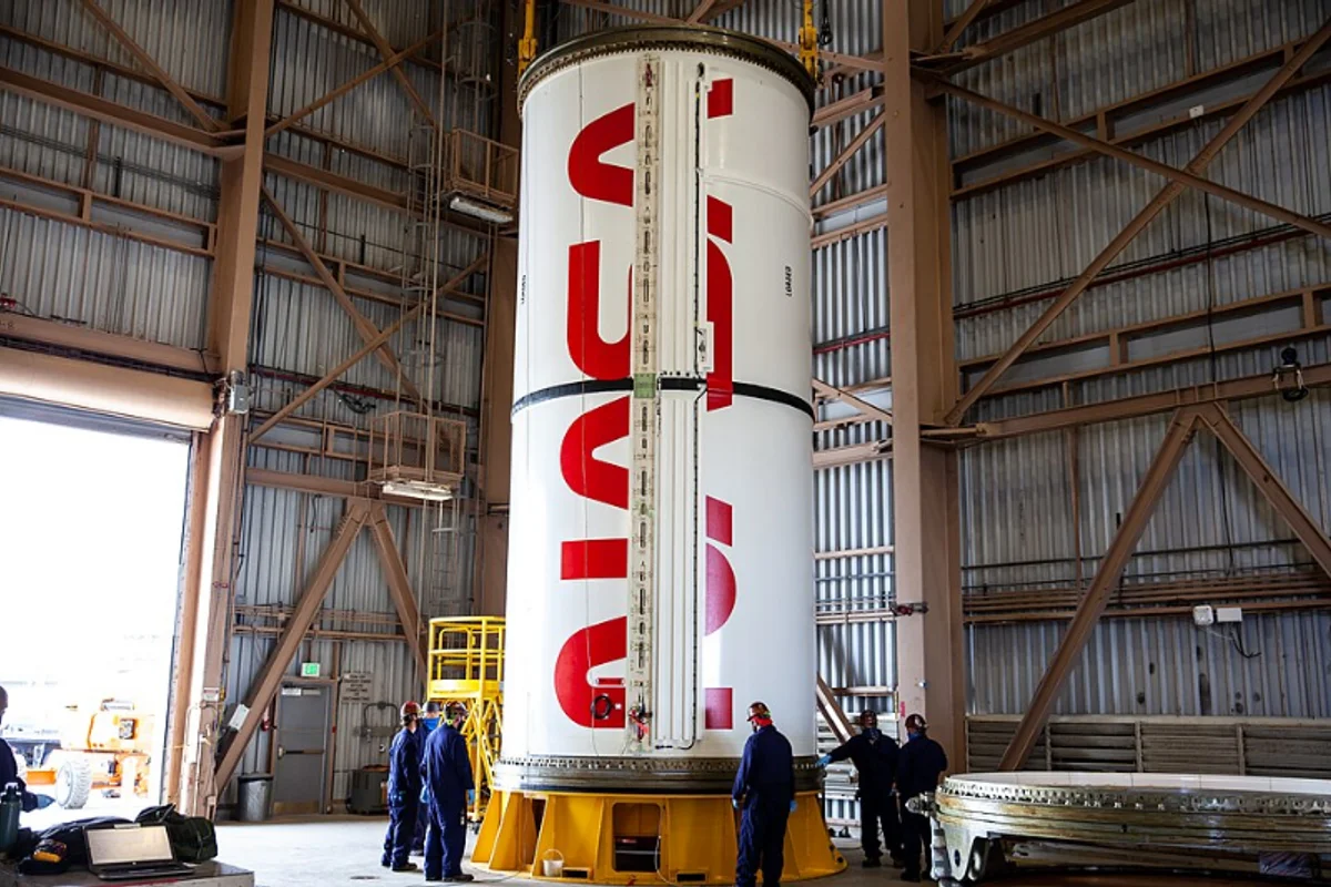
How NASA uses Futura
The typeface on the Moon — Futura appeared on Apollo mission patches and the plaque Neil Armstrong left on the lunar surface
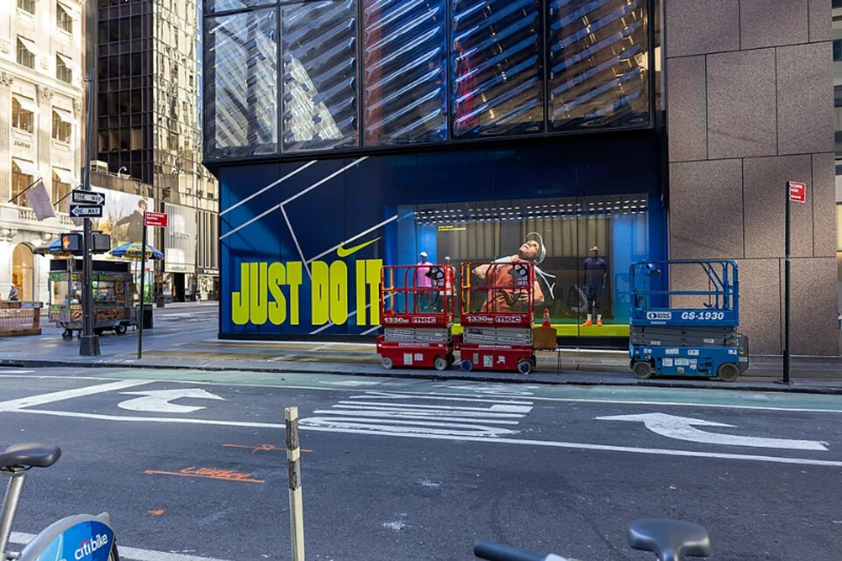
The Nike wordmark and 'JUST DO IT' are set in a modified Futura Condensed Extra Black — geometry built for speed
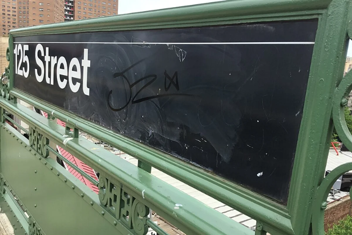
Helvetica Medium guides 5.5 million daily riders through 472 stations — the world's most famous wayfinding typeface
Box logo built on Futura Heavy Oblique — the typeface that defined streetwear's visual language
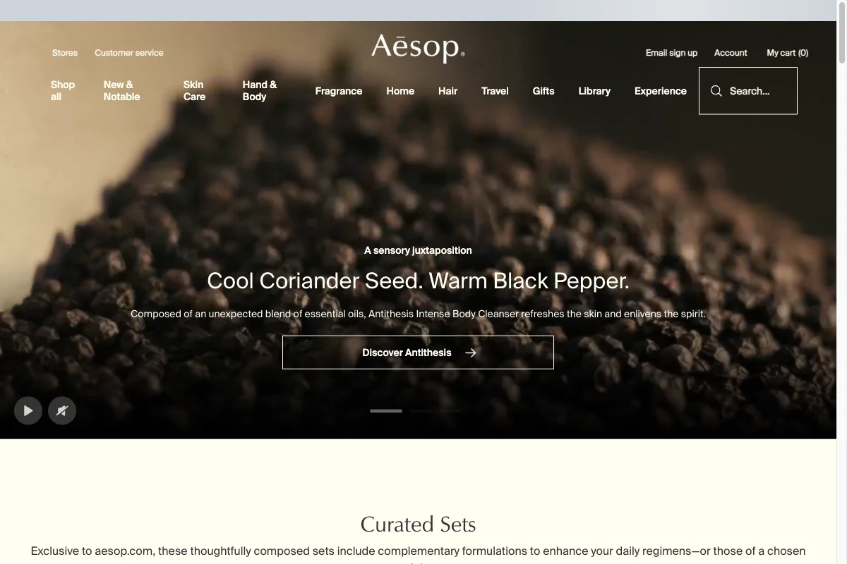
Swiss neutrality as a luxury signal — a beauty brand that removed every decorative cue its category depends on
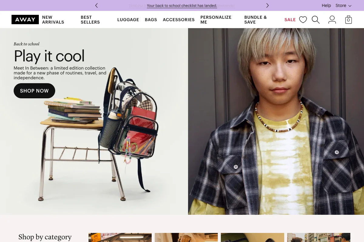
Graphik for the machinery, Lyon Display for the voice — a direct-to-consumer identity that separates the two jobs cleanly

A customised grotesque doing two jobs at once — shouty display for marketing, quiet workhorse for a chat client people leave open all day
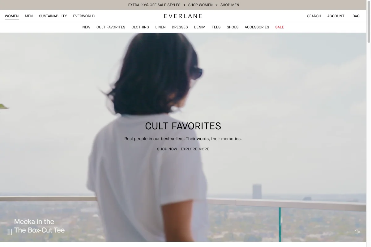
Wide-tracked caps and a neutral grotesque doing the work of a luxury serif — radical transparency, typographically
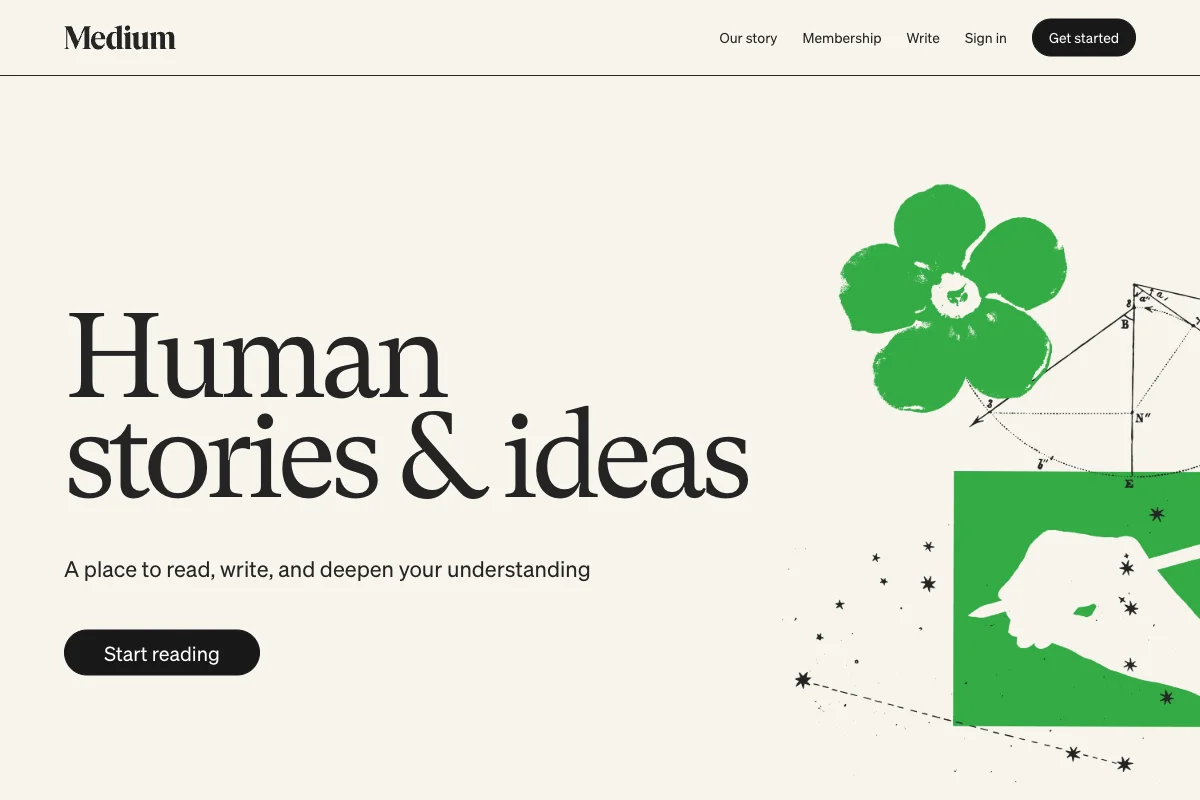
A publishing platform that put a high-contrast display serif where every competitor put a neutral sans
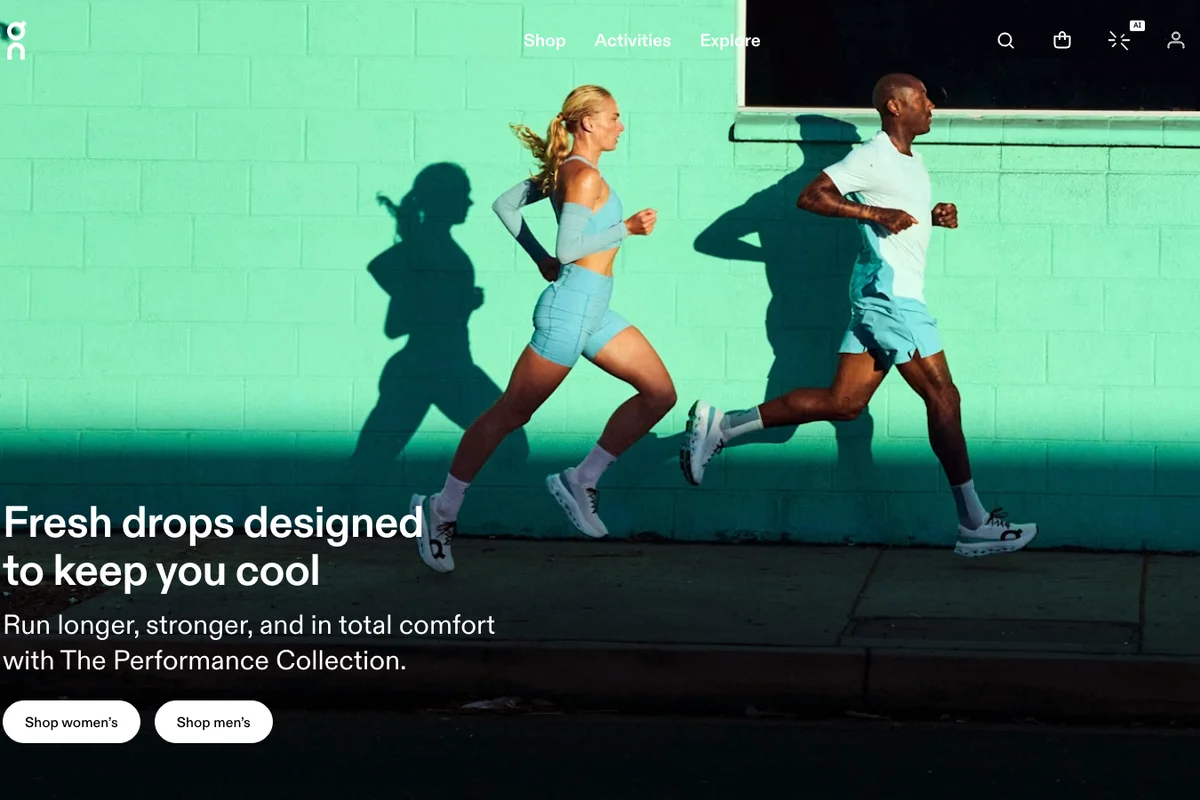
A neo-grotesque customised into something softer — Dinamo redrew ABC Diatype for On to make the letterforms feel like the shoes claim to
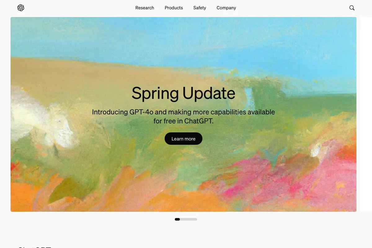
The typeface that gave the first mainstream AI product a voice — quiet, Swiss, deliberately unfuturistic
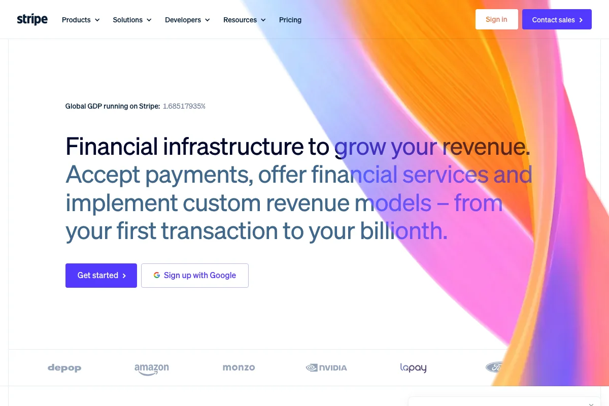
The typeface that made developer-facing fintech look like design work — Söhne carrying Stripe's entire interface, marketing and documentation
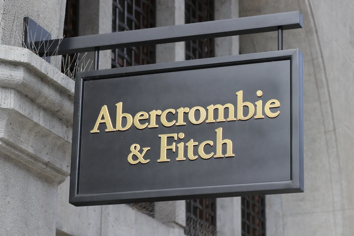
Garamond gave Abercrombie & Fitch its aspirational collegiate identity — old-world type for new-world ambition
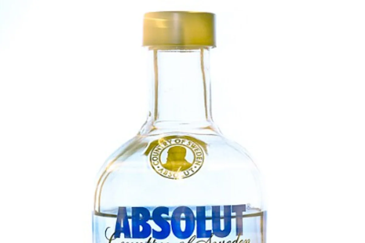
Absolut's bottle label uses a custom typeface derived from Futura Extra Bold Condensed, with distinctive flare serifs
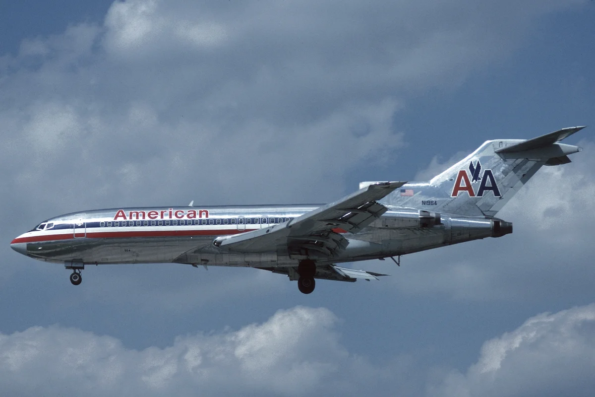
Akzidenz-Grotesk powered Massimo Vignelli's American Airlines identity — a masterclass in modernist branding that defined airline design for nearly five decades
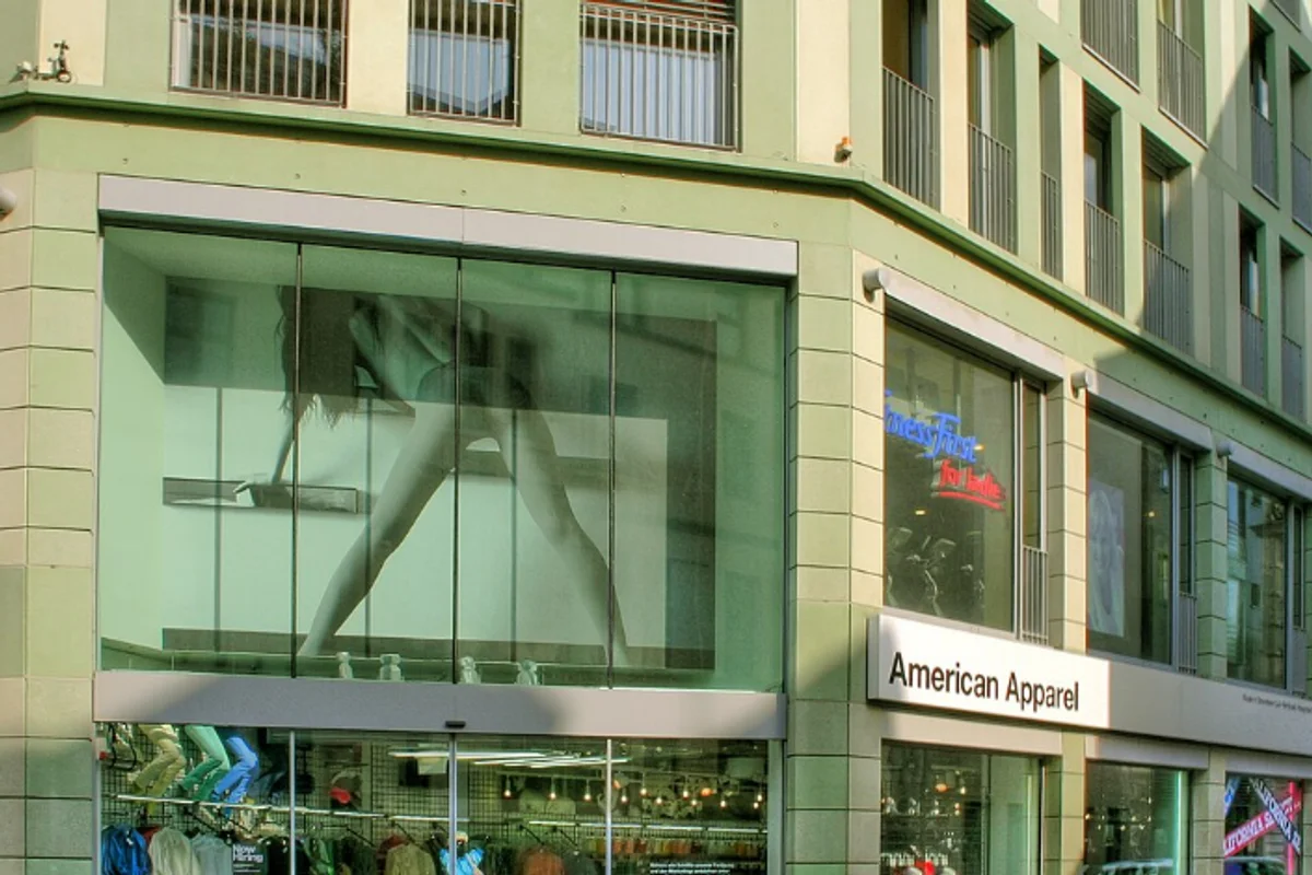
Helvetica Bold set in black caps on white — anti-branding as brand strategy
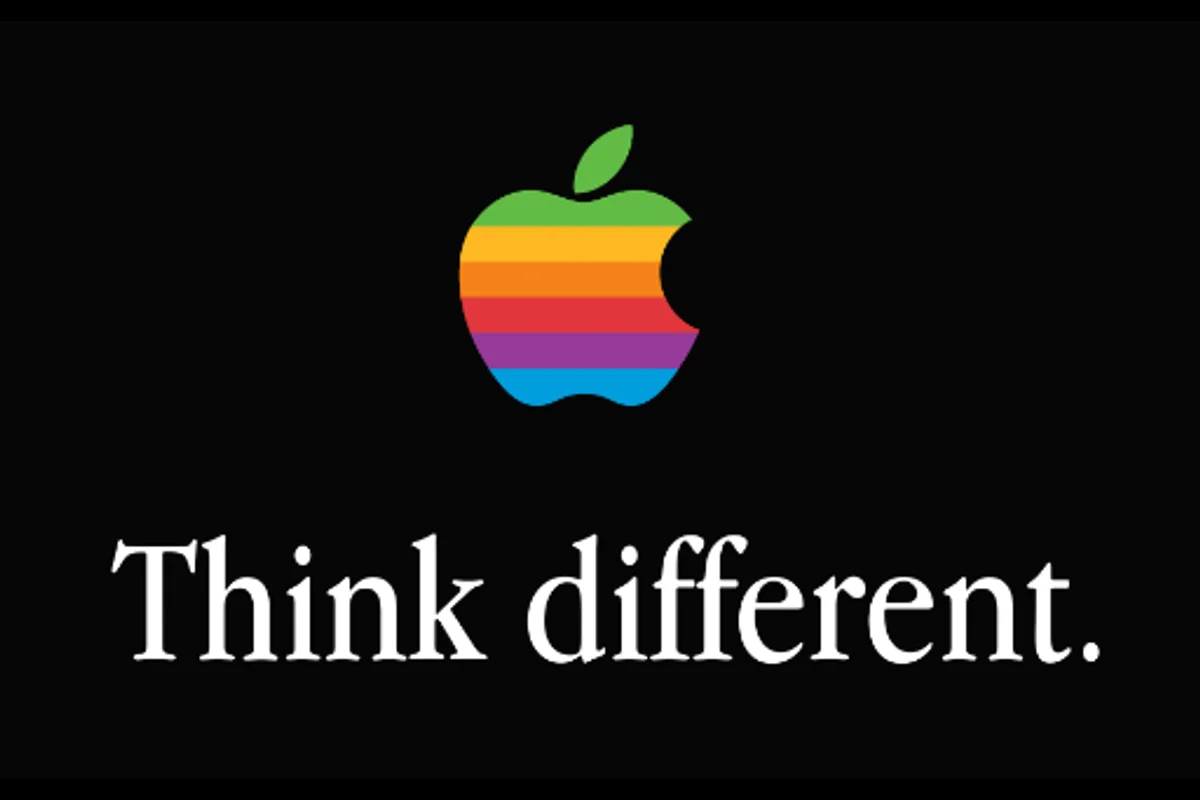
Apple Garamond defined the 'Think Different' era — a serif that made technology feel human
Optima's refined strokes have matched Aston Martin's hand-crafted British luxury since the early 1970s
Gill Sans served as the BBC's corporate typeface for decades, becoming as synonymous with British broadcasting as the channel's own ident
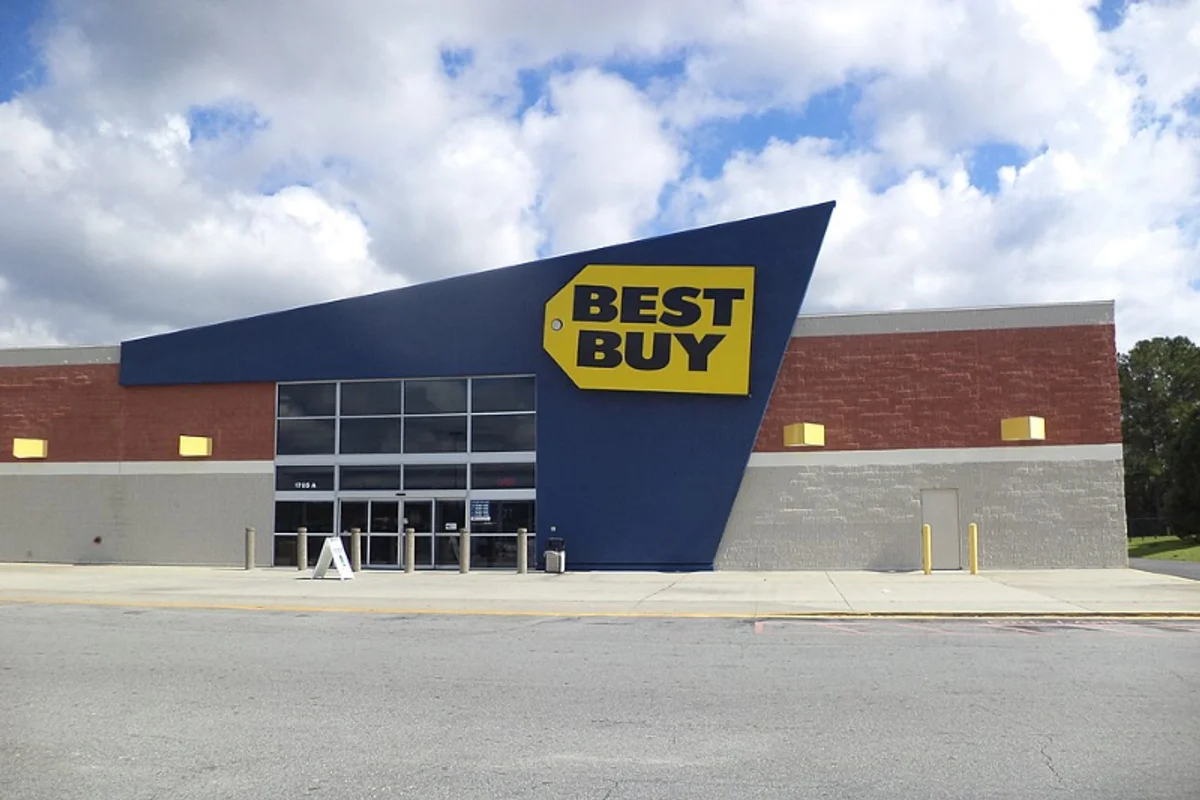
Futura Bold has anchored the Best Buy wordmark since 1989 — geometric clarity for consumer electronics retail
Helvetica Bold powers the BMW wordmark — Swiss neutrality for Bavarian engineering
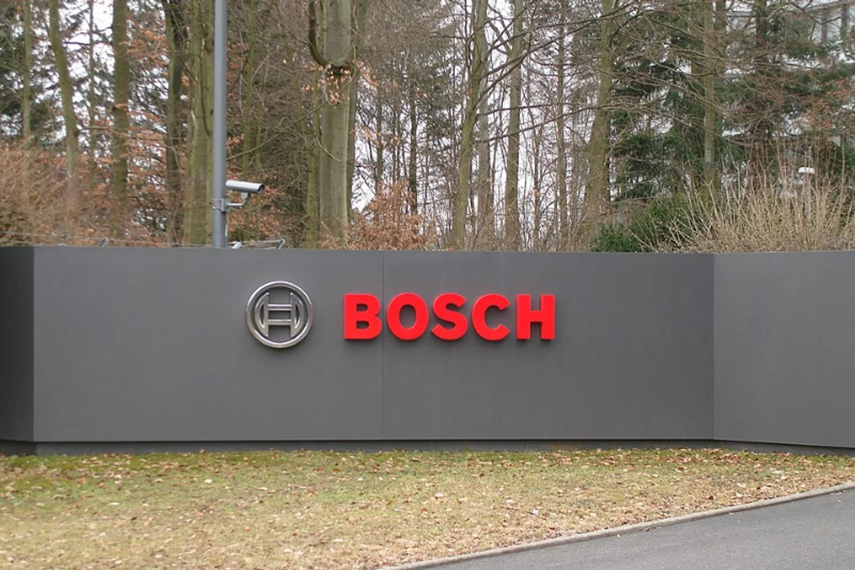
DIN's industrial German roots align perfectly with Bosch's engineering identity — both born from a culture that treats precision as a moral obligation
Gill Sans defined the look of Britain's rail network for decades, appearing on every platform sign, timetable, and poster from nationalisation onward

Proxima Nova became the default voice of millennial web media — and BuzzFeed made it the typeface of the internet's most shareable content
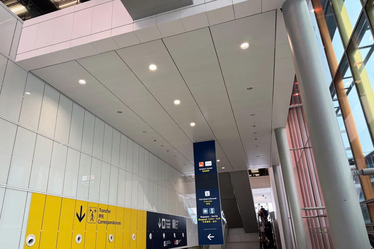
Frutiger was literally born here -- Adrian Frutiger designed the typeface specifically for Charles de Gaulle Airport, making it the birthplace of modern wayfinding typography