Install FontSwap
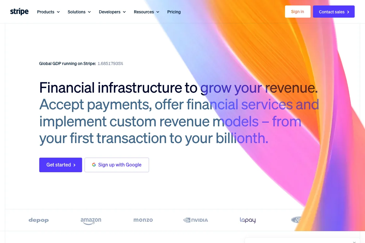
Stripe Uses Söhne
Stripe's design has been copied more than almost any other developer product of the last decade — the gradient, the generous whitespace, the calm density of the documentation. The typeface is the part people copy without noticing they are copying it.
What the site actually loads
Worth being precise here, because brand-typography claims age badly. Loading stripe.com today produces exactly two webfont requests: Söhne, and Source Code Pro for code samples.
That is a striking amount of restraint. No display cut, no separate serif, no mono beyond the code font — one commercial family carrying the wordmark, the navigation, the headline, the buttons and the body copy, with a free open-source mono handling the snippets.
Why Söhne fits a payments company
Kris Sowersby designed Söhne at Klim Type Foundry and released it in 2020, describing it as the memory of Akzidenz-Grotesk framed through the reality of Helvetica. That is a precise piece of self-description: it is not a Helvetica revival and not an Akzidenz revival, but a contemporary grotesque that knows both.
The relevant quality for Stripe is that Söhne is neutral without being cold. Helvetica at small sizes in a dense interface reads as bureaucratic — it is the typeface of forms and signage, and a payments dashboard set in it would feel like filing a tax return. Söhne opens the apertures slightly, relaxes the terminals, and gives the lowercase a fraction more warmth, which is enough to keep a page of financial data from feeling institutional.
The second quality is that it survives being small. Stripe's product surface is tables, key-value pairs, transaction IDs and amounts, mostly at 13–14px. Söhne's x-height and spacing hold up at that size in a way a stricter neo-grotesque does not.
And it does not date the page. A payments company cannot rebrand on the same cycle as a fashion label — the typeface is embedded in dashboards that businesses look at every day for years. Choosing a grotesque was choosing durability.
The gradient does the talking
The thing worth stealing from this page is not the font. It is the division of labour.
The headline is set in a single weight, at a single size, with no typographic ornament at all. Every bit of expression on the page comes from the gradient behind it and from the colour shift applied across the words. The type stays completely flat and lets the graphic carry the personality.
That is why the layout survives translation into a dozen languages and a dozen screen widths without ever looking broken. It is also why so many imitations look wrong: they copy the gradient and then also reach for a characterful typeface, and the two compete.
Free Alternatives
Inter is the closest free equivalent and our highest-scoring alternative for Söhne at 90%. It comes from the same design problem — a grotesque drawn for screens, with a tall x-height and open apertures — and it carries a full 100–900 variable range. Set at 400 for body and 500–600 for interface labels and it covers most of what Stripe asks of Söhne.
Where it differs: Inter is more mechanical. Söhne's slight irregularities are what stop it from feeling like a system font, and Inter, being genuinely designed as something close to a system font, doesn't have them.
Geist (85%) is the more interesting option if the goal is the feel rather than the metrics. Vercel commissioned it for developer-facing product design — the same brief Stripe solved with Söhne — and it is slightly warmer and more contemporary than Inter.
Work Sans (82%) is worth considering for marketing pages specifically. It has a little more character at large sizes and holds a headline better than Inter, though it's less disciplined in a dense table.
For the code blocks, you can use exactly what Stripe uses: Source Code Pro is free, open-licensed and already on the page.
:root {
  --font-sans: "Inter", system-ui, sans-serif;
  --font-mono: "Source Code Pro", ui-monospace, monospace;
}

.hero h1 {
  font-family: var(--font-sans);
  font-weight: 500;
  letter-spacing: -0.02em;  /* Söhne sets tighter than Inter's default */
  line-height: 1.1;
}
That negative tracking matters more than the font swap. Inter's default spacing is looser than Söhne's, and a headline set without it will read noticeably airier than the original.