Install FontSwap
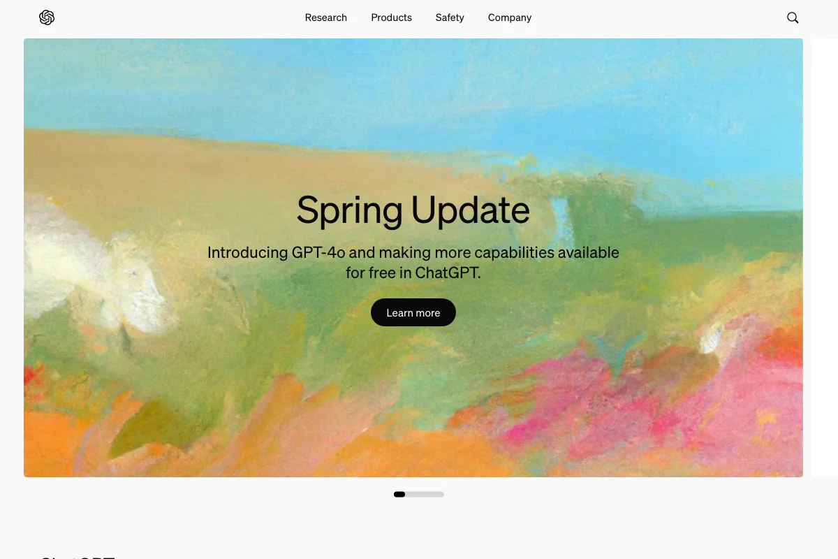
OpenAI Used Söhne
For roughly two years, the most-visited AI product on the internet was set in a typeface designed in Wellington, New Zealand, that takes its name from a German phrase and its skeleton from a 1898 Berlin grotesque.
That period is over — OpenAI moved to a bespoke face, OpenAI Sans — but the Söhne era is worth documenting, because it was a genuinely interesting decision and because almost every article about it is now wrong.
What was actually running
In February 2023, OpenAI replaced Colfax and Charter with two Klim Type Foundry faces: Söhne for the sans, Signifier for the serif. The screenshot here is from June 2024 — the GPT-4o launch — and everything on it, from the navigation to the "Spring Update" headline, is Söhne.
Loading openai.com today produces no Söhne at all. The site requests OpenAI Sans, plus Arabic and variable-script companions. Both facts are verifiable from the network log, which is the only reliable way to check this sort of claim.
Why Söhne was the right call at the time
The obvious move for a company selling machine intelligence in 2023 would have been a technical-looking typeface. Something geometric, wide, monospaced, faintly science-fictional — the visual language every AI startup was reaching for.
OpenAI went the other way, and the restraint is the whole point.
Kris Sowersby describes Söhne as the memory of Akzidenz-Grotesk framed through the reality of Helvetica. It is, in other words, a very ordinary-looking typeface: a Swiss grotesque with the corners taken off, the sort of face you'd expect on a bank's annual report. Nothing about it says artificial intelligence.
Which is exactly why it worked. In 2023 the product's problem was not that it seemed unimpressive — it was that it seemed alarming, unpredictable, and difficult to trust. A typeface that looked like the future would have amplified that. A typeface that looked like a utility made the thing feel like infrastructure: boring, dependable, already part of the furniture.
The mono cut did the remaining work. Söhne Mono in the code blocks put the product in the developer-tool tradition rather than the sci-fi one, and reinforced the same idea — this is a tool, not an oracle.
Why brands leave a typeface like this
The move to a bespoke face is the standard trajectory for a company at that scale, and licensing is usually the smaller half of the reason.
A licensed retail typeface is available to everyone, including competitors. When Anthropic, Perplexity and Figma all commissioned their own faces in the same period, the shared logic was ownership: at a certain size, being typographically indistinguishable from the rest of your category is a liability, and a face nobody else can license is the cheapest form of differentiation.
There is also a practical argument. A bespoke family can be drawn for the exact scripts, weights and interface sizes the product needs, without paying per-seat for cuts you never use.
None of which makes the original decision worse. Söhne carried the product through the period when it mattered most.
Free Alternatives
Our top match for Söhne is Inter at 90%, and it is a genuinely close one — both are grotesques drawn for screen reading with tall x-heights and open apertures. Inter is variable across 100–900, which covers everything from 12px interface labels to a display headline.
Geist (85%) is the more characterful option and arguably the better spiritual match: Vercel commissioned it for developer-facing product design, the same brief Söhne was solving here.
Work Sans (82%) has a little more warmth at large sizes if the marketing pages need to feel less neutral than the product.
For the mono, Source Code Pro or JetBrains Mono both sit comfortably beside Inter.
:root {
  --font-sans: "Inter", system-ui, sans-serif;
  --font-mono: "JetBrains Mono", ui-monospace, monospace;
}

h1 {
  font-family: var(--font-sans);
  font-weight: 400;         /* the restraint is the point */
  letter-spacing: -0.015em;
  line-height: 1.15;
}
Resist the urge to set the headline bold. The thing worth copying from this identity is that the biggest text on the page was Regular weight — the confidence came from not raising its voice.