Install FontSwap
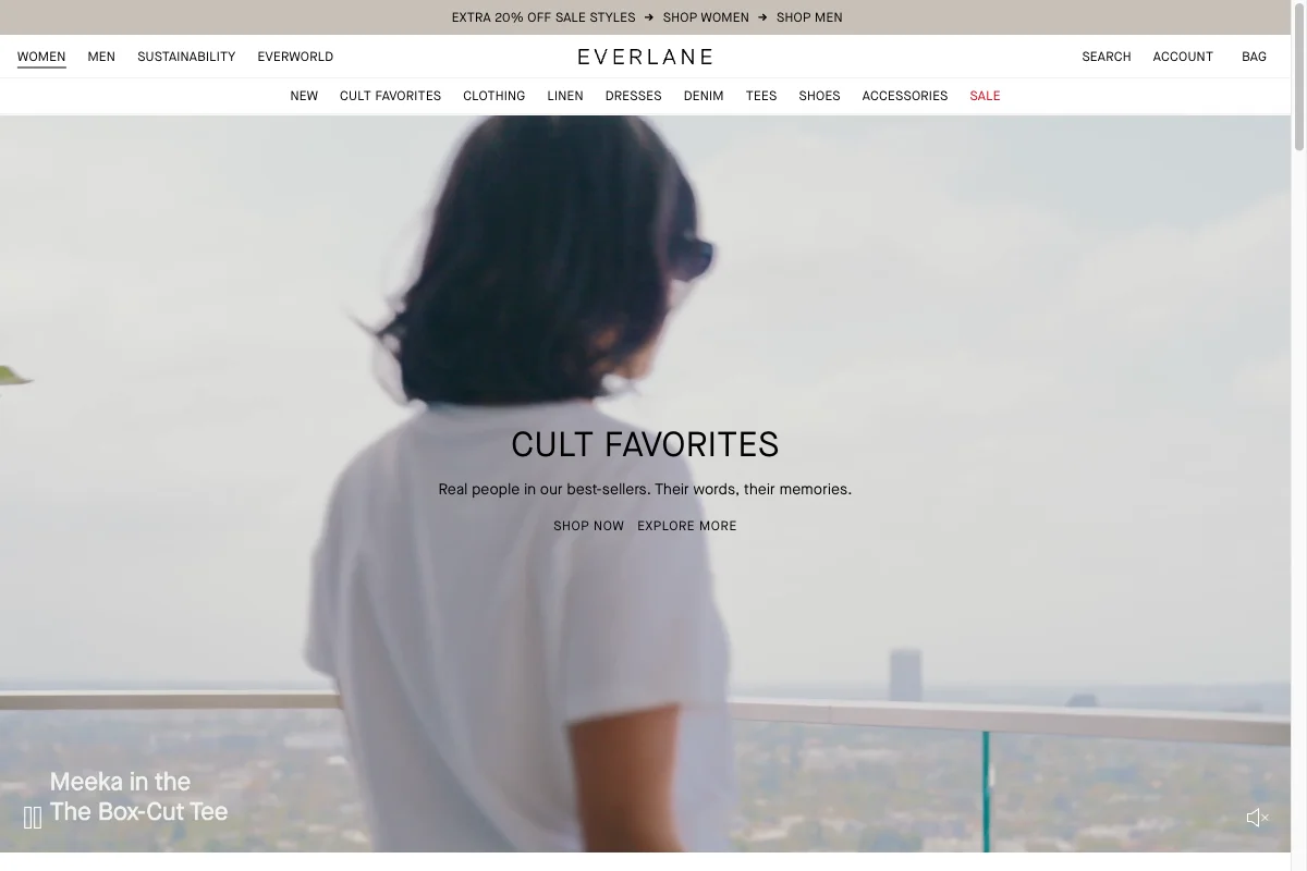
Everlane Uses Maison Neue
Everlane built a brand on telling you what things cost to make. The typography had to look like disclosure rather than seduction — and it does it almost entirely with letter-spacing.
The face
The site runs Maison Neue, Milieu Grotesque's neo-grotesque, across the wordmark, navigation, headlines and product copy, in Book and Demi weights. Graphik appears in a supporting role.
Maison Neue is a Helvetica descendant with slightly more warmth and looser apertures — neutral, but not clinical.
Tracking is the entire identity
Look at the wordmark: E V E R L A N E, letter-spaced wide enough that the word reads as a sequence of individual characters. The same treatment runs through the navigation — WOMEN, MEN, SUSTAINABILITY, EVERWORLD — and the section headline, CULT FAVORITES.
Wide-tracked caps in a neutral sans is one of the oldest moves in fashion retail, and it is doing something specific. Tracking slows reading down. A word set with generous letter-spacing is processed as a series of forms rather than absorbed as a unit, which makes it feel deliberate, unhurried and expensive.
It is the same effect luxury houses get from a high-contrast Didone, achieved without the Didone. Everlane wanted to look like a considered brand without looking like a fashion brand, because the whole proposition was that it wasn't one — no markup theatre, no seasonal hype, just the cost breakdown.
A serif would have undercut that. A geometric sans would have read as tech. A neutral grotesque, spaced out and set in caps, reads as catalogue — and catalogue is exactly the register a transparency-first retailer wants.
.wordmark,
nav a,
.section-head {
  font-family: "Maison Neue", sans-serif;
  text-transform: uppercase;
  letter-spacing: 0.18em;   /* the entire brand is in this line */
  font-weight: 400;
}
Where it stays quiet
Below the caps, everything reverts to sentence case at modest size and Book weight — product names, descriptions, the material and factory copy Everlane is known for. No emphasis, no accent colour, no italic.
That restraint is what makes the tracked caps read as intentional rather than decorative. If everything were spaced out, none of it would signal anything.
Free Alternatives
Inter is our closest match to Maison Neue at 85% — a screen-drawn grotesque with a tall x-height and a full 100–900 variable range. For this identity specifically it is more than sufficient, because the effect comes from spacing rather than from the letterforms.
Work Sans (82%) is slightly warmer and a little less mechanical, which is arguably closer to Maison Neue's actual temperament.
DM Sans (80%) is more geometric — good if you want a touch more friendliness in the product copy.
Plus Jakarta Sans (78%) reads more contemporary and works well if the brand skews younger.
Any of them will carry this look, because the look is a spacing decision. Two things to get right:
Track the caps, not the lowercase. letter-spacing: 0.15em–0.2em on uppercase; leave sentence-case body copy at normal or very slightly negative. Tracked lowercase looks like a mistake.
Stay at Regular. The temptation is to set the wordmark bold. Everlane's is not, and the airiness is the point — weight and tracking pull in opposite directions.