Free Alternatives to Maison Neue

About Maison Neue
- Foundry
- Milieu Grotesque
- Classification
- sans-serif
- Style
- neo-grotesque
Brands Using Maison Neue
Primary brand typeface across packaging, retail interiors, and digital presence
Brand identity, campaign typography, and e-commerce interface
Editorial typeface for travel and lifestyle magazine layouts
Brand identity and product communications for performance apparel
Supporting typeface in fragrance packaging and brand collateral
Maison Neue is a neo-grotesque sans-serif typeface designed by Timo Gaessner and released by Milieu Grotesque, the Swiss independent type foundry he established. First appearing around 2013-2015, Maison Neue quickly became the typographic signature of understated luxury — the typeface that brands choose when they want to communicate refinement through restraint rather than decoration. It occupies a specific and influential position in contemporary type design: the "if you know, you know" choice for fashion, beauty, and lifestyle brands that define themselves through curatorial precision rather than visual volume.
Maison Neue requires a paid license from Milieu Grotesque. Desktop, web, and app licenses are priced separately, with costs varying by project scope. There is no free tier. The standard family includes 9 weights (Thin to Black) with matching italics. An extended version adds condensed, extended, and mono variants. If your project cannot accommodate Milieu Grotesque's licensing, the alternatives below cover the strongest open-source options and what to consider when choosing one.
Why Maison Neue Matters
There is a category of typeface that you encounter constantly without consciously registering it. You see it on the amber glass bottles at Aesop, on the minimalist hangtags at COS, in the measured columns of Cereal magazine, on the packaging of a Byredo candle. You recognize the aesthetic — clean, calm, unhurried, expensive — before you identify the typography creating it. That is Maison Neue's design position, and it is a position of remarkable influence.
Maison Neue arrived at a moment when the design world was caught between two poles. On one side were the hyper-rational Swiss grotesques — Helvetica, Univers, Akzidenz-Grotesk — whose neutrality had calcified into ubiquity and, eventually, invisibility. On the other were the new wave of personality-forward neo-grotesques — Apercu, Favorit, Ginto — that introduced quirks and character to distinguish themselves in a crowded marketplace. Maison Neue declined to choose either extreme. It offered something rarer: a neo-grotesque that was neither invisible nor conspicuous. Perfectly calibrated neutrality with a whisper of warmth.
This calibration is what attracted Aesop, the Australian skincare company whose brand identity is essentially an exercise in quiet luxury. Aesop's design language — amber packaging, literary quotations on every store wall, botanically-named products — requires typography that reads as cultivated and intelligent without competing with the visual and verbal storytelling. Maison Neue accomplishes this. It sits on an Aesop label the way a well-chosen linen sits on a minimalist shelf: you notice the quality without noticing the choice. The typeface became so thoroughly identified with Aesop's aesthetic that it effectively defined how a generation of beauty and wellness brands approached their own typography.
COS, H&M's elevated fashion line, made a similar calculation. Where H&M's own branding is loud and promotional, COS positions itself as the thinking person's wardrobe — restrained, architectural, European in sensibility. Maison Neue supports this positioning by providing typography that feels considered without feeling designed. Campaign imagery, e-commerce interfaces, and in-store materials all benefit from a typeface that communicates "we care about these details" through its quality rather than its personality.
Cereal magazine, the Bristol-based travel and lifestyle publication, deployed Maison Neue for its editorial layouts — a context that demands a typeface capable of sustaining extended reading while maintaining a contemporary visual identity. The magazine's photography-forward approach needed typography that could be authoritative in headlines, invisible in body copy, and elegant in captions. Maison Neue delivered on all three registers, a versatility that stems from its carefully controlled personality.
What unites these adoptions is a specific brand philosophy: the belief that true sophistication is expressed through restraint. These are not brands seeking typographic differentiation through novelty. They are brands seeking to disappear their typography into an overall experience of quality. Maison Neue's genius is in being the typeface that makes this disappearing act possible while still carrying enough design intelligence to reward those who look closely.
This "quiet luxury" positioning explains both Maison Neue's influence and its relative lack of name recognition outside design circles. It will never achieve the mainstream awareness of Helvetica or the startup-era ubiquity of Circular. Its audience is specific: creative directors and brand strategists who treat typeface selection as an extension of brand philosophy rather than a functional requirement. For that audience, Maison Neue is not just a font choice — it is a statement about values.
Design Characteristics
Maison Neue's design reveals its Swiss DNA through details that prioritize precision over expression:
- Controlled, moderate x-height: Unlike the aggressively tall x-heights of screen-optimized typefaces like Inter, Maison Neue maintains classical proportions that create elegant vertical rhythm. Ascenders and descenders have room to breathe, producing the open, unhurried paragraph texture that editorial layouts demand
- Even, monoline stroke weight: Minimal contrast between thick and thin strokes creates an exceptionally calm typographic color across paragraphs. This evenness is critical to the typeface's luxury positioning — it produces text blocks that feel measured and deliberate rather than energetic or dynamic
- Subtle apertures — open but not wide: The
c,e,s, andahave apertures that split the difference between the claustrophobic closedness of Helvetica and the aggressive openness of screen-first fonts. This balance creates legibility without sacrificing the tight, rational character that defines Maison Neue's personality - Flat, horizontal terminals: Stroke endings are uniformly horizontal and clean, contributing to the typeface's restrained demeanor. There are no ball terminals, angled cuts, or decorative finishes that might introduce visual noise or personality
- Geometric underpinnings with grotesque softening: The foundational forms are geometric — circles, straight lines, consistent angles — but Gaessner softened joints and intersections to avoid the mechanical coldness of pure geometric sans-serifs like Futura. This subtle organic touch is what separates Maison Neue from its more clinical Swiss ancestors
- Compact, rational letterspacing: The default spacing is tighter than many contemporary grotesques, producing dense but readable text that suits the editorial and packaging contexts where Maison Neue thrives. This spacing rewards careful typographic attention — set too loose and it loses its character; set too tight and it becomes claustrophobic
- True italics with restrained cursive influence: The italic styles introduce genuine cursive characteristics in select letterforms rather than relying on mechanical obliquing. This distinction matters in editorial contexts where italic emphasis needs to provide real visual differentiation
- Comprehensive weight range: Nine weights from Thin to Black with matching italics provide a full typographic hierarchy. The Thin and Light weights are particularly successful, carrying the delicate precision that fashion and luxury applications demand
The extended Maison Neue family includes condensed, extended, and mono variants, creating a comprehensive typographic system. Maison Neue Mono has found particular favor among studios and agencies seeking a monospace typeface with the same refined character as the proportional family.
Where Maison Neue Excels
Maison Neue reaches its highest level of performance in contexts where understated refinement is the defining requirement:
- Luxury and beauty packaging: The typeface's controlled stroke weight and elegant proportions translate beautifully to physical packaging. On an Aesop bottle, a Byredo carton, or a premium cosmetics label, Maison Neue communicates quality through typographic restraint
- Fashion editorial and e-commerce: From lookbook headlines to product description body copy, Maison Neue handles the full range of fashion typography without breaking character. It is equally composed at 72pt display sizes and 9pt caption sizes
- Lifestyle magazine layouts: Publications like Cereal demonstrate Maison Neue's ability to sustain extended reading while maintaining a contemporary visual identity. The typeface's even texture and classical proportions make it exceptionally comfortable for long-form editorial content
- Brand identity systems for premium positioning: Companies seeking to communicate quiet confidence — in hospitality, architecture, fine dining, or professional services — find in Maison Neue a typeface perfectly calibrated to that register
- Gallery and museum materials: Cultural institutions benefit from the typeface's ability to be contemporary without being trendy, serious without being severe. Exhibition catalogs, wall labels, and event communications all sit comfortably in Maison Neue
- Corporate communications for design-conscious companies: Architecture firms, design consultancies, and creative agencies use Maison Neue for proposals, presentations, and reports where typography needs to project both competence and taste
Where Maison Neue Struggles
Maison Neue's precision creates corresponding limitations:
- Data-heavy product interfaces: The typeface lacks the aggressive screen optimization, tabular figure variants, and UI-specific features that products like dashboards and SaaS applications demand. Inter or a system font will perform better in dense digital interfaces
- Mass-market consumer brands: Maison Neue's quiet sophistication can read as cold or inaccessible in contexts targeting broad consumer audiences. Brands seeking warmth and approachability will find its restraint alienating
- Small sizes on standard-resolution screens: Without the extensive hinting infrastructure of fonts engineered specifically for screen rendering, Maison Neue's subtle details can degrade at sizes below 13px on non-retina displays
- Projects requiring broad script support: The standard family covers Latin and Latin Extended. The extended family adds Cyrillic, but Greek, Arabic, CJK, and other scripts require fallback typefaces. Multilingual projects should plan accordingly
- Loud, attention-seeking brand contexts: Maison Neue was designed to support, not to shout. In advertising, event promotion, or any context demanding typographic impact and energy, the typeface's reticence becomes a liability
- Budget-constrained projects with large team sizes: Per-weight, per-platform licensing for a nine-weight family across desktop, web, and app can represent a significant investment, particularly for organizations with many design seats
How to Choose a Free Substitute
When evaluating Maison Neue replacements, the central challenge is replicating its specific tonal register — Swiss precision tempered by just enough warmth to feel human rather than mechanical. Here is what to prioritize:
- Typographic color and texture at editorial sizes: Set a full paragraph at 15-18px in your candidate font and compare the overall grey value and rhythm against Maison Neue specimens. The paragraph-level impression matters more than individual letterform matches. Maison Neue produces exceptionally even, calm texture — your substitute should do the same
- Weight behavior in the Light and Thin range: Maison Neue's thinner weights are among its most distinctive features, widely used in fashion and luxury contexts. Test your alternative at Light (300) and Thin (100) weights specifically. Many free fonts are optimized for Regular and Bold but fall apart at the delicate end of the spectrum
- Letterspacing character: Maison Neue's default spacing is compact and considered. Set your candidate at its default tracking and evaluate whether it produces similarly dense, rational text or whether it reads as loose and casual. Adjust tracking if needed, but be aware that a typeface that requires significant spacing modification will never fully replicate Maison Neue's native rhythm
- Personality calibration: The critical distinction is between typefaces that are neutral (empty of character) and typefaces that are restrained (deliberately quiet). Maison Neue belongs to the second category. Test your alternative alongside luxury brand photography — does it feel like a considered choice, or does it feel like the designer did not choose at all?
- Variable font advantage: Maison Neue ships as static fonts only. Most of its best free alternatives offer variable font support, which is a genuine upgrade for web performance and responsive design. This is one area where the free alternatives can actually surpass the premium original
Inter is the strongest overall substitute for digital contexts, matching Maison Neue's structural discipline while adding screen optimization features. Work Sans is the better choice for editorial and fashion applications where the typeface's warmth and reading comfort matter more than pixel-level precision. For projects where multilingual support is essential, Source Sans 3 provides the most comprehensive coverage.
Premium Font Neighbors
If Maison Neue's approach resonates but you want to explore adjacent premium options:
Cluster A: Swiss and European refined grotesques (Maison Neue's direct peers)
- Suisse (Swiss Typefaces) — The most directly comparable typeface; shares Maison Neue's Swiss precision and quiet luxury positioning, with slightly wider proportions and a more systematic family structure
- Basis Grotesque (Colophon Foundry) — A London-inflected neo-grotesque with similar editorial versatility; warmer and more humanist than Maison Neue, popular in the same fashion and cultural contexts
- Atlas Grotesk (Commercial Type) — Occupies adjacent territory with more explicit references to historical grotesque models; slightly more robust and corporate in character
- Duplicata (Commercial Type) — Another thoughtful neo-grotesque with editorial credentials; shares Maison Neue's interest in balancing Swiss rationalism with contemporary refinement
Cluster B: Contemporary neo-grotesques for luxury and tech
- Apercu (Colophon Foundry) — More personality-forward than Maison Neue, with distinctive letterforms that draw attention; the choice when you want the typeface to be noticed rather than felt
- Neue Montreal (Pangram Pangram) — A more accessible, expressive grotesque popular with creative studios; shares Maison Neue's contemporary positioning but with more overt visual energy
- Favorit (Dinamo) — A Swiss neo-grotesque with similar cultural-institution appeal; slightly more angular and geometric, with a cooler overall temperature
- Sohne (Klim Type Foundry) — Kris Sowersby's "memory of Helvetica" targets a similar market of design-conscious tech companies; more explicitly digital in its optimization than Maison Neue's print-heritage character
FAQ
Is Maison Neue free?
No. Maison Neue is a premium typeface from Milieu Grotesque, the independent Swiss foundry run by its designer Timo Gaessner. Desktop, web, and app licenses are priced separately and vary by project scope. There is no free version or trial available. The best free alternative is Inter at 85% similarity.
What is the best free alternative to Maison Neue?
Inter is the closest free alternative at 85% similarity. Both share a disciplined neo-grotesque skeleton, even stroke weights, and open apertures that prioritize legibility. Inter adds variable font support (100-900 weight axis), optical sizing, and broader language coverage including Cyrillic and Greek. It is available on Google Fonts under the OFL-1.1 license. For more editorial contexts, Work Sans at 82% similarity may be a better tonal match.
Why do luxury brands choose Maison Neue?
Luxury brands gravitate toward Maison Neue because it communicates refinement through restraint rather than ornamentation. Its Swiss precision, even stroke weight, and controlled proportions produce typography that feels expensive and deliberate without being conspicuous. For brands like Aesop, COS, and Byredo, this "quiet luxury" approach aligns with a brand philosophy where quality should be evident but never ostentatious. The typeface signals taste through its presence rather than its personality.
What is the difference between Maison and Maison Neue?
Maison is the original release from Milieu Grotesque — a more compact, slightly rougher neo-grotesque with narrower proportions. Maison Neue is the refined successor, redesigned with smoother curves, more generous proportions, and an expanded weight range (nine weights versus Maison's five). Maison Neue also introduced matching italics and later gained condensed, extended, and mono variants. Most contemporary uses reference Maison Neue; the original Maison is less commonly seen in new projects.
What weights does Maison Neue come in?
The standard Maison Neue family includes nine weights: Thin, ExtraLight, Light, Regular, Medium, DemiBold, Bold, ExtraBold, and Black. Each weight has a matching italic. The extended family adds condensed and extended width variants across the same weight range, plus Maison Neue Mono for monospace applications. This comprehensive range makes Maison Neue suitable for complex typographic hierarchies from delicate fashion captions to bold headline treatments.
Does Maison Neue support Cyrillic?
The standard Maison Neue family supports Latin and Latin Extended scripts only. The extended family (Maison Neue Extended) includes Cyrillic support. For projects requiring Cyrillic without purchasing the extended license, Inter (full Cyrillic and Greek support) or Source Sans 3 (Latin, Cyrillic, Greek, Vietnamese) provide the most comprehensive free alternatives.
Can I use Maison Neue on the web?
Yes, with a web font license from Milieu Grotesque. Web licenses are priced by traffic volume and include WOFF2 files for self-hosting. Maison Neue is not available through Google Fonts, Adobe Fonts, or any font CDN. Because the standard family ships as static fonts (not variable), you will need to load individual weight files, which increases page weight. A typical editorial implementation loading Regular, Italic, Medium, and Bold weighs approximately 200-300KB — compared to a single variable font file for Inter or Work Sans.
Who designed Maison Neue?
Timo Gaessner, a Swiss type designer who founded Milieu Grotesque as an independent foundry. Gaessner's work is characterized by a deep connection to Swiss modernist design principles — precision, restraint, systematic thinking — applied to contemporary typographic needs. Beyond Maison Neue, the Milieu Grotesque catalog includes typefaces that share this philosophy of refined, purposeful design rooted in the tradition that made Swiss typography influential worldwide.
Is Maison Neue on Google Fonts?
No, Maison Neue is a premium font from Milieu Grotesque and is not available on Google Fonts.
The closest Google Fonts alternative is Inter with 85% similarity. Get it free on Google Fonts ↗
Free Alternatives (7)


Closest structural match with better variable font support and screen optimization


Similar editorial versatility and clean proportions with a slightly warmer tone


Comparable geometric-grotesque balance with clean, understated proportions


Modern geometric with similar approachability and premium feel


Softer grotesque with similar brand-friendly warmth and broad weight range


Enterprise alternative with broader language support and proven reliability

Neutral grotesque with institutional reliability and accessibility-first design
See where Maison Neue is used in the wild and swap to free alternatives live.
Install FontSwap →Replacement Summary
Source: FontAlternatives.com
Premium font: Maison Neue
Best free alternative: Inter
FontAlternatives similarity score: 85%
Replacement difficulty: Low
Best for: product UI and web applications, brand identity systems on a budget, design system foundations, multilingual digital projects
Notable users: Aesop, COS, Cereal
Not recommended when: Brand consistency with Aesop requires exact letterforms
What is the best free alternative to Maison Neue?
Inter is the best free alternative to Maison Neue with a FontAlternatives similarity score of 85%.
Inter shares similar proportions, stroke characteristics, and intended use with Maison Neue. It is available under the OFL-1.1 license, which permits both personal and commercial use at no cost.
This alternative works particularly well for: product UI and web applications, brand identity systems on a budget, design system foundations, multilingual digital projects.
Can I safely replace Maison Neue with Inter?
Yes, Inter is a high-confidence replacement for Maison Neue. The FontAlternatives similarity score of 85% indicates strong structural compatibility.
Licensing: Inter is licensed under OFL-1.1, which allows commercial use without licensing fees or royalties.
Weight coverage: Most weights have close or exact matches available.
When should I NOT replace Maison Neue?
While Inter is a strong alternative, there are situations where replacing Maison Neue may not be appropriate:
- Brand consistency: Maison Neue is commonly seen in Aesop packaging and retail environments contexts where exact letterforms may be required.
- Strict compliance: Verify that OFL-1.1 terms meet your specific legal and compliance requirements.
Weight-Matching Guide
Map Maison Neue weights to their closest free alternatives for accurate font substitution.
Inter
| Maison Neue | Inter | Match |
|---|---|---|
| Thin (100) | Thin (100) | close |
| Light (300) | Light (300) | exact |
| Regular (400) | Regular (400) | exact |
| Medium (500) | Medium (500) | exact |
| Bold (700) | Bold (700) | close |
| Black (900) | Black (900) | close |
Work Sans
| Maison Neue | Work Sans | Match |
|---|---|---|
| Light (300) | Light (300) | exact |
| Regular (400) | Regular (400) | exact |
| Medium (500) | Medium (500) | exact |
| Bold (700) | Bold (700) | close |
DM Sans
| Maison Neue | DM Sans | Match |
|---|---|---|
| Thin (100) | Thin (100) | close |
| Light (300) | Light (300) | close |
| Regular (400) | Regular (400) | close |
| Medium (500) | Medium (500) | close |
| Bold (700) | Bold (700) | close |
Plus Jakarta Sans
| Maison Neue | Plus Jakarta Sans | Match |
|---|---|---|
| Light (300) | Light (300) | close |
| Regular (400) | Regular (400) | close |
| Medium (500) | Medium (500) | close |
| Bold (700) | Bold (700) | close |
Nunito Sans
| Maison Neue | Nunito Sans | Match |
|---|---|---|
| Light (300) | Light (300) | close |
| Regular (400) | Regular (400) | close |
| Medium (500) | Medium (500) | substitute |
| Bold (700) | Bold (700) | close |
Source Sans 3
| Maison Neue | Source Sans 3 | Match |
|---|---|---|
| Light (300) | Light (300) | close |
| Regular (400) | Regular (400) | close |
| Medium (500) | Medium (500) | substitute |
| Bold (700) | Bold (700) | close |
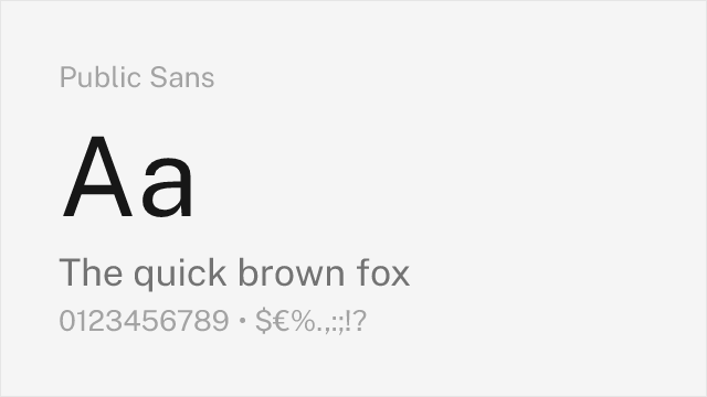
Public Sans
| Maison Neue | Public Sans | Match |
|---|---|---|
| Light (300) | Light (300) | close |
| Regular (400) | Regular (400) | close |
| Medium (500) | Medium (500) | close |
| Bold (700) | Bold (700) | close |
Performance Guide
Production performance metrics for each alternative.
How to Use Inter
Copy these code snippets to quickly add Inter to your project.
CSS code for Inter
@import url('https://fonts.googleapis.com/css2?family=Inter:wght@100..900&display=swap');HTML code for Inter
<link rel="preconnect" href="https://fonts.googleapis.com">
<link rel="preconnect" href="https://fonts.gstatic.com" crossorigin>
<link href="https://fonts.googleapis.com/css2?family=Inter:wght@100..900&display=swap" rel="stylesheet">
Tailwind code for Inter
// tailwind.config.js
module.exports = {
  theme: {
    extend: {
      fontFamily: {
        'inter': ['Inter', 'sans-serif'],
      },
    },
  },
}

// Usage in HTML:
// <p class="font-inter">Your text here</p>
Next.js code for Inter
// Using next/font (Next.js 13+)
import { Inter } from 'next/font/google';

const inter = Inter({
  subsets: ['latin'],
  weight: ['100', '200', '300', '400', '500', '600', '700', '800', '900'],
});

export default function Component() {
  return (
    <p className={inter.className}>
      Your text here
    </p>
  );
}

// Or using inline styles with Google Fonts link:
// <p style={{ fontFamily: "'Inter'" }}>Your text</p>
Expo and React Native code for Inter
// Install: npx expo install @expo-google-fonts/inter expo-font
import { useFonts, Inter_400Regular } from '@expo-google-fonts/inter';

export default function App() {
  const [fontsLoaded] = useFonts({
    Inter_400Regular,
  });

  if (!fontsLoaded) return null;

  return (
    <Text style={{ fontFamily: 'Inter_400Regular' }}>
      Your text here
    </Text>
  );
}
Recommended Font Pairings
These free fonts pair well with Inter Maison Neue for headlines, body text, or accent use.
Cormorant Garamond's elegant high-contrast serifs create striking editorial contrast against Maison Neue's restrained grotesque body text, producing the kind of refined typographic pairing seen in luxury fashion publishing and lifestyle magazines
Literata's warm, contemporary serifs provide comfortable long-form reading that complements Maison Neue's clean sans-serif headlines, creating an editorial pairing suited to travel, lifestyle, and culture publications
Source Serif Pro's structured, rational serifs pair naturally with Maison Neue's Swiss precision for layouts requiring typographic seriousness without visual tension, particularly in corporate and institutional editorial contexts
Browse Alternatives by Context
Find Maison Neue alternatives filtered by specific use case, style, or language support.
By Script
Frequently Asked Questions
What is the best free alternative to Maison Neue?
Inter is the best free alternative to Maison Neue with a FontAlternatives similarity score of 85%. It shares similar proportions and characteristics while being available under the OFL-1.1 license for both personal and commercial use at no cost.
Is there a free version of Maison Neue?
There is no official free version of Maison Neue. However, Inter is available under the OFL-1.1 open-source license and achieves a FontAlternatives similarity score of 85%. It includes variable weights and supports latin, latin-extended.
What Google Font looks like Maison Neue?
The Google Fonts most similar to Maison Neue are Inter, Work Sans, DM Sans. Among these alternatives, Inter offers the closest match with a FontAlternatives similarity score of 85% and includes variable weights for flexible typography options.
Can I use Inter commercially?
Yes, Inter can be used commercially. It is licensed under OFL-1.1, which allows free use in websites, applications, print materials, and commercial projects without purchasing a license or paying royalties.
Is Inter similar enough to Maison Neue?
Inter achieves a FontAlternatives similarity score of 85% compared to Maison Neue. While not identical, it offers comparable letterforms, proportions, and visual style. Most designers find it works excellently as a substitute in web and print projects.
What are the main differences between Maison Neue and its free alternatives?
Free alternatives to Maison Neue may differ in subtle details like letter spacing, curve refinements, and available weights. Premium fonts typically include more OpenType features, extended language support, and optimized screen rendering. However, for most projects, these differences are negligible.
Where can I download free alternatives to Maison Neue?
Download Inter directly from Google Fonts. Click the "Get Font" button on any alternative listed above to visit the official download page. Google Fonts also provides convenient embed codes for seamless web integration.