Free Alternatives to Basis Grotesque

About Basis Grotesque
- Foundry
- Colophon Foundry
- Classification
- sans-serif
- Style
- neo-grotesque
Brands Using Basis Grotesque
Primary editorial typeface across print magazine and digital presence
E-commerce interface and editorial content typography
Brand identity and environmental signage
Editorial platform typography for articles and features
Basis Grotesque is a neo-grotesque sans-serif typeface designed by Anthony Sheret and Edd Harrington at Colophon Foundry, first released around 2013 and expanded over subsequent years. It occupies a distinctive position in contemporary type design: a grotesque that thinks. Where most neo-grotesques optimize for either pure functionality or overt personality, Basis Grotesque finds a middle path, combining the rational skeleton of Swiss grotesque typography with subtle humanist inflections that give it warmth and editorial intelligence. It has become a quiet favorite among designers working in fashion, publishing, and cultural contexts who need typography that signals sophistication without shouting.
Basis Grotesque requires a paid license from Colophon Foundry. Desktop, web, and app licenses are priced separately, with costs varying by project scope and number of users. There is no free tier or trial version. If your project cannot accommodate Colophon's licensing structure, the alternatives below cover the strongest open-source options and how to evaluate them for your specific needs.
Why Basis Grotesque Matters
Basis Grotesque emerged at a moment when the design world was saturated with two extremes: clinical Swiss neo-grotesques that prioritized pure neutrality, and quirky contemporary sans-serifs that foregrounded personality at the expense of versatility. Colophon Foundry's contribution was to ask whether a grotesque could be both rational and warm, both functional and culturally literate.
The answer resonated immediately with a specific audience. When Kinfolk magazine adopted Basis Grotesque as part of its typographic identity, it confirmed what many editorial designers had already sensed: this was a typeface that understood the difference between minimal and empty. Kinfolk's aesthetic — measured, contemplative, visually sophisticated — required typography that could be quiet without being invisible. Basis Grotesque provided that restraint while carrying enough character to hold its own alongside the magazine's carefully art-directed photography and generous white space.
The fashion and lifestyle industries followed. Ssense, the Montreal-based luxury fashion platform, employs Basis Grotesque across its editorial content and e-commerce interface, where the typeface navigates between product descriptions, long-form cultural criticism, and navigation elements with equal fluency. Ace Hotel uses it to anchor a brand identity that straddles hospitality, cultural programming, and lifestyle publishing. Design publications like It's Nice That rely on it to set the editorial tone for articles about contemporary creative practice.
What these adoptions share is a common thread: Basis Grotesque attracts brands and publications that define themselves through curatorial intelligence. It is not the typeface for companies seeking maximum visibility or aggressive brand differentiation. It is the typeface for organizations that believe their audience will notice and appreciate considered typographic choices — and that the absence of typographic noise is itself a form of communication.
This positioning explains why Basis Grotesque has never achieved the mainstream ubiquity of Helvetica or the startup-era saturation of Circular. Its audience is smaller but more specific: art directors, editorial designers, brand strategists, and creative directors who treat typeface selection as an act of cultural positioning rather than a functional checkbox.
The typeface also benefits from Colophon Foundry's reputation within the design community. Founded by Sheret and Harrington in London, Colophon has built a catalog of typefaces that prioritize conceptual depth alongside commercial viability. Apercu, their best-known release, demonstrated that an independent foundry could produce a typeface with genuine cultural impact. Basis Grotesque extended that credibility into a quieter, more versatile direction — the typeface you reach for when Apercu's personality is too strong for the project, but a generic neo-grotesque would feel lazy.
The Basis family's expansion into Arabic script and monospace variants further distinguishes it from competitors. Where many boutique foundries release a single-width sans-serif and move on, Colophon invested in building Basis into a system. Basis Grotesque Arabic, designed in collaboration with Arabic type specialists, extends the editorial identity into a script that few premium Latin grotesques properly support. Basis Grotesque Mono provides the monospace companion that editorial and cultural projects increasingly need for code snippets, captions, and typographic contrast. This system-level thinking signals that Basis Grotesque was designed for sustained, professional use rather than trend-driven adoption.
Design Characteristics
Basis Grotesque's design reveals its intelligence through details that reward close inspection:
- Humanist grotesque hybrid: The overall skeleton follows grotesque principles — even stroke weights, vertical stress, restrained proportions — but individual letterforms carry subtle humanist touches. The lowercase
ahas a gentle curve at its bowl junction rather than the hard intersection typical of pure grotesques. Thegfeatures a slightly open lower counter. These details are invisible at body sizes but create a cumulative warmth in the overall typographic texture - Moderate x-height with balanced ascenders: Unlike the exaggerated x-heights common in screen-optimized grotesques, Basis Grotesque maintains classical proportions that create elegant vertical rhythm in editorial layouts. Ascenders and descenders have room to breathe, giving paragraphs a more open, literary quality
- Controlled apertures: The
c,e, andsfeature apertures that are open enough for legibility but not so wide as to lose the tight, rational character of grotesque design. This balance is critical to the typeface's editorial personality - Flat, horizontal terminals: Stroke endings are clean and horizontal, contributing to the typeface's calm, controlled presence on the page. There are no ball terminals or angled cuts that might introduce visual noise
- Consistent stroke weight with subtle modulation: The monoline quality of grotesque typography is maintained, but with imperceptible stroke weight variation that adds organic warmth at text sizes without disrupting the rational appearance at display sizes
- True italics with editorial character: The italic styles are not simple obliques. They introduce cursive characteristics in select letterforms, providing genuine typographic differentiation for emphasis in editorial contexts
The family ships in five weights — Light, Regular, Medium, Bold, and Black — with matching italics for each. While this is a narrower range than many contemporary grotesques, the five weights are carefully distributed to cover the core hierarchy needs of editorial and brand typography. The absence of Thin and ExtraLight weights is a deliberate choice that reflects Basis Grotesque's editorial rather than decorative ambitions.
Colophon has expanded the Basis family to include Basis Grotesque Mono (a monospace companion) and Basis Grotesque Arabic (extending the design system to Arabic script), though these are licensed separately.
Taken together, these characteristics position Basis Grotesque in a specific design register. It is not trying to be everything to everyone. The five-weight range, the humanist inflections, the editorial proportions — all point toward a typeface designed for environments where typographic decisions are made by people who understand and care about typography. This self-awareness is part of what makes Basis Grotesque effective: it performs best when deployed by designers who appreciate what it is doing.
Where Basis Grotesque Excels
Basis Grotesque performs at its highest level in contexts that demand typographic intelligence:
- Fashion editorial and lookbooks: The typeface's restrained elegance complements high-end photography without competing for attention. Its Light and Regular weights set body copy with the quiet authority that fashion publishing requires
- Cultural institution branding: Museums, galleries, and arts organizations find in Basis Grotesque a typeface that communicates contemporary relevance without sacrificing seriousness. It reads as curated rather than trendy
- Design studio identities: Creative agencies and design studios use Basis Grotesque to signal professional sophistication. It communicates that design decisions are intentional and informed
- Independent publishing: Literary magazines, art journals, and critical publications benefit from the typeface's ability to handle extended text with warmth while maintaining a contemporary editorial voice
- Lifestyle and hospitality brands: Hotels, restaurants, and lifestyle brands in the premium-but-not-ostentatious segment find Basis Grotesque's tone precisely calibrated to their positioning
- Corporate communications for creative companies: Architecture firms, design consultancies, and cultural agencies use Basis Grotesque for proposals, reports, and presentations where the typography needs to project competence and taste simultaneously
- Web typography at editorial sizes: Between 15px and 20px on screen, Basis Grotesque hits its sweet spot — large enough for the humanist details to register, small enough that the grotesque structure maintains reading efficiency. This range covers magazine-style web layouts, long-form articles, and portfolio sites
Where Basis Grotesque Struggles
Basis Grotesque's strengths create corresponding limitations:
- Data-heavy product interfaces: With only five weights and no tabular figures optimized for dashboards, Basis Grotesque lacks the hierarchy depth and technical features needed for complex SaaS applications. Inter or a system font will serve better here
- Mass-market consumer brands: The typeface's intellectual restraint can read as inaccessible or cold in contexts targeting broad consumer audiences. Brands seeking warmth and approachability should look elsewhere
- Small sizes on low-resolution screens: Without the aggressive screen optimization of fonts like Inter or the hinting infrastructure of system fonts, Basis Grotesque's subtle details can muddy at sizes below 13px on standard-resolution displays
- Projects requiring broad script support: Basis Grotesque covers Latin and Latin Extended only. Projects requiring Cyrillic, Greek, or other scripts need a fallback strategy or a different primary typeface entirely
- Display-forward branding: At very large sizes, Basis Grotesque's restrained personality may lack the impact needed for bold display typography. It was designed to be good company, not the loudest voice in the room
- Budget-constrained projects: The per-weight, per-platform licensing model means a full implementation across desktop, web, and app can represent a significant investment compared to free alternatives
How to Choose a Free Substitute
When evaluating Basis Grotesque replacements, the key challenge is matching its specific tonal position — rational but warm, functional but editorial, minimal but not empty. Here is what to prioritize:
- Typographic color and texture: Set a full paragraph at 16px in your candidate font and compare it against Basis Grotesque specimens. The overall grey value and rhythm of the paragraph matter more than individual letterform similarity. Basis Grotesque produces an even, calm texture; your substitute should do the same
- Weight distribution for editorial hierarchy: Basis Grotesque's five-weight system (Light through Black) is designed for editorial use. Your alternative needs at minimum Light, Regular, Medium, and Bold to replicate common editorial patterns — captions in Light, body in Regular, subheads in Medium, headlines in Bold
- Humanist warmth without personality: The critical distinction is between typefaces that are merely neutral (like Helvetica or Arial) and those that are warm but restrained (like Basis Grotesque). Test your alternative in a magazine-style layout alongside photography. Does it feel considered, or does it feel default?
- Italic quality: Basis Grotesque's true italics are important for editorial use. Avoid alternatives that use obliques (mechanically slanted Romans) rather than properly drawn italic forms. Check the lowercase
a,e, andfin italic — they should show cursive influence - Performance at editorial sizes: Basis Grotesque is most commonly used between 10pt and 18pt in print, and 14px to 20px on screen. Test your alternative at these sizes specifically. Many free fonts are optimized for UI sizes (12-14px) and lose character at the slightly larger editorial sizes where Basis Grotesque shines
Work Sans is the strongest overall substitute, capturing the editorial warmth and functional clarity that define Basis Grotesque's character. Inter is the better choice when screen optimization and digital product contexts take priority over editorial feel. For projects where language coverage matters more than tonal precision, Source Sans 3 provides the most comprehensive script support.
One consideration unique to Basis Grotesque substitution: the typeface is often chosen as part of a broader visual language that includes specific approaches to spacing, alignment, and image-text relationships. Simply swapping the font file will not replicate the full editorial effect. Pay attention to line-height (Basis Grotesque typically works well at 1.45-1.55 for body text), letter-spacing (neutral to slightly loose), and paragraph width (55-75 characters). These typographic settings are as important as the letterform selection when trying to preserve the design intent of a Basis Grotesque layout.
Premium Font Neighbors
If Basis Grotesque's approach resonates but you want to explore adjacent premium options:
Cluster A: London/European editorial grotesques
- Apercu (Colophon Foundry) — Colophon's more expressive grotesque; shares the editorial positioning but adds quirky personality through distinctive letterforms like the double-storey
gand slightly condensed proportions - Favorit (Dinamo) — A Swiss neo-grotesque with similar cultural-institution appeal; slightly more angular and geometric than Basis Grotesque, with a cooler overall temperature
- Atlas Grotesk (Commercial Type) — Occupies similar territory with more explicit references to historical grotesque models; slightly wider and more robust than Basis Grotesque
- Duplicata (Commercial Type) — Another thoughtful neo-grotesque with editorial credentials; shares Basis Grotesque's interest in balancing rationalism with subtle warmth
Cluster B: Contemporary refined grotesques
- Ginto (Dinamo) — A broader, more geometric grotesque that shares Basis Grotesque's appeal in fashion and cultural contexts but with more visual weight and presence
- Maison Neue (Milieu Grotesque) — A refined Swiss grotesque with similar restraint and editorial versatility; slightly wider proportions and a more Continental European character
- Founders Grotesk (Klim Type Foundry) — Kris Sowersby's condensed grotesque with editorial DNA; tighter and more compressed than Basis Grotesque but serving similar cultural markets
- Neue Montreal (Pangram Pangram) — A more accessible, approachable grotesque that shares Basis Grotesque's popularity with creative studios while being more overtly friendly in character
FAQ
Is Basis Grotesque free?
No. Basis Grotesque is a premium typeface from Colophon Foundry requiring separate licenses for desktop, web, and app usage. Pricing is based on the number of users for desktop licenses and traffic tiers for web licenses. There is no free version or trial available. The best free alternative is Work Sans at 85% similarity.
What is the best free alternative to Basis Grotesque?
Work Sans is the closest free alternative at 85% similarity. Both share a humanist-inflected grotesque structure, editorial sensibility, and restrained personality. Work Sans adds variable font support (100-900 weight axis), broader weight coverage, and Vietnamese language support. It is available on Google Fonts under the OFL-1.1 license.
Why do editorial and fashion brands choose Basis Grotesque?
Basis Grotesque appeals to editorial and fashion brands because it communicates curatorial intelligence without being decorative or loud. Its combination of grotesque rationality and humanist warmth creates typography that feels considered and intentional. For brands like Kinfolk, Ssense, and Ace Hotel, this tonal precision positions them as culturally literate and design-conscious — qualities their audiences recognize and value.
What is the difference between Basis Grotesque and Apercu?
Both are Colophon Foundry typefaces, but they occupy different positions. Apercu is more expressive and quirky, with distinctive letterforms and a personality that draws attention to itself. Basis Grotesque is quieter and more restrained, designed to support content rather than compete with it. Apercu is the choice when you want the typeface to be noticed; Basis Grotesque is the choice when you want the content to be noticed while the typography signals quality in the background.
Does Basis Grotesque work for body text?
Yes, body text is one of its primary strengths. The moderate x-height, controlled apertures, and humanist warmth create comfortable reading at editorial sizes (14-18px on screen, 9-12pt in print). The Regular weight sets clean, even paragraphs that maintain engagement in long-form articles and publications. However, for very long reading sessions in dense text, a serif typeface may still provide better reading comfort.
Can I use Basis Grotesque on the web?
Yes, with a web font license from Colophon Foundry. Web licenses are priced by traffic tiers and include WOFF and WOFF2 files for self-hosting. Basis Grotesque is not available through Google Fonts, Adobe Fonts, or any font CDN. Because the family is not a variable font, you will need to load individual weight files, which impacts page performance — typically 5 font files (Regular, Italic, Medium, Bold, and one additional weight) for a standard editorial implementation.
Is Basis Grotesque a variable font?
No. Basis Grotesque ships as static font files in five weights (Light, Regular, Medium, Bold, Black) with matching italics. This means loading separate files for each weight used, which increases page weight compared to variable font alternatives. Most of Basis Grotesque's free alternatives — including Work Sans, Inter, and DM Sans — offer variable font versions, which is a practical advantage for web performance and responsive design.
What weights does Basis Grotesque come in?
Basis Grotesque ships in five weights: Light, Regular, Medium, Bold, and Black. Each weight includes a matching italic. This five-weight range is narrower than many contemporary sans-serif families but is carefully calibrated for editorial and brand use. Light works for captions and secondary text, Regular for body copy, Medium for subheadings, Bold for headlines, and Black for display emphasis. For projects requiring finer weight gradations, free alternatives like Work Sans and Inter offer continuous variable weight axes from 100 to 900.
How does Basis Grotesque compare to Helvetica?
While both are neo-grotesques, they occupy different worlds. Helvetica is a maximally neutral typeface designed for universal application — it communicates nothing about itself. Basis Grotesque, by contrast, carries editorial intelligence and cultural specificity. Its humanist touches, balanced proportions, and restraint signal a design-conscious sensibility that Helvetica's ubiquity has long since erased. Choosing Basis Grotesque over Helvetica is a statement about intentionality; choosing Helvetica is often a statement about nothing at all. In practical terms, Basis Grotesque has warmer stroke junctions, more open counters, and a more contemporary rhythm in paragraph setting.
Who designed Basis Grotesque?
Basis Grotesque was designed by Anthony Sheret and Edd Harrington, the founders of Colophon Foundry, a London-based independent type foundry. Sheret and Harrington are known for typefaces that combine conceptual depth with practical application, including Apercu, Reader, and Burgess. Colophon's work is characterized by research-driven design where each typeface explores a specific idea or historical reference point, and Basis Grotesque reflects their interest in reinterpreting the grotesque tradition through a contemporary editorial lens.
Is Basis Grotesque on Google Fonts?
No, Basis Grotesque is a premium font from Colophon Foundry and is not available on Google Fonts.
The closest Google Fonts alternative is Work Sans with 85% similarity. Get it free on Google Fonts ↗
Free Alternatives (7)


Best overall match for editorial character with clean, functional proportions


Comparable grotesque structure with superior screen optimization


Similar American grotesque heritage reinterpreted for modern use


Clean, modern proportions with similar readability and minimal personality


Neutral grotesque with compatible editorial tone and accessibility focus


Broader language support with similar humanist grotesque balance
Contemporary neo-grotesque with editorial sensibility and Scandinavian refinement
See where Basis Grotesque is used in the wild and swap to free alternatives live.
Install FontSwap →Replacement Summary
Source: FontAlternatives.com
Premium font: Basis Grotesque
Best free alternative: Work Sans
FontAlternatives similarity score: 85%
Replacement difficulty: Low
Best for: editorial and magazine layouts, fashion brand websites, cultural institution sites, content-heavy digital platforms
Notable users: Kinfolk, Ssense, Ace Hotel
Not recommended when: Brand consistency with Kinfolk requires exact letterforms
What is the best free alternative to Basis Grotesque?
Work Sans is the best free alternative to Basis Grotesque with a FontAlternatives similarity score of 85%.
Work Sans shares similar proportions, stroke characteristics, and intended use with Basis Grotesque. It is available under the OFL-1.1 license, which permits both personal and commercial use at no cost.
This alternative works particularly well for: editorial and magazine layouts, fashion brand websites, cultural institution sites, content-heavy digital platforms.
Can I safely replace Basis Grotesque with Work Sans?
Yes, Work Sans is a high-confidence replacement for Basis Grotesque. The FontAlternatives similarity score of 85% indicates strong structural compatibility.
Licensing: Work Sans is licensed under OFL-1.1, which allows commercial use without licensing fees or royalties.
Weight coverage: Most weights have close or exact matches available.
When should I NOT replace Basis Grotesque?
While Work Sans is a strong alternative, there are situations where replacing Basis Grotesque may not be appropriate:
- Brand consistency: Basis Grotesque is commonly seen in Kinfolk magazine contexts where exact letterforms may be required.
- Strict compliance: Verify that OFL-1.1 terms meet your specific legal and compliance requirements.
Weight-Matching Guide
Map Basis Grotesque weights to their closest free alternatives for accurate font substitution.
Work Sans
| Basis Grotesque | Work Sans | Match |
|---|---|---|
| Light (300) | Light (300) | exact |
| Regular (400) | Regular (400) | exact |
| Medium (500) | Medium (500) | exact |
| Bold (700) | Bold (700) | close |
| Black (900) | Black (900) | close |
Inter
| Basis Grotesque | Inter | Match |
|---|---|---|
| Light (300) | Light (300) | exact |
| Regular (400) | Regular (400) | exact |
| Medium (500) | Medium (500) | exact |
| Bold (700) | Bold (700) | close |
Libre Franklin
| Basis Grotesque | Libre Franklin | Match |
|---|---|---|
| Light (300) | Light (300) | close |
| Regular (400) | Regular (400) | close |
| Medium (500) | Medium (500) | close |
| Bold (700) | Bold (700) | close |
DM Sans
| Basis Grotesque | DM Sans | Match |
|---|---|---|
| Light (300) | Light (300) | close |
| Regular (400) | Regular (400) | close |
| Medium (500) | Medium (500) | close |
| Bold (700) | Bold (700) | close |
Public Sans
| Basis Grotesque | Public Sans | Match |
|---|---|---|
| Light (300) | Light (300) | close |
| Regular (400) | Regular (400) | close |
| Medium (500) | Medium (500) | close |
| Bold (700) | Bold (700) | close |
Source Sans 3
| Basis Grotesque | Source Sans 3 | Match |
|---|---|---|
| Light (300) | Light (300) | close |
| Regular (400) | Regular (400) | close |
| Medium (500) | Medium (500) | substitute |
| Bold (700) | Bold (700) | close |
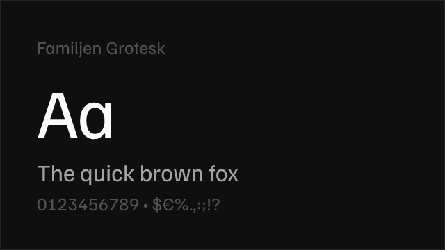
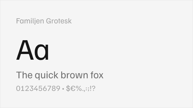
Familjen Grotesk
| Basis Grotesque | Familjen Grotesk | Match |
|---|---|---|
| Regular (400) | Regular (400) | close |
| Medium (500) | Medium (500) | close |
| Bold (700) | Bold (700) | close |
Performance Guide
Production performance metrics for each alternative.
How to Use Work Sans
Copy these code snippets to quickly add Work Sans to your project.
CSS code for Work Sans
@import url('https://fonts.googleapis.com/css2?family=Work+Sans:wght@100..900&display=swap');HTML code for Work Sans
<link rel="preconnect" href="https://fonts.googleapis.com">
<link rel="preconnect" href="https://fonts.gstatic.com" crossorigin>
<link href="https://fonts.googleapis.com/css2?family=Work+Sans:wght@100..900&display=swap" rel="stylesheet">
Tailwind code for Work Sans
// tailwind.config.js
module.exports = {
  theme: {
    extend: {
      fontFamily: {
        'work-sans': ['"Work Sans"', 'sans-serif'],
      },
    },
  },
}

// Usage in HTML:
// <p class="font-work-sans">Your text here</p>
Next.js code for Work Sans
// Using next/font (Next.js 13+)
import { Work_Sans } from 'next/font/google';

const work_sans = Work_Sans({
  subsets: ['latin'],
  weight: ['100', '200', '300', '400', '500', '600', '700', '800', '900'],
});

export default function Component() {
  return (
    <p className={work_sans.className}>
      Your text here
    </p>
  );
}

// Or using inline styles with Google Fonts link:
// <p style={{ fontFamily: '"Work Sans"' }}>Your text</p>
Expo and React Native code for Work Sans
// Install: npx expo install @expo-google-fonts/work-sans expo-font
import { useFonts, Work_Sans_400Regular } from '@expo-google-fonts/work-sans';

export default function App() {
  const [fontsLoaded] = useFonts({
    Work_Sans_400Regular,
  });

  if (!fontsLoaded) return null;

  return (
    <Text style={{ fontFamily: 'Work_Sans_400Regular' }}>
      Your text here
    </Text>
  );
}
Recommended Font Pairings
These free fonts pair well with Work Sans Basis Grotesque for headlines, body text, or accent use.
Literata's warm, contemporary serifs provide comfortable long-form reading that contrasts with Basis Grotesque's clean grotesque headlines, creating the kind of editorial pairing found in design-conscious magazines and cultural publications
Source Serif Pro's structured, rational serifs create a disciplined editorial pairing with Basis Grotesque's restrained sans-serif character, suitable for publications that prioritize intellectual clarity over visual drama
Cormorant Garamond's elegant high-contrast serifs provide striking display headlines that pair beautifully with Basis Grotesque's quiet body text, echoing the fashion editorial aesthetic where Basis Grotesque thrives
Browse Alternatives by Context
Find Basis Grotesque alternatives filtered by specific use case, style, or language support.
By Use Case
By Script
Frequently Asked Questions
What is the best free alternative to Basis Grotesque?
Work Sans is the best free alternative to Basis Grotesque with a FontAlternatives similarity score of 85%. It shares similar proportions and characteristics while being available under the OFL-1.1 license for both personal and commercial use at no cost.
Is there a free version of Basis Grotesque?
There is no official free version of Basis Grotesque. However, Work Sans is available under the OFL-1.1 open-source license and achieves a FontAlternatives similarity score of 85%. It includes variable weights and supports latin, latin-extended.
What Google Font looks like Basis Grotesque?
The Google Fonts most similar to Basis Grotesque are Work Sans, Inter, Libre Franklin. Among these alternatives, Work Sans offers the closest match with a FontAlternatives similarity score of 85% and includes variable weights for flexible typography options.
Can I use Work Sans commercially?
Yes, Work Sans can be used commercially. It is licensed under OFL-1.1, which allows free use in websites, applications, print materials, and commercial projects without purchasing a license or paying royalties.
Is Work Sans similar enough to Basis Grotesque?
Work Sans achieves a FontAlternatives similarity score of 85% compared to Basis Grotesque. While not identical, it offers comparable letterforms, proportions, and visual style. Most designers find it works excellently as a substitute in web and print projects.
What are the main differences between Basis Grotesque and its free alternatives?
Free alternatives to Basis Grotesque may differ in subtle details like letter spacing, curve refinements, and available weights. Premium fonts typically include more OpenType features, extended language support, and optimized screen rendering. However, for most projects, these differences are negligible.
Where can I download free alternatives to Basis Grotesque?
Download Work Sans directly from Google Fonts. Click the "Get Font" button on any alternative listed above to visit the official download page. Google Fonts also provides convenient embed codes for seamless web integration.