Free Alternatives to Favorit

About Favorit
- Foundry
- Dinamo
- Classification
- sans-serif
- Style
- neo-grotesque
Brands Using Favorit
Primary editorial and brand typeface across print and digital
Exhibition materials and institutional communications
Brand identity and exhibition typography
Editorial typeface for architecture and design publication
Supporting typeface in seasonal campaign materials
Favorit is a neo-grotesque sans-serif typeface designed by Johannes Breyer and Fabian Harb, released by their foundry Dinamo (ABC Dinamo) around 2017. It belongs to a rare category of typefaces: grotesques that look standard at first glance but reveal themselves as deeply unconventional upon closer inspection. Favorit takes the familiar skeleton of a Swiss neo-grotesque and introduces idiosyncratic details — unexpected terminal shapes, subtly irregular proportions, and a rhythm that feels more hand-drawn than digitally engineered. The result is a typeface that reads as "normal" in body text but carries a quiet strangeness in its details, a quality that has made it the default choice for art galleries, cultural magazines, and the particular corner of the creative industry that treats typeface selection as an act of self-identification.
Favorit requires a paid license from Dinamo (ABC Dinamo). The foundry offers desktop, web, and app licenses, with pricing that reflects its position as a boutique, design-led foundry rather than a mass-market distributor. There is no free tier, trial weight, or inclusion in any font service like Google Fonts or Adobe Fonts. If your project cannot accommodate Dinamo's licensing structure, this page covers the best open-source alternatives and the honest reality of what gets lost in translation.
Why Favorit Matters
Favorit's cultural significance extends far beyond its letterforms. It has become shorthand for a specific kind of creative positioning — the typeface equivalent of wearing a slightly oversized, perfectly cut blazer over a band t-shirt. When Highsnobiety adopted Favorit as a core element of its typographic identity, the choice was not about readability or web performance. It was about signaling to an audience of culturally literate twenty- and thirty-somethings that the publication takes both streetwear and design seriously, and that its editorial voice exists at the intersection of high culture and subcultural credibility.
This is the territory Favorit occupies. It is the typeface of contemporary art galleries that want to feel accessible rather than forbidding. It is the typeface of architecture magazines that care about typography as much as they care about buildings. It is the typeface of independent publishing houses whose catalogs are curated rather than simply assembled. Favorit tells the viewer: the person who chose this typeface knows about type, cares about getting it right, and has decided that a perfectly conventional grotesque would be the wrong kind of perfect.
What makes this positioning work is that Favorit actually functions superbly as a text typeface. It is not a display novelty or a one-trick headline face. The quirky details that give it personality at large sizes settle into a warm, slightly irregular rhythm at text sizes that makes long-form reading genuinely pleasant. This combination — distinctive at display sizes, characterful at text sizes — is why Favorit has held its position in the cultural-creative market despite a constant churn of new typeface releases. Most competitors sacrifice functionality for personality or personality for functionality. Favorit does not make that trade.
The foundry behind it matters to the story. Dinamo, founded in Basel and Berlin, has cultivated a reputation for typefaces that challenge conventions while remaining commercially viable. Their catalog — which includes ABC Diatype, Whyte, and Monument Extended — shares a philosophical commitment to what might be called "productive strangeness": designs that work within established typographic frameworks but introduce enough deviation to feel genuinely new. Favorit is the purest expression of this philosophy. It does not look experimental. It does not look radical. It looks like a grotesque. But it does not feel like any grotesque you have used before, and that perceptual gap is where its value lives.
The timing of Favorit's release also contributed to its adoption. By 2017, the design world was deep into a period of grotesque saturation. Every tech company had adopted a neo-grotesque, every design studio portfolio was set in one, and the category had begun to feel exhausted. Favorit arrived with a proposition that resonated precisely because of this fatigue: what if a grotesque could feel fresh again, not by adding decorative elements or historical references, but by introducing small irregularities that disrupted the expected rhythm of reading? The answer was a typeface that spread through the creative industry not through marketing campaigns but through the quiet endorsement of designers recognizing it in work they admired and deciding it matched their own sensibility.
Favorit's reach extends across widths and variants. The family is available in Standard, Extended, and Lining widths, each offered in multiple weights with matching italics. Favorit Lining, with its distinctive tabular numerals and monolinear construction, extends the system's utility into contexts requiring technical precision. Favorit Extended broadens the proportions for display use, creating a more commanding presence at large sizes while preserving the quirky DNA of the standard width. This family architecture reflects Dinamo's understanding that cultural institutions and creative publishers need typographic systems, not isolated font files.
Design Characteristics
Favorit's design intelligence is concentrated in details that most viewers will never consciously register but that collectively create its distinctive character:
- Unconventional terminal treatments: This is Favorit's signature. Stroke endings throughout the typeface feature shapes that deviate subtly from neo-grotesque convention. Where a standard grotesque would use a clean horizontal or vertical terminal, Favorit introduces slight angles, unexpected curves, or marginally different proportions that create a gentle sense of irregularity. The effect is visible in the
c,e,s, andaat display sizes and contributes to the typeface's warm, handmade quality - Unexpected proportional relationships: Individual letterforms have proportions that do not quite match what grotesque experience predicts. Certain characters are slightly wider or narrower than expected, creating a reading rhythm that feels natural but unfamiliar — like hearing a familiar song performed in a slightly different time signature. This quality is most apparent in the capitals, where the
M,W, andRcarry proportions that distinguish them from standard grotesque models - Flat-sided curves with subtle irregularity: The bowls and counters in letters like
b,d,p,qfollow the flat-sided convention common to contemporary grotesques, but with micro-variations in the curvature that prevent the perfect-circle monotony of pure geometric construction. These variations are invisible at text sizes but create a sense of organic life at display sizes - Moderate x-height with considered vertical rhythm: Favorit's x-height is generous but not extreme, placing it in the editorial sweet spot between the aggressive x-heights of screen-first fonts and the classical proportions of bookish typefaces. Ascenders and descenders have room to contribute to the typeface's vertical rhythm, which is important for its editorial applications
- Even stroke weight with minimal contrast: The monoline character typical of grotesque design is maintained, creating consistent typographic color in paragraphs. The lack of stroke contrast keeps the typeface neutral enough for body text while the terminal and proportional quirks prevent it from reading as bland
- Carefully drawn italics: Unlike the mechanically slanted obliques found in some neo-grotesques, Favorit's italics introduce genuine cursive influence in select letterforms, providing real typographic differentiation for emphasis in editorial contexts without disrupting the typeface's overall personality
The family spans multiple weights across three width variants. Favorit Standard is the workhorse for body text and general branding. Favorit Extended provides wider proportions for display and headline use. Favorit Lining offers an alternative character set with tabular numerals and a more systematic construction for interfaces and technical applications. Each variant maintains the core personality while adapting it to specific functional requirements.
Where Favorit Excels
Favorit performs at its highest level in contexts where cultural credibility and design intelligence matter as much as legibility:
- Contemporary art institutions: Museums, galleries, and kunsthalles find in Favorit a typeface that communicates contemporary relevance without the sterility of pure Swiss grotesques or the decorative noise of display faces. It reads as curated and intentional — exactly the message these institutions want their typography to carry
- Independent cultural magazines: Publications covering art, architecture, design, and culture use Favorit to signal editorial intelligence. Its ability to carry personality at both headline and body sizes makes it practical for the full range of magazine typography, from cover lines to captions
- Streetwear and culture-adjacent brands: Highsnobiety's adoption of Favorit established it as the typographic bridge between high culture and street culture. Brands operating in this space — where credibility depends on appearing both knowledgeable and casual — find Favorit's studied imperfection precisely calibrated to their positioning
- Design studio portfolios: Creative agencies and independent designers use Favorit to signal that they treat typography as a design decision rather than a default. It communicates taste and awareness without the preciousness of more explicitly "design-y" typefaces
- Art book publishing: Publishers producing exhibition catalogs, artist monographs, and critical texts use Favorit for its ability to handle extended reading while maintaining a contemporary visual identity that aligns with the art it accompanies
- Brand identity for cultural projects: Film festivals, artist residencies, lecture series, and cultural programs benefit from Favorit's ability to feel both professional and creative simultaneously
Where Favorit Struggles
Favorit's strengths define its limitations with equal clarity:
- Corporate and enterprise contexts: Favorit's quirky details read as unprofessional or distracting in environments where typography is expected to be invisible. Financial institutions, law firms, and large corporations will find it too idiosyncratic for their communication standards
- Mass-market consumer products: The typeface's cultural specificity — its appeal to design-literate audiences — becomes a liability when the audience is broad and typographically unaware. The subtle strangeness that delights designers may read as "something looks off" to general consumers
- Data-heavy interfaces and dashboards: While Favorit Lining addresses some technical requirements, the standard family lacks the tabular figure optimization and systematic weight distribution needed for complex product interfaces. Teams building SaaS dashboards should look elsewhere
- Projects requiring broad language support: Favorit covers Latin and Latin Extended scripts only. Any project requiring Cyrillic, Greek, Arabic, or CJK scripts needs either a fallback font or a different primary typeface, and matching Favorit's personality in other scripts is exceptionally difficult
- High-volume body text at small sizes: At sizes below 13px on standard-resolution screens, Favorit's distinctive details begin to interfere with reading efficiency rather than enhance it. For dense UI text or extensive long-form reading, a more aggressively screen-optimized font like Inter will outperform it
- Budget-sensitive projects: Dinamo's per-variant, per-platform licensing model means that a full implementation across Standard, Extended, and Lining variants for desktop and web represents a significant investment, particularly for smaller studios and independent projects
How to Choose a Free Substitute
Here is the honest reality: no free font truly replicates Favorit's character. Its value lies in the specific combination of grotesque functionality and idiosyncratic detail that Dinamo's designers achieved through deliberate, knowing deviation from convention. Free alternatives can match parts of the equation — the grotesque structure, the editorial readability, the contemporary positioning — but the specific quality of "standard but not quite standard" is Favorit's defining feature and the hardest thing to approximate.
With that caveat established, here is how to evaluate substitutes:
- Personality at display sizes: Set your candidate font at 48px and 72px alongside Favorit specimens. Does it carry any character at all, or does it flatten into generic grotesque neutrality? Space Grotesk and to a lesser extent Familjen Grotesk retain some personality at large sizes; Inter and DM Sans do not
- Reading texture at text sizes: Set a full paragraph at 16px and compare the overall typographic color. Favorit produces a slightly warm, subtly irregular texture that feels alive. Most free grotesques produce a perfectly even texture that feels clinical. Work Sans comes closest to Favorit's editorial warmth at body sizes
- Cultural signaling: This is the most subjective criterion and arguably the most important. Favorit tells a culturally aware audience that the designer cares about type. Does your substitute communicate anything beyond "this project uses a font"? Space Grotesk communicates design awareness; Geist communicates tech sophistication; Libre Franklin communicates editorial credibility. Choose based on which signal your project needs
- Weight range and family architecture: Favorit's three-width system (Standard, Extended, Lining) provides exceptional versatility. No single free font replicates this. Consider whether your project needs width variants or whether a single-width alternative with a broader weight range will suffice
- Variable font availability: Every free alternative listed here offers variable font support, which Favorit does not. This is a genuine advantage for web performance and responsive design. If your project loads multiple weights, the file-size savings of a variable font may be a meaningful practical benefit
The best strategy for most projects is to accept the personality loss and optimize for the functional aspects of Favorit's role. If Favorit was serving as body text in an editorial layout, Work Sans or Inter will handle that function well. If it was providing display typography for a cultural brand, Space Grotesk captures some of the unconventional spirit. If it was doing both simultaneously — which is Favorit's particular superpower — no single free font will replicate the full experience, and you may need to use different alternatives for different roles in the hierarchy.
Premium Font Neighbors
If Favorit's approach resonates but you want to explore adjacent premium options:
Cluster A: Quirky contemporary grotesques (Favorit's closest relatives)
- ABC Diatype (Dinamo) — Favorit's sibling from the same foundry; wider-set with a more systematic construction but sharing the family tendency toward unexpected details in terminals and joints. Less quirky than Favorit, more versatile across corporate contexts
- Apercu (Colophon Foundry) — The London counterpart to Favorit's Basel sensibility; more overtly quirky with distinctive characters like the double-storey
gand slightly condensed proportions. Where Favorit hides its strangeness, Apercu puts it on display - Basis Grotesque (Colophon Foundry) — Shares Favorit's cultural-institution audience but with a quieter, more humanist approach. If Favorit is the art-world grotesque that knows it is interesting, Basis Grotesque is the one that does not need to prove it
- Agrandir (Pangram Pangram) — A bolder, more geometric interpretation of the quirky-grotesque concept; where Favorit achieves its character through subtle proportional irregularities, Agrandir achieves it through more overt geometric decisions and wider proportions
Cluster B: Refined contemporary grotesques (polished siblings)
- Ginto (Dinamo) — Another Dinamo grotesque with a broader, more commanding presence; shares Favorit's cultural positioning but with a more geometric, display-forward personality
- Atlas Grotesk (Commercial Type) — Occupies similar cultural territory with more explicit historical grotesque references; wider and more robust than Favorit, with less quirkiness and more conventional authority
- Sohne (Klim Type Foundry) — The rational neo-grotesque that tech companies choose when they want to signal design taste; shares Favorit's "designer's grotesque" positioning but through precision rather than personality
- Neue Montreal (Pangram Pangram) — Overlaps with Favorit's creative-studio audience through a more accessible, slightly raw aesthetic; less quirky but more immediately approachable
FAQ
Is Favorit free?
No. Favorit is a premium typeface from Dinamo (ABC Dinamo) requiring separate licenses for desktop, web, and app usage. The foundry does not offer free trials or free weights. Favorit is not available through Google Fonts, Adobe Fonts, or any other font subscription service. The best free alternative is Inter at 78% similarity, though the personality gap between Inter and Favorit is significant.
What is the best free alternative to Favorit?
Inter is the closest structural match at 78% similarity, sharing Favorit's grotesque construction and screen readability. However, if Favorit's quirky personality is what drew you to it, Space Grotesk at 76% similarity better captures the unconventional, design-conscious character that makes Favorit distinctive. The honest answer is that no free font replicates Favorit's specific combination of functional clarity and idiosyncratic detail — the choice of substitute depends on whether you are trying to match the structure or the spirit.
Why do art galleries and cultural institutions use Favorit?
Favorit communicates contemporary cultural awareness without the sterility of pure Swiss neutrality or the decorative excess of display typefaces. For institutions like the Kunsthalle Basel or Swiss Institute, which need to project both intellectual seriousness and contemporary relevance, Favorit's studied irregularity signals exactly the right balance. It tells a design-literate audience that the institution's visual identity was crafted with the same care as its curatorial program. The typeface has become a cultural marker in the art world — choosing it is itself a curatorial decision.
What is the difference between Favorit Standard, Extended, and Lining?
Favorit Standard is the primary width for body text, editorial typography, and general branding. Favorit Extended widens the proportions for display and headline use, creating a more commanding presence while preserving the quirky DNA of the standard width. Favorit Lining offers an alternative character set with tabular numerals and a more systematic, monolinear construction for interfaces, data presentation, and technical contexts. Each variant is licensed separately, and most projects use Standard as the primary face with Extended or Lining for specific roles.
Can I use Favorit on the web?
Yes, with a web font license from Dinamo. Web licenses are priced based on traffic tiers, and you receive WOFF2 files for self-hosting. Favorit is not available through any font CDN or hosting service. Because the family ships as static fonts (no variable font version), loading multiple weights and widths can impact page performance. A typical editorial implementation might require four to six font files (Regular, Italic, Medium, Bold in Standard width), each adding to the total page weight.
Is Favorit a variable font?
No. Favorit ships as static font files across its three width variants (Standard, Extended, Lining), each in multiple weights with matching italics. There is no variable font version. This means loading individual weight files rather than a single variable font file, which affects web performance budgets. Most of Favorit's free alternatives — including Inter, Space Grotesk, Work Sans, and DM Sans — offer variable font versions, which is a practical advantage for web projects.
How does Favorit compare to Helvetica?
Both are neo-grotesques, but they represent fundamentally different philosophies. Helvetica was designed to be maximally neutral — a typeface that communicates nothing about itself and lets content speak. Favorit was designed to be almost neutral but with deliberate, knowing deviations that give it personality and cultural specificity. Helvetica says "this is professional." Favorit says "this is professional, and someone who cares about design chose this." The practical differences are in terminal treatments (Favorit's are more varied and less predictable), proportional relationships (Favorit introduces subtle irregularities), and overall reading rhythm (Favorit feels slightly more organic and less mechanical). In contemporary design culture, choosing Favorit over Helvetica is a statement about cultural awareness and typographic literacy.
Who designed Favorit?
Johannes Breyer and Fabian Harb, the founders of Dinamo (ABC Dinamo), a type foundry with studios in Basel and Berlin. Breyer and Harb established Dinamo as a platform for typefaces that challenge conventions while remaining commercially functional — a philosophy they describe as designing tools for contemporary visual culture rather than historical revivals or neutral utility faces. Their catalog includes ABC Diatype, Whyte, Monument Extended, and Arizona, all of which share a commitment to productive strangeness. Favorit represents the most refined expression of this approach: a typeface where the experimentation is so subtle that it registers as warmth and character rather than as overt conceptual statement.
Is Favorit on Google Fonts?
No, Favorit is a premium font from Dinamo and is not available on Google Fonts.
The closest Google Fonts alternative is Inter with 78% similarity. Get it free on Google Fonts ↗
Free Alternatives (7)


Clean grotesque that matches Favorit's structural proportions while losing the quirky details


Shares quirky geometric details and a contemporary sensibility that echoes Favorit's unconventional spirit


Similar editorial character with more conventional proportions and American gothic influence


Clean modern sans that substitutes geometric precision for Favorit's handmade quality
Contemporary neo-grotesque with similar editorial sensibility and understated cultural positioning

Tech-focused grotesque with rational character that shares Favorit's contemporary positioning


American grotesque heritage provides editorial credibility with more conventional character
See where Favorit is used in the wild and swap to free alternatives live.
Install FontSwap →Replacement Summary
Source: FontAlternatives.com
Premium font: Favorit
Best free alternative: Inter
FontAlternatives similarity score: 78%
Replacement difficulty: Medium
Best for: product UI requiring Favorit's proportions, editorial web layouts at body sizes, design system foundations, projects where quirk is less important than coverage
Notable users: Highsnobiety, Kunsthalle Basel, Swiss Institute New York
Not recommended when: Precise optical matching is needed - Inter has measurable structural differences
What is the best free alternative to Favorit?
Inter is the best free alternative to Favorit with a FontAlternatives similarity score of 78%.
Inter shares similar proportions, stroke characteristics, and intended use with Favorit. It is available under the OFL-1.1 license, which permits both personal and commercial use at no cost.
This alternative works particularly well for: product UI requiring Favorit's proportions, editorial web layouts at body sizes, design system foundations, projects where quirk is less important than coverage.
Can I safely replace Favorit with Inter?
Yes, with some considerations. Inter achieves a FontAlternatives similarity score of 78%, indicating good structural compatibility for most use cases.
Licensing: Inter is licensed under OFL-1.1, which allows commercial use without licensing fees or royalties.
Weight coverage: Most weights have close or exact matches available.
When should I NOT replace Favorit?
While Inter is a strong alternative, there are situations where replacing Favorit may not be appropriate:
- Optical precision requirements: Inter has measurable structural differences from Favorit that may be visible in precise design work.
- Brand consistency: Favorit is commonly seen in Highsnobiety magazine contexts where exact letterforms may be required.
- Strict compliance: Verify that OFL-1.1 terms meet your specific legal and compliance requirements.
Weight-Matching Guide
Map Favorit weights to their closest free alternatives for accurate font substitution.
Inter
| Favorit | Inter | Match |
|---|---|---|
| Light (300) | Light (300) | close |
| Regular (400) | Regular (400) | close |
| Medium (500) | Medium (500) | close |
| Bold (700) | Bold (700) | close |
Space Grotesk
| Favorit | Space Grotesk | Match |
|---|---|---|
| Light (300) | Light (300) | close |
| Regular (400) | Regular (400) | close |
| Medium (500) | Medium (500) | close |
| Bold (700) | Bold (700) | close |
Work Sans
| Favorit | Work Sans | Match |
|---|---|---|
| Light (300) | Light (300) | exact |
| Regular (400) | Regular (400) | exact |
| Medium (500) | Medium (500) | exact |
| Bold (700) | Bold (700) | close |
DM Sans
| Favorit | DM Sans | Match |
|---|---|---|
| Light (300) | Light (300) | close |
| Regular (400) | Regular (400) | close |
| Medium (500) | Medium (500) | close |
| Bold (700) | Semi Bold (600) | substitute |
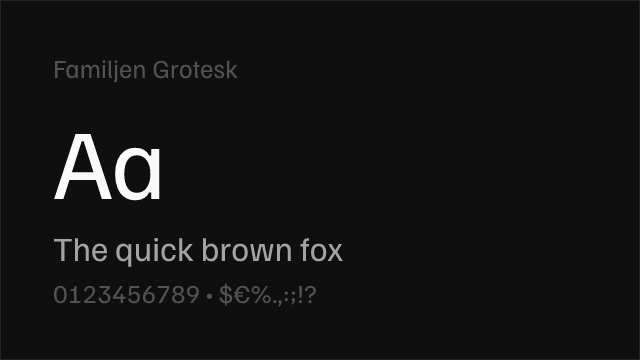
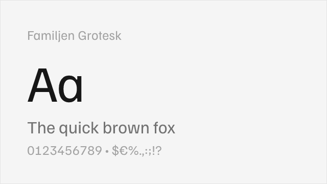
Familjen Grotesk
| Favorit | Familjen Grotesk | Match |
|---|---|---|
| Regular (400) | Regular (400) | close |
| Medium (500) | Medium (500) | close |
| Bold (700) | Bold (700) | close |
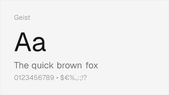
Geist
| Favorit | Geist | Match |
|---|---|---|
| Light (300) | Light (300) | close |
| Regular (400) | Regular (400) | close |
| Medium (500) | Medium (500) | close |
| Bold (700) | Bold (700) | close |
Libre Franklin
| Favorit | Libre Franklin | Match |
|---|---|---|
| Light (300) | Light (300) | close |
| Regular (400) | Regular (400) | close |
| Medium (500) | Medium (500) | close |
| Bold (700) | Bold (700) | close |
Performance Guide
Production performance metrics for each alternative.
How to Use Inter
Copy these code snippets to quickly add Inter to your project.
CSS code for Inter
@import url('https://fonts.googleapis.com/css2?family=Inter:wght@100..900&display=swap');HTML code for Inter
<link rel="preconnect" href="https://fonts.googleapis.com">
<link rel="preconnect" href="https://fonts.gstatic.com" crossorigin>
<link href="https://fonts.googleapis.com/css2?family=Inter:wght@100..900&display=swap" rel="stylesheet">
Tailwind code for Inter
// tailwind.config.js
module.exports = {
  theme: {
    extend: {
      fontFamily: {
        'inter': ['Inter', 'sans-serif'],
      },
    },
  },
}

// Usage in HTML:
// <p class="font-inter">Your text here</p>
Next.js code for Inter
// Using next/font (Next.js 13+)
import { Inter } from 'next/font/google';

const inter = Inter({
  subsets: ['latin'],
  weight: ['100', '200', '300', '400', '500', '600', '700', '800', '900'],
});

export default function Component() {
  return (
    <p className={inter.className}>
      Your text here
    </p>
  );
}

// Or using inline styles with Google Fonts link:
// <p style={{ fontFamily: "'Inter'" }}>Your text</p>
Expo and React Native code for Inter
// Install: npx expo install @expo-google-fonts/inter expo-font
import { useFonts, Inter_400Regular } from '@expo-google-fonts/inter';

export default function App() {
  const [fontsLoaded] = useFonts({
    Inter_400Regular,
  });

  if (!fontsLoaded) return null;

  return (
    <Text style={{ fontFamily: 'Inter_400Regular' }}>
      Your text here
    </Text>
  );
}
Recommended Font Pairings
These free fonts pair well with Inter Favorit for headlines, body text, or accent use.
Literata's warm, contemporary serifs create rich editorial contrast against Favorit's clean but quirky grotesque headlines — both typefaces share a design-conscious sensibility that works for art publications, cultural magazines, and brand editorial where typography is part of the message
EB Garamond's classical proportions and old-style figures provide a historically grounded counterpoint to Favorit's contemporary quirkiness, creating editorial pairings that feel intellectually layered — the tension between 16th-century serif tradition and 21st-century grotesque idiosyncrasy suits art and culture publications
Cormorant Garamond's high-contrast elegance against Favorit's flat, idiosyncratic grotesque creates the kind of dramatic editorial pairing found in independent art and fashion publications where typographic tension is a deliberate design choice
Browse Alternatives by Context
Find Favorit alternatives filtered by specific use case, style, or language support.
By Use Case
By Script
Frequently Asked Questions
What is the best free alternative to Favorit?
Inter is the best free alternative to Favorit with a FontAlternatives similarity score of 78%. It shares similar proportions and characteristics while being available under the OFL-1.1 license for both personal and commercial use at no cost.
Is there a free version of Favorit?
There is no official free version of Favorit. However, Inter is available under the OFL-1.1 open-source license and achieves a FontAlternatives similarity score of 78%. It includes variable weights and supports latin, latin-extended.
What Google Font looks like Favorit?
The Google Fonts most similar to Favorit are Inter, Space Grotesk, Work Sans. Among these alternatives, Inter offers the closest match with a FontAlternatives similarity score of 78% and includes variable weights for flexible typography options.
Can I use Inter commercially?
Yes, Inter can be used commercially. It is licensed under OFL-1.1, which allows free use in websites, applications, print materials, and commercial projects without purchasing a license or paying royalties.
Is Inter similar enough to Favorit?
Inter achieves a FontAlternatives similarity score of 78% compared to Favorit. While not identical, it offers comparable letterforms, proportions, and visual style. Most designers find it works excellently as a substitute in web and print projects.
What are the main differences between Favorit and its free alternatives?
Free alternatives to Favorit may differ in subtle details like letter spacing, curve refinements, and available weights. Premium fonts typically include more OpenType features, extended language support, and optimized screen rendering. However, for most projects, these differences are negligible.
Where can I download free alternatives to Favorit?
Download Inter directly from Google Fonts. Click the "Get Font" button on any alternative listed above to visit the official download page. Google Fonts also provides convenient embed codes for seamless web integration.