Free Alternatives to ABC Diatype

About ABC Diatype
- Foundry
- Dinamo
- Classification
- sans-serif
- Variable
- Yes
- Style
- neo-grotesque
Brands Using ABC Diatype
Widely used across community templates and design system kits
Supporting interface typeface in product and marketing materials
Editorial and e-commerce typography for fashion platform
Digital communications and web presence typography
ABC Diatype is a neo-grotesque sans-serif typeface designed by Erkin Karamemet and released by Dinamo (ABC Dinamo) in 2019. It is the foundry's systematic workhorse — a typeface built for the same functional territory as Berthold's Akzidenz-Grotesk and Haas' Helvetica, but designed natively for digital interfaces rather than retrofitted from metal or phototype originals. Where Dinamo's other grotesque, Favorit, trades in studied quirkiness and cultural signaling, ABC Diatype is the sibling that shows up on time, does the work, and does not need to be the most interesting typeface in the room.
ABC Diatype requires a paid license from Dinamo (ABC Dinamo). The foundry offers desktop, web, and app licenses, with pricing that reflects its position as a boutique, design-led foundry. There is no free tier, trial weight, or inclusion in Google Fonts or Adobe Fonts. A variable font version (Diatype Variable) is available as a separate purchase. If your project cannot accommodate Dinamo's licensing model, this page covers the best open-source alternatives and what to prioritize when choosing one.
Why ABC Diatype Matters
ABC Diatype occupies a specific and increasingly important position in contemporary type design: it is a programmer's grotesque. Not a programming font in the monospace sense, but a typeface built with the same values that programmers bring to their tools — systematic construction, functional clarity, predictable behavior, and an aesthetic that emerges from optimization rather than ornamentation.
When Dinamo released Diatype in 2019, the grotesque landscape was already crowded. Helvetica Now had just updated the world's most famous grotesque. Klim had released Sohne, which was rapidly becoming the default for design-conscious tech companies. Commercial Type's Graphik had owned the startup space for years. Pangram Pangram's Neue Montreal was everywhere in creative portfolios. Into this saturated market, Diatype arrived with a proposition that was quietly radical: what if a grotesque was built from scratch for the way interfaces actually work, rather than adapting a design philosophy inherited from print?
The answer shows in Diatype's DNA. Its proportions are calibrated for the pixel grid. Its weight distribution anticipates the specific hierarchy needs of product interfaces — navigation labels, body text, button text, heading levels — rather than the headline-to-caption range of traditional editorial type. Its variable font implementation treats the weight axis not as a convenience feature but as a core design tool, enabling the continuous micro-adjustments that responsive interfaces demand. This is a typeface that understands that most of its life will be spent at 14px in a sidebar, not at 72pt on a poster.
The cultural positioning matters too. Dinamo's foundry identity carries weight in the design world. Using a Dinamo typeface signals awareness of contemporary type culture without the overt quirkiness of Favorit or the maximalism of Monument Extended. Diatype says: the designer chose this deliberately, values functionality, and is familiar with the current landscape. For tech companies and design studios, this is precisely the message their typography needs to carry.
The family architecture reinforces this systematic philosophy. ABC Diatype is available in a standard-width text family, but also as Diatype Variable (with continuous weight and potentially other axes), Diatype Rounded (with softened terminals for friendlier applications), and Diatype Mono (for code and technical contexts). This modular system means that a team can build an entire typographic identity within the Diatype ecosystem, from marketing headlines to UI labels to code editors, maintaining visual consistency across every touchpoint.
Design Characteristics
ABC Diatype's design intelligence lies in its systematic approach to what might seem like minor decisions, each compounding to create a typeface that feels engineered rather than drawn:
- Distinctive rounded dots on i and j: This is Diatype's most recognizable detail. Where most neo-grotesques use square or rectangular dots (tittles), Diatype uses perfectly round ones. At body sizes this registers subconsciously as warmth without compromising the rational skeleton. At display sizes it becomes a signature detail that distinguishes Diatype from the dozens of neo-grotesques that share its basic proportions
- Tall x-height with compact extenders: Like its contemporary competitors, Diatype maximizes the x-height to improve legibility at small screen sizes. But its ascenders and descenders are more restrained than Inter's or Geist's, creating a tighter vertical rhythm that works well in dense UI layouts where line-height is compressed
- Open apertures with controlled counters: The
c,e,s, andafeature generous openings that prevent letterform collapse at small sizes, but the counters inb,d,p,qare more tightly controlled than in a humanist design. This balance keeps the typeface legible without the wide, airy feel of fonts designed primarily for body text - Subtly quirky terminals: Stroke endings throughout the typeface carry micro-variations that prevent the mechanical uniformity of a pure Swiss grotesque. These are far subtler than Favorit's deliberate idiosyncrasies — more like the carefully considered imperfections a craftsman leaves to prove the work is handmade rather than stamped
- Flat-sided curves with geometric rigor: The bowls and curves in rounded characters follow the flat-sided convention of contemporary grotesques, but with a geometric precision that gives Diatype its systematic, engineered quality. The curves are mathematically consistent in a way that reflects digital-native design tools
- Monoline stroke weight: Minimal contrast between thick and thin strokes creates even typographic color across paragraphs, essential for the dense, information-rich layouts common in product interfaces. This monoline quality is more pronounced in Diatype than in humanist-influenced alternatives like Work Sans or Source Sans 3
- Tabular and proportional figures: Both numeral sets are included, supporting the reality that modern interfaces constantly switch between running text (proportional) and data displays (tabular). The tabular figures are designed to align cleanly in columns without the awkward spacing that some grotesques produce
- True italics with maintained character: Diatype's italics are not simple obliques but redesigned forms that provide genuine typographic differentiation for emphasis, maintaining the systematic personality of the uprights while introducing enough cursive influence to function as real italics
The weight range spans from Thin through Black, and the variable font version enables continuous interpolation across this range. This is not a trivial feature — it means designers can specify the exact weight that produces optimal contrast in a specific UI context rather than choosing from predetermined steps.
Where ABC Diatype Excels
Diatype performs at its highest level in contexts where systematic clarity and functional precision are the primary requirements:
- Product interfaces and SaaS dashboards: Diatype's even typographic color, tabular figures, and weight distribution handle dense information displays with the calm authority of a typeface that was designed for this exact purpose. Navigation, labels, body text, and data all coexist without hierarchy conflicts
- Developer tools and documentation: The rational construction and tight vertical rhythm suit engineering-minded products where typography should be invisible and information should be immediate. Paired with Diatype Mono, it creates a complete technical typographic system
- Design system foundations: Diatype's systematic architecture — standard, variable, rounded, mono — provides everything a design system needs in a single coherent family. The variable font axis enables the fluid, responsive typography that modern design systems demand
- Tech startup branding: Diatype carries the same premium positioning as Sohne or Calibre but with a slightly different tonal register — more European, more systematic, more aligned with the design-tool ecosystem where many startup designers work
- Digital editorial layouts: At body sizes, Diatype produces a clean, slightly warm reading texture that works well for tech journalism, design writing, and product-focused editorial content
Where ABC Diatype Struggles
Diatype's systematic strengths define its limitations with equal clarity:
- Warm or playful brand identities: Diatype's rational construction reads as cold and clinical in contexts that require friendliness, approachability, or playfulness. Brands targeting families, children, or casual consumers will find it too austere. Even Diatype Rounded, which softens the terminals, remains fundamentally systematic in character
- Long-form editorial reading: At body sizes in continuous prose exceeding a few hundred words, Diatype's low contrast and tight rhythm can cause reader fatigue faster than a humanist alternative like Source Sans 3 or Work Sans. The typeface prioritizes scanning efficiency over sustained reading comfort
- Projects requiring Cyrillic, Greek, or CJK: Diatype supports Latin and Latin Extended scripts only. Multilingual projects need a fallback strategy, and matching Diatype's specific character in other scripts is difficult
- Print at small sizes: Without the hinting advantages of fonts specifically engineered for print reproduction, Diatype's thin weights can appear fragile below 8pt in print. It was designed for screens first
- Expressive or cultural brand contexts: Unlike Favorit, which carries cultural signaling power in art-world and fashion contexts, Diatype's systematic neutrality does not communicate much beyond competence and intentionality. For brands that need their typography to carry emotional weight or cultural specificity, Diatype is too restrained
How to Choose a Free Substitute
When evaluating ABC Diatype replacements, prioritize these criteria in order of impact:
- Proportional rhythm at UI sizes: Diatype's x-height-to-cap-height ratio and letter-spacing are its most recognizable structural features. Test your alternative at 14px and 16px in a product UI context — set a navigation bar, a paragraph of body text, and a data table side by side. Does the alternative produce the same density and reading rhythm? Inter and DM Sans come closest here
- Weight distribution for interface hierarchy: Diatype's weight range is calibrated for the specific needs of product interfaces — thin for secondary labels, regular for body, medium for emphasis, bold for headings. Your alternative needs at least Regular (400), Medium (500), Semi Bold (600), and Bold (700) to replicate common UI weight patterns. Inter, Geist, and Work Sans all provide this
- Systematic character versus personality: The critical question is whether your alternative reads as deliberately chosen or defaulted to. Diatype's value is partly positional — it signals design awareness and functional intentionality. Inter and Geist both convey this in tech contexts; Public Sans and Source Sans 3 convey it in institutional contexts; Libre Franklin conveys editorial seriousness
- Variable font support: Diatype Variable is a core part of the system. Most free alternatives (Inter, Geist, DM Sans, Work Sans) offer variable font support, which is actually equivalent or superior for web performance. If your project relies on continuous weight interpolation, verify the alternative's variable font implementation handles the same range
- Tabular figures and OpenType features: If your product displays numbers in tables, dashboards, or financial contexts, verify the alternative includes tabular numerals. Inter's OpenType feature set is the most comprehensive among the alternatives listed here
- The rounded dot detail: This is Diatype's visual signature. No free alternative replicates it. If the rounded dot on i and j is a recognizable element of your current design, accept that any substitute will change this detail. At body sizes it is nearly invisible; at display sizes it is noticeable
Premium Font Neighbors
If ABC Diatype's approach resonates but you want to explore adjacent premium options:
Cluster A: Systematic workhorse grotesques (Diatype's direct competitors)
- Sohne (Klim Type Foundry) — The other defining neo-grotesque of the 2020s tech industry; more explicitly a Helvetica reinterpretation where Diatype builds from a broader Akzidenz tradition. Sohne is tighter and more clinical; Diatype is slightly warmer with its rounded details
- Neufile Grotesk (Indian Type Foundry) — An affordable workhorse grotesque with broader language support than Diatype; less distinctive in character but more practical for multilingual enterprise projects
- Nitti Grotesk (Bold Monday) — Shares Diatype's interest in systematic, grid-aware construction; tighter and more technical, with a monospace sibling that parallels Diatype Mono
- Basis Grotesque (Colophon Foundry) — Quieter and more humanist than Diatype, but serving the same audience of designers who want a neo-grotesque that communicates intentionality
Cluster B: Contemporary tech-culture grotesques
- Favorit (Dinamo) — Diatype's own sibling from the same foundry; more quirky and culturally specific, trading Diatype's systematic reliability for deliberate idiosyncrasy. Where Diatype works, Favorit performs
- Ginto (Dinamo) — Another Dinamo family with a broader, more commanding presence; shares Diatype's foundry DNA but with a more geometric, display-forward personality
- Neue Montreal (Pangram Pangram) — Popular in startup branding with a rawer, more expressive edge than Diatype; overlaps in the creative-tech audience but with more visible personality
- Apercu (Colophon Foundry) — More overtly quirky than Diatype with distinctive character details; shares the design-world audience but with a London rather than Basel sensibility
FAQ
Is ABC Diatype free?
No. ABC Diatype is a premium typeface from Dinamo (ABC Dinamo) requiring separate licenses for desktop, web, and app usage. Pricing varies by license type and project scope. Diatype is not available through Google Fonts, Adobe Fonts, or any font subscription service. The best free alternative is Inter at 85% similarity.
What is the best free alternative to ABC Diatype?
Inter is the closest free alternative at 85% similarity. Both share a tall x-height, open apertures, and neo-grotesque construction optimized for screen interfaces. Inter adds variable font support with an optical sizing axis, broader language coverage including Cyrillic and Greek, and one of the most comprehensive OpenType feature sets of any free font. For projects where Diatype was chosen primarily for its functional clarity in product interfaces, Inter is a strong practical substitute.
What is the difference between ABC Diatype, Diatype Variable, and Diatype Rounded?
ABC Diatype is the standard family available in fixed weight steps from Thin through Black with matching italics. Diatype Variable is the variable font version offering continuous weight interpolation along a single axis, ideal for responsive web interfaces that need precise weight control. Diatype Rounded applies soft, rounded terminals to the entire character set, creating a friendlier, more approachable version suitable for consumer-facing products and brands that need warmth without sacrificing the systematic skeleton. Each variant is licensed separately by Dinamo.
How does ABC Diatype compare to Helvetica?
Both are neo-grotesques, but they represent different eras of design thinking. Helvetica was designed for print universality in the 1950s — a typeface that communicates neutrality through mid-century Swiss rationalism. ABC Diatype was designed for digital interfaces in the 2010s — a typeface that achieves neutrality through systematic optimization for screens. The practical differences include Diatype's taller x-height (better for UI text), its rounded dots on i and j (a distinguishing detail Helvetica lacks), its variable font support (critical for modern web performance), and its overall proportions calibrated for pixel rendering rather than phototype reproduction.
Is ABC Diatype a variable font?
Yes. Diatype Variable offers a continuous weight axis, enabling precise weight selection beyond the standard fixed-weight files. This is a meaningful advantage for web projects using fluid typography, responsive design systems, or any context where the optimal weight for a given element might fall between standard steps like Regular (400) and Medium (500). The variable font is licensed separately from the standard static weight files.
Who designed ABC Diatype?
Erkin Karamemet designed ABC Diatype for Dinamo (ABC Dinamo), the Basel and Berlin-based foundry founded by Johannes Breyer and Fabian Harb. Dinamo is known for typefaces that challenge conventions while remaining commercially functional, including Favorit, Ginto, Whyte, and Monument Extended. Diatype represents the foundry's entry into the systematic workhorse category — less conceptually provocative than their other releases but arguably more commercially significant, providing the kind of reliable, everyday grotesque that design teams reach for across dozens of projects.
Can I use ABC Diatype on the web?
Yes, with a web font license from Dinamo. Web licenses are priced based on traffic tiers, and you receive WOFF2 files for self-hosting. For the variable font version, a single Diatype Variable WOFF2 file replaces multiple static weight files, improving page load performance significantly. Diatype is not available through any font CDN or hosting service — self-hosting with the licensed files is the only option.
Why do design studios choose ABC Diatype over free alternatives?
The choice is partly functional and partly positional. Functionally, Diatype's family architecture — standard, variable, rounded, mono — provides a complete typographic system that no single free font replicates. The rounded dots, the specific terminal treatments, and the overall proportional rhythm create a distinct identity that separates a project visually from the thousands of sites using Inter or DM Sans. Positionally, using a Dinamo typeface communicates design literacy and intentionality to an audience of peers who recognize the foundry and understand what the choice signals. For studios whose reputation depends on typographic decisions, this distinction justifies the licensing cost.
Is ABC Diatype on Google Fonts?
No, ABC Diatype is a premium font from Dinamo and is not available on Google Fonts.
The closest Google Fonts alternative is Inter with 85% similarity. Get it free on Google Fonts ↗
Free Alternatives (7)


Closest match in functional grotesque territory with exceptional screen rendering


Clean geometric-grotesque with similar modern proportions

Tech-focused grotesque with compatible rational character


Similar editorial flexibility and clean construction


Broader language support with similar functional approach


Neutral, institutional grotesque with similar goals


American grotesque heritage, more conventional
See where ABC Diatype is used in the wild and swap to free alternatives live.
Install FontSwap →Replacement Summary
Source: FontAlternatives.com
Premium font: ABC Diatype
Best free alternative: Inter
FontAlternatives similarity score: 85%
Replacement difficulty: Low
Best for: product UI and dashboards, SaaS marketing sites, design system foundations, developer documentation
Notable users: Figma Community, Ableton, Ssense
Not recommended when: Brand consistency with Figma Community requires exact letterforms
What is the best free alternative to ABC Diatype?
Inter is the best free alternative to ABC Diatype with a FontAlternatives similarity score of 85%.
Inter shares similar proportions, stroke characteristics, and intended use with ABC Diatype. It is available under the OFL-1.1 license, which permits both personal and commercial use at no cost.
This alternative works particularly well for: product UI and dashboards, SaaS marketing sites, design system foundations, developer documentation.
Can I safely replace ABC Diatype with Inter?
Yes, Inter is a high-confidence replacement for ABC Diatype. The FontAlternatives similarity score of 85% indicates strong structural compatibility.
Licensing: Inter is licensed under OFL-1.1, which allows commercial use without licensing fees or royalties.
Weight coverage: Most weights have close or exact matches available.
When should I NOT replace ABC Diatype?
While Inter is a strong alternative, there are situations where replacing ABC Diatype may not be appropriate:
- Brand consistency: ABC Diatype is commonly seen in Design studio brand identities contexts where exact letterforms may be required.
- Strict compliance: Verify that OFL-1.1 terms meet your specific legal and compliance requirements.
Weight-Matching Guide
Map ABC Diatype weights to their closest free alternatives for accurate font substitution.
Inter
| ABC Diatype | Inter | Match |
|---|---|---|
| Thin (100) | Thin (100) | close |
| Light (300) | Light (300) | exact |
| Regular (400) | Regular (400) | exact |
| Medium (500) | Medium (500) | exact |
| Bold (700) | Bold (700) | close |
DM Sans
| ABC Diatype | DM Sans | Match |
|---|---|---|
| Light (300) | Light (300) | close |
| Regular (400) | Regular (400) | close |
| Medium (500) | Medium (500) | close |
| Semi Bold (600) | Semi Bold (600) | close |
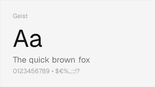
Geist
| ABC Diatype | Geist | Match |
|---|---|---|
| Light (300) | Light (300) | close |
| Regular (400) | Regular (400) | close |
| Medium (500) | Medium (500) | close |
| Semi Bold (600) | Semi Bold (600) | close |
Work Sans
| ABC Diatype | Work Sans | Match |
|---|---|---|
| Light (300) | Light (300) | exact |
| Regular (400) | Regular (400) | exact |
| Medium (500) | Medium (500) | exact |
| Bold (700) | Bold (700) | close |
Source Sans 3
| ABC Diatype | Source Sans 3 | Match |
|---|---|---|
| Light (300) | Light (300) | close |
| Regular (400) | Regular (400) | close |
| Medium (500) | Medium (500) | substitute |
| Bold (700) | Bold (700) | close |
Public Sans
| ABC Diatype | Public Sans | Match |
|---|---|---|
| Light (300) | Light (300) | close |
| Regular (400) | Regular (400) | close |
| Medium (500) | Medium (500) | close |
| Bold (700) | Bold (700) | close |
Libre Franklin
| ABC Diatype | Libre Franklin | Match |
|---|---|---|
| Light (300) | Light (300) | close |
| Regular (400) | Regular (400) | close |
| Medium (500) | Medium (500) | close |
| Bold (700) | Bold (700) | close |
Performance Guide
Production performance metrics for each alternative.
How to Use Inter
Copy these code snippets to quickly add Inter to your project.
CSS code for Inter
@import url('https://fonts.googleapis.com/css2?family=Inter:wght@100..900&display=swap');HTML code for Inter
<link rel="preconnect" href="https://fonts.googleapis.com">
<link rel="preconnect" href="https://fonts.gstatic.com" crossorigin>
<link href="https://fonts.googleapis.com/css2?family=Inter:wght@100..900&display=swap" rel="stylesheet">
Tailwind code for Inter
// tailwind.config.js
module.exports = {
  theme: {
    extend: {
      fontFamily: {
        'inter': ['Inter', 'sans-serif'],
      },
    },
  },
}

// Usage in HTML:
// <p class="font-inter">Your text here</p>
Next.js code for Inter
// Using next/font (Next.js 13+)
import { Inter } from 'next/font/google';

const inter = Inter({
  subsets: ['latin'],
  weight: ['100', '200', '300', '400', '500', '600', '700', '800', '900'],
});

export default function Component() {
  return (
    <p className={inter.className}>
      Your text here
    </p>
  );
}

// Or using inline styles with Google Fonts link:
// <p style={{ fontFamily: "'Inter'" }}>Your text</p>
Expo and React Native code for Inter
// Install: npx expo install @expo-google-fonts/inter expo-font
import { useFonts, Inter_400Regular } from '@expo-google-fonts/inter';

export default function App() {
  const [fontsLoaded] = useFonts({
    Inter_400Regular,
  });

  if (!fontsLoaded) return null;

  return (
    <Text style={{ fontFamily: 'Inter_400Regular' }}>
      Your text here
    </Text>
  );
}
Recommended Font Pairings
These free fonts pair well with Inter ABC Diatype for headlines, body text, or accent use.
Source Serif Pro's structured, rational serifs provide editorial contrast against ABC Diatype's clean grotesque headlines without introducing stylistic friction — both typefaces share a disciplined, systematic approach that creates harmonious hierarchy in documentation and editorial layouts
JetBrains Mono's programming ligatures and clear glyph differentiation make it the natural monospace companion for ABC Diatype in developer tool interfaces, where Diatype handles UI chrome and JetBrains Mono handles code blocks and terminal output
Literata's warm, contemporary serifs balance ABC Diatype's clinical precision for editorial layouts that need reading comfort alongside modern interface elements, creating contrast without conflict
Browse Alternatives by Context
Find ABC Diatype alternatives filtered by specific use case, style, or language support.
By Script
Frequently Asked Questions
What is the best free alternative to ABC Diatype?
Inter is the best free alternative to ABC Diatype with a FontAlternatives similarity score of 85%. It shares similar proportions and characteristics while being available under the OFL-1.1 license for both personal and commercial use at no cost.
Is there a free version of ABC Diatype?
There is no official free version of ABC Diatype. However, Inter is available under the OFL-1.1 open-source license and achieves a FontAlternatives similarity score of 85%. It includes variable weights and supports latin, latin-extended.
What Google Font looks like ABC Diatype?
The Google Fonts most similar to ABC Diatype are Inter, DM Sans, Geist. Among these alternatives, Inter offers the closest match with a FontAlternatives similarity score of 85% and includes variable weights for flexible typography options.
Can I use Inter commercially?
Yes, Inter can be used commercially. It is licensed under OFL-1.1, which allows free use in websites, applications, print materials, and commercial projects without purchasing a license or paying royalties.
Is Inter similar enough to ABC Diatype?
Inter achieves a FontAlternatives similarity score of 85% compared to ABC Diatype. While not identical, it offers comparable letterforms, proportions, and visual style. Most designers find it works excellently as a substitute in web and print projects.
What are the main differences between ABC Diatype and its free alternatives?
Free alternatives to ABC Diatype may differ in subtle details like letter spacing, curve refinements, and available weights. Premium fonts typically include more OpenType features, extended language support, and optimized screen rendering. However, for most projects, these differences are negligible.
Where can I download free alternatives to ABC Diatype?
Download Inter directly from Google Fonts. Click the "Get Font" button on any alternative listed above to visit the official download page. Google Fonts also provides convenient embed codes for seamless web integration.