Free Alternatives to Basis Grotesque Supporting Latin Extended
Need a free alternative to Basis Grotesque with Latin Extended script support? These 7 options include Latin Extended characters and share visual similarities with Basis Grotesque. Each is licensed for free personal and commercial use.
Top Picks
Comparison Table
| Font | Relevance ⓘ
How well this alternative fits the specific context (use-case or trait) of this page. Score 0–100 based on matching keywords, industries, and font characteristics. Alternatives scoring 25+ are highlighted.
| Similarity ⓘ
How visually similar this free font is to the premium original. Score 0–100 based on x-height, width, stroke contrast, use-case overlap, and language coverage.
Learn more → | Weights | Variable | License | Source |
|---|---|---|---|---|---|---|
| Work Sans | 0 | 85% | Variable | Yes | OFL-1.1 | Google Fonts ↗ |
| Inter | 0 | 82% | Variable | Yes | OFL-1.1 | Google Fonts ↗ |
| Libre Franklin | 0 | 78% | Variable | Yes | OFL-1.1 | Google Fonts ↗ |
| DM Sans | 0 | 76% | Variable | Yes | OFL-1.1 | Google Fonts ↗ |
| Public Sans | 0 | 74% | Variable | Yes | OFL-1.1 | Google Fonts ↗ |
| Source Sans 3 | 0 | 72% | Variable | Yes | OFL-1.1 | Google Fonts ↗ |
| Familjen Grotesk | 0 | 70% | Variable | Yes | OFL-1.1 | Google Fonts ↗ |
All Alternatives (7)


[Google Fonts] · OFL-1.1 · Variable
Best overall match for editorial character with clean, functional proportions
Why it matches: Work Sans shares Basis Grotesque's editorial sensibility and humanist-inflected grotesque structure. Both typefaces feature generous x-heights, open apertures, and a deliberate restraint in personality that lets content take priority. Work Sans leans slightly more toward the American gothic tradition where Basis Grotesque draws from European rationalism, but the overall rhythm, weight distribution, and editorial tone align closely. At text sizes in magazine layouts or website body copy, the two produce nearly identical typographic color.
editorial and magazine layoutsfashion brand websitescultural institution sitescontent-heavy digital platforms


[Google Fonts] · OFL-1.1 · Variable
Comparable grotesque structure with superior screen optimization
Why it matches: Inter mirrors Basis Grotesque's disciplined neo-grotesque skeleton with a tall x-height and open apertures optimized for screen rendering. Both typefaces aim for functional clarity over decorative personality, and both produce clean, even typographic color in dense layouts. Inter is more explicitly digital in its optimization, with optical sizing and extensive OpenType features that Basis Grotesque lacks. The trade-off is that Inter reads as more utilitarian where Basis Grotesque retains a subtle editorial warmth.
product UI and web applicationsdesign system typographycorporate websitesdocumentation and knowledge bases


[Google Fonts] · OFL-1.1 · Variable
Similar American grotesque heritage reinterpreted for modern use
Why it matches: Libre Franklin captures a comparable balance of grotesque neutrality and functional warmth. Both typefaces draw on the tradition of no-nonsense sans-serifs refined for contemporary editorial use. Libre Franklin's proportions are slightly more condensed than Basis Grotesque, and its stroke weight distribution carries more of an American journalistic character, but the overall reading experience at text sizes is similar. Both work equally well in magazine-style layouts and brand identity systems.
editorial and publishingnews and journalism websitesbrand identity systemsprint-to-digital projects


[Google Fonts] · OFL-1.1 · Variable
Clean, modern proportions with similar readability and minimal personality
Why it matches: DM Sans shares Basis Grotesque's commitment to clean, undemonstrative design that prioritizes readability over personality. Both feature open apertures, consistent stroke weights, and a geometric-humanist hybrid construction. DM Sans is slightly rounder in its bowls and more geometric in its foundations, where Basis Grotesque maintains tighter grotesque proportions. The difference is most visible in display settings; at text sizes, both produce a similarly quiet, professional reading experience.
startup branding and marketingmobile app typographyminimal website designpresentation materials


[Google Fonts] · OFL-1.1 · Variable
Neutral grotesque with compatible editorial tone and accessibility focus
Why it matches: Public Sans shares Basis Grotesque's philosophy of transparent, functional typography that serves content rather than drawing attention to itself. Both typefaces feature open apertures, even stroke weights, and restrained personality. Public Sans is wider-set and more explicitly neutral than Basis Grotesque, optimized for accessibility requirements rather than editorial sophistication. Where Basis Grotesque whispers "design studio," Public Sans reads as "institutional clarity."
institutional and government sitesaccessible web applicationscorporate communicationsform-heavy enterprise tools


[Google Fonts] · OFL-1.1 · Variable
Broader language support with similar humanist grotesque balance
Why it matches: Source Sans 3 occupies a similar position in the humanist-grotesque spectrum as Basis Grotesque, balancing rational construction with subtle organic touches that improve readability in extended text. Both typefaces perform well at text sizes in editorial contexts. Source Sans 3 is broader in its proportions and carries more overt humanist characteristics, particularly in its stroke terminals and letter spacing. Its chief advantage is comprehensive language support including Cyrillic and Greek, which Basis Grotesque lacks.
multilingual editorial projectsenterprise documentationgovernment and institutional platformslong-form reading environments
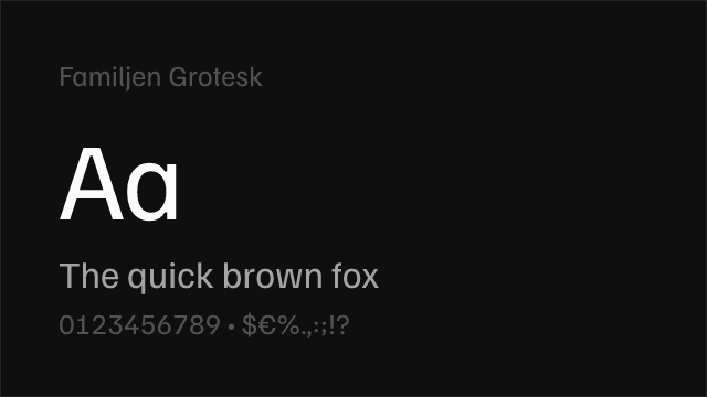
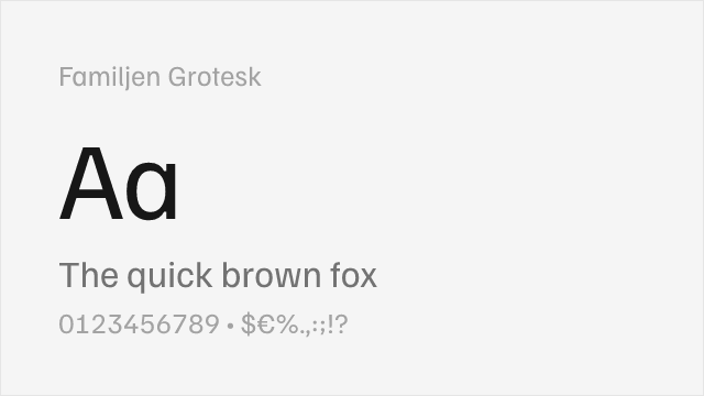
[Google Fonts] · OFL-1.1 · Variable
Contemporary neo-grotesque with editorial sensibility and Scandinavian refinement
Why it matches: Familjen Grotesk shares Basis Grotesque's position as a contemporary neo-grotesque designed for editorial and cultural contexts. Both feature clean proportions, open apertures, and a restrained sophistication that appeals to design-conscious audiences. Familjen Grotesk carries a Scandinavian minimalism that reads slightly cooler than Basis Grotesque's London-inflected warmth, and its weight range is narrower (Regular to Bold only). At text sizes in editorial layouts, both produce a similarly refined, professional reading experience.
editorial and cultural platformsScandinavian-influenced designgallery and museum sitesminimal brand identities