Free Alternatives to Neue Montreal

About Neue Montreal
- Foundry
- Pangram Pangram
- Classification
- sans-serif
- Style
- neo-grotesque
Brands Using Neue Montreal
Marketing site and product interface typography
Brand identity and web typography across the platform
Agency branding and digital experience typography
Supporting typeface in early brand iterations and marketing
Neue Montreal is a neo-grotesque sans-serif typeface designed by Mathieu Desjardins and released by Pangram Pangram Foundry around 2018-2019. It draws from the functional Swiss typographic tradition but filters that heritage through a contemporary, slightly raw aesthetic that resonated immediately with creative studios, design-forward startups, and independent creatives worldwide. Within a year of its release, Neue Montreal became one of the most recognizable typefaces on platforms like Behance and Dribbble, establishing itself as shorthand for "designer who knows what they are doing."
Neue Montreal requires a paid license from Pangram Pangram Foundry. The foundry offers desktop, web, and app licenses at accessible price points relative to traditional type foundries. A free trial weight (Regular) is available for personal projects, which significantly contributed to the typeface's viral adoption — designers discovered it through the free weight and later licensed the full family. If your budget cannot accommodate Pangram Pangram's licensing structure, this page covers the best open-source alternatives and what to evaluate when choosing one.
Why Neue Montreal Matters
Neue Montreal's dominance in startup and creative branding was not a marketing accident — it filled a gap that designers had been navigating awkwardly for years. Before Neue Montreal, the options for creative studios seeking a neo-grotesque with personality fell into predictable camps: Helvetica and its descendants (reliable but exhausted), Akzidenz-Grotesk and its revisions (historically credible but carrying mid-century baggage), or the increasingly ubiquitous tech grotesques like Inter and Roboto (functional but personality-free). Neue Montreal offered something genuinely different: a grotesque that felt Swiss in its bones but raw and slightly imperfect on its surface.
The typeface's popularity among creative agencies tells the story. Browse the portfolios of studios like Huge Inc, Collins, or dozens of independent design practices that emerged between 2019 and 2023, and you will find Neue Montreal everywhere — in case studies, brand identity systems, portfolio headers, and presentation decks. It became the typographic equivalent of a well-curated design bookshelf: a signal that the person making the choices has taste, awareness of contemporary trends, and enough confidence to avoid the safe defaults.
What accelerated this adoption was Pangram Pangram's distribution strategy. By offering a free trial weight, the foundry removed the friction that typically keeps premium typefaces confined to well-funded projects. Student designers, freelancers building their first portfolios, and small studios experimenting with brand directions could all access Neue Montreal without a licensing commitment. The result was exponential exposure — every portfolio site built with the free weight became an advertisement for the full family.
Neue Montreal also arrived at the precise cultural moment when the design industry was moving away from the sterile, system-font-driven minimalism of the mid-2010s and toward a more expressive, editorial approach to digital design. Designers wanted type that looked intentional and distinctive without being decorative or loud. Neue Montreal threaded that needle: clean enough for product interfaces, characterful enough for brand identity work, and distinctive enough to avoid the "could be any sans-serif" problem that plagued Inter-era design.
The typeface's stronghold extends beyond tech into music, fashion, and cultural branding. Album artwork, festival identities, streetwear labels, and independent magazines adopted Neue Montreal for its ability to feel both polished and slightly unfinished — a combination that aligns with the studied casualness of contemporary creative culture.
There is also a generational dimension to Neue Montreal's success. Designers who entered the profession between 2018 and 2023 grew up with it as a default reference point, much as the previous generation grew up with Gotham or Proxima Nova. For this cohort, Neue Montreal is not a trend but a baseline — the typeface you start from before making a more specific choice. This embedded familiarity ensures continued demand even as newer alternatives emerge, because the network effects of widespread adoption create their own momentum: clients recognize it, design systems are built around it, and teams have existing assets in it.
Design Characteristics
Neue Montreal's design choices are what separate it from the clean-room neo-grotesques that dominate the tech industry. Every detail serves the goal of being functional enough for interface work while retaining enough personality to drive brand identity:
- Moderate x-height with balanced ascenders: Letters like
a,e,xoccupy a comfortable middle ground — tall enough for screen legibility but not so extreme that the typeface loses its editorial proportions. This distinguishes it from UI-first fonts like Inter (which maximizes x-height) and keeps it versatile across display, body, and interface contexts - Subtly flat-sided curves: The bowls and counters in letters like
b,d,p,qfeature a gentle flattening on the vertical sides that creates a quietly geometric impression without the full commitment of a geometric sans. This is one of Neue Montreal's most recognizable features — it gives headlines a sense of architectural structure - Slightly closed apertures: Unlike the wide-open apertures of Inter or Source Sans, Neue Montreal's
c,e, andsclose down slightly, creating a tighter, more contained typographic color. This is part of what gives it its "raw" character — the letterforms feel less eager to be legible and more confident in their shapes - Monoline stroke weight with minimal contrast: The consistent stroke thickness across characters creates an even texture in paragraphs, making it predictable and calm in dense UI layouts while reading as deliberate rather than default in headlines
- Ink traps and joint treatment: Subtle ink traps at stroke junctions (visible in
M,N,Wat larger sizes) reference the letterpress tradition while serving the practical purpose of preventing visual thickening at small sizes. These details reward close inspection without demanding attention - Straight-legged R and distinctive G: The capital
Rfeatures a straight leg rather than a curved tail, and theGhas a clean horizontal crossbar — both choices that lean toward the geometric-grotesque tradition rather than the humanist one. These characters are among the most identifiable in the family - Five weights with italics: The family ships in Light, Regular, Medium, Semi Bold, and Bold with matching italics — a more restrained weight range than many contemporary sans families. This limitation is arguably intentional, forcing typographic hierarchy through contrast and scale rather than an abundance of weight options
The absence of a variable font version is notable. While most of Neue Montreal's free alternatives offer variable font support, Pangram Pangram has not released a variable version. This means static font files for each weight, which affects web performance budgets for projects loading multiple weights.
Taken together, these characteristics place Neue Montreal in a specific zone: more geometric than Graphik, less geometric than Futura, more expressive than Inter, less expressive than Favorit. It is a typeface of deliberate restraint with just enough personality leaking through the cracks to feel alive. That balance is precisely what makes it difficult to replicate with a single free alternative — and why the choice of substitute depends heavily on which aspect of Neue Montreal matters most for your project.
Where Neue Montreal Excels
Neue Montreal is at its best in contexts where creative credibility matters as much as legibility:
- Creative agency portfolios and case studies: The typeface's slightly raw character elevates studio portfolios beyond the generic "clean and minimal" baseline. It reads as intentional and contemporary without trying too hard
- Startup brand identity: For companies in the creative tools, design infrastructure, or cultural technology space, Neue Montreal signals alignment with the design community. It says "we are building for creators" more convincingly than a system font ever could
- Editorial and magazine layouts: The five-weight range with italics provides enough hierarchy for editorial spreads, and the typeface's personality carries well at both headline and deck sizes
- Music and cultural branding: Album artwork, festival identities, event collateral, and artist websites benefit from Neue Montreal's ability to feel both polished and slightly underground
- Presentation decks and pitch materials: In contexts where visual communication matters (design reviews, investor presentations, conference talks), Neue Montreal adds production value without appearing overdone
- E-commerce for design-conscious brands: Streetwear labels, independent bookshops, and curated marketplaces use Neue Montreal to signal taste and curation
- Social media and content templates: The typeface's contemporary character translates well to Instagram carousels, LinkedIn graphics, and presentation templates where visual credibility matters in a single glance
The common thread across these use cases is that Neue Montreal performs best when the audience is design-literate or design-adjacent. It rewards viewers who notice typography and carries enough personality to register even in contexts where most people would not consciously evaluate the typeface choice. This makes it less of a workhorse sans-serif and more of a strategic brand tool — you choose it because of what it communicates about you, not just because it renders text clearly.
Where Neue Montreal Struggles
No typeface is universal, and Neue Montreal has clear limitations:
- Long-form reading: At body sizes in continuous prose (blog posts, documentation, articles), the slightly closed apertures and monoline strokes cause reader fatigue faster than a humanist alternative. For sustained reading, Inter or Source Sans 3 are better choices
- Enterprise and corporate contexts: Neue Montreal reads as creative and somewhat informal. Fortune 500 companies, financial institutions, and government agencies will find it too edgy for their communication standards
- Data-heavy interfaces: The five-weight limitation and lack of tabular figure variants make Neue Montreal less practical for dashboards, financial displays, and data visualization where precise numeric alignment matters
- Projects requiring broad language support: Neue Montreal supports Latin and Latin Extended scripts only. Any project requiring Cyrillic, Greek, Arabic, or CJK scripts needs a fallback strategy — and finding a fallback that matches Neue Montreal's personality is harder than matching a neutral sans
- Accessibility-first design: The slightly closed apertures and similar letterform shapes (particularly
l,I, and1) may not meet the differentiation standards required by accessibility-focused projects - Print at very small sizes: Without variable font technology or optical sizing, the lighter weights can appear weak in print below 8pt, and the monoline strokes lose their subtle character
- Warm or playful brands: Neue Montreal's personality skews cool and self-aware. Brands targeting children, families, or casual audiences that need to project warmth will find it too detached — a geometric sans like Nunito or Poppins is a better fit for approachable consumer products
How to Choose a Free Substitute
When evaluating Neue Montreal replacements, prioritize these criteria in order:
- Personality and typographic tone: Neue Montreal's value is not purely structural — it carries a creative, contemporary personality. Test your alternative in a portfolio site header or brand mockup. Does it still feel intentional and design-conscious, or does it default to generic neutrality? Inter and Geist both carry enough personality for creative contexts; Source Sans 3 does not
- Proportions and spacing rhythm: Neue Montreal's moderate x-height and slightly tight spacing create a distinctive reading texture. Compare your alternative at 16px and 48px side by side — does it maintain the same density and rhythm? DM Sans will feel slightly more open; Work Sans slightly more condensed
- Weight range and hierarchy: With only five weights (Light through Bold), Neue Montreal forces disciplined hierarchy. If your alternative offers nine weights, resist the temptation to use them all — stick to three or four weights to maintain the same controlled feel
- The slightly imperfect character: This is the hardest quality to replicate. Neue Montreal's appeal comes partly from what it is not — not perfectly optimized, not exhaustively engineered, not designed by committee. Space Grotesk captures some of this energy; highly polished fonts like Inter trade it for reliability
- Variable font availability: Ironically, most of Neue Montreal's best free alternatives offer variable font support, which is an upgrade for web performance. This is an area where the free alternatives genuinely outperform the premium original
Premium Font Neighbors
If Neue Montreal's approach resonates but you want to explore adjacent premium options:
Cluster A: Contemporary creative grotesques (Neue Montreal's direct competitors)
- Favorit (Dinamo) — shares the slightly raw, off-kilter character with wider proportions and more pronounced quirkiness in terminals and joints
- ABC Diatype (Dinamo) — similarly clinical at first glance, but with distinctive details in curves and terminals that reward close inspection; wider-set than Neue Montreal
- Basis Grotesque (Colophon) — the "designer's grotesque" with comparable creative positioning; slightly more rigid and systematic than Neue Montreal's relaxed personality
- Satoshi (Fontshare) — from Indian Type Foundry's free library, it occupies similar territory with geometric-grotesque foundations and contemporary appeal
Cluster B: Polished tech grotesques (more refined siblings)
- Aeonik (CoType Foundry) — blends geometric and grotesque DNA with more polish than Neue Montreal; suitable when creative credibility needs to pair with corporate professionalism
- Sohne (Klim Type Foundry) — the "memory of Helvetica" occupies the premium tier of rational neo-grotesques; more restrained and institutional than Neue Montreal
- Calibre (Klim Type Foundry) — tighter and more condensed with a purely functional attitude; lacks Neue Montreal's raw warmth but excels in dense UI layouts
- Graphik (Commercial Type) — the pre-Neue Montreal default for design-conscious companies; warmer and more humanist, with broader weight and width options
FAQ
Is Neue Montreal free?
No. Neue Montreal is a premium typeface from Pangram Pangram Foundry. However, the foundry offers a free trial weight (Regular) for personal use, which is how most designers first encounter the typeface. Full commercial licensing for the complete five-weight family with italics requires a paid license. Desktop and web licenses are priced more accessibly than traditional type foundries.
What is the best free alternative to Neue Montreal?
Inter is the closest free alternative at 88% similarity. Both share a neo-grotesque skeleton optimized for screen interfaces, with similar proportions and letter-spacing. Inter adds variable font support, optical sizing, and broader language coverage (including Cyrillic, Greek, and Vietnamese) — features Neue Montreal lacks. For projects where creative personality matters more than technical features, Geist at 85% similarity offers a comparable contemporary feel.
Why do so many designers and creative studios use Neue Montreal?
Neue Montreal fills a specific gap in the type market: it is a neo-grotesque with personality. Most grotesques optimize for neutrality (Helvetica, Inter, Aktiv Grotesk), but Neue Montreal retains a slightly raw, imperfect character that signals creative awareness without being decorative or loud. Its popularity among studios on Behance and Dribbble created a network effect — designers saw it in admired work and adopted it for their own projects. The free trial weight removed the cost barrier that typically limits premium typeface adoption, allowing it to spread virally through portfolio sites, case studies, and design templates. By the time competitors noticed, Neue Montreal had already become the default creative grotesque for an entire generation of designers.
Can I use the free trial weight of Neue Montreal commercially?
The free trial weight from Pangram Pangram is licensed for personal and non-commercial use only. Commercial projects — including client work, products, and revenue-generating websites — require a paid license. Check Pangram Pangram's current licensing terms for specific restrictions, as they have updated their policies over time.
What is the difference between Neue Montreal and regular Montreal?
Neue Montreal is a distinct typeface designed by Pangram Pangram Foundry, not a revision of an older "Montreal" font. The "Neue" in the name follows the typographic convention of signaling a fresh design (as in Neue Haas Grotesk or Neue Helvetica), but Neue Montreal is an original design by Mathieu Desjardins rather than a reworking of a historical predecessor.
Does Neue Montreal support Cyrillic or other non-Latin scripts?
No. Neue Montreal supports Latin and Latin Extended character sets only. For projects requiring Cyrillic, Greek, Arabic, or CJK scripts, Inter (Cyrillic, Greek, Vietnamese) or Noto Sans (nearly all scripts) are the standard open-source solutions. Finding a non-Latin font that matches Neue Montreal's personality is challenging — most broad-coverage sans-serifs are more neutral in character.
Is Neue Montreal a variable font?
No. Neue Montreal ships as static font files in five weights (Light, Regular, Medium, Semi Bold, Bold) with matching italics. There is no variable font version available. This means loading individual weight files rather than a single variable font file, which impacts web performance budgets. Most of Neue Montreal's free alternatives (Inter, Geist, Work Sans, DM Sans) are available as variable fonts, which is actually an advantage for web projects.
How does Neue Montreal compare to Helvetica?
Both are neo-grotesques, but they occupy very different cultural positions. Helvetica is the universal workhorse — neutral, corporate, and omnipresent after more than sixty years of continuous use. Neue Montreal draws from the same Swiss grotesque tradition but filters it through a contemporary sensibility that adds subtle personality. The apertures are slightly different, the proportions feel more modern, and the overall impression is contemporary rather than timeless. Where Helvetica says "established institution," Neue Montreal says "design-forward studio." For projects that need Swiss-style clarity with a creative edge, Neue Montreal is the more contemporary choice. For projects that need invisible, trustworthy neutrality, Helvetica (or its free equivalent Inter) remains the safer option.
Who designed Neue Montreal?
Mathieu Desjardins, founder of Pangram Pangram Foundry, a Brooklyn-based independent type foundry. Desjardins established Pangram Pangram as a source for bold, contemporary typefaces at accessible price points, and Neue Montreal became the foundry's breakout success. The foundry's model of offering free trial weights while maintaining professional-grade quality across the full family helped democratize access to premium typography. Other notable typefaces from the foundry include Editorial New, Right Grotesk, Voyage, and Neue Plak.
Is Neue Montreal on Google Fonts?
No, Neue Montreal is a premium font from Pangram Pangram and is not available on Google Fonts.
The closest Google Fonts alternative is Inter with 88% similarity. Get it free on Google Fonts ↗
Free Alternatives (7)


Closest structural match for UI and product work

Similar tech-contemporary positioning


Comparable clean, modern proportions


Similar editorial flexibility


Shares the slightly quirky contemporary feel

Modern geometric with compatible proportions


Broader language support, similar neutrality
See where Neue Montreal is used in the wild and swap to free alternatives live.
Install FontSwap →Replacement Summary
Source: FontAlternatives.com
Premium font: Neue Montreal
Best free alternative: Inter
FontAlternatives similarity score: 88%
Replacement difficulty: Low
Best for: product UI and dashboards, SaaS marketing sites, design system foundations, startup brand identity
Notable users: Framer, Awwwards, Huge Inc
Not recommended when: Brand consistency with Framer requires exact letterforms
What is the best free alternative to Neue Montreal?
Inter is the best free alternative to Neue Montreal with a FontAlternatives similarity score of 88%.
Inter shares similar proportions, stroke characteristics, and intended use with Neue Montreal. It is available under the OFL-1.1 license, which permits both personal and commercial use at no cost.
This alternative works particularly well for: product UI and dashboards, SaaS marketing sites, design system foundations, startup brand identity.
Can I safely replace Neue Montreal with Inter?
Yes, Inter is a high-confidence replacement for Neue Montreal. The FontAlternatives similarity score of 88% indicates strong structural compatibility.
Licensing: Inter is licensed under OFL-1.1, which allows commercial use without licensing fees or royalties.
Weight coverage: Most weights have close or exact matches available.
When should I NOT replace Neue Montreal?
While Inter is a strong alternative, there are situations where replacing Neue Montreal may not be appropriate:
- Brand consistency: Neue Montreal is commonly seen in Creative agency portfolios contexts where exact letterforms may be required.
- Strict compliance: Verify that OFL-1.1 terms meet your specific legal and compliance requirements.
Weight-Matching Guide
Map Neue Montreal weights to their closest free alternatives for accurate font substitution.
Inter
| Neue Montreal | Inter | Match |
|---|---|---|
| Light (300) | Light (300) | exact |
| Regular (400) | Regular (400) | exact |
| Medium (500) | Medium (500) | exact |
| Bold (700) | Bold (700) | close |
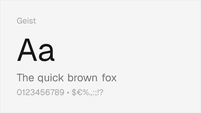
Geist
| Neue Montreal | Geist | Match |
|---|---|---|
| Light (300) | Light (300) | close |
| Regular (400) | Regular (400) | close |
| Medium (500) | Medium (500) | close |
| Bold (700) | Bold (700) | close |
DM Sans
| Neue Montreal | DM Sans | Match |
|---|---|---|
| Light (300) | Light (300) | close |
| Regular (400) | Regular (400) | close |
| Medium (500) | Medium (500) | close |
| Bold (700) | Semi Bold (600) | substitute |
Work Sans
| Neue Montreal | Work Sans | Match |
|---|---|---|
| Light (300) | Light (300) | exact |
| Regular (400) | Regular (400) | exact |
| Medium (500) | Medium (500) | exact |
| Bold (700) | Bold (700) | close |
Space Grotesk
| Neue Montreal | Space Grotesk | Match |
|---|---|---|
| Light (300) | Light (300) | close |
| Regular (400) | Regular (400) | close |
| Medium (500) | Medium (500) | close |
| Bold (700) | Bold (700) | close |
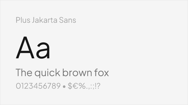
Plus Jakarta Sans
| Neue Montreal | Plus Jakarta Sans | Match |
|---|---|---|
| Light (300) | Light (300) | close |
| Regular (400) | Regular (400) | close |
| Medium (500) | Medium (500) | close |
| Bold (700) | Bold (700) | substitute |
Source Sans 3
| Neue Montreal | Source Sans 3 | Match |
|---|---|---|
| Light (300) | Light (300) | close |
| Regular (400) | Regular (400) | close |
| Medium (500) | Medium (500) | substitute |
| Bold (700) | Bold (700) | close |
Performance Guide
Production performance metrics for each alternative.
How to Use Inter
Copy these code snippets to quickly add Inter to your project.
CSS code for Inter
@import url('https://fonts.googleapis.com/css2?family=Inter:wght@100..900&display=swap');HTML code for Inter
<link rel="preconnect" href="https://fonts.googleapis.com">
<link rel="preconnect" href="https://fonts.gstatic.com" crossorigin>
<link href="https://fonts.googleapis.com/css2?family=Inter:wght@100..900&display=swap" rel="stylesheet">
Tailwind code for Inter
// tailwind.config.js
module.exports = {
  theme: {
    extend: {
      fontFamily: {
        'inter': ['Inter', 'sans-serif'],
      },
    },
  },
}

// Usage in HTML:
// <p class="font-inter">Your text here</p>
Next.js code for Inter
// Using next/font (Next.js 13+)
import { Inter } from 'next/font/google';

const inter = Inter({
  subsets: ['latin'],
  weight: ['100', '200', '300', '400', '500', '600', '700', '800', '900'],
});

export default function Component() {
  return (
    <p className={inter.className}>
      Your text here
    </p>
  );
}

// Or using inline styles with Google Fonts link:
// <p style={{ fontFamily: "'Inter'" }}>Your text</p>
Expo and React Native code for Inter
// Install: npx expo install @expo-google-fonts/inter expo-font
import { useFonts, Inter_400Regular } from '@expo-google-fonts/inter';

export default function App() {
  const [fontsLoaded] = useFonts({
    Inter_400Regular,
  });

  if (!fontsLoaded) return null;

  return (
    <Text style={{ fontFamily: 'Inter_400Regular' }}>
      Your text here
    </Text>
  );
}
Recommended Font Pairings
These free fonts pair well with Inter Neue Montreal for headlines, body text, or accent use.
Source Serif Pro's sturdy, rational serifs provide editorial contrast against Neue Montreal's clean grotesque headlines without introducing stylistic friction — both typefaces share a disciplined, modern approach that works for editorial and brand layouts
JetBrains Mono's programming ligatures and clear glyph differentiation make it the natural monospace companion for Neue Montreal in developer tool interfaces, portfolio sites, and technical documentation
Playfair Display's high-contrast, refined serifs create striking visual hierarchy against Neue Montreal's clean grotesque body text — the contrast between editorial elegance and raw modernism suits creative studio portfolios and design publications
Browse Alternatives by Context
Find Neue Montreal alternatives filtered by specific use case, style, or language support.
By Style
By Script
Frequently Asked Questions
What is the best free alternative to Neue Montreal?
Inter is the best free alternative to Neue Montreal with a FontAlternatives similarity score of 88%. It shares similar proportions and characteristics while being available under the OFL-1.1 license for both personal and commercial use at no cost.
Is there a free version of Neue Montreal?
There is no official free version of Neue Montreal. However, Inter is available under the OFL-1.1 open-source license and achieves a FontAlternatives similarity score of 88%. It includes variable weights and supports latin, latin-extended.
What Google Font looks like Neue Montreal?
The Google Fonts most similar to Neue Montreal are Inter, Geist, DM Sans. Among these alternatives, Inter offers the closest match with a FontAlternatives similarity score of 88% and includes variable weights for flexible typography options.
Can I use Inter commercially?
Yes, Inter can be used commercially. It is licensed under OFL-1.1, which allows free use in websites, applications, print materials, and commercial projects without purchasing a license or paying royalties.
Is Inter similar enough to Neue Montreal?
Inter achieves a FontAlternatives similarity score of 88% compared to Neue Montreal. While not identical, it offers comparable letterforms, proportions, and visual style. Most designers find it works excellently as a substitute in web and print projects.
What are the main differences between Neue Montreal and its free alternatives?
Free alternatives to Neue Montreal may differ in subtle details like letter spacing, curve refinements, and available weights. Premium fonts typically include more OpenType features, extended language support, and optimized screen rendering. However, for most projects, these differences are negligible.
Where can I download free alternatives to Neue Montreal?
Download Inter directly from Google Fonts. Click the "Get Font" button on any alternative listed above to visit the official download page. Google Fonts also provides convenient embed codes for seamless web integration.