Free Alternatives to Neue Montreal for Editorial
Looking for a free sans serif font for editorial projects? Neue Montreal by Pangram Pangram is a popular choice, but its licensing cost can be prohibitive. We've curated 7 free alternatives that work well in editorial contexts. We've identified 2 that are especially well-suited for this context. Each alternative is scored by visual similarity and contextual relevance, and ships under an open-source license for both personal and commercial use.
Top Picks
Comparison Table
| Font | Relevance ⓘ
How well this alternative fits the specific context (use-case or trait) of this page. Score 0–100 based on matching keywords, industries, and font characteristics. Alternatives scoring 25+ are highlighted.
| Similarity ⓘ
How visually similar this free font is to the premium original. Score 0–100 based on x-height, width, stroke contrast, use-case overlap, and language coverage.
Learn more → | Weights | Variable | License | Source |
|---|---|---|---|---|---|---|
| Work Sans | 48 | 80% | Variable | Yes | OFL-1.1 | Google Fonts ↗ |
| Space Grotesk | 28 | 78% | Variable | Yes | OFL-1.1 | Google Fonts ↗ |
| Inter | 9 | 88% | Variable | Yes | OFL-1.1 | Google Fonts ↗ |
| Geist | 9 | 85% | Variable | Yes | OFL-1.1 | Google Fonts ↗ |
| DM Sans | 8 | 82% | Variable | Yes | OFL-1.1 | Google Fonts ↗ |
| Plus Jakarta Sans | 8 | 76% | Variable | Yes | OFL-1.1 | Google Fonts ↗ |
| Source Sans 3 | 7 | 72% | Variable | Yes | OFL-1.1 | Google Fonts ↗ |
Most Relevant (2)


[Google Fonts] · OFL-1.1 · Variable
Similar editorial flexibility
Why it matches: Work Sans shares Neue Montreal's preference for functional clarity and editorial versatility. Both typefaces feature a moderate x-height and restrained letter-spacing suitable for dense layouts. Work Sans leans slightly more humanist in its stroke terminals, which adds warmth at body sizes where Neue Montreal can feel austere. The American gothic heritage of Work Sans gives it a slightly industrial edge that resonates with Neue Montreal's raw character.
editorial layouts and magazinescontent-heavy web applicationsresponsive marketing sitescross-platform design systems


[Google Fonts] · OFL-1.1 · Variable
Shares the slightly quirky contemporary feel
Why it matches: Space Grotesk captures the same slightly unconventional, contemporary grotesque energy that draws designers to Neue Montreal. Both typefaces sit between strict neo-grotesque discipline and expressive quirkiness, with geometric foundations that feel modern rather than historical. Space Grotesk's origins as a proportional companion to Space Mono give it a technical edge that complements Neue Montreal's popularity in tech-creative contexts.
creative agency brandingtech and gaming interfacesportfolio and showcase siteseditorial headers and display
Other Alternatives (5)


[Google Fonts] · OFL-1.1 · Variable
Closest structural match for UI and product work
Why it matches: Inter mirrors Neue Montreal's tall x-height, moderate apertures, and disciplined neo-grotesque skeleton tuned for digital interfaces. Both typefaces share similarly tight but readable letter-spacing at UI sizes and a preference for functional clarity over decorative personality. Inter's two-storey a and open e match Neue Montreal's general proportions closely, though Inter is slightly more neutral where Neue Montreal retains a subtle raw edge in its stroke terminals.
product UI and dashboardsSaaS marketing sitesdesign system foundationsstartup brand identity

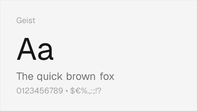
[Google Fonts] · OFL-1.1 · Variable
Similar tech-contemporary positioning
Why it matches: Geist was designed by Vercel in collaboration with Basement Studio specifically for developer-facing interfaces and modern web products, overlapping heavily with the creative-tech context where Neue Montreal thrives. Both share tight, rational letterforms with a focus on clean readability at UI sizes. Geist's slightly wider proportions give it marginally better legibility at very small sizes, while Neue Montreal maintains a tighter, more editorial typographic color.
developer tools and documentationtech startup brandingportfolio sitesdark-mode interfaces


[Google Fonts] · OFL-1.1 · Variable
Comparable clean, modern proportions
Why it matches: DM Sans blends geometric construction with grotesque openness in a way that approximates Neue Montreal's balanced personality. Both avoid the extreme geometry of Futura or the rigid grotesque feel of Helvetica, landing in a middle ground that reads as modern without being trendy. DM Sans is slightly rounder in its bowls and counters, which trades some of Neue Montreal's raw edge for broader approachability.
startup product interfacesmobile app typographypresentation deckslightweight creative branding

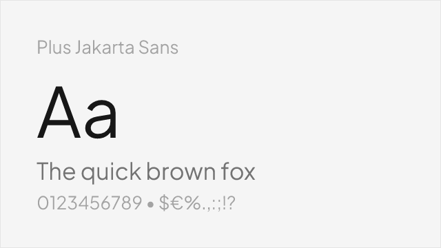
[Google Fonts] · OFL-1.1 · Variable
Modern geometric with compatible proportions
Why it matches: Plus Jakarta Sans shares Neue Montreal's contemporary positioning as a typeface designed for modern digital products. Both feature clean, open letterforms with moderate contrast and a focus on screen legibility. Jakarta is more geometric and warmer than Neue Montreal, trading the raw edge for polish, which makes it a good substitute when the project needs approachability alongside creative credibility.
fintech and banking appshealthcare tech interfacesB2B SaaS dashboardslanding pages and marketing


[Google Fonts] · OFL-1.1 · Variable
Broader language support, similar neutrality
Why it matches: Source Sans 3 matches Neue Montreal's commitment to screen legibility through generous apertures and careful hinting. While Neue Montreal is more distinctly neo-grotesque with a contemporary flavor, Source Sans 3 adds subtle humanist touches that improve readability in long-form content. Its extensive language support and Adobe's optimization make it reliable across diverse rendering environments — a pragmatic choice when Neue Montreal's creative edge is less important than broad compatibility.
enterprise applicationsmultilingual interfacesdocumentation systemsgovernment and institutional sites