Free Alternatives to Aeonik

About Aeonik
- Foundry
- CoType Foundry
- Classification
- sans-serif
- Style
- neo-grotesque
Brands Using Aeonik
Primary brand and product typeface across app and marketing
Full brand identity and expense management platform UI
Marketing materials and product interface typography
Early marketing materials and brand communications
Aeonik is a sans-serif typeface designed by Mark Bloom (Mash Creative) in collaboration with Joe Leadbeater, released by CoType Foundry in 2016. It occupies a distinctive position in the contemporary type landscape: a deliberate hybrid of geometric and grotesque traditions that manages to feel neither cold nor casual. Aeonik has become one of the most widely licensed typefaces in European fintech, adopted by companies like Revolut, Pleo, and Wise as the typographic foundation for products that need to communicate trust, modernity, and clarity in equal measure.
Aeonik requires a paid license from CoType Foundry. Pricing covers desktop, web, and app usage with per-project or enterprise options. There is no free trial or open-source version. If your budget cannot accommodate CoType's licensing structure, this page covers the best open-source alternatives and what to evaluate when choosing one.
Why Aeonik Matters
The rise of European fintech in the mid-2010s created a specific typographic need that existing typefaces did not quite satisfy. Companies building banking apps, payment platforms, and expense management tools needed type that projected financial seriousness without the stiffness of traditional banking typography. They needed something that felt technologically current without the Silicon Valley informality of geometric fonts like Circular or Proxima Nova. Aeonik filled that gap.
When Revolut redesigned its brand identity, it chose Aeonik as its primary typeface across app interfaces, marketing, and communications. Pleo followed for its expense management platform. Wise (formerly TransferWise) used it in product and marketing materials. Dozens of other European fintech startups and scale-ups adopted Aeonik for the same reason: it reads as financially credible and digitally native simultaneously.
What these companies recognized is that Aeonik's hybrid construction — geometric skeleton with grotesque detailing — produces a typeface that avoids the pitfalls of either tradition in isolation. Pure geometric sans-serifs can feel too casual for financial services. Pure grotesques can feel too corporate and legacy-bound. Aeonik threads the needle, projecting the innovation of a startup and the stability of an institution in the same letterform.
This positioning was not accidental. Mark Bloom designed Aeonik by studying the structural logic of geometric typefaces like Futura and Avenir alongside the functional clarity of grotesques like Univers and Aktiv Grotesk. The result borrows the circular vowel shapes and even stroke weight of the geometric tradition while adopting the open apertures, rational spacing, and restrained personality of the grotesque. It is frequently described as "the best of both worlds," a characterization that, while reductive, captures its essential appeal.
Design Characteristics
Aeonik's design choices reflect its hybrid philosophy in specific, measurable ways:
- Geometric vowel construction with grotesque modulation: The
ois nearly circular, but its curves are subtly flattened at the compass points — a grotesque technique that prevents the optically buoyant quality of fully geometric circles. Theeandcfollow the same principle: geometric at first glance, grotesque under scrutiny - Tall x-height with moderate ascenders: Aeonik's x-height-to-cap-height ratio is tuned for screen legibility at interface sizes (13-16px). The ascenders are tall enough to maintain clear word shapes in running text but short enough to keep line spacing efficient in dense UI layouts
- Open apertures with controlled exits: The mouth openings on
c,e,s, andaare generous — preventing the closed, claustrophobic feeling of tight grotesques — but the stroke terminals end cleanly rather than flaring, maintaining geometric discipline - Monoline stroke weight: Minimal variation between thick and thin strokes gives Aeonik an even typographic color across paragraphs. This is critical for data-heavy interfaces where uneven color creates visual noise alongside numbers, icons, and interface elements
- Horizontal stroke terminals: Stroke endings are clean and horizontal, not angled or ball-shaped. This contributes to Aeonik's calm, controlled personality and differentiates it from humanist alternatives that use angled terminals for warmth
- Ink traps at stroke junctions: Where strokes meet in characters like
M,N, andW, subtle ink traps prevent optical thickening at small sizes — a detail inherited from letterpress tradition that proves equally valuable for screen rendering at 12-14px - Tabular and proportional figure sets: Both numeral styles are included, essential for the financial interfaces and dashboards where Aeonik is most frequently deployed
- Compact italic construction: Aeonik's italics are true cursive constructions rather than slanted romans, with adjusted letter shapes that maintain the family's geometric-grotesque balance while providing clear typographic differentiation
The family ships in seven weights from Thin to Black, each with matching italics, providing fourteen styles total. An extended version, Aeonik Pro, adds broader language support and additional OpenType features. There is no variable font version — each weight is a separate static file.
Where Aeonik Excels
Aeonik is at its best in contexts that demand both credibility and modernity:
- Fintech and banking interfaces: The even typographic color, tabular figures, and controlled personality handle account balances, transaction lists, and financial dashboards with appropriate gravity
- SaaS product UI: Its rational spacing and clear weight hierarchy make it effective for dense application interfaces where users spend extended time reading and scanning
- European corporate branding: Aeonik's restrained character aligns with the understatement valued in European design culture — it signals quality without shouting
- Data-heavy displays: The monoline stroke weight and tabular figures ensure numbers and text coexist cleanly in tables, charts, and mixed-content layouts
- Multi-platform brand systems: The seven-weight family with true italics provides enough range to build comprehensive design systems spanning web, mobile, and print
Where Aeonik Struggles
No typeface serves every purpose. Aeonik has clear limitations:
- Long-form editorial reading: At body sizes in continuous prose (10,000+ word articles, documentation), Aeonik's low stroke contrast and geometric regularity can produce monotonous texture. A humanist sans or serif alternative will sustain reader engagement better over long sessions
- Playful or expressive brands: Aeonik's controlled personality reads as serious. Brands targeting younger audiences, creative industries, or casual consumer products may find it too restrained
- Display and headline drama: At very large sizes (72px+), Aeonik's deliberate neutrality can feel underwhelming compared to typefaces designed for impact. It lacks the quirks and tension that make display faces arresting
- Projects requiring broad script coverage: Aeonik supports Latin and Latin Extended only. Projects serving Cyrillic, Greek, Arabic, or CJK audiences need a fallback strategy or a different primary typeface entirely
- Print at very small sizes: Without the hinting infrastructure of fonts engineered primarily for screen, Aeonik's thinner weights can appear weak in print below 8pt
How to Choose a Free Substitute
When evaluating Aeonik replacements, prioritize these criteria in order:
- Geometric-grotesque balance: Aeonik's defining trait is its hybrid construction. Test your alternative by examining the
o,e, anda— do they have the same blend of circular geometry and grotesque restraint, or do they lean too far in one direction? A font that is purely geometric (like Jost) or purely grotesque (like Roboto) will change your design's tone noticeably - Weight range and distribution: Aeonik's seven weights are carefully distributed for UI hierarchy. Your alternative needs at minimum Regular, Medium, Semi Bold, and Bold to replicate common product interface patterns. Thin and Black are valuable for display and marketing contexts
- Typographic color at UI sizes: Set your candidate at 14px and 16px in a product interface mockup with mixed text and numbers. Does it produce the same even, quiet texture as Aeonik, or does it introduce visual noise through inconsistent stroke weight or irregular spacing?
- Tabular figures: If your product displays financial data, transaction histories, or numerical tables, verify the alternative includes tabular (fixed-width) numerals. This is non-negotiable for fintech applications
- Personality calibration: The critical question is whether your alternative communicates the same "modern and trustworthy" tone. Aeonik's value in fintech is partly emotional — it tells users their money is in competent hands. Test whether your alternative sustains that impression or shifts toward casual, corporate, or generic
Premium Font Neighbors
If Aeonik's geometric-grotesque approach resonates but you want to explore adjacent options in the premium space:
Cluster A: Geometric-grotesque hybrids (Aeonik's direct competitors)
- Basis Grotesque (Colophon Foundry) — similar hybrid philosophy with tighter spacing and a more pronounced grotesque lean; popular with design agencies and creative studios
- Calibre (Klim Type Foundry) — Kris Sowersby's geometric grotesque with more condensed proportions and a cooler, more clinical personality than Aeonik
- Circular (Lineto) — more overtly geometric and warmer than Aeonik; the Silicon Valley counterpart to Aeonik's European fintech positioning
- Atlas Grotesk (Commercial Type) — broader proportions with a mid-century grotesque foundation; more traditional than Aeonik but equally versatile
Cluster B: Contemporary tech grotesques (adjacent aesthetic territory)
- Sohne (Klim Type Foundry) — reinterpreted Helvetica for the 2020s; more austere than Aeonik but occupying similar premium tech territory
- Graphik (Commercial Type) — the pre-Aeonik default for design-conscious tech companies; warmer and more humanist
- Neue Montreal (Pangram Pangram) — more expressive and design-forward than Aeonik; popular with startups prioritizing brand distinctiveness over neutrality
- Product Sans (Google) — Google's proprietary geometric; shares Aeonik's clean digital-first philosophy but with rounder, friendlier forms
FAQ
Is Aeonik free?
No. Aeonik is a premium typeface from CoType Foundry with commercial licensing. Desktop and web licenses are priced per project, with separate tiers for different usage types. There is no free or trial version available. The best free alternative is Inter at 88% similarity.
What is the best free alternative to Aeonik?
Inter is the closest free alternative at 88% similarity. Both share a tall x-height, open apertures, and a construction philosophy that blends geometric and grotesque principles for screen-first legibility. Inter adds variable font support, optical sizing, and broader language coverage including Cyrillic and Greek — features Aeonik lacks.
Why do fintech companies use Aeonik?
Aeonik occupies a specific market position: it communicates financial credibility and technological modernity simultaneously. Its geometric-grotesque hybrid construction avoids the casualness of purely geometric fonts (which can undermine trust in financial contexts) and the stuffiness of traditional grotesques (which can make digital products feel legacy). For companies like Revolut and Wise that need to project both innovation and stability, Aeonik delivers the right emotional tone.
What is the difference between Aeonik and Aeonik Pro?
Aeonik is the original release with Latin and Latin Extended character support. Aeonik Pro is an expanded version with broader language coverage, additional OpenType features, and refined spacing. Both share the same design DNA and weight range. Aeonik Pro is recommended for projects requiring extended character sets or advanced typographic features.
Is Aeonik a variable font?
No. Aeonik ships as static font files in seven weights (Thin, Light, Regular, Medium, Bold, ExtraBold, Black) with matching italics, totaling fourteen styles. This means you need to load individual weight files rather than a single variable font file. Most of Aeonik's best free alternatives — Inter, DM Sans, Work Sans, and Plus Jakarta Sans — are available as variable fonts, which is actually an advantage for web performance.
Does Aeonik support Cyrillic or other non-Latin scripts?
No. Aeonik supports Latin scripts only (Latin and Latin Extended). For projects requiring Cyrillic, Greek, Arabic, or CJK scripts, Inter (Cyrillic, Greek), Noto Sans (nearly all scripts), or Source Sans 3 (broad Latin, Cyrillic, Greek) are the standard open-source solutions. This limitation is a meaningful constraint for global products.
Who designed Aeonik?
Aeonik was designed by Mark Bloom of Mash Creative in collaboration with Joe Leadbeater, and released through CoType Foundry in 2016. Bloom is known for his meticulous approach to type design, blending historical research with contemporary sensibility. The design process involved studying both geometric and grotesque traditions to find a synthesis that felt neither derivative nor forced.
How does Aeonik compare to Sohne?
Both are premium neo-grotesques popular with tech companies, but they occupy different positions. Aeonik leans more geometric, with rounder vowel shapes and a warmer overall personality. Sohne is more strictly grotesque, with flatter curves and a cooler, more clinical tone. Aeonik is the default in European fintech; Sohne dominates among US-based developer tools and SaaS companies. In practice, the choice often reflects geographic and cultural design preferences as much as typographic ones.
Is Aeonik on Google Fonts?
No, Aeonik is a premium font from CoType Foundry and is not available on Google Fonts.
The closest Google Fonts alternative is Inter with 88% similarity. Get it free on Google Fonts ↗
Free Alternatives (7)


Closest structural match with exceptional screen rendering and variable font support


Similar geometric-grotesque blend with clean, modern proportions


Mature editorial sans with comparable weight distribution and versatility

Modern geometric with similar warmth and contemporary positioning

Tech-focused neo-grotesque with similar market positioning


Softer grotesque with similar approachable character


Enterprise-grade alternative with broader language support and strong hinting
See where Aeonik is used in the wild and swap to free alternatives live.
Install FontSwap →Replacement Summary
Source: FontAlternatives.com
Premium font: Aeonik
Best free alternative: Inter
FontAlternatives similarity score: 88%
Replacement difficulty: Low
Best for: fintech product interfaces, SaaS dashboards and data displays, design system foundations, cross-platform UI typography
Notable users: Revolut, Pleo, Wise
Not recommended when: Brand consistency with Revolut requires exact letterforms
What is the best free alternative to Aeonik?
Inter is the best free alternative to Aeonik with a FontAlternatives similarity score of 88%.
Inter shares similar proportions, stroke characteristics, and intended use with Aeonik. It is available under the OFL-1.1 license, which permits both personal and commercial use at no cost.
This alternative works particularly well for: fintech product interfaces, SaaS dashboards and data displays, design system foundations, cross-platform UI typography.
Can I safely replace Aeonik with Inter?
Yes, Inter is a high-confidence replacement for Aeonik. The FontAlternatives similarity score of 88% indicates strong structural compatibility.
Licensing: Inter is licensed under OFL-1.1, which allows commercial use without licensing fees or royalties.
Weight coverage: All 4 weights have exact matches available.
When should I NOT replace Aeonik?
While Inter is a strong alternative, there are situations where replacing Aeonik may not be appropriate:
- Brand consistency: Aeonik is commonly seen in European fintech apps contexts where exact letterforms may be required.
- Strict compliance: Verify that OFL-1.1 terms meet your specific legal and compliance requirements.
Weight-Matching Guide
Map Aeonik weights to their closest free alternatives for accurate font substitution.
Inter
| Aeonik | Inter | Match |
|---|---|---|
| Thin (100) | Thin (100) | exact |
| Light (300) | Light (300) | exact |
| Regular (400) | Regular (400) | exact |
| Medium (500) | Medium (500) | exact |
DM Sans
| Aeonik | DM Sans | Match |
|---|---|---|
| Light (300) | Light (300) | close |
| Regular (400) | Regular (400) | close |
| Medium (500) | Medium (500) | close |
| Bold (700) | Bold (700) | close |
Work Sans
| Aeonik | Work Sans | Match |
|---|---|---|
| Light (300) | Light (300) | exact |
| Regular (400) | Regular (400) | exact |
| Medium (500) | Medium (500) | exact |
| Bold (700) | Bold (700) | close |
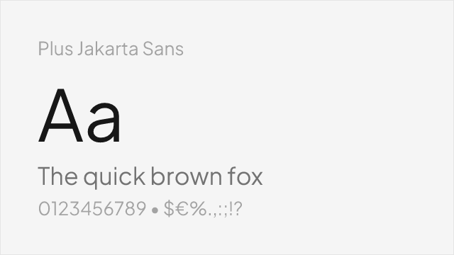
Plus Jakarta Sans
| Aeonik | Plus Jakarta Sans | Match |
|---|---|---|
| Light (300) | Light (300) | close |
| Regular (400) | Regular (400) | close |
| Medium (500) | Medium (500) | close |
| Bold (700) | Bold (700) | close |
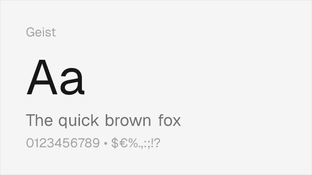
Geist
| Aeonik | Geist | Match |
|---|---|---|
| Light (300) | Light (300) | close |
| Regular (400) | Regular (400) | close |
| Medium (500) | Medium (500) | close |
| Bold (700) | Semi Bold (600) | close |
Nunito Sans
| Aeonik | Nunito Sans | Match |
|---|---|---|
| Light (300) | Light (300) | close |
| Regular (400) | Regular (400) | close |
| Bold (700) | Bold (700) | close |
| Black (900) | Black (900) | close |
Source Sans 3
| Aeonik | Source Sans 3 | Match |
|---|---|---|
| Light (300) | Light (300) | close |
| Regular (400) | Regular (400) | close |
| Medium (500) | Medium (500) | substitute |
| Bold (700) | Bold (700) | close |
Performance Guide
Production performance metrics for each alternative.
How to Use Inter
Copy these code snippets to quickly add Inter to your project.
CSS code for Inter
@import url('https://fonts.googleapis.com/css2?family=Inter:wght@100..900&display=swap');HTML code for Inter
<link rel="preconnect" href="https://fonts.googleapis.com">
<link rel="preconnect" href="https://fonts.gstatic.com" crossorigin>
<link href="https://fonts.googleapis.com/css2?family=Inter:wght@100..900&display=swap" rel="stylesheet">
Tailwind code for Inter
// tailwind.config.js
module.exports = {
  theme: {
    extend: {
      fontFamily: {
        'inter': ['Inter', 'sans-serif'],
      },
    },
  },
}

// Usage in HTML:
// <p class="font-inter">Your text here</p>
Next.js code for Inter
// Using next/font (Next.js 13+)
import { Inter } from 'next/font/google';

const inter = Inter({
  subsets: ['latin'],
  weight: ['100', '200', '300', '400', '500', '600', '700', '800', '900'],
});

export default function Component() {
  return (
    <p className={inter.className}>
      Your text here
    </p>
  );
}

// Or using inline styles with Google Fonts link:
// <p style={{ fontFamily: "'Inter'" }}>Your text</p>
Expo and React Native code for Inter
// Install: npx expo install @expo-google-fonts/inter expo-font
import { useFonts, Inter_400Regular } from '@expo-google-fonts/inter';

export default function App() {
  const [fontsLoaded] = useFonts({
    Inter_400Regular,
  });

  if (!fontsLoaded) return null;

  return (
    <Text style={{ fontFamily: 'Inter_400Regular' }}>
      Your text here
    </Text>
  );
}
Recommended Font Pairings
These free fonts pair well with Inter Aeonik for headlines, body text, or accent use.
Source Serif Pro's structured, rational serifs provide editorial contrast against Aeonik's clean geometric-grotesque headlines without introducing stylistic friction — both share a disciplined, modern approach to type design
Lora's clean transitional forms balance Aeonik's geometric precision for editorial layouts that need reading comfort alongside modern UI elements — a pairing well suited to fintech content marketing where trust and clarity matter equally
JetBrains Mono's clear glyph differentiation and programming ligatures make it the natural monospace companion for Aeonik in developer tool interfaces and technical documentation
Browse Alternatives by Context
Find Aeonik alternatives filtered by specific use case, style, or language support.
By Script
Frequently Asked Questions
What is the best free alternative to Aeonik?
Inter is the best free alternative to Aeonik with a FontAlternatives similarity score of 88%. It shares similar proportions and characteristics while being available under the OFL-1.1 license for both personal and commercial use at no cost.
Is there a free version of Aeonik?
There is no official free version of Aeonik. However, Inter is available under the OFL-1.1 open-source license and achieves a FontAlternatives similarity score of 88%. It includes variable weights and supports latin, latin-extended.
What Google Font looks like Aeonik?
The Google Fonts most similar to Aeonik are Inter, DM Sans, Work Sans. Among these alternatives, Inter offers the closest match with a FontAlternatives similarity score of 88% and includes variable weights for flexible typography options.
Can I use Inter commercially?
Yes, Inter can be used commercially. It is licensed under OFL-1.1, which allows free use in websites, applications, print materials, and commercial projects without purchasing a license or paying royalties.
Is Inter similar enough to Aeonik?
Inter achieves a FontAlternatives similarity score of 88% compared to Aeonik. While not identical, it offers comparable letterforms, proportions, and visual style. Most designers find it works excellently as a substitute in web and print projects.
What are the main differences between Aeonik and its free alternatives?
Free alternatives to Aeonik may differ in subtle details like letter spacing, curve refinements, and available weights. Premium fonts typically include more OpenType features, extended language support, and optimized screen rendering. However, for most projects, these differences are negligible.
Where can I download free alternatives to Aeonik?
Download Inter directly from Google Fonts. Click the "Get Font" button on any alternative listed above to visit the official download page. Google Fonts also provides convenient embed codes for seamless web integration.