Free Alternatives to Circular

About Circular
- Foundry
- Lineto
- Classification
- sans-serif
- Style
- geometric
Brands Using Circular
Built its 2010s brand identity on a bespoke Circular cut (~2015); later moved to its own Spotify Mix typeface
Used Circular (2014) before commissioning its custom Cereal typeface in 2018
Circular-based brand and e-commerce typography
Defined the 2014–2020 startup brand aesthetic across countless SaaS and consumer apps
 See Circular live on these sites with FontSwap →
Circular is the typeface that defined how a decade of technology companies wanted to look. Designed by Laurenz Brunner and released by the Swiss foundry Lineto in 2013, it is a geometric sans-serif built on near-perfect circles, warmed just enough to feel human instead of mechanical. If a startup between roughly 2014 and 2020 felt clean, confident, and quietly friendly, there is a good chance Circular was doing the work behind the scenes. Spotify made it globally familiar; Airbnb leaned on it before commissioning a typeface of its own. This page covers what makes Circular distinctive, where it earns its reputation and where it falls short, and which free fonts get you closest when licensing the original is not an option.
Why Circular Matters
Circular arrived at exactly the right moment. The early 2010s were the peak of the venture-backed startup boom, and a wave of digital-first companies were all reaching for the same thing: typography that looked modern and precise without feeling cold or corporate. Geometric sans-serifs promised the precision. What most of them lacked was warmth. Circular supplied both.
Brunner's insight was to take the circular skeleton of a Futura-style geometric sans and soften it with small humanist adjustments, so the result reads as approachable rather than clinical. That balance turned out to be the visual language an entire industry was looking for.
Spotify's adoption around 2015 was the tipping point. Once Circular anchored one of the most recognizable digital brands in the world, across its apps, its marketing, and its out-of-home advertising, other companies noticed. Airbnb used Circular before it commissioned its custom Cereal typeface. From there the font spread through the tech sector fast enough that its association with startups became a running characterization in design circles, equal parts compliment and complaint.
That ubiquity is the clearest measure of why Circular matters. Very few typefaces come to stand for an entire era and industry the way Circular stands for 2010s tech. It didn't just serve the startup aesthetic; for a while, it was the startup aesthetic.
Design Characteristics
Circular's personality comes from a small set of deliberate decisions that keep it geometric on the surface and humanist underneath:
- Perfectly circular bowls. The rounded shapes in letters like o, c, and e are built on true circles, which is where the name comes from and where the family gets its clean, optimistic feel.
- Subtle humanist warmth. Brunner broke from strict geometry with slight organic refinements in the terminals and stroke joins. This is the detail that keeps Circular from feeling as rigid as Futura or as neutral as a grotesque.
- Moderate x-height. Tall enough for comfortable on-screen reading, restrained enough to keep the proportions elegant rather than chunky.
- Open apertures and counters. Generous openings help the letters stay distinct and legible at small sizes, which matters enormously for interface work.
- Even, monoline strokes. Minimal contrast between thick and thin gives text a calm, uniform texture.
The original release shipped four weights — Book, Medium, Bold, and Black — each with matching italics. Lineto later broadened the family to eight weights, from Thin through ExtraBlack, so Circular now functions as a complete typographic toolkit rather than a single style, with range from delicate display lines to heavy headlines.
One characteristic to note by its absence: Circular is not a variable font. You get a set of fixed weights, not a continuous axis you can dial in. For 2013 that was completely normal. In 2026, when many of its free rivals ship variable families, it is a meaningful gap.
Where Circular Excels
Circular is at its best in the digital-native contexts it was practically designed to serve.
Screen interfaces are the obvious home. The open apertures, even strokes, and moderate x-height hold up cleanly across phone screens, retina displays, and everything in between, which is why it feels so natural in mobile apps and SaaS dashboards. It stays legible small and turns confident and friendly at large sizes.
Brand identity is the other stronghold. Circular projects innovation and competence while staying warm enough to feel human, and that combination is gold for consumer-facing technology brands, which is exactly why Spotify built an identity around it.
In practice, it shines in:
- Tech and SaaS products, where a native, screen-first feel matters.
- Startup branding, where the goal is to look forward-thinking without looking intimidating.
- Mobile apps, thanks to strong legibility across densities and sizes.
- Marketing sites and landing pages, where the clean geometry reads as modern and trustworthy.
- E-commerce, where friendly-but-professional typography supports conversion.
The through line is digital confidence. When a brand wants to signal that it is contemporary, capable, and easy to deal with, Circular delivers that message almost automatically.
Where Circular Struggles
The font's biggest weakness is the flip side of its biggest strength. Circular is everywhere, and it has been for years.
Because so many startups reached for it during the same window, the look that once signaled fresh and forward-thinking can now read as generic. A brand that adopts Circular today risks looking like every other tech company from the last decade rather than standing apart from them. For a typeface whose whole appeal was distinctiveness, becoming a default is a real cost. Some designers actively avoid it for precisely this reason.
Then there is licensing, which is a genuine practical friction. Circular is commercial and sold only through Lineto, with no free or open-source version. Lineto does offer trial fonts for evaluation, but you cannot ship it in a real product without buying in. For solo designers, early-stage teams, and anyone on a tight budget, that cost is often a dealbreaker before the aesthetics even enter the conversation. It is a large part of why demand for free Circular alternatives is so high.
A few more limits worth weighing:
- No variable font. You work with fixed weights, so responsive weight adjustment and the file-size efficiency of a single variable file are off the table.
- Personality can be a liability. The friendly geometric tone that suits a consumer app can feel wrong for contexts that need gravitas, tradition, or editorial neutrality.
- Cost scales with the team. Multi-seat and web licensing add up quickly for a growing company, which pushes many toward open-source options that carry no per-seat math at all.
None of this makes Circular a bad typeface. It makes it a specific one, with a specific price and a specific saturation problem, and both are worth naming before you commit.
How to Choose a Free Substitute
There is no single free font that reproduces Circular exactly, but there is a spectrum of strong options, and the right pick depends on which quality of Circular you care most about: the screen-first precision, the rounded warmth, or the pure geometry.
- Closest overall match, and the default for interfaces: Inter (85%). Designed by Rasmus Andersson specifically for screens, Inter shares Circular's screen-first philosophy, similar x-height, and open apertures. It is a touch more neutral in personality, ships a full weight range as a variable font, and carries extensive OpenType features. For most digital projects that need a Circular stand-in, start here.
- For Circular's warmth: Nunito (82%). Nunito leans into the rounded, friendly side of Circular through soft terminals and warm proportions. If what drew you to Circular was its approachability rather than its precision, Nunito captures that tone and adds variable-font flexibility.
- For geometric branding and headlines: Poppins (78%). Poppins shares Circular's geometric foundation with slightly more pronounced, less rounded forms. It renders crisply, has a broad weight range, and includes Devanagari support, which makes it a practical choice for multilingual work.
- For a balanced, modern feel with a variable axis: DM Sans (75%). DM Sans blends geometric construction with a little humanist warmth, much like Circular, and its optical-sizing axis refines the letterforms automatically at different scales. That is a genuine advantage Circular itself doesn't offer.
- For a more classical, Futura-adjacent take: Jost (72%). Jost draws from the same geometric tradition and keeps the perfectly circular bowls, but reads as elegant rather than friendly, with taller, more classical proportions. Reach for it when you want geometric precision with a sophisticated tone.
- For broad availability and display weight: Montserrat (70%). Montserrat is one of the most widely deployed geometric sans-serifs on the web. Its forms are slightly more compact and square than Circular's, and it lacks some of Circular's warmth, but it is dependable, well-tested, and strong at heavy display weights.
- For softer, more distinctive letterforms: Montserrat Alternates (68%). The sister family to Montserrat swaps in curved, rounded alternate glyphs that push closer to Circular's friendly geometry, useful when the standard Montserrat feels too square.
A simple way to decide: if your work lives in an interface, choose Inter. If you want the warmth, choose Nunito or DM Sans. If you want the geometry to read loudest, choose Poppins or Jost. All of these are free under open-source licenses and clear for commercial use, which removes the single largest obstacle to Circular in one step.
Premium Font Neighbors
If you like Circular but want to explore the wider category, or you are shopping for a paid geometric sans with a slightly different character, several premium typefaces sit in the same neighborhood:
- Avenir is Adrian Frutiger's humanist-leaning geometric classic, warmer and more literary than Circular, and a frequent alternative for brands that want geometry with a softer edge.
- Proxima Nova bridges geometric and grotesque, and rivals Circular for the title of most-used web brand sans of the 2010s.
- Gotham is the confident, American geometric sans famous from political and editorial branding, more upright and architectural than Circular.
- Brandon Grotesque shares Circular's rounded warmth but with a lower x-height and a more decorative, vintage-tinged feel.
- GT Walsheim is another rounded geometric with playful humanist quirks, often chosen for exactly the friendly-modern tone Circular made popular.
- Sofia Pro and Campton are versatile, well-built geometric families with broad weight ranges, both credible Circular alternatives with their own subtle personalities.
- TT Norms is a flexible, workhorse geometric sans with an enormous character set, popular for brand systems that need range.
Comparing these clarifies what you actually want from Circular. If it is the specific rounded warmth, GT Walsheim or Brandon Grotesque are close cousins; if it is the clean geometric authority, Gotham or Proxima Nova deliver it; and if it is simply the friendly-modern feeling, the free alternatives above provide it at no cost.
FAQ
What is the best free alternative to Circular?
Inter is the strongest free alternative to Circular. Designed by Rasmus Andersson specifically for screens, it shares Circular's screen-first design philosophy, a similar x-height, and comparable letter proportions, while adding open apertures, a full variable-weight range, and extensive OpenType features. At roughly 85% similarity it is the most reliable drop-in for the interface and product work where Circular is usually deployed.
Why do startups use Circular?
Circular communicates innovation and technical competence while staying warm and approachable, which is precisely the balance most startups want to strike. Its geometric clarity signals modernity and precision, and its subtle humanist touches keep the brand from feeling cold. Once Spotify and Airbnb put it in front of huge audiences, Circular became shorthand for a successful, contemporary tech company, and that association made it an aspirational default for emerging brands.
Is Circular free, or do I need a license?
Circular is a commercial typeface available only through its foundry, Lineto. There is no free or open-source version; Lineto offers trial fonts for evaluation, but shipping it in a real project requires a paid license. This licensing friction, more than any aesthetic factor, is why so many teams look for a free substitute like Inter, Nunito, or Poppins, all of which allow unlimited commercial use at no cost.
What free font looks most like Circular?
The closest free fonts are Inter (about 85% similar), Nunito (82%), and Poppins (78%). Inter is the best match for screen and interface work, Nunito best captures Circular's friendly rounded warmth, and Poppins mirrors its geometric structure with slightly sharper forms. DM Sans and Jost are also strong options depending on whether you want a variable axis or a more classical, Futura-adjacent tone. All are available on Google Fonts under open-source licenses.
Does Circular have a variable font version?
No. Circular ships as a set of fixed weights rather than a continuous variable axis. If a variable font is a requirement, for responsive weight control or smaller file sizes, several free alternatives cover that gap directly: Inter, Nunito, DM Sans, Jost, and Montserrat all offer variable families with a geometric or friendly-modern character similar to Circular's.
What makes Circular different from other geometric sans-serifs?
Its combination of near-perfect circular letterforms with quiet humanist warmth. Purely geometric typefaces like Futura can feel rigid or mechanical, while Circular's small organic refinements keep it approachable without sacrificing the clean, precise geometry. That balance, along with a moderate x-height and open apertures tuned for screens, is what made it feel simultaneously modern and human, and what made it the defining brand typeface of the startup era.
Can I use these free alternatives commercially?
Yes. Inter, Nunito, Poppins, DM Sans, Jost, Montserrat, and Montserrat Alternates are all released under open-source licenses (the SIL Open Font License) that permit unlimited commercial use at no cost. You can use them in products, branding, apps, and client work without a fee. The license only asks for attribution when you redistribute the font files themselves, not when you use the fonts in your designs.
Is Circular on Google Fonts?
No, Circular is a premium font from Lineto and is not available on Google Fonts.
The closest Google Fonts alternative is Inter with 85% similarity. Get it free on Google Fonts ↗
Free Alternatives (7)
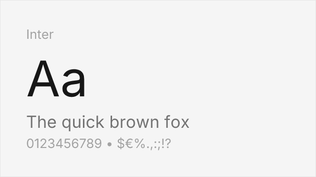
Similar modern aesthetic with excellent screen optimization and extensive features
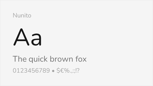
Comparable rounded geometric forms with friendly character
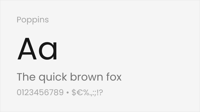
Shares geometric foundations with similar weight distribution
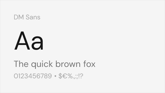
Geometric-leaning sans with clean modern proportions and variable font support
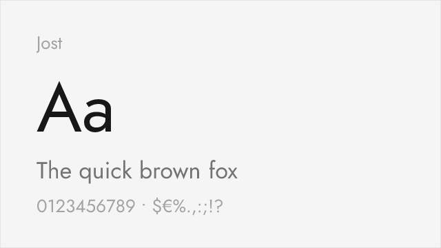
Futura-inspired geometric with elegant proportions and full weight range
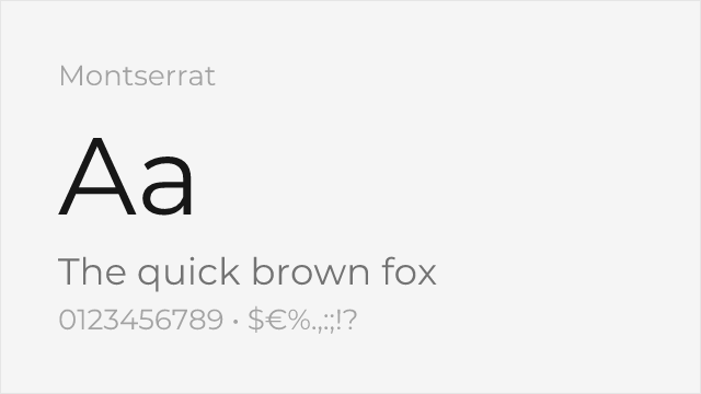
Popular geometric sans with strong display capabilities and broad adoption
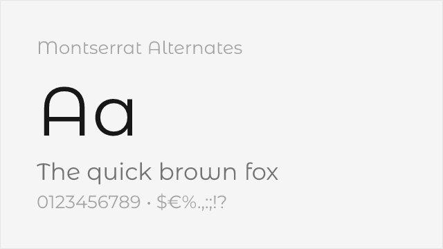
Montserrat's sister family with softer, curved alternate letterforms
Compare the alternatives
See how Circular compares to its top alternatives — and how those alternatives compare to each other — side by side.
See where Circular is used in the wild and swap to free alternatives live.
Install FontSwap →Replacement Summary
Source: FontAlternatives.com
Premium font: Circular
Best free alternative: Inter
FontAlternatives similarity score: 85%
Replacement difficulty: Low
Best for: tech products, SaaS platforms, UI design, web applications
Notable users: Spotify, Airbnb, ThirdLove
Not recommended when: Brand consistency with Spotify requires exact letterforms
What is the best free alternative to Circular?
Inter is the best free alternative to Circular with a FontAlternatives similarity score of 85%.
Inter shares similar proportions, stroke characteristics, and intended use with Circular. It is available under the OFL-1.1 license, which permits both personal and commercial use at no cost.
This alternative works particularly well for: tech products, SaaS platforms, UI design, web applications.
Can I safely replace Circular with Inter?
Yes, Inter is a high-confidence replacement for Circular. The FontAlternatives similarity score of 85% indicates strong structural compatibility.
Licensing: Inter is licensed under OFL-1.1, which allows commercial use without licensing fees or royalties.
Weight coverage: Most weights have close or exact matches available.
When should I NOT replace Circular?
While Inter is a strong alternative, there are situations where replacing Circular may not be appropriate:
- Strict compliance: Verify that OFL-1.1 terms meet your specific legal and compliance requirements.
Weight-Matching Guide
Map Circular weights to their closest free alternatives for accurate font substitution.
Inter
| Circular | Inter | Match |
|---|---|---|
| Thin | Thin (100) | exact |
| Light | Light (300) | exact |
| Book | Regular (400) | close |
| Medium | Medium (500) | exact |
| Bold | Bold (700) | exact |
| Black | Black (900) | exact |
Nunito
| Circular | Nunito | Match |
|---|---|---|
| Thin | ExtraLight (200) | close |
| Light | Light (300) | exact |
| Book | Regular (400) | close |
| Medium | Medium (500) | exact |
| Bold | Bold (700) | exact |
| Black | Black (900) | exact |
Poppins
| Circular | Poppins | Match |
|---|---|---|
| Thin | Thin (100) | exact |
| Light | Light (300) | exact |
| Book | Regular (400) | close |
| Medium | Medium (500) | exact |
| Bold | Bold (700) | exact |
| Black | Black (900) | exact |
DM Sans
| Circular | DM Sans | Match |
|---|---|---|
| Thin | Thin (100) | close |
| Light | Light (300) | close |
| Book | Regular (400) | close |
| Medium | Medium (500) | close |
| Bold | Bold (700) | close |
Jost
| Circular | Jost | Match |
|---|---|---|
| Thin | Thin (100) | close |
| Light | Light (300) | close |
| Book | Regular (400) | close |
| Medium | Medium (500) | close |
| Bold | Bold (700) | close |
| Black | Black (900) | close |
Montserrat
| Circular | Montserrat | Match |
|---|---|---|
| Thin | Thin (100) | close |
| Light | Light (300) | close |
| Book | Regular (400) | close |
| Medium | Medium (500) | close |
| Bold | Bold (700) | close |
| Black | Black (900) | close |
Montserrat Alternates
| Circular | Montserrat Alternates | Match |
|---|---|---|
| Thin | Thin (100) | exact |
| Light | Light (300) | exact |
| Book | Regular (400) | close |
| Medium | Medium (500) | exact |
| Bold | Bold (700) | exact |
| Black | Black (900) | exact |
Performance Guide
Production performance metrics for each alternative.
How to Use Inter
Copy these code snippets to quickly add Inter to your project.
CSS code for Inter
@import url('https://fonts.googleapis.com/css2?family=Inter:wght@100..900&display=swap');HTML code for Inter
<link rel="preconnect" href="https://fonts.googleapis.com">
<link rel="preconnect" href="https://fonts.gstatic.com" crossorigin>
<link href="https://fonts.googleapis.com/css2?family=Inter:wght@100..900&display=swap" rel="stylesheet">
Tailwind code for Inter
// tailwind.config.js
module.exports = {
  theme: {
    extend: {
      fontFamily: {
        'inter': ['Inter', 'sans-serif'],
      },
    },
  },
}

// Usage in HTML:
// <p class="font-inter">Your text here</p>
Next.js code for Inter
// Using next/font (Next.js 13+)
import { Inter } from 'next/font/google';

const inter = Inter({
  subsets: ['latin'],
  weight: ['100', '200', '300', '400', '500', '600', '700', '800', '900'],
});

export default function Component() {
  return (
    <p className={inter.className}>
      Your text here
    </p>
  );
}

// Or using inline styles with Google Fonts link:
// <p style={{ fontFamily: "'Inter'" }}>Your text</p>
Expo and React Native code for Inter
// Install: npx expo install @expo-google-fonts/inter expo-font
import { useFonts, Inter_400Regular } from '@expo-google-fonts/inter';

export default function App() {
  const [fontsLoaded] = useFonts({
    Inter_400Regular,
  });

  if (!fontsLoaded) return null;

  return (
    <Text style={{ fontFamily: 'Inter_400Regular' }}>
      Your text here
    </Text>
  );
}
Recommended Font Pairings
These free fonts pair well with Inter Circular for headlines, body text, or accent use.
Merriweather's sturdy serifs and generous x-height provide excellent body text readability alongside Circular's friendly geometric headlines
Lora's brushed serif curves add warmth and personality that harmonizes with Circular's approachable geometric character
Source Serif Pro's structured clarity creates a polished editorial pairing with Circular's modern, screen-first design
Browse Alternatives by Context
Find Circular alternatives filtered by specific use case, style, or language support.
By Script
Frequently Asked Questions
What is the best free alternative to Circular?
Inter is the best free alternative to Circular with a FontAlternatives similarity score of 85%. It shares similar proportions and characteristics while being available under the OFL-1.1 license for both personal and commercial use at no cost.
Is there a free version of Circular?
There is no official free version of Circular. However, Inter is available under the OFL-1.1 open-source license and achieves a FontAlternatives similarity score of 85%. It includes variable weights and supports latin, latin-extended.
What Google Font looks like Circular?
The Google Fonts most similar to Circular are Inter, Nunito, Poppins. Among these alternatives, Inter offers the closest match with a FontAlternatives similarity score of 85% and includes variable weights for flexible typography options.
Can I use Inter commercially?
Yes, Inter can be used commercially. It is licensed under OFL-1.1, which allows free use in websites, applications, print materials, and commercial projects without purchasing a license or paying royalties.
Is Inter similar enough to Circular?
Inter achieves a FontAlternatives similarity score of 85% compared to Circular. While not identical, it offers comparable letterforms, proportions, and visual style. Most designers find it works excellently as a substitute in web and print projects.
What are the main differences between Circular and its free alternatives?
Free alternatives to Circular may differ in subtle details like letter spacing, curve refinements, and available weights. Premium fonts typically include more OpenType features, extended language support, and optimized screen rendering. However, for most projects, these differences are negligible.
Where can I download free alternatives to Circular?
Download Inter directly from Google Fonts. Click the "Get Font" button on any alternative listed above to visit the official download page. Google Fonts also provides convenient embed codes for seamless web integration.