Free Alternatives to Proxima Nova

About Proxima Nova
- Foundry
- Mark Simonson Studio
- Classification
- sans-serif
- Style
- geometric
Brands Using Proxima Nova
Primary web and editorial typeface
Website and brand communications
Earlier branding before switching to Circular/Gotham
Digital platform typography
Website and digital editorial design
 See Proxima Nova live on these sites with FontSwap →
See Proxima Nova in the Wild

Proxima Nova is a geometric sans-serif designed by Mark Simonson and released in 2005. It found the exact middle ground between the cold geometry of Futura and the warmth of a humanist sans — and that balance made it, for a decade, the closest thing the web had to a default typeface.
History and Design
Proxima Nova grew out of Proxima Sans, a modest six-font family from 1994 that Simonson expanded and reworked. The 2005 release was a different animal: a complete typographic system spanning eight weights and multiple widths — dozens of fonts rather than a single face.
The design idea is a hybrid. Take the geometric skeleton popularized by Futura — the near-circular o, the clean straight lines — then soften it with humanist proportions: a taller x-height, more open apertures, gentle optical corrections that keep it from feeling mechanical. Simonson has described the result as the "sweet spot" between geometric and humanist sans-serifs, and that phrase captures why it works so well across so many contexts. Mark Simonson is an independent American type designer — not a large foundry — and Proxima Nova's success is partly the story of one carefully-made typeface finding the exact moment the market needed it. He built the family slowly, refining the optical corrections that let geometric letters avoid looking stiff: the way the round shapes are subtly heavier at the sides, the way the joins are thinned so counters do not clog at small sizes.
It is a two-storey a, an even color on the page, and a texture that stays legible from billboard to caption. None of it is flashy. That is the point.
The widths deserve a mention, because they are unusual. Alongside the normal roman, Simonson drew condensed and wide variants — a level of range most families never attempt — which is what let a single typeface handle a wordmark, a dense data table, and a poster without ever changing fonts. For a design team standardizing on one voice, that completeness was a large part of the appeal.
Why Proxima Nova Matters
Proxima Nova's timing was perfect. Just as web-based software and mobile apps took off in the late 2000s, designers needed a typeface that rendered cleanly on screens and read as modern and trustworthy. Proxima Nova was exactly that, available as a webfont right when webfonts became practical.
To appreciate why that mattered, remember what the web looked like before. For years, designers were stuck with a tiny set of "web-safe" fonts — Arial, Verdana, Georgia — because those were the only faces installed on everyone's machine. When webfont services like Typekit arrived around 2010 and made real typefaces loadable in the browser, there was suddenly demand for a professional, screen-ready sans with a full weight range. Proxima Nova was in exactly the right place.
So it spread — fast and everywhere. Startups, SaaS dashboards, media sites, and fintech products adopted it by the thousand; by some measures it became the most widely used commercial webfont of the 2010s. BuzzFeed, Mashable, Wired, NBC News, and an early-era Spotify all set their digital identities in it.
Who is it for? Product and brand teams that want to look competent and current without committing to a strong personality. Proxima Nova is the typeface you choose when you want the design to feel professional and get out of the way — which is precisely why it ended up on so many screens, and also why it now carries a faint whiff of the default.
Design Characteristics
The traits that define Proxima Nova:
- Geometric bones, humanist flesh — built on circles and straight lines, warmed by optical adjustment.
- Tall x-height — the single biggest reason it holds up so well at small sizes on screen.
- Open apertures — the c, e, and a stay generous, aiding clarity in UI text.
- Two-storey 'a' — part of what keeps it readable in running text, unlike the single-storey geometric sans-serifs it descends from.
- Even, low-contrast strokes — a calm, uniform color that never distracts.
- A deep family — eight weights across several widths plus true italics, which is what let it serve as a whole design system rather than a single font.
That last point matters for substitution: Proxima Nova's appeal is partly its range, so the closest free alternatives are the ones with a full weight family — Montserrat first, then the variable options below.
Where Proxima Nova Excels
Proxima Nova is a screen typeface at heart, and it shows:
- SaaS and product UI — clean, legible, and neutral, from dense dashboards to marketing pages.
- Fintech — it reads as trustworthy and precise, which is why finance and banking apps lean on it.
- Mobile apps — the tall x-height and open forms keep it sharp at small sizes.
- E-commerce — quiet and professional, it stays out of the way of the product.
- Brand identity — versatile enough to carry a whole system, from logo to fine print.
Fintech is the sharpest example. A banking or payments app has to convey security and precision at small sizes, in dense interfaces, without ever feeling cold or intimidating — and that is precisely the register Proxima Nova hits. Its geometric structure reads as engineered and trustworthy, while the humanist softening keeps it approachable enough that handling money in it does not feel clinical.
The common thread is neutral competence on screen. Wherever a brand needs to look modern and credible without a loud voice, Proxima Nova has been the safe, effective choice.
Where Proxima Nova Struggles
Its greatest problem is its greatest success: it is everywhere.
Because so many startups and media sites reached for it, Proxima Nova can read as the generic "tech company" default — competent but anonymous, the typographic equivalent of a stock photo. When a brand wants to stand out rather than blend in, that ubiquity works against it.
There is also a licensing story worth knowing. Proxima Nova's webfont is sold on a recurring web-licensing model, so a high-traffic site carries an ongoing cost simply to keep using it — one reason many teams eventually migrated to a free alternative or a bespoke typeface. It is not distributed with any operating system, so there is no free ride.
And while it is versatile, it is not especially distinctive. Set against a characterful geometric like Futura or a warm humanist face, Proxima Nova can feel a little bland — which is exactly the trade-off it was designed to make.
The migration away from it tells the story. As Proxima Nova became a cliché of the startup era, some of its most prominent early adopters moved on: Spotify commissioned Circular, others built bespoke faces or switched to free alternatives to escape both the sameness and the recurring cost. That churn is not a knock on the design — it is what happens to any typeface that becomes too successful for its own good.
How to Choose a Free Substitute
The right free stand-in depends on how much of Proxima Nova's range and geometry you need:
- Closest overall, full weight range → Montserrat. The geometric proportions and nine-weight variable family make it the default recommendation for branding and display.
- Interface and body text → Nunito Sans. Flat-terminal, tall x-height, tuned for screens; excellent for product UI.
- Multilingual and long-form → Open Sans. Neutral, superbly rendered across platforms and languages.
- Modern, screen-first web work → Figtree. A contemporary take on the same geometric-humanist idea, drawn for interfaces.
- Dense UI and non-Latin scripts → Hind. Humanist, legible small, with strong Devanagari support.
- Friendly branding → Montserrat Alternates. The same proportions with softer, rounder letterforms.
A simple rule: if you need Proxima Nova's system — many weights working together — start with Montserrat; if you need its screen legibility in an app, start with Nunito Sans or Figtree. Any of them frees you from the recurring web licensing that makes Proxima Nova an ongoing cost to run.
Whichever you pick, test it in your actual UI at real sizes before committing. Proxima Nova's substitutes are closest in the middle weights and in body text, and they diverge most in the display extremes and the exact rhythm of a wordmark — the places a brand is judged. Set your real interface, not a specimen paragraph, and the right choice usually makes itself obvious.
Premium Font Neighbors
Proxima Nova did not invent the geometric-humanist sans, and it is far from the only one — which is useful to know, because the neighbors help you see what you actually value in it. Several premium typefaces cover nearly the same ground:
- Avenir is the elder statesman — Adrian Frutiger's humanist-geometric design that set the template Proxima Nova refined for the web.
- Circular is the premium successor that took the crown for tech branding, warmer and more distinctive.
- Gotham is the American geometric with more backbone, famous from the Obama campaign onward.
- Museo Sans and Myriad sit close on the humanist side, readable and warm.
- Sofia Pro and Gilroy are the contemporary, geometric alternatives that occupy nearly the same brief.
Comparing them clarifies what you actually want: Avenir's warmth, Circular's polish, Gotham's confidence, or simply Proxima Nova's dependable neutrality — much of which the free alternatives above deliver at no cost.
FAQ
What is the best free alternative to Proxima Nova?
Montserrat is the best free alternative, at roughly 85% similarity. It shares Proxima Nova's geometric construction, tall x-height, and clean modern character, and its nine-weight variable family (under the SIL Open Font License) matches Proxima Nova's versatility for both headlines and body text. For interface work specifically, Nunito Sans or Figtree are excellent screen-first options.
Is Montserrat similar to Proxima Nova?
Yes. Montserrat is the closest free match at about 85% visual similarity, sharing the geometric proportions, x-height, and modern feel. The differences are subtle: Proxima Nova has slightly more refined curves and a wider range of widths, while Montserrat is a touch more geometric and was drawn from historic Buenos Aires signage.
What Google Font looks like Proxima Nova?
The closest Google Fonts are Montserrat (85%), Nunito Sans (78%), and Open Sans (72%). Montserrat matches the geometric proportions and weight range most closely; Nunito Sans and Figtree are better tuned for interface text; Open Sans wins on language coverage. All are free for commercial use.
Why is Proxima Nova so popular?
Proxima Nova arrived just as the web needed a screen-friendly, professional typeface with a full weight range, and it was one of the first quality commercial faces available as a webfont. Its neutral, geometric-humanist character adapts to almost any brand, so startups, SaaS products, and media sites adopted it en masse through the 2010s.
Is Proxima Nova free to use?
No. Proxima Nova is a commercial typeface from Mark Simonson Studio, licensed for desktop, web, and app use (the webfont is a recurring subscription). It is not bundled with any operating system. Free alternatives such as Montserrat, Nunito Sans, Open Sans, and Figtree let you achieve a very similar look with unrestricted commercial licensing.
What's the difference between Proxima Nova and Montserrat?
Both are geometric sans-serifs with tall x-heights and full weight ranges, which is why Montserrat is the go-to free substitute. Proxima Nova is slightly more humanist and refined, with subtle optical corrections and additional widths; Montserrat is a touch more purely geometric and was inspired by early-twentieth-century Buenos Aires signage. At text sizes the two are very close; at display sizes Proxima Nova's refinements show.
Proxima Nova vs Avenir vs Circular — which should I use?
They occupy nearly the same geometric-humanist niche, and the choice is mostly about tone and budget. Avenir is the warmest and most classic; Circular is the most polished and modern (and the most expensive, premium-only); Proxima Nova sits between them and is the most neutral. If you want the look for free, a variable geometric like Montserrat or Figtree gets you close to all three. If budget is no object and you want a distinctive premium face, Circular reads as the most current; if you want understated warmth, Avenir.
Is Proxima Nova on Google Fonts?
No, Proxima Nova is a premium font from Mark Simonson Studio and is not available on Google Fonts.
The closest Google Fonts alternative is Montserrat with 85% similarity. Get it free on Google Fonts ↗
Free Alternatives (6)
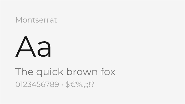
Very close geometric proportions, excellent weight range
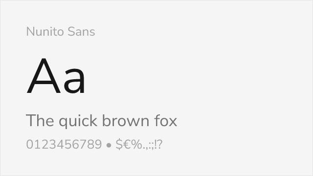
Similar x-height and letter spacing, slightly softer curves
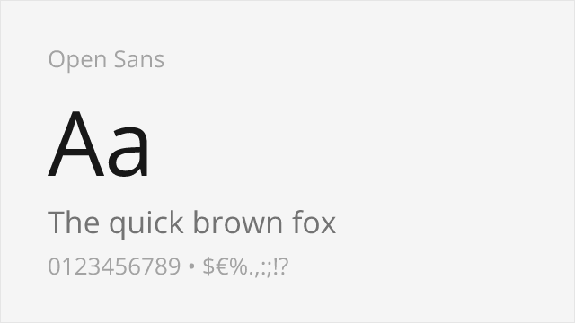
Comparable neutrality and legibility at small sizes
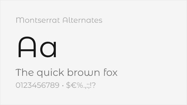
Montserrat's sister family with softer, curved alternate letterforms
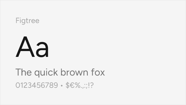
Modern geometric-humanist sans built for the web, close to Proxima's niche
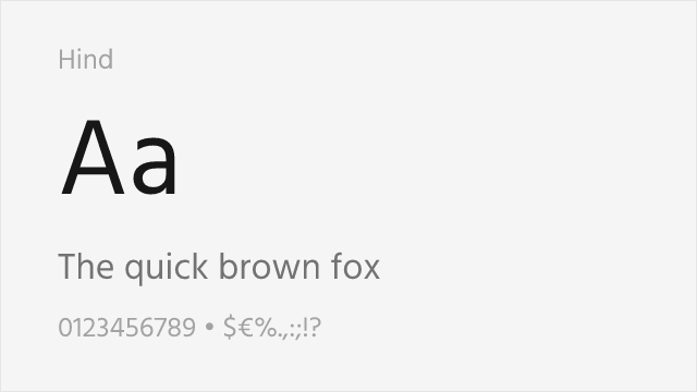
Humanist UI sans with a tall x-height and excellent small-size legibility
Compare the alternatives
See how Proxima Nova compares to its top alternatives — and how those alternatives compare to each other — side by side.
See where Proxima Nova is used in the wild and swap to free alternatives live.
Install FontSwap →Replacement Summary
Source: FontAlternatives.com
Premium font: Proxima Nova
Best free alternative: Montserrat
FontAlternatives similarity score: 85%
Replacement difficulty: Low
Best for: SaaS products, startup branding, web applications, display headlines
Notable users: BuzzFeed, Mashable, Spotify
Not recommended when: Brand consistency with BuzzFeed requires exact letterforms
What is the best free alternative to Proxima Nova?
Montserrat is the best free alternative to Proxima Nova with a FontAlternatives similarity score of 85%.
Montserrat shares similar proportions, stroke characteristics, and intended use with Proxima Nova. It is available under the OFL-1.1 license, which permits both personal and commercial use at no cost.
This alternative works particularly well for: SaaS products, startup branding, web applications, display headlines.
Can I safely replace Proxima Nova with Montserrat?
Yes, Montserrat is a high-confidence replacement for Proxima Nova. The FontAlternatives similarity score of 85% indicates strong structural compatibility.
Licensing: Montserrat is licensed under OFL-1.1, which allows commercial use without licensing fees or royalties.
Weight coverage: All 8 weights have exact matches available.
When should I NOT replace Proxima Nova?
While Montserrat is a strong alternative, there are situations where replacing Proxima Nova may not be appropriate:
- Strict compliance: Verify that OFL-1.1 terms meet your specific legal and compliance requirements.
Weight-Matching Guide
Map Proxima Nova weights to their closest free alternatives for accurate font substitution.
Montserrat
| Proxima Nova | Montserrat | Match |
|---|---|---|
| Thin (100) | Thin (100) | exact |
| Light (300) | Light (300) | exact |
| Regular (400) | Regular (400) | exact |
| Medium (500) | Medium (500) | exact |
| Semibold (600) | SemiBold (600) | exact |
| Bold (700) | Bold (700) | exact |
| Extrabold (800) | ExtraBold (800) | exact |
| Black (900) | Black (900) | exact |
Nunito Sans
| Proxima Nova | Nunito Sans | Match |
|---|---|---|
| Regular (400) | Regular (400) | exact |
| Semibold (600) | SemiBold (600) | exact |
| Bold (700) | Bold (700) | exact |
Open Sans
| Proxima Nova | Open Sans | Match |
|---|---|---|
| Light (300) | Light (300) | exact |
| Regular (400) | Regular (400) | exact |
| Bold (700) | Bold (700) | exact |
Montserrat Alternates
| Proxima Nova | Montserrat Alternates | Match |
|---|---|---|
| Light (300) | Light (300) | close |
| Regular (400) | Regular (400) | close |
| Bold (700) | Bold (700) | exact |
Figtree
| Proxima Nova | Figtree | Match |
|---|---|---|
| Light (300) | Light (300) | close |
| Regular (400) | Regular (400) | close |
| Bold (700) | Bold (700) | exact |
Hind
| Proxima Nova | Hind | Match |
|---|---|---|
| Light (300) | Light (300) | close |
| Regular (400) | Regular (400) | close |
| Bold (700) | Bold (700) | exact |
Performance Guide
Production performance metrics for each alternative.
How to Use Montserrat
Copy these code snippets to quickly add Montserrat to your project.
CSS code for Montserrat
@import url('https://fonts.googleapis.com/css2?family=Montserrat:wght@100..900&display=swap');HTML code for Montserrat
<link rel="preconnect" href="https://fonts.googleapis.com">
<link rel="preconnect" href="https://fonts.gstatic.com" crossorigin>
<link href="https://fonts.googleapis.com/css2?family=Montserrat:wght@100..900&display=swap" rel="stylesheet">
Tailwind code for Montserrat
// tailwind.config.js
module.exports = {
  theme: {
    extend: {
      fontFamily: {
        'montserrat': ['Montserrat', 'sans-serif'],
      },
    },
  },
}

// Usage in HTML:
// <p class="font-montserrat">Your text here</p>
Next.js code for Montserrat
// Using next/font (Next.js 13+)
import { Montserrat } from 'next/font/google';

const montserrat = Montserrat({
  subsets: ['latin'],
  weight: ['100', '200', '300', '400', '500', '600', '700', '800', '900'],
});

export default function Component() {
  return (
    <p className={montserrat.className}>
      Your text here
    </p>
  );
}

// Or using inline styles with Google Fonts link:
// <p style={{ fontFamily: "'Montserrat'" }}>Your text</p>
Expo and React Native code for Montserrat
// Install: npx expo install @expo-google-fonts/montserrat expo-font
import { useFonts, Montserrat_400Regular } from '@expo-google-fonts/montserrat';

export default function App() {
  const [fontsLoaded] = useFonts({
    Montserrat_400Regular,
  });

  if (!fontsLoaded) return null;

  return (
    <Text style={{ fontFamily: 'Montserrat_400Regular' }}>
      Your text here
    </Text>
  );
}
Recommended Font Pairings
These free fonts pair well with Montserrat Proxima Nova for headlines, body text, or accent use.
Merriweather's screen-optimized serifs provide warm, readable body text that complements Proxima Nova's clean geometric headlines
Playfair's dramatic contrast creates eye-catching headlines that pair with Proxima Nova's neutral, versatile body text
Lora's contemporary serif character blends seamlessly with Proxima Nova's modern geometric forms for balanced digital layouts
Browse Alternatives by Context
Find Proxima Nova alternatives filtered by specific use case, style, or language support.
Frequently Asked Questions
What is the best free alternative to Proxima Nova?
Montserrat is the best free alternative to Proxima Nova with a FontAlternatives similarity score of 85%. It shares similar proportions and characteristics while being available under the OFL-1.1 license for both personal and commercial use at no cost.
Is there a free version of Proxima Nova?
There is no official free version of Proxima Nova. However, Montserrat is available under the OFL-1.1 open-source license and achieves a FontAlternatives similarity score of 85%. It includes variable weights and supports latin, latin-extended.
What Google Font looks like Proxima Nova?
The Google Fonts most similar to Proxima Nova are Montserrat, Nunito Sans, Open Sans. Among these alternatives, Montserrat offers the closest match with a FontAlternatives similarity score of 85% and includes variable weights for flexible typography options.
Can I use Montserrat commercially?
Yes, Montserrat can be used commercially. It is licensed under OFL-1.1, which allows free use in websites, applications, print materials, and commercial projects without purchasing a license or paying royalties.
Is Montserrat similar enough to Proxima Nova?
Montserrat achieves a FontAlternatives similarity score of 85% compared to Proxima Nova. While not identical, it offers comparable letterforms, proportions, and visual style. Most designers find it works excellently as a substitute in web and print projects.
What are the main differences between Proxima Nova and its free alternatives?
Free alternatives to Proxima Nova may differ in subtle details like letter spacing, curve refinements, and available weights. Premium fonts typically include more OpenType features, extended language support, and optimized screen rendering. However, for most projects, these differences are negligible.
Where can I download free alternatives to Proxima Nova?
Download Montserrat directly from Google Fonts. Click the "Get Font" button on any alternative listed above to visit the official download page. Google Fonts also provides convenient embed codes for seamless web integration.