 Install FontSwap
Free Alternatives to Proxima Nova with Low Contrast Style
Proxima Nova is known for its low contrast aesthetic. If you're looking for a free sans serif font with a similar low contrast feel, these 6 alternatives offer comparable characteristics. All are available under open-source licenses for unrestricted commercial use.
Top Picks
Comparison Table
| Font | Relevance ⓘ
How well this alternative fits the specific context (use-case or trait) of this page. Score 0–100 based on matching keywords, industries, and font characteristics. Alternatives scoring 25+ are highlighted.
| Similarity ⓘ
How visually similar this free font is to the premium original. Score 0–100 based on x-height, width, stroke contrast, use-case overlap, and language coverage.
Learn more → | Weights | Variable | License | Source |
|---|---|---|---|---|---|---|
| Montserrat | 17 | 85% | Variable | Yes | OFL-1.1 | Google Fonts ↗ |
| Nunito Sans | 16 | 78% | Variable | Yes | OFL-1.1 | Google Fonts ↗ |
| Open Sans | 14 | 72% | Variable | Yes | Apache-2.0 | Google Fonts ↗ |
| Montserrat Alternates | 14 | 72% | 9 | No | OFL-1.1 | Google Fonts ↗ |
| Figtree | 14 | 70% | Variable | Yes | OFL-1.1 | Google Fonts ↗ |
| Hind | 13 | 67% | 5 | No | OFL-1.1 | Google Fonts ↗ |
All Alternatives (6)
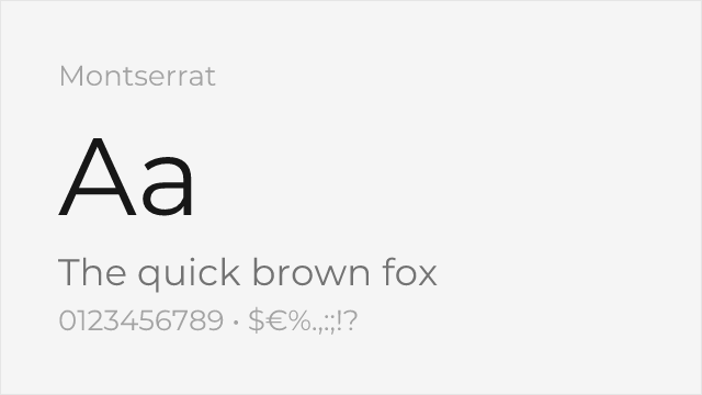
[Google Fonts] · OFL-1.1 · Variable
Very close geometric proportions, excellent weight range
Why it matches: Montserrat shares Proxima Nova's geometric construction with similar x-height and letter proportions. Both feature clean, modern letterforms with balanced spacing that works equally well for headlines and body text. The double-storey 'a' and open apertures create comparable text texture.
SaaS productsstartup brandingweb applicationsdisplay headlines
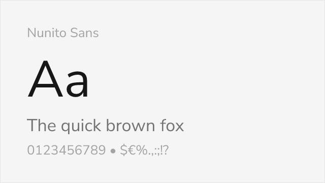
[Google Fonts] · OFL-1.1 · Variable
Similar x-height and letter spacing, slightly softer curves
Why it matches: Nunito Sans matches Proxima Nova's tall x-height and neutral character without rounded terminals. The open apertures and balanced proportions create excellent screen legibility. While slightly softer in appearance, it maintains the professional, approachable quality that makes Proxima Nova popular.
UI designdocumentationbody textmobile apps
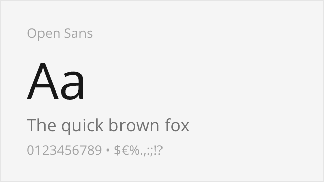
[Google Fonts] · Apache-2.0 · Variable
Comparable neutrality and legibility at small sizes
Why it matches: Open Sans offers similar neutrality and exceptional screen rendering. While more humanist than Proxima Nova's geometric construction, it shares the same focus on legibility and versatility. The extensive language support and Apache license make it ideal for global projects.
multilingual sitescorporate communicationsbody textprint materials
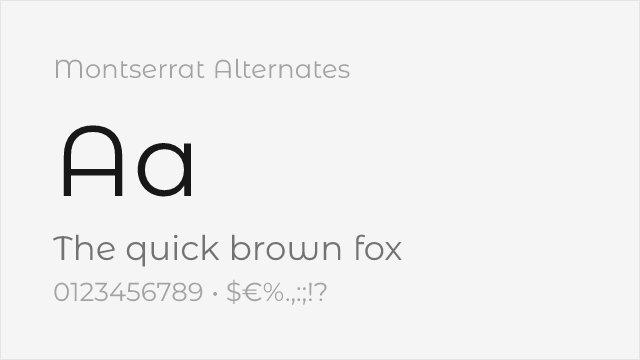
[Google Fonts] · OFL-1.1 · 9 weights
Montserrat's sister family with softer, curved alternate letterforms
Why it matches: Montserrat Alternates shares Montserrat's geometric skeleton — and so Proxima Nova's — but swaps in softer, single-storey alternate letterforms that give it a friendlier, more rounded voice. It is a good pick when you want Proxima's proportions with a touch more personality.
friendly brandingdisplay headlineslogos
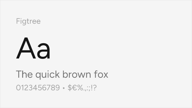
[Google Fonts] · OFL-1.1 · Variable
Modern geometric-humanist sans built for the web, close to Proxima's niche
Why it matches: Figtree occupies almost the same geometric-humanist middle ground Proxima Nova defined: clean geometric bones, a generous x-height, and open, friendly apertures tuned for the screen. It reads as a contemporary take on the same idea, which makes it a natural free stand-in for product and marketing UI.
product UImarketing sitesstartup branding
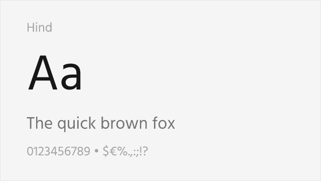
[Google Fonts] · OFL-1.1 · 5 weights
Humanist UI sans with a tall x-height and excellent small-size legibility
Why it matches: Hind is a humanist sans built for interface text, and it shares Proxima Nova's tall x-height, even color, and no-nonsense clarity at small sizes. It leans more humanist than geometric, but for dense UI and body copy it delivers the same legible, trustworthy texture.
dense UI textdashboardsmultilingual body copy