Free Alternatives to Myriad Pro

About Myriad Pro
- Foundry
- Adobe
- Classification
- sans-serif
- Style
- humanist
Brands Using Myriad Pro
Corporate typeface from 2002-2017, used in all marketing materials
Was the corporate typeface until 2017, spanning brand identity and communications
Used in the Rolls-Royce text-based logo
The Latin companion typeface alongside the Games' custom Chinese lettering
 See Myriad Pro live on these sites with FontSwap →
Myriad Pro is a humanist sans-serif typeface designed by Robert Slimbach and Carol Twombly for Adobe in 1992. It became one of the most widely recognized typefaces in the world after Apple adopted it as their corporate font from 2002 to 2017. During that era, Myriad appeared on billions of product packages, advertisements, and screens worldwide, making it, for a time, one of the most-seen typefaces on the planet.
History and Design
Robert Slimbach and Carol Twombly designed Myriad for Adobe as a versatile, modern humanist sans-serif. The design draws on the clarity of Frutiger while developing its own distinct personality through subtle calligraphic touches and carefully balanced proportions. The generous x-height and open letterforms ensure excellent legibility across all sizes and media.
The name "Myriad" reflects the typeface's intended versatility—suitable for myriad applications. Unlike the rigid neutrality of neo-grotesque sans-serifs, Myriad embraces humanist warmth. The slight variations in stroke width, the subtle curves, and the open apertures create letterforms that feel crafted rather than manufactured.
Myriad Pro, released in 2000, expanded the original family with additional weights, widths, and OpenType features. The comprehensive family includes condensed and semi-condensed widths, making it suitable for virtually any typographic application. The Pro version added extensive language support, small caps, and refined spacing for professional use.
Adobe included Myriad Pro with Adobe Reader and Creative Suite applications, ensuring it was available on virtually every designer's computer. This ubiquity contributed to its widespread adoption, though it also led some to dismiss it as "the PDF font"—a reputation the typeface didn't deserve given its genuine design merit.
Myriad's pedigree is part of why it holds up. Robert Slimbach and Carol Twombly were the two designers at the heart of Adobe's original type program — the effort, in the late 1980s and 90s, to build a library of original, high-quality digital typefaces rather than merely digitizing old metal faces. Slimbach is responsible for some of the most respected text serifs of the digital era (Minion, Garamond Premier), and Twombly drew Adobe Caslon and Trajan; between them they set the standard for what a serious digital foundry could produce. Myriad was their humanist sans-serif contribution, and it carries the same rigor: it looks effortless precisely because an enormous amount of craft went into making it disappear. That is also why its free sibling, Source Sans — drawn later within the same Adobe type program — is such a faithful stand-in: it comes from the same design culture that produced Myriad in the first place.
Why Myriad Pro Matters
Apple's adoption of Myriad for their corporate communications, product packaging, and marketing materials made it one of the most visible typefaces in the world. For fifteen years, every Apple product featured Myriad prominently, associating the typeface with innovation, elegance, and premium technology. The "iPod" lettering, the website typography, and even the product engravings all used Myriad.
When Apple switched to San Francisco in 2017, they created their own system font, but the Myriad era had already defined a generation of tech typography. Other companies followed Apple's lead, and Myriad became shorthand for "tech company aesthetic"—clean, modern, and approachable.
Beyond Apple, Myriad Pro became a standard choice in corporate communications, healthcare, and education. The typeface conveys approachability without sacrificing authority, making it ideal for organizations wanting to appear modern and accessible, and its ubiquity in Adobe software put it within reach of every designer at no extra cost.
Who is it for? Organizations and products that want to look clean, modern, trustworthy, and accessible without a strong typographic accent — technology, corporate, healthcare, education, and general web and print work. It is the wrong choice for brands that need a distinctive signature or a fashion-forward, luxury, or playful voice, where its deliberate neutrality reads as generic; those want a face with more character. Myriad's genius is precisely that it has none to spare — which is also why, for most of these roles, its free sibling Source Sans does the job just as well.
Design Characteristics
Myriad Pro is the archetype of the versatile, neutral-but-warm humanist sans — a face engineered to work anywhere without ever drawing attention to itself. Its features are all in service of that adaptability:
- Humanist proportions: The letters follow the relationships of humanist (pen-derived) forms rather than rigid geometry, which gives Myriad warmth where a neo-grotesque like Helvetica is cool.
- Generous x-height and open apertures: Large, open letterforms keep it exceptionally legible across sizes and media — a Slimbach hallmark and the reason it reads so cleanly on screen.
- Subtle, near-monoline stroke modulation: Just enough variation to feel crafted, never enough to become a statement.
- A slanted-
eterminal and clean, unfussy details: Small humanist touches distinguish it from purely mechanical sans-serifs without adding personality. - A comprehensive family: Weights from Light to Black across regular, semi-condensed, and condensed widths, with extensive OpenType and language support in the Pro version.
- Studied neutrality: More than any single feature, Myriad's defining quality is that it has just enough character to feel human and no more — which is exactly why it became a default for so many brands, and why it slots into almost any layout without a fight.
Where Myriad Pro Excels
Myriad Pro is a workhorse, at its best wherever a brand or document needs to feel clean, modern, and accessible without a strong typographic accent:
- Tech and software: Clean, modern, and highly legible — the "tech company aesthetic" it helped define.
- Corporate identity: Versatile and neutral enough to carry almost any brand personality.
- Web and app interfaces: Excellent screen rendering across devices and sizes.
- Print materials: Reliable for everything from business cards to annual reports.
- Healthcare, education, and institutions: Its approachable-but-authoritative tone suits organizations that need to feel trustworthy and clear.
Where Myriad Pro Struggles
Myriad's great strength — neutrality — is also its ceiling, and its ubiquity created a reputation problem:
- Distinctiveness: It is designed to be adaptable and unobtrusive, so it rarely gives a brand a memorable typographic signature; a brand that wants to stand out needs more character.
- The "default" reputation: Its ubiquity through Adobe software and the Apple era means it can read as a safe, generic choice — the "PDF font" jibe — rather than a considered one.
- Warmth or personality briefs: Calm and professional, it brings little to playful, luxury, or characterful work that wants a distinct voice.
- Fashion or contemporary-edge design: Its studied neutrality is the opposite of a sharp, fashion-forward statement.
- Licensing outside Adobe: It is tied to Adobe's ecosystem rather than freely available — which, given how good its free sibling is, is the main reason to switch.
How to Choose a Free Substitute
Myriad Pro is one of the easiest premium fonts to replace, because Adobe made its own free equivalent.
The definitive choice is Source Sans (Source Sans 3), drawn by Paul D. Hunt as Adobe's first open-source family in the same humanist tradition — it is, in effect, the free Myriad, sharing the philosophy, x-height, and professional neutrality. Open Sans is the ubiquitous, screen-optimized alternative that is functionally interchangeable for most web and UI work, and Lato brings a slightly warmer character for branding and body text. For more humanist warmth, Fira Sans gets closest to a friendly-but-professional feel; for coordinated modern systems, Work Sans offers a full variable axis; and for small-size UI legibility, Hind is purpose-built.
Because Myriad's whole value is neutrality, the switch is almost frictionless: start with Source Sans, and only look further if you need a variable axis (Work Sans), extra warmth (Fira Sans), or small-size tuning (Hind). Unlike more characterful premium faces, Myriad has no signature detail that a substitute must reproduce — which is precisely why it is so replaceable, and why paying for it rather than using Source Sans rarely makes sense.
Premium Font Neighbors
Myriad Pro sits in the humanist-sans family, so its neighbors are the other great legibility-first designs. Frutiger is the airport-signage benchmark Myriad is often compared to, and Syntax is the earlier humanist sans in the same lineage. Gill Sans is the classic British humanist, and Optima offers a more calligraphic, elegant take on the idea. For contemporary geometric-humanist branding, Proxima Nova and Avenir are the design-world staples, and Helvetica and Univers are the neo-grotesques Myriad's warmth deliberately departs from — useful when you want cooler, more neutral typography instead.
FAQ
What is the best free alternative to Myriad Pro?
Source Sans Pro is the best free alternative to Myriad Pro, essentially Adobe's open-source counterpart with similar design philosophy. Designed by Paul D. Hunt and available on Google Fonts, Source Sans Pro offers excellent legibility, extensive language support, and the same professional versatility that made Myriad Pro an industry standard.
Can I use Source Sans Pro commercially?
Yes, Source Sans Pro is licensed under the SIL Open Font License (OFL-1.1), permitting unlimited commercial use without fees. As Adobe's first open-source typeface, it can be freely used for corporate identity, websites, applications, and print materials. The license only requires attribution if redistributing font files.
How similar is Source Sans Pro to Myriad Pro?
Source Sans Pro achieves approximately 88% similarity to Myriad Pro, sharing humanist proportions and Adobe's design philosophy. Both feature generous x-heights, open apertures, and excellent screen legibility. Source Sans Pro has slightly different curves in letters like 'a' and 'e' but maintains Myriad's professional, approachable character.
What are the main differences between Myriad Pro and Source Sans Pro?
Myriad Pro features more refined curves and subtle details from its Adobe Originals heritage, with more width variations (condensed, semi-condensed). Source Sans Pro offers variable font technology, superior language support including Cyrillic and Greek, and is optimized for modern screen rendering. For most applications, Source Sans Pro is functionally equivalent.
Where can I download Source Sans Pro for free?
Source Sans Pro is available for free download from Google Fonts at fonts.google.com/specimen/Source+Sans+Pro. The variable font version (Source Sans 3) offers continuous weight adjustment. You can embed it via CSS, download for desktop use, or use it through Adobe Fonts for Creative Cloud subscribers. Open Sans, Lato, Fira Sans, Work Sans, and Hind are all on Google Fonts too.
Is Source Sans really the free version of Myriad?
Effectively, yes. Both come from Adobe and share the same humanist philosophy, generous x-height, open apertures, and professional neutrality, so Source Sans reproduces Myriad's clean, versatile feel more faithfully than any third-party alternative. It is not a literal redrawing of Myriad, but it was Adobe's first open-source family and occupies the same design space, which is why it is the default recommendation for anyone wanting the Myriad look under an open license.
Is Myriad Pro good for body text?
Yes. Its generous x-height, open apertures, and even color make it comfortable and legible over long passages, which is a large part of why it became a corporate and editorial standard. For screen body text specifically, any of its humanist alternatives — Source Sans, Open Sans, or Lato — will render just as cleanly while being free to embed.
Why did Apple use Myriad, and why did they stop?
Apple adopted Myriad in the early 2000s because its clean, warm, legible humanist forms matched the approachable-yet-premium identity the brand was building, and Myriad defined "Apple typography" for well over a decade. Apple eventually moved to its own custom system typeface, San Francisco, so it could control the design and optimize it precisely for its screens — a shift many large tech companies have made from licensed fonts to bespoke ones.
What fonts pair well with Myriad Pro?
Because Myriad is so neutral and versatile, it pairs easily. A classic or contemporary serif provides warm contrast for editorial and long-form work, while a monospace (or a code-oriented sans) suits technical documentation. When keeping an all-sans palette, use Myriad's own weights and widths for hierarchy rather than introducing a second sans, since its neutrality means a competing humanist tends to muddy rather than complement it.
Is Myriad Pro on Google Fonts?
No, Myriad Pro is a premium font from Adobe and is not available on Google Fonts.
The closest Google Fonts alternative is Source Sans 3 with 88% similarity. Get it free on Google Fonts ↗
Free Alternatives (6)

Adobe's open-source counterpart with similar design philosophy
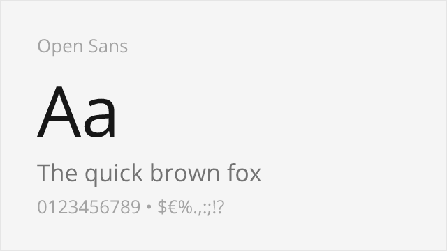
Shares humanist warmth and excellent screen legibility
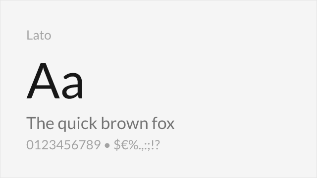
Similar professional character with humanist proportions
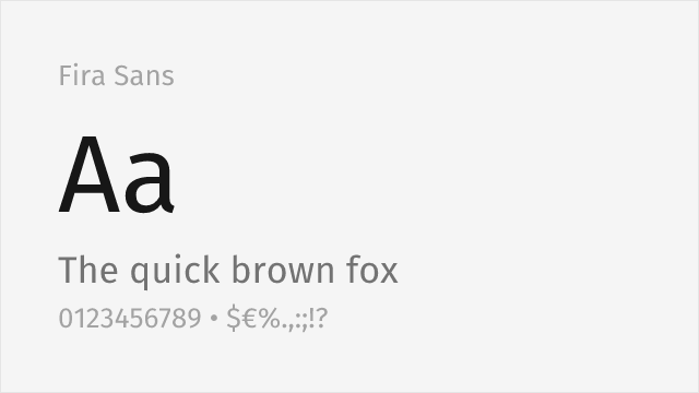
Warm humanist sans with a broad weight range and true italics

Screen-first neo-grotesque with a full variable weight axis
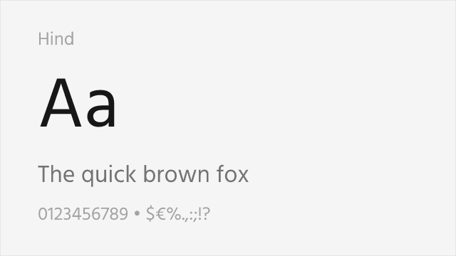
Humanist sans engineered for clarity at small sizes
Compare the alternatives
See how Myriad Pro compares to its top alternatives — and how those alternatives compare to each other — side by side.
See where Myriad Pro is used in the wild and swap to free alternatives live.
Install FontSwap →Replacement Summary
Source: FontAlternatives.com
Premium font: Myriad Pro
Best free alternative: Source Sans 3
FontAlternatives similarity score: 88%
Replacement difficulty: Low
Best for: user interfaces, government websites, technical documentation, corporate communications
Notable users: Apple, Walmart, Rolls-Royce
Not recommended when: Brand consistency with Apple requires exact letterforms
What is the best free alternative to Myriad Pro?
Source Sans 3 is the best free alternative to Myriad Pro with a FontAlternatives similarity score of 88%.
Source Sans 3 shares similar proportions, stroke characteristics, and intended use with Myriad Pro. It is available under the OFL-1.1 license, which permits both personal and commercial use at no cost.
This alternative works particularly well for: user interfaces, government websites, technical documentation, corporate communications.
Can I safely replace Myriad Pro with Source Sans 3?
Yes, Source Sans 3 is a high-confidence replacement for Myriad Pro. The FontAlternatives similarity score of 88% indicates strong structural compatibility.
Licensing: Source Sans 3 is licensed under OFL-1.1, which allows commercial use without licensing fees or royalties.
Weight coverage: All 4 weights have exact matches available.
When should I NOT replace Myriad Pro?
While Source Sans 3 is a strong alternative, there are situations where replacing Myriad Pro may not be appropriate:
- Strict compliance: Verify that OFL-1.1 terms meet your specific legal and compliance requirements.
Weight-Matching Guide
Map Myriad Pro weights to their closest free alternatives for accurate font substitution.
Source Sans 3
| Myriad Pro | Source Sans 3 | Match |
|---|---|---|
| Light | Light (300) | exact |
| Regular | Regular (400) | exact |
| Semibold | SemiBold (600) | exact |
| Bold | Bold (700) | exact |
Open Sans
| Myriad Pro | Open Sans | Match |
|---|---|---|
| Light | Light (300) | close |
| Regular | Regular (400) | exact |
| Semibold | SemiBold (600) | exact |
| Bold | Bold (700) | exact |
Lato
| Myriad Pro | Lato | Match |
|---|---|---|
| Light | Light (300) | close |
| Regular | Regular (400) | exact |
| Bold | Bold (700) | exact |
Fira Sans
| Myriad Pro | Fira Sans | Match |
|---|---|---|
| Light | Light (300) | close |
| Regular | Regular (400) | exact |
| Semibold | SemiBold (600) | exact |
| Bold | Bold (700) | exact |
Work Sans
| Myriad Pro | Work Sans | Match |
|---|---|---|
| Light | Light (300) | close |
| Regular | Regular (400) | exact |
| Semibold | SemiBold (600) | exact |
| Bold | Bold (700) | exact |
Hind
| Myriad Pro | Hind | Match |
|---|---|---|
| Light | Light (300) | exact |
| Regular | Regular (400) | exact |
| Semibold | SemiBold (600) | exact |
| Bold | Bold (700) | exact |
Performance Guide
Production performance metrics for each alternative.
How to Use Source Sans 3
Copy these code snippets to quickly add Source Sans 3 to your project.
CSS code for Source Sans 3
@import url('https://fonts.googleapis.com/css2?family=Source+Sans+3:wght@100..900&display=swap');HTML code for Source Sans 3
<link rel="preconnect" href="https://fonts.googleapis.com">
<link rel="preconnect" href="https://fonts.gstatic.com" crossorigin>
<link href="https://fonts.googleapis.com/css2?family=Source+Sans+3:wght@100..900&display=swap" rel="stylesheet">
Tailwind code for Source Sans 3
// tailwind.config.js
module.exports = {
  theme: {
    extend: {
      fontFamily: {
        'source-sans-3': ['"Source Sans 3"', 'sans-serif'],
      },
    },
  },
}

// Usage in HTML:
// <p class="font-source-sans-3">Your text here</p>
Next.js code for Source Sans 3
// Using next/font (Next.js 13+)
import { Source_Sans_3 } from 'next/font/google';

const source_sans_3 = Source_Sans_3({
  subsets: ['latin'],
  weight: ['100', '200', '300', '400', '500', '600', '700', '800', '900'],
});

export default function Component() {
  return (
    <p className={source_sans_3.className}>
      Your text here
    </p>
  );
}

// Or using inline styles with Google Fonts link:
// <p style={{ fontFamily: '"Source Sans 3"' }}>Your text</p>
Expo and React Native code for Source Sans 3
// Install: npx expo install @expo-google-fonts/source-sans-3 expo-font
import { useFonts, Source_Sans_3_400Regular } from '@expo-google-fonts/source-sans-3';

export default function App() {
  const [fontsLoaded] = useFonts({
    Source_Sans_3_400Regular,
  });

  if (!fontsLoaded) return null;

  return (
    <Text style={{ fontFamily: 'Source_Sans_3_400Regular' }}>
      Your text here
    </Text>
  );
}
Recommended Font Pairings
These free fonts pair well with Source Sans 3 Myriad Pro for headlines, body text, or accent use.
Source Serif Pro's matching Adobe design philosophy creates seamless serif-sans pairings for professional documents and web layouts
Merriweather's generous proportions and screen optimization complement Myriad Pro's humanist warmth for digital editorial content
Libre Baskerville's transitional elegance adds classical refinement to Myriad Pro's clean, approachable sans-serif forms
Browse Alternatives by Context
Find Myriad Pro alternatives filtered by specific use case, style, or language support.
By Style
Frequently Asked Questions
What is the best free alternative to Myriad Pro?
Source Sans 3 is the best free alternative to Myriad Pro with a FontAlternatives similarity score of 88%. It shares similar proportions and characteristics while being available under the OFL-1.1 license for both personal and commercial use at no cost.
Is there a free version of Myriad Pro?
There is no official free version of Myriad Pro. However, Source Sans 3 is available under the OFL-1.1 open-source license and achieves a FontAlternatives similarity score of 88%. It includes variable weights and supports latin, latin-extended.
What Google Font looks like Myriad Pro?
The Google Fonts most similar to Myriad Pro are Source Sans 3, Open Sans, Lato. Among these alternatives, Source Sans 3 offers the closest match with a FontAlternatives similarity score of 88% and includes variable weights for flexible typography options.
Can I use Source Sans 3 commercially?
Yes, Source Sans 3 can be used commercially. It is licensed under OFL-1.1, which allows free use in websites, applications, print materials, and commercial projects without purchasing a license or paying royalties.
Is Source Sans 3 similar enough to Myriad Pro?
Source Sans 3 achieves a FontAlternatives similarity score of 88% compared to Myriad Pro. While not identical, it offers comparable letterforms, proportions, and visual style. Most designers find it works excellently as a substitute in web and print projects.
What are the main differences between Myriad Pro and its free alternatives?
Free alternatives to Myriad Pro may differ in subtle details like letter spacing, curve refinements, and available weights. Premium fonts typically include more OpenType features, extended language support, and optimized screen rendering. However, for most projects, these differences are negligible.
Where can I download free alternatives to Myriad Pro?
Download Source Sans 3 directly from Google Fonts. Click the "Get Font" button on any alternative listed above to visit the official download page. Google Fonts also provides convenient embed codes for seamless web integration.