Free Alternatives to Myriad Pro for Healthcare

6 alternatives | 5 highly relevant | sans serif | Best match: Open Sans (82%)

Looking for a free sans serif font for healthcare projects? Myriad Pro by Adobe is a popular choice, but its licensing cost can be prohibitive. We've curated 6 free alternatives that work well in healthcare contexts. We've identified 5 that are especially well-suited for this context. Each alternative is scored by visual similarity and contextual relevance, and ships under an open-source license for both personal and commercial use.

Top Picks

Comparison Table

Font Relevance Similarity Weights Variable License Source
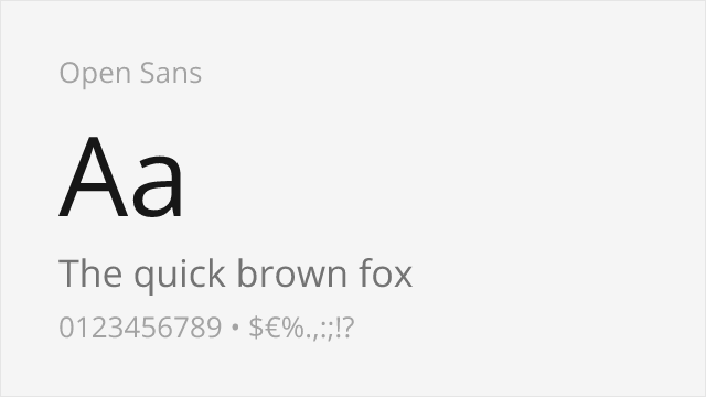
Open Sans 34 82% Variable Yes Apache-2.0 Google Fonts ↗
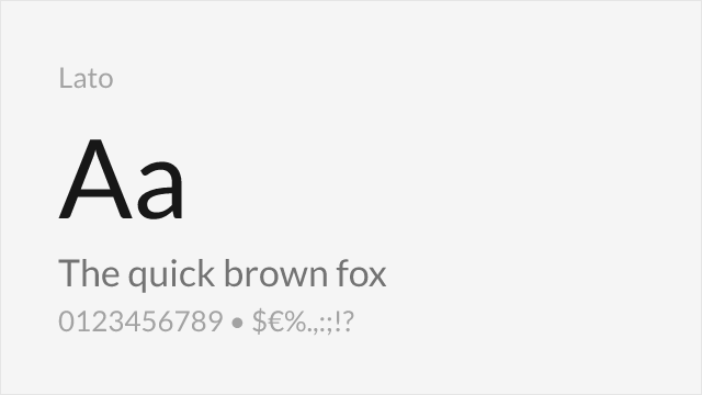
Lato 34 78% 5 No OFL-1.1 Google Fonts ↗
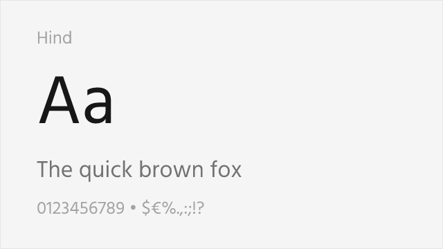
Hind 33 66% 5 No OFL-1.1 Google Fonts ↗
Source Sans 3 27 88% Variable Yes OFL-1.1 Google Fonts ↗
Work Sans 25 70% Variable Yes OFL-1.1 Google Fonts ↗
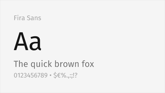
Fira Sans 15 74% 9 No OFL-1.1 Google Fonts ↗

Most Relevant (5)

#1 Open Sans 82% Relevant
[Google Fonts] · Apache-2.0 · Variable

Shares humanist warmth and excellent screen legibility
Why it matches: Open Sans shares Myriad Pro's humanist warmth and screen optimization with similar generous x-height and open letterforms. Both prioritize clarity and neutrality while maintaining an approachable, friendly character. Open Sans's widespread adoption and excellent cross-platform rendering make it functionally interchangeable with Myriad for most web and UI applications.
web applicationsmobile appsmultilingual projectsprint materials
Get Font ↗
#2 Lato 78% Relevant
[Google Fonts] · OFL-1.1 · 5 weights

Similar professional character with humanist proportions
Why it matches: Lato shares Myriad Pro's balance of warmth and professionalism with similar humanist proportions. Both feature the clean, modern character appropriate for corporate and tech contexts. Lato's slightly more geometric construction gives it a subtly different feel while maintaining comparable utility.
brandingbody textcorporate identityprint materials
Get Font ↗
#3 Hind 66% Relevant
[Google Fonts] · OFL-1.1 · 5 weights

Humanist sans engineered for clarity at small sizes

Why it matches: Hind shares Myriad Pro's priority of legibility, with open apertures and a generous x-height tuned for clarity at small sizes and in interfaces. It is a narrower family than Myriad, but for UI, mobile, and body-text roles where Myriad's clean readability is the point, Hind is a capable free choice with multilingual support.
mobile and UIbody textmultilingual projectsdashboards
Get Font ↗
#4 Source Sans 3 88% Relevant
[Google Fonts] · OFL-1.1 · Variable

Adobe's open-source counterpart with similar design philosophy

Why it matches: Source Sans Pro is essentially Adobe's open-source sibling to Myriad Pro, sharing the same humanist philosophy, generous x-height, and professional utility. Both feature open apertures, excellent screen legibility, and the warm-but-neutral character that made Myriad ubiquitous in corporate communications. Source Sans Pro's variable font version offers even more flexibility than Myriad Pro.
user interfacesgovernment websitestechnical documentationcorporate communications
Get Font ↗
#5 Work Sans 70% Relevant
[Google Fonts] · OFL-1.1 · Variable

Screen-first neo-grotesque with a full variable weight axis

Why it matches: Work Sans sits close to Myriad Pro's neutral, functional temperament — clean, even, and legible — while being drawn for the screen with a full 100–900 variable axis. It is slightly more grotesque and less overtly humanist than Myriad, but for coordinated identity systems and UI it is a flexible, contemporary free stand-in.
identity systemsweb and app UIeditorial hierarchydocumentation
Get Font ↗

Other Alternatives (1)

#6 Fira Sans 74%
[Google Fonts] · OFL-1.1 · 9 weights

Warm humanist sans with a broad weight range and true italics

Why it matches: Fira Sans, from Erik Spiekermann's studio, shares Myriad Pro's humanist warmth and clear, open letterforms, with a generous x-height and a very broad weight range for building complete systems. It is a touch more characterful than Myriad's studied neutrality, but for corporate, editorial, and interface work it covers the same ground with genuine warmth.
corporate and editorialinterfacesmultilingual textlong-form reading
Get Font ↗

Related Pages