 Install FontSwap
Free Alternatives to Myriad Pro Supporting Greek
Need a free alternative to Myriad Pro with Greek script support? These 3 options include Greek characters and share visual similarities with Myriad Pro. Each is licensed for free personal and commercial use.
Top Picks
Comparison Table
| Font | Relevance ⓘ
How well this alternative fits the specific context (use-case or trait) of this page. Score 0–100 based on matching keywords, industries, and font characteristics. Alternatives scoring 25+ are highlighted.
| Similarity ⓘ
How visually similar this free font is to the premium original. Score 0–100 based on x-height, width, stroke contrast, use-case overlap, and language coverage.
Learn more → | Weights | Variable | License | Source |
|---|---|---|---|---|---|---|
| Source Sans 3 | 0 | 88% | Variable | Yes | OFL-1.1 | Google Fonts ↗ |
| Open Sans | 0 | 82% | Variable | Yes | Apache-2.0 | Google Fonts ↗ |
| Fira Sans | 0 | 74% | 9 | No | OFL-1.1 | Google Fonts ↗ |
All Alternatives (3)

[Google Fonts] · OFL-1.1 · Variable
Adobe's open-source counterpart with similar design philosophy
Why it matches: Source Sans Pro is essentially Adobe's open-source sibling to Myriad Pro, sharing the same humanist philosophy, generous x-height, and professional utility. Both feature open apertures, excellent screen legibility, and the warm-but-neutral character that made Myriad ubiquitous in corporate communications. Source Sans Pro's variable font version offers even more flexibility than Myriad Pro.
user interfacesgovernment websitestechnical documentationcorporate communications
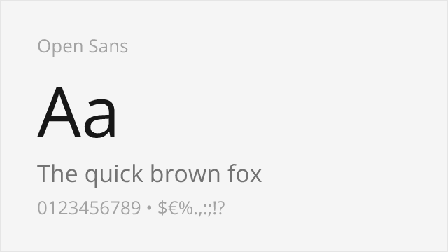
[Google Fonts] · Apache-2.0 · Variable
Shares humanist warmth and excellent screen legibility
Why it matches: Open Sans shares Myriad Pro's humanist warmth and screen optimization with similar generous x-height and open letterforms. Both prioritize clarity and neutrality while maintaining an approachable, friendly character. Open Sans's widespread adoption and excellent cross-platform rendering make it functionally interchangeable with Myriad for most web and UI applications.
web applicationsmobile appsmultilingual projectsprint materials
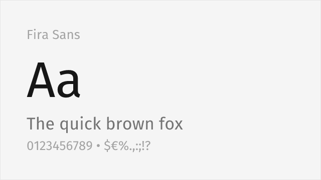
[Google Fonts] · OFL-1.1 · 9 weights
Warm humanist sans with a broad weight range and true italics
Why it matches: Fira Sans, from Erik Spiekermann's studio, shares Myriad Pro's humanist warmth and clear, open letterforms, with a generous x-height and a very broad weight range for building complete systems. It is a touch more characterful than Myriad's studied neutrality, but for corporate, editorial, and interface work it covers the same ground with genuine warmth.
corporate and editorialinterfacesmultilingual textlong-form reading