Free Alternatives to Frutiger

About Frutiger
- Foundry
- Linotype
- Classification
- sans-serif
- Style
- humanist
Brands Using Frutiger
Frutiger is the core brand font of the UK National Health Service
Corporate and signage typeface for the US passenger rail operator
Its original application — adopted for signage systems worldwide
A favorite for calm, legible communication in high-stakes settings
 See Frutiger live on these sites with FontSwap →
See Frutiger in the Wild
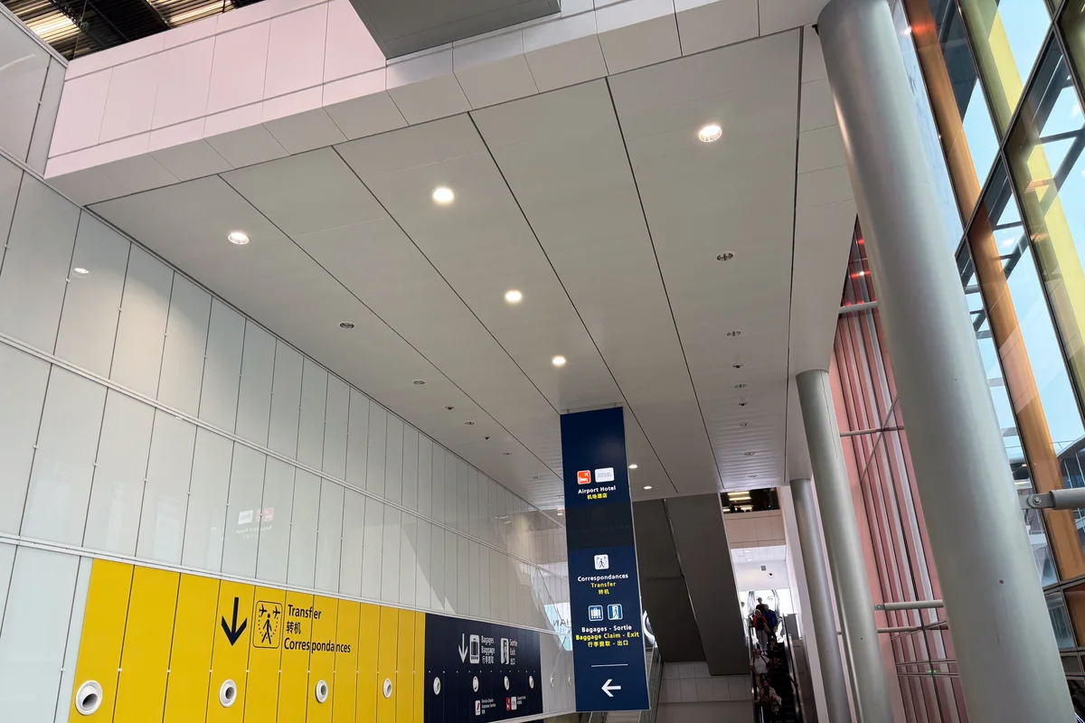


Frutiger is a landmark humanist sans-serif typeface designed by Adrian Frutiger and released in 1976. Originally created for the signage system at Charles de Gaulle Airport in Paris, Frutiger set new standards for legibility and became one of the most influential typefaces in history. Its revolutionary approach to wayfinding typography influenced virtually every sans-serif designed since.
History and Design
Adrian Frutiger designed Frutiger (originally named "Roissy" after the airport's location) specifically for the signage needs of Charles de Gaulle Airport. The brief demanded a typeface that would be instantly legible at multiple distances, in various lighting conditions, and when viewed from angles while moving through the airport. Travelers rushing to catch flights needed to read signs quickly and accurately—lives might depend on it.
Frutiger drew on his earlier work with Univers but created something distinctly warmer and more humane. Where Univers aimed for Swiss neutrality, Frutiger embraced organic warmth. The open apertures, generous x-height, and subtle calligraphic influences produce letterforms that are immediately recognizable even when partially obscured. Unlike geometric sans-serifs, Frutiger's curves feel organic and natural—as if drawn by a confident hand rather than constructed with rulers and compasses.
The typeface's success at Charles de Gaulle led to its commercial release through Linotype. Frutiger became the standard for wayfinding design, adopted by airports, train stations, and hospitals worldwide, and transit and institutional systems across many countries have employed it or its variants for their signage. (Note that not every legible signage sans is Frutiger: Britain's road signs, for instance, use the separate Transport typeface drawn by Jock Kinneir and Margaret Calvert, not a Frutiger design.)
Linotype expanded the family over subsequent decades, adding weights, widths, and language support. Frutiger Next (2000) and Neue Frutiger (2009) refined the original while maintaining its essential character. The family now spans from Ultralight to Ultra Black with condensed variants.
Frutiger's place in this design was the culmination of a career spent thinking about legibility. He had already reshaped the neo-grotesque with Univers in 1957, complete with its logical two-digit numbering system, and the airport commission let him apply everything he had learned to the hardest possible test: type that people's safety and orientation genuinely depend on. He reportedly considered Frutiger among his finest achievements, and the design world has largely agreed — it is difficult to name a humanist sans-serif of the last half-century that does not owe something to it. When Microsoft needed a system interface font it commissioned Segoe UI, whose close resemblance to Frutiger was widely noted at the time (and formally disputed by Microsoft). Frutiger did not just design a typeface for an airport; he defined a grammar of legibility that later interface and signage designers drew on whenever a screen or a sign had to be read without effort.
The name itself tells part of the story. The face was first issued as "Roissy," after the commune where Charles de Gaulle Airport sits, and only renamed Frutiger when Linotype released it commercially — a rare case of a typeface carrying its designer's own name, and a mark of how completely it came to represent his philosophy.
Why Frutiger Matters
Frutiger proved that functionality and beauty could coexist in typeface design. Its success at Charles de Gaulle Airport led to widespread adoption for transportation, healthcare, and corporate signage worldwide. The typeface influenced countless subsequent designs, from Microsoft's Segoe UI to the wider family of humanist sans-serifs that dominate signage and interface work today.
Adrian Frutiger considered it his finest work, and many typographers agree. Its combination of clarity, warmth, and professionalism remains unmatched. Healthcare systems particularly favor Frutiger for its calming, trustworthy character—essential qualities when patients are anxious and need clear information quickly.
The typeface fundamentally changed how designers think about legibility. Before Frutiger, sans-serifs tended toward either cold geometric precision or rough grotesque character. Frutiger demonstrated that humanist warmth could enhance rather than diminish functional clarity.
Who is it for? Organizations and systems where being read clearly matters more than making a bold statement — transport, healthcare, government, and any corporate identity that wants to feel accessible and trustworthy rather than trendy. It is the wrong choice for fashion, luxury, or attention-grabbing display work, where its calm neutrality reads as plain; those projects want a face with more personality, while Frutiger's genius is to have exactly enough and no more.
Design Characteristics
Frutiger is the reference standard for humanist legibility, and every feature is in service of one goal: being read instantly, at any size, in any condition. Adrian Frutiger designed it to be recognized even when partly obscured or seen at a glance from a moving vehicle, and that brief shaped its whole character:
- Open apertures: The openings of
c,e,s,a, andgare wide and clear, so the letters never collapse into one another even at distance, in glare, or at speed — the single most important legibility feature. - Generous x-height: A large lowercase relative to the caps keeps text open and readable at small sizes and from far away.
- Humanist warmth: Subtle calligraphic influences and organic curves — as if drawn by a confident hand rather than constructed with compasses — give it warmth that geometric sans-serifs lack.
- Distinct letterforms: Careful differentiation between similar shapes prevents the misreadings that matter in signage and safety-critical contexts.
- Even, unfussy strokes: A clean, near-monoline finish keeps it neutral and calm rather than showy.
- A comprehensive family: Weights and widths from Ultralight to Ultra Black, expanded by the digital revivals (Frutiger Next, Neue Frutiger), so it can carry an entire wayfinding or corporate system.
Where Frutiger Excels
Frutiger is the archetype of the legibility-first sans, at its best wherever people must read quickly, accurately, and often under pressure:
- Signage and wayfinding: Its original job and enduring benchmark — airports, transit, hospitals, and public buildings worldwide.
- Healthcare: Clear, calming, and highly legible, which is exactly what anxious patients need — a reason it is a healthcare favorite.
- Corporate identity: Professional with genuine human warmth, for organizations that want to feel trustworthy rather than cold.
- Government and public sector: Accessible, neutral, and authoritative for civic communications.
- Multilingual institutional systems: Its broad language coverage suits international bodies and cross-border brands.
Where Frutiger Struggles
Frutiger's virtues are so specific — legible, warm, neutral — that its limits are mostly about what it deliberately is not:
- Distinctiveness: Its neutrality is a feature for signage but a drawback for a brand that wants to stand out; Frutiger rarely gives a project a memorable typographic signature.
- Fashion or contemporary-edge work: Warm and practical rather than sharp or trendy, it is the wrong tool for fashion, luxury, or cutting-edge tech identities.
- Availability and cost: The genuine Linotype cuts are commercial and licensed per use, and it is not bundled with common software — which is precisely why designers reach for the free humanist alternatives below.
- Screen optimization at small sizes: As a print-and-signage-era design, its digital cuts are less screen-tuned than web-first humanists like Open Sans or Source Sans.
- Over-familiarity in wayfinding: Because it (and its imitators) dominate signage, it can read as the safe, expected default rather than a considered choice.
How to Choose a Free Substitute
Frutiger's specific blend of warmth and clarity is hard to reproduce exactly, so match on the trait you most need — legibility at small sizes, humanist warmth, or a coordinated system.
For maximum small-size legibility (UI, healthcare, dense signage), Hind is the closest match, drawn for clarity at text sizes. For corporate and government work where a coordinated document system matters, Source Sans 3 mirrors Frutiger's professional clarity with matching serif and mono companions. For humanist warmth, Fira Sans gets closest to Frutiger's friendly temperament, and Lato is the dependable corporate workhorse. Open Sans is the safe, ubiquitous, screen-optimized default, and Cabin brings a signage-adjacent humanist feel for branding.
What no free font fully supplies is Frutiger's decades of real-world signage testing — the certainty that it will read at 40 metres, at an angle, in the rain. For pure wayfinding at scale, that pedigree can be worth the licence; for everything else — corporate, web, print, healthcare interfaces — the free alternatives get you Frutiger's clarity and warmth at no cost. As always, test a candidate at your real size and viewing distance, since legibility is the whole point and only shows up under real conditions.
Premium Font Neighbors
Frutiger sits at the head of the humanist-sans tradition, so its neighbors are its own relatives and heirs. Univers, Adrian Frutiger's earlier systematic neo-grotesque, is the cooler sibling he built on, and Myriad and Syntax are the other great humanist sans-serifs in the same legibility-first lineage. Gill Sans is the older British humanist that anticipated the style, while Avenir is Frutiger's own warm geometric take. For signage and wayfinding specifically, Interstate (from US highway lettering) and DIN (the German industrial standard) share Frutiger's functional, at-a-distance clarity, and Optima offers a more elegant, calligraphic humanist alternative.
FAQ
What is the best free alternative to Frutiger?
Hind is an excellent free alternative to Frutiger, offering similar open apertures and outstanding legibility at small sizes. Designed for the Devanagari and Latin scripts, Hind available on Google Fonts provides the clarity and warmth that made Frutiger famous, making it perfect for signage, healthcare, and corporate applications.
Can I use Open Sans commercially?
Yes, Open Sans is licensed under the Apache License 2.0, permitting unlimited commercial use without fees. You can use it for corporate identity, signage, websites, applications, and print materials. The license is very permissive and does not require attribution for normal use.
How similar is Open Sans to Frutiger?
Open Sans achieves approximately 80% similarity to Frutiger, sharing humanist proportions and emphasis on digital legibility. Both feature generous x-heights, open apertures, and friendly character. Open Sans has slightly more neutral forms optimized for screen display, while Frutiger retains more distinctive warmth in its curves.
What are the main differences between Frutiger and Open Sans?
Frutiger features more refined curves and subtle calligraphic influences from Adrian Frutiger's pen-drawn origins, giving it exceptional warmth and character. Open Sans has more optimized forms for digital screens with crisper details at small sizes. Frutiger offers more weights and widths, while Open Sans provides variable font flexibility.
Where can I download Hind for free?
Hind is available for free download from Google Fonts at fonts.google.com/specimen/Hind. The family includes five weights (Light, Regular, Medium, SemiBold, Bold) optimized for body text. You can embed it via CSS, download for desktop use, or use it through web font services. Open Sans, Source Sans 3, Fira Sans, Lato, and Cabin are all on Google Fonts too.
Why is Frutiger so good for signage?
Frutiger was designed from scratch for the signage brief at Charles de Gaulle Airport, where type had to be read instantly, at distance, at an angle, and in poor light. Its open apertures, generous x-height, and distinct letterforms keep the letters recognizable even when partly obscured or glimpsed at speed — exactly the conditions wayfinding demands. Decades of use in airports, transit, and hospitals have proven those qualities in the real world, which is why it remains the benchmark for legibility.
Can I use these free alternatives commercially?
Yes. Hind, Source Sans 3, Fira Sans, Lato, and Cabin are released under the SIL Open Font License, and Open Sans under the Apache License 2.0 — all permit unlimited commercial use without fees across signage, web, app, branding, and print. Attribution is only required if you redistribute the font files themselves.
What fonts pair well with Frutiger?
Because Frutiger is a complete, versatile family, the simplest strong pairing is Frutiger with itself — a bold or condensed weight for headings over the roman for text. When contrast is wanted, a classical serif provides warmth beneath its clean sans headings, and for interfaces a matching monospace (or the Source family, if you use Source Sans as the free stand-in) keeps code and data consistent with the rest of the system.
Is Frutiger on Google Fonts?
No, Frutiger is a premium font from Linotype and is not available on Google Fonts.
The closest Google Fonts alternative is Hind with 82% similarity. Get it free on Google Fonts ↗
Free Alternatives (6)
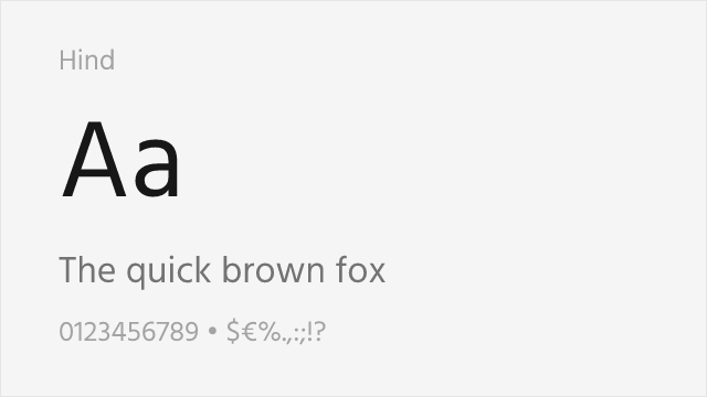
Similar open apertures and excellent legibility at small sizes
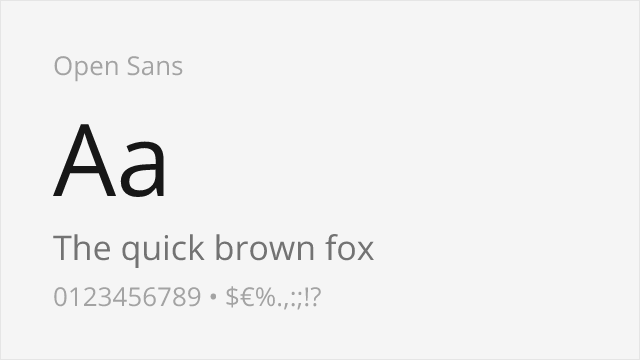
Comparable humanist proportions designed for digital clarity

Shares emphasis on legibility with similar stroke contrast
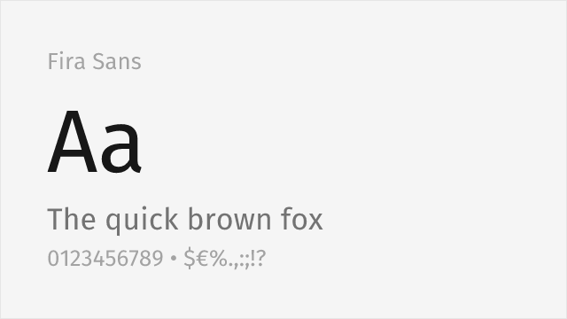
Humanist sans from Spiekermann's studio with warmth and broad weights
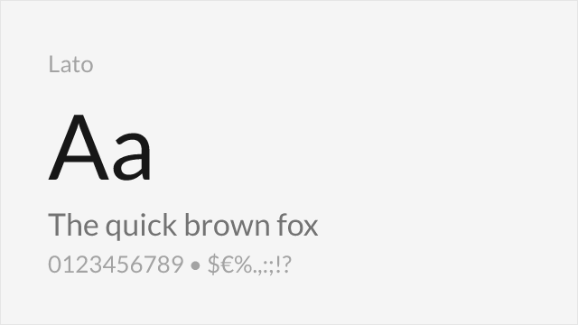
Warm humanist workhorse widely used for corporate and body text
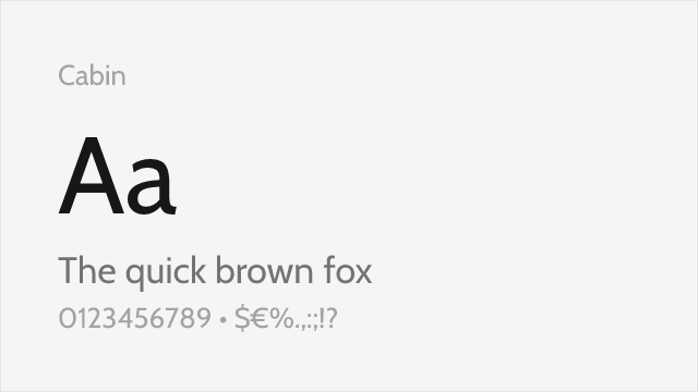
Humanist sans drawn from the same signage tradition as Frutiger
Compare the alternatives
See how Frutiger compares to its top alternatives — and how those alternatives compare to each other — side by side.
See where Frutiger is used in the wild and swap to free alternatives live.
Install FontSwap →Replacement Summary
Source: FontAlternatives.com
Premium font: Frutiger
Best free alternative: Hind
FontAlternatives similarity score: 82%
Replacement difficulty: Medium
Best for: mobile applications, body text, healthcare applications, multilingual projects
Notable users: NHS, Amtrak, Airport & transit wayfinding
Not recommended when: Brand consistency with NHS requires exact letterforms
What is the best free alternative to Frutiger?
Hind is the best free alternative to Frutiger with a FontAlternatives similarity score of 82%.
Hind shares similar proportions, stroke characteristics, and intended use with Frutiger. It is available under the OFL-1.1 license, which permits both personal and commercial use at no cost.
This alternative works particularly well for: mobile applications, body text, healthcare applications, multilingual projects.
Can I safely replace Frutiger with Hind?
Yes, with some considerations. Hind achieves a FontAlternatives similarity score of 82%, indicating good structural compatibility for most use cases.
Licensing: Hind is licensed under OFL-1.1, which allows commercial use without licensing fees or royalties.
Weight coverage: All 3 weights have exact matches available.
When should I NOT replace Frutiger?
While Hind is a strong alternative, there are situations where replacing Frutiger may not be appropriate:
- Optical precision requirements: Hind has measurable structural differences from Frutiger that may be visible in precise design work.
- Strict compliance: Verify that OFL-1.1 terms meet your specific legal and compliance requirements.
Weight-Matching Guide
Map Frutiger weights to their closest free alternatives for accurate font substitution.
Hind
| Frutiger | Hind | Match |
|---|---|---|
| Light | Light (300) | exact |
| Roman | Regular (400) | exact |
| Bold | Bold (700) | exact |
Open Sans
| Frutiger | Open Sans | Match |
|---|---|---|
| Light | Light (300) | close |
| Roman | Regular (400) | exact |
| Bold | Bold (700) | exact |
Source Sans 3
| Frutiger | Source Sans 3 | Match |
|---|---|---|
| Light | Light (300) | close |
| Roman | Regular (400) | exact |
| Bold | Bold (700) | exact |
Fira Sans
| Frutiger | Fira Sans | Match |
|---|---|---|
| Light | Light (300) | close |
| Roman | Regular (400) | exact |
| Bold | Bold (700) | exact |
Lato
| Frutiger | Lato | Match |
|---|---|---|
| Light | Light (300) | close |
| Roman | Regular (400) | exact |
| Bold | Bold (700) | exact |
Cabin
| Frutiger | Cabin | Match |
|---|---|---|
| Roman | Regular (400) | close |
| Medium | Medium (500) | close |
| Bold | Bold (700) | close |
Performance Guide
Production performance metrics for each alternative.
How to Use Hind
Copy these code snippets to quickly add Hind to your project.
CSS code for Hind
@import url('https://fonts.googleapis.com/css2?family=Hind:wght@300;400;500;600;700&display=swap');HTML code for Hind
<link rel="preconnect" href="https://fonts.googleapis.com">
<link rel="preconnect" href="https://fonts.gstatic.com" crossorigin>
<link href="https://fonts.googleapis.com/css2?family=Hind:wght@300;400;500;600;700&display=swap" rel="stylesheet">
Tailwind code for Hind
// tailwind.config.js
module.exports = {
  theme: {
    extend: {
      fontFamily: {
        'hind': ['Hind', 'sans-serif'],
      },
    },
  },
}

// Usage in HTML:
// <p class="font-hind">Your text here</p>
Next.js code for Hind
// Using next/font (Next.js 13+)
import { Hind } from 'next/font/google';

const hind = Hind({
  subsets: ['latin'],
  weight: ['300', '400', '500', '600', '700'],
});

export default function Component() {
  return (
    <p className={hind.className}>
      Your text here
    </p>
  );
}

// Or using inline styles with Google Fonts link:
// <p style={{ fontFamily: "'Hind'" }}>Your text</p>
Expo and React Native code for Hind
// Install: npx expo install @expo-google-fonts/hind expo-font
import { useFonts, Hind_400Regular } from '@expo-google-fonts/hind';

export default function App() {
  const [fontsLoaded] = useFonts({
    Hind_400Regular,
  });

  if (!fontsLoaded) return null;

  return (
    <Text style={{ fontFamily: 'Hind_400Regular' }}>
      Your text here
    </Text>
  );
}
Recommended Font Pairings
These free fonts pair well with Hind Frutiger for headlines, body text, or accent use.
Merriweather's sturdy serifs and generous x-height complement Frutiger's humanist warmth for readable editorial pairings
Libre Baskerville's transitional elegance creates refined contrast against Frutiger's open, friendly sans-serif forms
Source Serif Pro's systematic design philosophy mirrors Frutiger's functional clarity for cohesive corporate typography
Browse Alternatives by Context
Find Frutiger alternatives filtered by specific use case, style, or language support.
By Use Case
By Style
By Script
Frequently Asked Questions
What is the best free alternative to Frutiger?
Hind is the best free alternative to Frutiger with a FontAlternatives similarity score of 82%. It shares similar proportions and characteristics while being available under the OFL-1.1 license for both personal and commercial use at no cost.
Is there a free version of Frutiger?
There is no official free version of Frutiger. However, Hind is available under the OFL-1.1 open-source license and achieves a FontAlternatives similarity score of 82%. It includes 5 weights and supports latin, latin-extended.
What Google Font looks like Frutiger?
The Google Fonts most similar to Frutiger are Hind, Open Sans, Source Sans 3. Among these alternatives, Hind offers the closest match with a FontAlternatives similarity score of 82% and includes 5 weights for design flexibility.
Can I use Hind commercially?
Yes, Hind can be used commercially. It is licensed under OFL-1.1, which allows free use in websites, applications, print materials, and commercial projects without purchasing a license or paying royalties.
Is Hind similar enough to Frutiger?
Hind achieves a FontAlternatives similarity score of 82% compared to Frutiger. While not identical, it offers comparable letterforms, proportions, and visual style. Most designers find it works excellently as a substitute in web and print projects.
What are the main differences between Frutiger and its free alternatives?
Free alternatives to Frutiger may differ in subtle details like letter spacing, curve refinements, and available weights. Premium fonts typically include more OpenType features, extended language support, and optimized screen rendering. However, for most projects, these differences are negligible.
Where can I download free alternatives to Frutiger?
Download Hind directly from Google Fonts. Click the "Get Font" button on any alternative listed above to visit the official download page. Google Fonts also provides convenient embed codes for seamless web integration.