Free Alternatives to Univers

About Univers
- Foundry
- Linotype
- Classification
- sans-serif
- Style
- neo-grotesque
Brands Using Univers
Corporate communications and financial reports
Logo wordmark — a thicker Univers cut (1999–2012), then a thinner Univers (2012–present)
Corporate communications via the Univers-based Audi Sans
Transit wayfinding and station signage
 See Univers live on these sites with FontSwap →
Univers is a landmark neo-grotesque sans-serif typeface designed by Adrian Frutiger and released by Deberny & Peignot in 1957. It represents one of the first typefaces conceived as a complete system with coordinated weights and widths, revolutionizing typographic practice. Univers established the blueprint for modern type superfamilies and remains a cornerstone of professional typography.
History and Design
Adrian Frutiger designed Univers while working at Deberny & Peignot in Paris, where he had joined as a young designer from Switzerland. Unlike traditional typeface development where weights and widths were added incrementally over years, Frutiger conceived Univers as a unified family from the outset—a radical departure from industry practice.
To organize the 21 original weights and widths, Frutiger created his famous two-digit numbering system. The first digit indicates weight (from 3=light to 8=extra bold), while the second digit indicates width and style (5=roman, 6=oblique, 3=extended, 7=condensed, etc.). This systematic approach influenced type design for decades and became the model for future superfamilies.
The typeface was released the same year as Helvetica (1957), but the two designs took fundamentally different approaches. Both are rooted in the Akzidenz-Grotesk tradition, but where Helvetica closely redrew that model, Univers reworked the grotesque idea into a system designed as a coordinated whole from the outset. Frutiger's letterforms feature slightly more consistent stroke widths and subtly warmer curves than Helvetica, giving Univers a more humanist touch while maintaining neo-grotesque neutrality.
That difference in method is why Univers has long been described as the thinking designer's grotesque. Helvetica won the culture war — it became the default sans of the twentieth century and a byword for corporate neutrality — but among typographers Univers is often the more admired of the two, precisely because its coherence was engineered rather than inherited. Frutiger himself went on to design the eponymous Frutiger typeface for the wayfinding of Charles de Gaulle Airport, extending the same legibility-first, systematic thinking into humanist territory; Univers was the foundation that made that later work possible.
Univers also had the unusual fortune of being designed at a moment of technological change, and it survived every transition that followed. It was conceived to work across both metal and the new phototypesetting machines — itself a demonstration of the systematic thinking behind it — released first for phototype in 1957 and as foundry metal type in 1958, then licensed widely and eventually carried into the digital era. In 1997 Frutiger reworked the whole family in cooperation with Linotype as Linotype Univers, a comprehensive revision that expanded it and improved consistency across weights; in 2010 Linotype extended that work with true small caps and renamed it Univers Next. These revisions kept Univers relevant for digital typography while honoring the original design principles, and Univers Next is the version most designers license today.
Why Univers Matters
Univers's systematic approach to type families fundamentally changed how designers and foundries think about typeface organization. Before Univers, type families grew organically with inconsistent naming conventions. Frutiger demonstrated that a typeface could be conceived holistically, with all weights and widths designed in relation to each other.
The numbering system itself became influential beyond Univers. Designers could instantly understand "Univers 55" meant regular weight and width, while "Univers 47" indicated light condensed. This logical organization proved invaluable for complex corporate identity systems requiring consistent typography across diverse applications.
It is hard to overstate how novel this was in 1957. Names like "regular," "book," "demibold," and "extra condensed" varied wildly from foundry to foundry and told you nothing precise about how two styles related. Frutiger replaced that guesswork with a coordinate system: the two digits located a style on a grid of weight against width, so the whole family could be reasoned about at a glance. Corporate design manuals of the 1960s and 70s — the era when big organizations first codified their visual identities — leaned on that predictability, and the discipline of "one system, many coordinated styles" that Univers introduced is now simply assumed in every serious type family, variable fonts included.
Major corporations recognized Univers's systematic qualities. Deutsche Bank built its global identity around Univers, and eBay's wordmark remains a cut of Univers to this day. San Francisco's BART system adopted it for transit wayfinding, demonstrating its effectiveness in signage environments. These high-profile implementations cemented Univers's reputation as the thinking designer's alternative to Helvetica.
Design Characteristics
Univers is a study in disciplined neutrality — every letter subordinated to the coherence of the whole family rather than showing off on its own. Frutiger's guiding idea was that the individual glyph mattered less than the relationships between glyphs, weights, and widths; a designer should be able to move from a light condensed caption to an extended black headline and have everything still feel like one voice. That systemic thinking, rather than any single striking letterform, is what makes Univers Univers:
- Systematic organization: The two-digit numbering system coordinates every weight and width, so the family behaves as one designed system rather than a set of loosely related styles.
- Consistent stroke modulation: More uniform than Helvetica's, giving Univers an especially even, calm typographic color across a paragraph.
- Moderate x-height and open apertures: Balanced proportions and clear letter openings keep it legible at text sizes and at a distance.
- Subtly humanist curves: Compared with Helvetica, Frutiger's curves are a touch warmer and the terminals a shade less rigid, which many designers find easier on the eye over long stretches.
- Neutral character: A professional presence without strong personality — the point is that the reader notices the message, not the typeface.
- Comprehensive family: The current Univers Next family runs to dozens of coordinated styles, from light condensed to extended black, all sharing a common skeleton so that any combination reads as intentional rather than accidental.
Where Univers Excels
Univers earns its keep wherever a large, coordinated typographic system has to stay coherent across many contexts. Its neutrality is a feature, not a limitation: when a single organization needs one typeface to carry everything from legal fine print to a building-scale sign, the fact that Univers has no strong accent of its own is exactly what lets it do that job invisibly. The strongest fits:
- Signage and wayfinding: Excellent legibility across sizes and viewing distances — its long history in transit and airports is no accident.
- Corporate identity: The systematic weights and widths make it ideal for global brands that need one voice across every touchpoint.
- Editorial design: The versatile range enables sophisticated hierarchy without ever leaving the family.
- Environmental and large-scale graphics: Consistent appearance from a business card to a building.
- Government and institutional communications: A neutral, authoritative presence that reads as trustworthy rather than trendy, and that will not look dated a decade from now the way a more fashionable choice might.
Where Univers Struggles
The qualities that make Univers a superb system typeface also cap its range, and its age shows in a digital context. Most of its weaknesses are really the trade-offs of neutrality and of being a print-first design:
- Personality-forward brands: Univers's whole value is neutrality, so it brings little warmth or distinctiveness to a brand that wants to feel characterful or contemporary.
- Screen and small-size UI: As a print-era design, its digital cuts are less optimized for interface text than screen-first families like Inter; on the web, a modern alternative often renders more cleanly.
- Over-familiarity with Helvetica: To a non-specialist audience Univers reads as "a Helvetica," so it rarely differentiates a brand from the neo-grotesque crowd.
- Licensing cost: The quality Univers/Univers Next cuts are commercial and licensed per use, which is the practical reason the free alternatives below exist.
How to Choose a Free Substitute
Univers sits in the best-populated corner of free type — the neutral neo-grotesque — so the question is less "can I match it" than "which strengths do I need."
For digital interfaces and modern products, Inter is the default: systematic, neutral, and drawn for the screen, with a full variable range. For corporate and government work where a coordinated document system matters, Source Sans 3 mirrors Univers's family philosophy with matching serif and mono companions. Roboto is the pragmatic cross-platform choice (it is Android's system font), and Work Sans offers a clean, variable neo-grotesque for editorial hierarchy. If you want a slightly more characterful, American-gothic flavor, Libre Franklin is the pick, and Schibsted Grotesk brings a contemporary brand-system feel for display and headlines.
Whatever you choose, remember that Univers's real magic was the system, not any single weight — so pick a family with a genuinely coordinated range (most of these span 100–900) and build your hierarchy inside it rather than mixing families. The temptation with free fonts is to reach for a different family every time you need a new effect; the more Univers-like discipline is to commit to one well-made system and exhaust its weights and widths first. That single choice will do more for the coherence of your design than any amount of hunting for the perfect letterform, which is the very lesson Univers was built to teach.
Premium Font Neighbors
Univers lives at the heart of the neo-grotesque tradition, so its neighbors are the other pillars of that world. Helvetica is its eternal twin — released the same year, aiming at the same neutrality from the opposite direction (closely redrawing Akzidenz-Grotesk, where Univers reworked the same tradition into a coordinated system). Akzidenz-Grotesk is the nineteenth-century ancestor both descend from, and Neue Haas Grotesk is Helvetica restored to its original drawing. Frutiger, Adrian Frutiger's own later humanist signage face, is the warmer sibling; Aktiv Grotesk and Neuzeit offer contemporary and industrial takes on the same idea; and Graphik and GT America are the modern, design-forward grotesques that dominate current branding.
FAQ
What is the best free alternative to Univers?
Inter is the best free alternative, sharing Univers's systematic design philosophy, neutral character, and comprehensive weight coverage at roughly 85% similarity — with a similar x-height, stroke consistency, and functional clarity. Its variable font technology makes it equally versatile for corporate identity, editorial design, and digital interfaces. For document systems, Source Sans 3 is a strong second choice.
How is Univers different from Helvetica?
Both are neutral neo-grotesques released in 1957, and both grow out of the Akzidenz-Grotesk tradition, but they were built differently. Helvetica closely redrew Akzidenz-Grotesk; Univers reworked the grotesque idea into a coordinated family designed as a whole. Univers has slightly more even stroke widths and subtly warmer curves, which many designers find a touch more comfortable for long reading, while Helvetica became the more culturally ubiquitous of the two.
What is the Univers numbering system?
Adrian Frutiger's two-digit system organizes the family: the first digit is weight (3 = light through 8 = extra bold) and the second is width and style (5 = roman, 6 = oblique, 3 = extended, 7 = condensed). So Univers 55 is regular roman, Univers 47 is light condensed, and Univers 67 is bold condensed. It was the first system of its kind and became the model for later type superfamilies.
Can I use these free alternatives commercially?
Yes. Inter, Source Sans 3, Roboto, Work Sans, Libre Franklin, and Schibsted Grotesk are all free for unlimited commercial use — websites, apps, branding, and print. Most are released under the SIL Open Font License; Roboto uses the Apache License 2.0, which is equally permissive for commercial use. Attribution is only required if you redistribute the font files themselves.
Is Univers a good choice for websites?
It can be, but its digital cuts were adapted from a print design and are less screen-optimized than families built for the web. For interface and body text online, Inter or Roboto usually render more cleanly at small sizes while preserving Univers's neutral, systematic feel — and they come with the variable-font and hinting advantages a print-era face lacks.
Who designed Univers, and when?
Adrian Frutiger — one of the twentieth century's most influential type designers — designed Univers at Deberny & Peignot in Paris, released in 1957. Frutiger later reworked the whole family with Linotype in 1997 as Linotype Univers (expanded and renamed Univers Next in 2010), improving consistency across weights for the digital era.
What fonts pair well with Univers?
Because Univers is a complete system, the simplest strong pairing is Univers with itself — a heavier width for headlines over a roman for text. When contrast is wanted, a classical serif (a Garamond or a transitional serif) balances its cool neutrality, and for on-screen work a readable humanist serif like Source Serif makes a comfortable body companion beneath Univers-style headings.
Is Univers on Google Fonts?
No, Univers is a premium font from Linotype and is not available on Google Fonts.
The closest Google Fonts alternative is Inter with 85% similarity. Get it free on Google Fonts ↗
Free Alternatives (6)
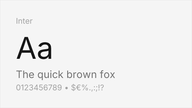
Modern interpretation with excellent screen optimization and similar neutrality

Adobe's open-source alternative with comparable weight range and clarity
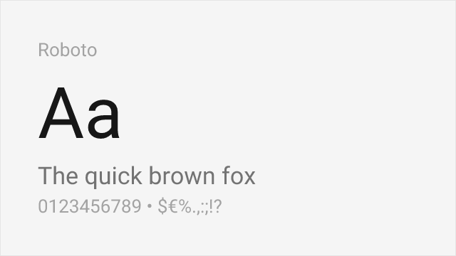
Similar functional design philosophy optimized for digital interfaces

Neo-grotesque with a full variable range and screen-first tuning
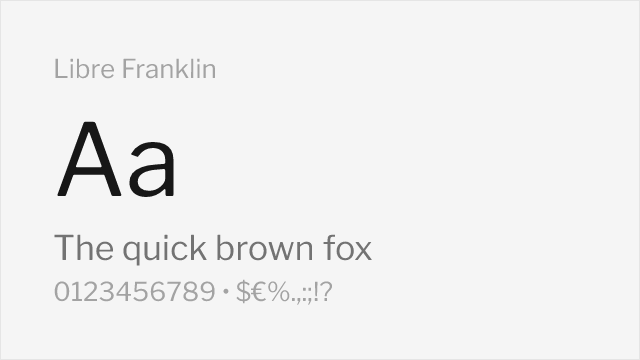
American-gothic grotesque with a systematic, wide weight range
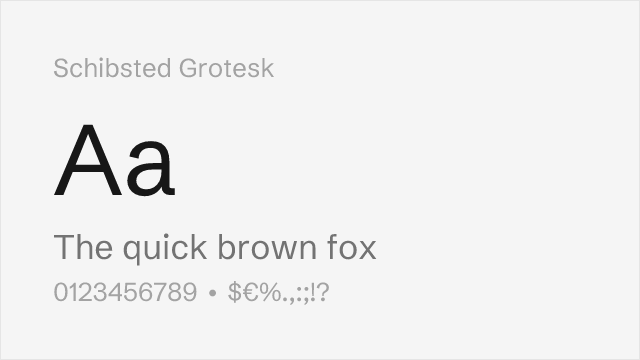
Contemporary neutral grotesque built for brand systems
Compare the alternatives
See how Univers compares to its top alternatives — and how those alternatives compare to each other — side by side.
See where Univers is used in the wild and swap to free alternatives live.
Install FontSwap →Replacement Summary
Source: FontAlternatives.com
Premium font: Univers
Best free alternative: Inter
FontAlternatives similarity score: 85%
Replacement difficulty: Low
Best for: corporate identity, UI design, web applications, editorial
Notable users: Deutsche Bank, eBay, Audi
Not recommended when: Brand consistency with Deutsche Bank requires exact letterforms
What is the best free alternative to Univers?
Inter is the best free alternative to Univers with a FontAlternatives similarity score of 85%.
Inter shares similar proportions, stroke characteristics, and intended use with Univers. It is available under the OFL-1.1 license, which permits both personal and commercial use at no cost.
This alternative works particularly well for: corporate identity, UI design, web applications, editorial.
Can I safely replace Univers with Inter?
Yes, Inter is a high-confidence replacement for Univers. The FontAlternatives similarity score of 85% indicates strong structural compatibility.
Licensing: Inter is licensed under OFL-1.1, which allows commercial use without licensing fees or royalties.
Weight coverage: Most weights have close or exact matches available.
When should I NOT replace Univers?
While Inter is a strong alternative, there are situations where replacing Univers may not be appropriate:
- Strict compliance: Verify that OFL-1.1 terms meet your specific legal and compliance requirements.
Weight-Matching Guide
Map Univers weights to their closest free alternatives for accurate font substitution.
Inter
| Univers | Inter | Match |
|---|---|---|
| 45 Light | Light (300) | exact |
| 55 Roman | Regular (400) | exact |
| 65 Bold | Bold (700) | exact |
| 75 Black | ExtraBold (800) | close |
Source Sans 3
| Univers | Source Sans 3 | Match |
|---|---|---|
| 45 Light | Light (300) | exact |
| 55 Roman | Regular (400) | exact |
| 65 Bold | Bold (700) | exact |
| 75 Black | Black (900) | close |
Roboto
| Univers | Roboto | Match |
|---|---|---|
| 45 Light | Light (300) | exact |
| 55 Roman | Regular (400) | exact |
| 65 Bold | Bold (700) | exact |
| 75 Black | Black (900) | exact |
Work Sans
| Univers | Work Sans | Match |
|---|---|---|
| 45 Light | Light (300) | close |
| 55 Roman | Regular (400) | exact |
| 65 Bold | Bold (700) | exact |
| 75 Black | Black (900) | close |
Libre Franklin
| Univers | Libre Franklin | Match |
|---|---|---|
| 45 Light | Light (300) | close |
| 55 Roman | Regular (400) | exact |
| 65 Bold | Bold (700) | exact |
| 75 Black | Black (900) | close |
Schibsted Grotesk
| Univers | Schibsted Grotesk | Match |
|---|---|---|
| 55 Roman | Regular (400) | exact |
| 65 Bold | Bold (700) | exact |
| 75 Black | Black (900) | close |
Performance Guide
Production performance metrics for each alternative.
How to Use Inter
Copy these code snippets to quickly add Inter to your project.
CSS code for Inter
@import url('https://fonts.googleapis.com/css2?family=Inter:wght@100..900&display=swap');HTML code for Inter
<link rel="preconnect" href="https://fonts.googleapis.com">
<link rel="preconnect" href="https://fonts.gstatic.com" crossorigin>
<link href="https://fonts.googleapis.com/css2?family=Inter:wght@100..900&display=swap" rel="stylesheet">
Tailwind code for Inter
// tailwind.config.js
module.exports = {
  theme: {
    extend: {
      fontFamily: {
        'inter': ['Inter', 'sans-serif'],
      },
    },
  },
}

// Usage in HTML:
// <p class="font-inter">Your text here</p>
Next.js code for Inter
// Using next/font (Next.js 13+)
import { Inter } from 'next/font/google';

const inter = Inter({
  subsets: ['latin'],
  weight: ['100', '200', '300', '400', '500', '600', '700', '800', '900'],
});

export default function Component() {
  return (
    <p className={inter.className}>
      Your text here
    </p>
  );
}

// Or using inline styles with Google Fonts link:
// <p style={{ fontFamily: "'Inter'" }}>Your text</p>
Expo and React Native code for Inter
// Install: npx expo install @expo-google-fonts/inter expo-font
import { useFonts, Inter_400Regular } from '@expo-google-fonts/inter';

export default function App() {
  const [fontsLoaded] = useFonts({
    Inter_400Regular,
  });

  if (!fontsLoaded) return null;

  return (
    <Text style={{ fontFamily: 'Inter_400Regular' }}>
      Your text here
    </Text>
  );
}
Browse Alternatives by Context
Find Univers alternatives filtered by specific use case, style, or language support.
By Use Case
By Style
By Script
Frequently Asked Questions
What is the best free alternative to Univers?
Inter is the best free alternative to Univers with a FontAlternatives similarity score of 85%. It shares similar proportions and characteristics while being available under the OFL-1.1 license for both personal and commercial use at no cost.
Is there a free version of Univers?
There is no official free version of Univers. However, Inter is available under the OFL-1.1 open-source license and achieves a FontAlternatives similarity score of 85%. It includes variable weights and supports latin, latin-extended.
What Google Font looks like Univers?
The Google Fonts most similar to Univers are Inter, Source Sans 3, Roboto. Among these alternatives, Inter offers the closest match with a FontAlternatives similarity score of 85% and includes variable weights for flexible typography options.
Can I use Inter commercially?
Yes, Inter can be used commercially. It is licensed under OFL-1.1, which allows free use in websites, applications, print materials, and commercial projects without purchasing a license or paying royalties.
Is Inter similar enough to Univers?
Inter achieves a FontAlternatives similarity score of 85% compared to Univers. While not identical, it offers comparable letterforms, proportions, and visual style. Most designers find it works excellently as a substitute in web and print projects.
What are the main differences between Univers and its free alternatives?
Free alternatives to Univers may differ in subtle details like letter spacing, curve refinements, and available weights. Premium fonts typically include more OpenType features, extended language support, and optimized screen rendering. However, for most projects, these differences are negligible.
Where can I download free alternatives to Univers?
Download Inter directly from Google Fonts. Click the "Get Font" button on any alternative listed above to visit the official download page. Google Fonts also provides convenient embed codes for seamless web integration.