 Install FontSwap
Free Alternatives to Univers with Neo-Grotesque Style
Univers is known for its neo-grotesque aesthetic. If you're looking for a free sans serif font with a similar neo-grotesque feel, these 6 alternatives offer comparable characteristics. We've identified 6 that are especially well-suited for this context. All are available under open-source licenses for unrestricted commercial use.
Top Picks
Comparison Table
| Font | Relevance ⓘ
How well this alternative fits the specific context (use-case or trait) of this page. Score 0–100 based on matching keywords, industries, and font characteristics. Alternatives scoring 25+ are highlighted.
| Similarity ⓘ
How visually similar this free font is to the premium original. Score 0–100 based on x-height, width, stroke contrast, use-case overlap, and language coverage.
Learn more → | Weights | Variable | License | Source |
|---|---|---|---|---|---|---|
| Inter | 37 | 85% | Variable | Yes | OFL-1.1 | Google Fonts ↗ |
| Source Sans 3 | 36 | 82% | Variable | Yes | OFL-1.1 | Google Fonts ↗ |
| Roboto | 36 | 78% | Variable | Yes | Apache-2.0 | Google Fonts ↗ |
| Work Sans | 35 | 75% | Variable | Yes | OFL-1.1 | Google Fonts ↗ |
| Libre Franklin | 34 | 72% | Variable | Yes | OFL-1.1 | Google Fonts ↗ |
| Schibsted Grotesk | 34 | 68% | Variable | Yes | OFL-1.1 | Google Fonts ↗ |
All Alternatives (6)
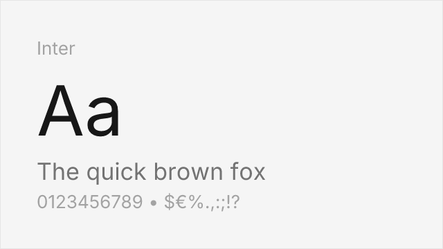
[Google Fonts] · OFL-1.1 · Variable
Modern interpretation with excellent screen optimization and similar neutrality
Why it matches: Inter shares Univers's systematic approach to type design with similar x-height, stroke consistency, and neutral character. Both prioritize clarity and functionality over personality. Inter's comprehensive weight range and extensive OpenType features make it equally versatile for corporate and editorial applications.
corporate identityUI designweb applicationseditorial

[Google Fonts] · OFL-1.1 · Variable
Adobe's open-source alternative with comparable weight range and clarity
Why it matches: Source Sans Pro embodies Univers's functional clarity with similar neutral character and systematic weight range. Both excel in corporate and governmental contexts where professionalism and legibility are paramount. The Adobe family's coordination with Source Serif and Source Code mirrors Univers's systematic approach.
government websitesdocumentationcorporate communicationsUI design
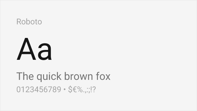
[Google Fonts] · Apache-2.0 · Variable
Similar functional design philosophy optimized for digital interfaces
Why it matches: Roboto shares Univers's neo-grotesque foundations with similar emphasis on functional clarity. While Roboto adds subtle humanist touches, it maintains the neutral, systematic character that defines Univers. Its role as Android's system font demonstrates comparable versatility across applications.
Android appsMaterial Designcross-platform productsmobile interfaces

[Google Fonts] · OFL-1.1 · Variable
Neo-grotesque with a full variable range and screen-first tuning
Why it matches: Work Sans sits squarely in Univers's neo-grotesque tradition — neutral, even, and functional — while being drawn for the screen. Its optically corrected middle weights and full 100–900 range make it a flexible, systematic substitute for corporate and editorial hierarchies, trading a little of Univers's mid-century precision for modern digital polish.
corporate identityweb and app UIeditorial hierarchydocumentation
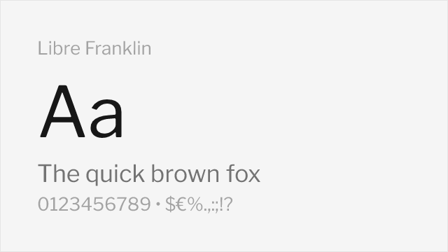
[Google Fonts] · OFL-1.1 · Variable
American-gothic grotesque with a systematic, wide weight range
Why it matches: Libre Franklin is a revival of the Franklin Gothic tradition, which sits just beside Univers in the grotesque family tree. It is a shade more characterful than Univers, but its neutral, workmanlike forms and complete Thin-to-Black range make it a strong systematic alternative for identity systems and long text alike.
institutional brandingnews and editorialcorporate systemssignage
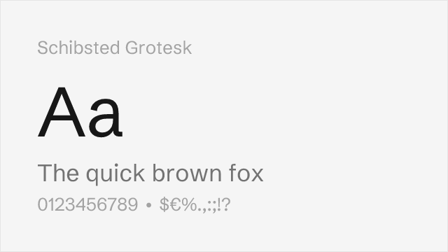
[Google Fonts] · OFL-1.1 · Variable
Contemporary neutral grotesque built for brand systems
Why it matches: Schibsted Grotesk is a modern neutral grotesque designed for a large media brand system, which gives it exactly the kind of systematic, low-personality clarity Univers pioneered. It is more contemporary in feel and narrower in range, but for clean corporate and editorial work it captures Univers's calm, functional neutrality.
brand systemseditorial designdisplay and headlinescontemporary corporate