Free Alternatives to Helvetica

About Helvetica
- Foundry
- Linotype
- Classification
- sans-serif
- Style
- neo-grotesque
Brands Using Helvetica
Primary brand typeface for all retail and advertising materials
Logo wordmark and brand communications
Corporate wordmark and global communications
Airline branding, signage, and in-flight materials
Supporting typeface used in vehicle documentation and marketing
Official signage system for New York City transit since the 1980s
Corporate communications and dealer signage
 See Helvetica live on these sites with FontSwap →
See Helvetica in the Wild
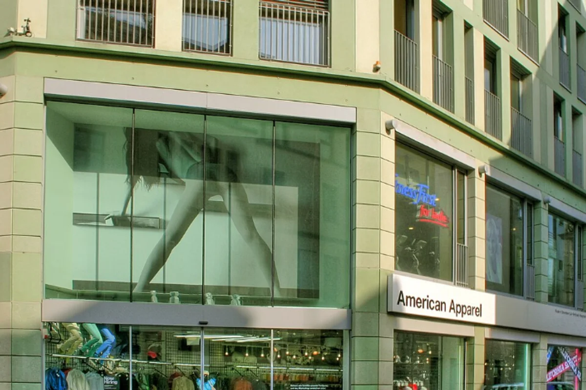

Helvetica is arguably the most famous typeface in the world. Designed by Max Miedinger and Eduard Hoffmann in 1957 at the Haas Type Foundry in Switzerland, it has become synonymous with modern graphic design and corporate identity. Its influence extends far beyond typography, shaping visual culture for over six decades — and, because a licensed copy of Helvetica is expensive and rarely bundled with modern operating systems, it is also one of the fonts designers most often need a free substitute for.
History and Design
Originally named Neue Haas Grotesk, the typeface was developed as a refinement of the earlier Akzidenz-Grotesk. When Linotype acquired the design for international distribution, it was renamed Helvetica (from the Latin name for Switzerland, "Helvetia"). The redesign aimed to create a more refined, modern alternative to the popular grotesque typefaces of the era.
Max Miedinger, a former Haas salesman turned designer, worked closely with Eduard Hoffmann to create a typeface that embodied rationality and neutrality. The result was a remarkably balanced design with uniform stroke widths, horizontal terminals, and tight letter spacing that would come to define the International Typographic Style. Linotype expanded the family through the 1960s and 1970s, and in 1983 released Neue Helvetica, a rationalized version with a numbered weight-and-width system that remains the standard reference today.
The move from metal to phototypesetting and then to digital changed how Helvetica was used more than how it looked. As desktop publishing spread in the late 1980s, Helvetica became a fixture of the design toolkit — but licensing costs and the arrival of the near-identical Arial (bundled free with Microsoft software) split the world into those who paid for the original and those who reached for a substitute. That split is still with us: because Helvetica is not included with today's operating systems, most people who set out to "use Helvetica" are really choosing between licensing it and picking one of the free alternatives covered below.
Why Helvetica Matters
Helvetica's success lies in its extraordinary neutrality. Unlike typefaces with distinctive personalities, Helvetica doesn't impose itself on the content it presents. This chameleonic quality makes it suitable for everything from subway signage in New York City to corporate logos for multinational brands. It reads as trustworthy, orderly, and modern without announcing a point of view — which is exactly why so many institutions reach for it.
That restraint is the whole trick. Helvetica gets out of the way.
That neutrality is also what makes Helvetica a safe default for anyone who is not a typographer. If you need a typeface that will look competent and inoffensive in a pitch deck, a spreadsheet, a storefront, or a wayfinding sign, Helvetica rarely makes a wrong impression. It is the font for people who want the typography to disappear so the message can do the work — brands, transit authorities, product teams, and public bodies that value clarity over character.
The typeface's cultural impact was explored in Gary Hustwit's 2007 documentary "Helvetica," which introduced it to audiences beyond the design community. The film featured interviews with legendary designers including Massimo Vignelli, Erik Spiekermann, and Paula Scher, debating whether Helvetica represents the pinnacle of modernist design or corporate conformity. Both readings are true, and both are reasons it matters: Helvetica is simultaneously the most admired and the most argued-about typeface of the modern era.
Design Characteristics
Helvetica's design rests on a handful of decisions that give it its unmistakable, even-tempered look:
- Horizontal terminals: Strokes are cut on a strict horizontal or vertical, not at an angle. Look at the terminals of the a, c, e, g, and s — they end flat, which is a fast way to tell Helvetica apart from humanist sans-serifs like Frutiger.
- Uniform stroke width: There is minimal contrast between thick and thin strokes, giving text an even, quiet grey on the page.
- High x-height: Lowercase letters are tall relative to the capitals, which improves legibility at a glance but leaves little room in the counters at small sizes.
- Tight letter spacing: Characters sit close together, creating the compact, locked-up texture that defines a Helvetica setting.
- Closed apertures: The openings of letters like c and e curl inward. This is elegant at large sizes but is the single characteristic that most limits Helvetica on small screens.
- Square proportions: Rounded letters tend toward the square rather than the circle, reinforcing the sense of engineered regularity.
These traits are the reason the closest free alternatives fall into two camps: strict metric clones that copy the shapes exactly (Nimbus Sans), and modern grotesques that keep the skeleton but open the apertures for the screen (Inter, Work Sans, Libre Franklin).
Where Helvetica Excels
Helvetica excels wherever neutrality and legibility at a glance matter more than personality:
- Corporate branding: Its neutral character suits professional contexts without imposing personality, which is why it anchors identities from Panasonic to Toyota.
- Signage and wayfinding: Excellent readability at distance and large sizes makes it ideal for transit systems; New York City's subway standardized on Helvetica for its signage.
- Editorial headlines: Clean and authoritative for titles, decks, and captions in magazine and report layouts.
- User interfaces at display sizes: Familiar and trustworthy for headers, buttons, and marketing type in digital products.
- Healthcare and pharmaceutical: The required neutral, non-emotive tone for regulated communications.
- Government and institutional communications: An official, even-handed presence without stylistic bias.
A good example is transit wayfinding: New York City's subway adopted Helvetica as its signage standard in 1989, and its even color and predictable widths let signs stay legible from across a platform. (Fittingly, Massimo Vignelli's celebrated 1970 subway signage system actually specified Standard Medium — a close Akzidenz-Grotesk relative — and the MTA only standardized on Helvetica years later.) The same qualities serve airlines, hospitals, and government forms, where a reader should absorb information instantly and never notice the type doing its job. In all of these, the common thread is large-to-medium type where the tight spacing and closed apertures read as precision rather than clutter.
Where Helvetica Struggles
Helvetica is a triumph of large-format design, and that is also where its limits begin:
- Small sizes and low resolution: The tight spacing and closed apertures that look crisp on a poster close up in body text, where letters like c, e, and a can blur together. This is precisely the problem Inter was drawn to fix, and it is why Helvetica was never an ideal choice for long paragraphs of screen text.
- Character ambiguity: The capital I, lowercase l, and figure 1 are near-identical, which hurts in code, data tables, and anything where a glyph must be unmistakable.
- Long-form reading: The even, low-contrast texture that makes Helvetica calm in short bursts becomes monotonous over pages of running text; humanist sans-serifs and serifs are more comfortable for immersive reading.
- Emotional range: Neutrality cuts both ways. When a brand needs warmth, playfulness, or a distinct voice, Helvetica's refusal to take a position becomes a liability rather than a strength.
- Overexposure: Helvetica is so ubiquitous that it can read as generic or safe by default, which some brands specifically want to avoid.
Recognizing these limits is useful when choosing a substitute: if your work lives at small sizes on screens, a shape-faithful clone actually inherits Helvetica's weaknesses, and an optimized modern grotesque is the better call.
How to Choose a Free Substitute
The right free alternative depends less on which looks "most like Helvetica" in a specimen and more on where your type will live:
- Print and layout fidelity → Nimbus Sans. When existing files must reflow with identical line breaks and column widths, the metric-compatible clone is the only safe answer. The cost is a limited weight range (Regular and Bold).
- Screens, UI, and marketing sites → Inter. Inter keeps Helvetica's neutral tone but opens the apertures and ships a nine-weight variable family, so it stays legible where Helvetica tightens up. For most digital projects this is the default recommendation.
- Android and Material Design → Roboto. Roboto is the platform-native neutral sans and integrates cleanly with the Material ecosystem.
- Long-form and documentation → Source Sans Pro. Its slightly humanist, open lowercase is easier on the eyes across extended reading than a strict Helvetica clone.
- Editorial branding with more weights → Libre Franklin. A warmer grotesque with the full variable range, good when you want neutrality plus a little character.
- Interface text that must hold up small → Work Sans. Drawn for the screen, it renders more cleanly than Helvetica in small UI copy.
A practical rule: if you are matching an existing Helvetica document, choose by metrics (Nimbus Sans). If you are starting fresh, choose by medium (Inter for screens, Source Sans Pro for reading), because a modern grotesque will serve you better than a clone that faithfully reproduces Helvetica's small-size shortcomings.
Premium Font Neighbors
If you are drawn to Helvetica, several other premium typefaces occupy the same neo-grotesque neighborhood and are worth knowing:
- Neue Haas Grotesk is Helvetica's own original design, restored by Christian Schwartz to the pre-Linotype drawings — the closest thing to "Helvetica before the compromises."
- Neue Helvetica is the 1983 systematized family, the version most studios actually license today.
- Akzidenz-Grotesk is the 19th-century grotesque that Helvetica was created to refine; it reads slightly more industrial and historic.
- Univers is Adrian Frutiger's rival system from the same era, more organized and with a wider range of widths.
- Aktiv Grotesk is a contemporary, cleaned-up take often described as "Helvetica without the quirks."
- Frutiger and Gill Sans sit one step toward the humanist side — warmer and more open, useful when Helvetica feels too cold.
Exploring these helps clarify what you actually want from Helvetica: the exact shapes (Neue Haas Grotesk), the systematic family (Neue Helvetica), or simply the neutral grotesque feeling, which the free alternatives above deliver at no cost.
FAQ
Why is Inter the best Helvetica alternative?
Inter matches Helvetica's neutral, neo-grotesque character while adding modern optimizations for screen rendering. With 88% visual similarity, nine weights, and a variable font option, Inter provides excellent coverage for most Helvetica use cases. Crucially, it opens the apertures that make Helvetica hard to read at small sizes, so it is often a better choice than Helvetica itself for digital work. Its open-source OFL license allows unlimited commercial use.
What is the closest free clone of Helvetica?
Nimbus Sans, from URW, is the closest free clone. It is metric-compatible, meaning its character widths and spacing match Helvetica exactly, so a document reflows without any layout change. That makes it the right choice for print production and migrating legacy files. The trade-off is a narrower weight range than Helvetica's full family.
Is Helvetica free, or do I need to buy it?
Helvetica is a commercial typeface licensed by Monotype (Linotype), and it is not free — it is also not bundled with Windows or, in its classic form, with recent macOS releases. Because of this, most projects that "use Helvetica" are actually looking for a free substitute like Nimbus Sans, Inter, or Roboto, all of which allow commercial use at no cost.
Does Helvetica have a variable font version?
Yes. Monotype released Helvetica Now in 2019 — a ground-up reworking with size-specific optical designs — and followed it with Helvetica Now Variable in 2021, offering continuous weight and width adjustment. However, this premium version requires licensing. For free variable alternatives, Inter, Roboto, Libre Franklin, and Work Sans all offer variable font families with similar neutral aesthetics.
Should I use Helvetica for body text on a website?
Usually not. Helvetica's tight spacing and closed apertures were designed for print and large sizes, and they reduce legibility in small on-screen paragraphs. For website body text, a screen-optimized grotesque like Inter or Work Sans keeps the neutral Helvetica feel while reading more comfortably at small sizes and low resolutions.
What is the difference between Helvetica and Arial?
Arial was designed as a metric-compatible substitute for Helvetica: the two occupy the same widths, but Arial's details differ — its terminals are cut at an angle rather than strictly horizontal, and letters like the R, G, and t are drawn differently. If you like Helvetica but want a free, faithful match to its shapes rather than just its metrics, Nimbus Sans is closer to Helvetica than Arial is.
Is Helvetica on Google Fonts?
No, Helvetica is a premium font from Linotype and is not available on Google Fonts.
The closest Google Fonts alternative is Inter with 88% similarity. Get it free on Google Fonts ↗
Free Alternatives (7)
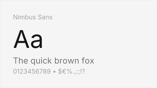
Metric-compatible Helvetica clone from URW — identical character widths
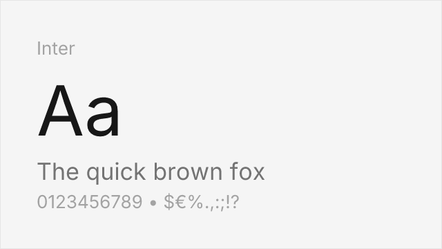
Modern interpretation with excellent screen optimization
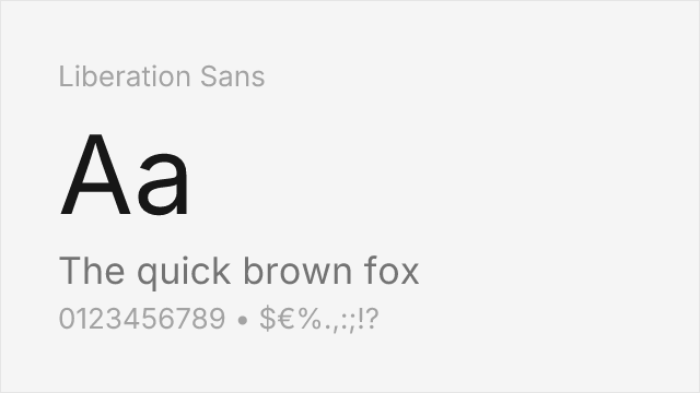
Arial-metric clone; Arial itself matches Helvetica's widths, so it fits closely.
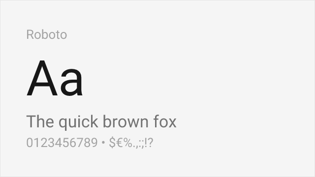
Similar neutral character, designed for Android

Adobe's humanist sans with comparable neutrality and readability
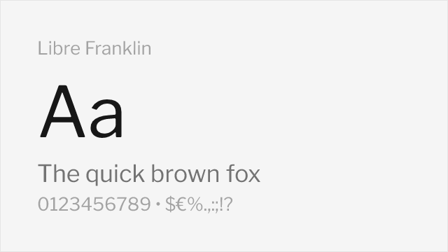
Grotesque with Franklin Gothic roots and a full nine-weight variable family

Screen-optimized grotesque with a wide variable weight range
Compare the alternatives
See how Helvetica compares to its top alternatives — and how those alternatives compare to each other — side by side.
See where Helvetica is used in the wild and swap to free alternatives live.
Install FontSwap →Replacement Summary
Source: FontAlternatives.com
Premium font: Helvetica
Best free alternative: Nimbus Sans
FontAlternatives similarity score: 92%
Replacement difficulty: Low
Best for: print production, PDF generation, legacy system migration
Notable users: American Apparel, Jeep, Panasonic
Not recommended when: Brand consistency with American Apparel requires exact letterforms
What is the best free alternative to Helvetica?
Nimbus Sans is the best free alternative to Helvetica with a FontAlternatives similarity score of 92%.
Nimbus Sans shares similar proportions, stroke characteristics, and intended use with Helvetica. It is available under the GPL-2.0-with-font-exception license, which permits both personal and commercial use at no cost.
This alternative works particularly well for: print production, PDF generation, legacy system migration.
Can I safely replace Helvetica with Nimbus Sans?
Yes, Nimbus Sans is a high-confidence replacement for Helvetica. The FontAlternatives similarity score of 92% indicates strong structural compatibility.
Licensing: Nimbus Sans is licensed under GPL-2.0-with-font-exception, which allows commercial use without licensing fees or royalties.
Weight coverage: All 2 weights have exact matches available.
When should I NOT replace Helvetica?
While Nimbus Sans is a strong alternative, there are situations where replacing Helvetica may not be appropriate:
- Strict compliance: Verify that GPL-2.0-with-font-exception terms meet your specific legal and compliance requirements.
Weight-Matching Guide
Map Helvetica weights to their closest free alternatives for accurate font substitution.
Nimbus Sans
| Helvetica | Nimbus Sans | Match |
|---|---|---|
| Regular (400) | Regular (400) | exact |
| Bold (700) | Bold (700) | exact |
Inter
| Helvetica | Inter | Match |
|---|---|---|
| Light (300) | Light (300) | exact |
| Regular (400) | Regular (400) | exact |
| Medium (500) | Medium (500) | exact |
| Bold (700) | Bold (700) | exact |
Liberation Sans
| Helvetica | Liberation Sans | Match |
|---|---|---|
| Regular (400) | Regular (400) | exact |
| Bold (700) | Bold (700) | exact |
Roboto
| Helvetica | Roboto | Match |
|---|---|---|
| Light (300) | Light (300) | exact |
| Regular (400) | Regular (400) | exact |
| Bold (700) | Bold (700) | exact |
Source Sans 3
| Helvetica | Source Sans 3 | Match |
|---|---|---|
| Regular (400) | Regular (400) | exact |
| Bold (700) | Bold (700) | exact |
Libre Franklin
| Helvetica | Libre Franklin | Match |
|---|---|---|
| Regular (400) | Regular (400) | exact |
| Medium (500) | Medium (500) | exact |
| Bold (700) | Bold (700) | exact |
Work Sans
| Helvetica | Work Sans | Match |
|---|---|---|
| Light (300) | Light (300) | close |
| Regular (400) | Regular (400) | exact |
| Bold (700) | Bold (700) | exact |
Performance Guide
Production performance metrics for each alternative.
How to Use Nimbus Sans
Copy these code snippets to quickly add Nimbus Sans to your project.
CSS code for Nimbus Sans
/* Download from: https://www.fontsquirrel.com/fonts/nimbus-sans-l */
@font-face {
  font-family: "Nimbus Sans";
  src: url('/fonts/nimbus-sans.woff2') format('woff2');
  font-display: swap;
}
HTML code for Nimbus Sans
<!-- Download from: https://www.fontsquirrel.com/fonts/nimbus-sans-l -->
<link href="/fonts/nimbus-sans.css" rel="stylesheet">
Tailwind code for Nimbus Sans
// tailwind.config.js
module.exports = {
  theme: {
    extend: {
      fontFamily: {
        'nimbus-sans': ['"Nimbus Sans"', 'sans-serif'],
      },
    },
  },
}

// Usage in HTML:
// <p class="font-nimbus-sans">Your text here</p>
Next.js code for Nimbus Sans
// Import the font CSS in your _app.js or layout
import '/fonts/nimbus-sans.css';

export default function Component() {
  return (
    <p style={{ fontFamily: '"Nimbus Sans"' }}>
      Your text here
    </p>
  );
}
Expo and React Native code for Nimbus Sans
// Install: npx expo install expo-font
import { useFonts } from 'expo-font';

export default function App() {
  const [fontsLoaded] = useFonts({
    'Nimbus Sans': require('./assets/fonts/nimbus-sans.ttf'),
  });

  if (!fontsLoaded) return null;

  return (
    <Text style={{ fontFamily: 'Nimbus Sans' }}>
      Your text here
    </Text>
  );
}

// Download font from: https://www.fontsquirrel.com/fonts/nimbus-sans-l
Recommended Font Pairings
These free fonts pair well with Nimbus Sans Helvetica for headlines, body text, or accent use.
Source Serif's structured serifs complement Helvetica's neutral forms for balanced editorial layouts
Lora's calligraphic curves add warmth and contrast to Helvetica's precise neo-grotesque character
Merriweather's generous x-height and sturdy serifs pair naturally with Helvetica for screen-optimized reading
Browse Alternatives by Context
Find Helvetica alternatives filtered by specific use case, style, or language support.
Frequently Asked Questions
What is the best free alternative to Helvetica?
Nimbus Sans is the best free alternative to Helvetica with a FontAlternatives similarity score of 92%. It shares similar proportions and characteristics while being available under the GPL-2.0-with-font-exception license for both personal and commercial use at no cost.
Is there a free version of Helvetica?
There is no official free version of Helvetica. However, Nimbus Sans is available under the GPL-2.0-with-font-exception open-source license and achieves a FontAlternatives similarity score of 92%. It includes 2 weights and supports latin, latin-extended.
What Google Font looks like Helvetica?
The Google Fonts most similar to Helvetica are Inter, Roboto, Source Sans 3. Among these alternatives, Inter offers the closest match with a FontAlternatives similarity score of 88% and includes variable weights for flexible typography options.
Can I use Nimbus Sans commercially?
Yes, Nimbus Sans can be used commercially. It is licensed under GPL-2.0-with-font-exception, which allows free use in websites, applications, print materials, and commercial projects without purchasing a license or paying royalties.
Is Nimbus Sans similar enough to Helvetica?
Nimbus Sans achieves a FontAlternatives similarity score of 92% compared to Helvetica. While not identical, it offers comparable letterforms, proportions, and visual style. Most designers find it works excellently as a substitute in web and print projects.
What are the main differences between Helvetica and its free alternatives?
Free alternatives to Helvetica may differ in subtle details like letter spacing, curve refinements, and available weights. Premium fonts typically include more OpenType features, extended language support, and optimized screen rendering. However, for most projects, these differences are negligible.
Where can I download free alternatives to Helvetica?
Download Nimbus Sans directly from fontsquirrel. Click the "Get Font" button on any alternative listed above to visit the official download page. Google Fonts also provides convenient embed codes for seamless web integration.