Free Alternatives to Avenir

About Avenir
- Foundry
- Linotype
- Classification
- sans-serif
- Style
- geometric
Brands Using Avenir
Avenir Next Condensed used for Apple Maps labels (from iOS 6, 2012)
Retail signage and marketing materials
Outdoor brand communications and catalogs
Luxury division marketing materials
 See Avenir live on these sites with FontSwap →
Avenir is a geometric sans-serif designed by Adrian Frutiger and released in 1988 by Linotype. Its name is French for "future" — a deliberate nod to Futura — but where Futura chases geometric purity, Avenir chases warmth. Frutiger set out to prove that a geometric sans could be humane, and the result is one of the most quietly beloved typefaces of the past forty years.
History and Design
By 1988 Adrian Frutiger had little left to prove. He had already given the world Univers and the signage face that bears his own name. Avenir was a late-career return to an idea that had nagged at him for decades: he admired Futura, but found it cold.
So he warmed it up. Avenir is geometric in spirit but humanist in execution, and the difference lives in small decisions. The O is not a perfect circle but a subtly optimized oval. Vertical strokes are drawn a touch heavier than horizontals, the way a pen would naturally weight them. The apertures open up, the x-height sits higher than Futura's, and the ascenders and descenders are shortened — all of which make Avenir far more comfortable at text sizes than its geometric ancestor.
Those humanist touches are the whole point. They are what let Avenir feel constructed and friendly at the same time.
It helps to know what Frutiger cared about. More than almost any designer of his generation, he treated legibility as an engineering problem: Univers came with a rational numbering grid for its weights and widths, and the typeface that bears his name grew out of the signage he designed for Charles de Gaulle Airport, where letters had to be read at speed, at an angle, in poor light. Avenir carries that same discipline. Every humanist softening in it is there to serve the reader, not to decorate the page.
In 2004 Frutiger teamed up with Akira Kobayashi to draw Avenir Next, a comprehensive expansion: more weights, matching widths, proper hinting for screens, and — importantly — true italics in place of the original's slanted obliques. Avenir Next is the version most people actually license today, and the one that went on to reach the widest audience of all.
Why Avenir Matters
Avenir matters because it solved a real problem: how to be modern without being cold.
That balance makes it unusually versatile. The same typeface can carry a hospital's patient materials, a bank's annual report, and a running-shoe brand's campaign without feeling out of place in any of them. It projects competence and calm — professional without the starch, friendly without the whimsy.
Its biggest megaphone was Apple. Avenir Next has shipped with iOS and macOS for years, and Apple set the labels in its redesigned Maps app in it — so hundreds of millions of people read Avenir every day without ever learning its name. They just register that the type feels trustworthy and clear. That is exactly the effect Frutiger was after.
There is a broader influence, too. Avenir helped define a whole category — the humanist-geometric sans — that has dominated branding ever since. When you notice how many modern companies use a warm, geometric, slightly rounded sans-serif that feels approachable but serious, you are looking at Avenir's descendants. It set the template that Circular, Proxima Nova, and a hundred variable-font startups have been refining for thirty years.
Who is it for? Brands and product teams that want a single, dependable voice — one that reads as human at 11 points on a phone and as confident at 60 points on a billboard. If Futura is the typeface of bold statements, Avenir is the typeface of being quietly, consistently good.
Design Characteristics
The details that define Avenir:
- Geometric skeleton, humanist flesh — built on circles and straight lines, then softened by hand.
- Two-storey 'a' and 'g' — a key difference from Futura's single-storey a, and part of why Avenir reads more easily in text.
- Higher x-height with short extenders — the single biggest reason Avenir works at small sizes where Futura falters.
- Open apertures — the openings of c, e, and s stay generous, aiding legibility.
- Subtle stroke modulation — a slight thick-thin contrast that adds warmth without looking calligraphic.
- Optically refined widths — letter proportions tuned by eye rather than by compass.
If you are choosing a free alternative, this is the checklist that matters: you want a two-storey a, a comfortable x-height, and open apertures. A rounded-terminal face like Nunito nails the warmth; a flatter one like Nunito Sans nails the professionalism.
Where Avenir Excels
Avenir is a genuine all-rounder, but it is happiest in a few places:
- Mobile and screen interfaces — the moderate x-height and open forms hold up beautifully at small sizes, as Apple's long use demonstrates.
- Corporate identity — approachable authority for banks, insurers, and B2B brands that want to feel human.
- Healthcare and public services — clear, calm, and trustworthy where anxiety runs high.
- Navigation and maps — legible and neutral at small sizes, crowded in among other information.
- Editorial and body text — readable across long passages in a way most geometric sans-serifs are not.
Apple Maps is the textbook case. When Apple redrew Maps in 2012 it set the map labels in Avenir Next Condensed, and the reasons are exactly Avenir's strengths: the letters stay legible at tiny sizes, crowded in among streets and place names, without the coldness that would make a map feel clinical. That is Avenir doing what Frutiger built it to do, in one of the most demanding legibility environments there is.
The thread running through all of these is readability under pressure — small sizes, long text, high stakes — which is precisely where Avenir's humanist adjustments earn their keep.
Where Avenir Struggles
Avenir's great strength, its even-tempered warmth, is also its ceiling.
Because it is so balanced and so agreeable, it rarely makes a strong statement. Set a poster in Futura and it announces itself; set the same poster in Avenir and it simply looks nice. When a brand needs a distinctive, ownable display face, Avenir's neutrality works against it.
Ubiquity compounds the problem. Years of visibility in Apple's software and a place in countless brand guidelines mean Avenir can read as the safe, expected choice — the typographic equivalent of a navy suit.
There is also real-world friction. Avenir, Avenir Next, and Avenir Next Pro are different families with different weights and metrics, and it is easy to license one and design against another. The type is not cheap, and while Avenir Next ships with macOS, using it on the web or embedding it in an app still requires proper licensing — which is why so many teams that love the look end up reaching for a free substitute instead.
How to Choose a Free Substitute
The right free stand-in depends on how warm and how screen-first you need to be:
- Closest overall, with warmth → Nunito. Its rounded terminals capture Avenir's friendly character; ideal for healthcare, education, and consumer brands.
- Closest for professional, flat-terminal work → Nunito Sans. The same humanist-geometric balance without the rounded corners — better for corporate and editorial settings.
- Body text and documents → Lato. Neutral in paragraphs, subtly friendly at display; a workhorse for reports and long copy.
- Minimal product UI → Mulish. Clean and quiet, good when you want Avenir's calm with a more pared-back texture.
- Screen-first interfaces → Manrope. A modern, UI-tuned cousin that renders crisply at small sizes.
- Geometric branding with more weights → Poppins. Rounder and more geometric than Avenir, with a full family for flexible digital work.
A useful shortcut: if warmth is the priority, start with Nunito; if you are matching Avenir in a corporate system, start with Nunito Sans; if the work lives entirely in an app, try Manrope. Any of the three gets you most of the way to Avenir at no cost.
One caution when substituting: Avenir's family is deep, with carefully tuned intermediate weights like Book and Medium that brands lean on heavily. Check that your free choice has the weights your design actually uses before committing — a substitute that only ships Regular and Bold will force compromises a six- or nine-weight family like Nunito or Mulish avoids.
Premium Font Neighbors
If Avenir is your reference, a cluster of premium typefaces circles the same humanist-geometric territory:
- Futura is the ancestor Avenir set out to humanize — purer geometry, colder, more distinctive.
- Circular is the contemporary darling that occupies almost the same niche: geometric with a warm, friendly finish, and hugely popular in tech branding.
- Proxima Nova is the American counterpart, a geometric-humanist hybrid that became one of the defining webfonts of the 2010s.
- Century Gothic shares the geometric bones but with a colder, more mechanical feel.
- Museo Sans and Myriad sit close on the humanist side, warm and readable at text sizes.
Circular and Proxima Nova are the two most worth studying, because they show how the market kept chasing Avenir's exact balance. Proxima Nova became one of the most-licensed webfonts of the 2010s, seemingly everywhere across startups and media sites; Circular then took the crown for premium tech branding, Spotify's 2015 rebrand among the best-known examples. Both are, in essence, contemporary answers to the question Frutiger asked in 1988 — how do you make geometry feel human? — which is a good reminder that if you like Avenir, you are in extremely well-trodden company.
Comparing these clarifies what you actually value in Avenir: the pure geometry (Futura), the same warmth in a trendier suit (Circular, Proxima Nova), or simply readable, humane modernism (Museo Sans, Myriad) — much of which the free alternatives above deliver for nothing.
FAQ
What is the best free alternative to Avenir?
For most projects, Nunito is the best free alternative — it shares Avenir's humanist-geometric structure and rounded, friendly terminals at roughly 88% similarity, and it is licensed under the SIL Open Font License for unlimited commercial use. If you need Avenir's professionalism without rounded corners, Nunito Sans is an even closer match to the original letterforms.
Is Nunito similar to Avenir?
Yes. Nunito is the closest free match, at about 88% visual similarity. Both combine geometric foundations with rounded terminals that create warmth and approachability, which is why Nunito works so well as an Avenir stand-in for healthcare, education, and consumer branding. Its flat-terminal sibling, Nunito Sans, is the better pick when rounded corners feel too casual.
Did Apple use Avenir in iOS?
Yes, though not as the main interface font. Apple set the labels in its redesigned Maps app (from iOS 6 in 2012) in Avenir Next Condensed, chosen for its small-size legibility and warm, humanist character, and Avenir Next ships with iOS and macOS as a bundled font. The primary system typeface, though, was Helvetica Neue and later San Francisco — Avenir's role was in Maps and as an available option, not the system chrome.
What's the difference between Avenir and Futura?
Both are geometric sans-serifs, but Avenir is the humanist take. Futura uses a single-storey a, near-perfect circles, and a low x-height, which makes it striking at display sizes but harder to read small. Avenir uses a two-storey a, a higher x-height, subtly modulated strokes, and open apertures — trading some of Futura's iconic geometry for far better readability in body text and on screens.
What is the difference between Avenir and Avenir Next?
Avenir (1988) is the original six-weight family with slanted obliques instead of true italics. Avenir Next (2004), drawn with Akira Kobayashi, expanded the range with more weights and widths, added genuine italics, and improved screen hinting. Avenir Next is the version most designers license today, especially for digital work — just be careful not to mix metrics between the two families.
Is Avenir free to use?
No. Avenir and Avenir Next are commercial typefaces licensed by Monotype. Avenir Next ships with macOS for system use, but publishing it on the web or embedding it in software requires a separate license. Free alternatives such as Nunito, Nunito Sans, Lato, and Manrope let you achieve a very similar look at no cost and with unrestricted commercial licensing.
What fonts pair well with Avenir?
Avenir's warm neutrality gives it a lot of pairing range. A classic transitional serif such as Libre Baskerville adds gravitas for editorial layouts, while a sturdier text serif like Merriweather balances it well in long-form reading. Because Avenir is already friendly, you can also let it stand alone across an entire brand — using its weight range for hierarchy — without any second typeface at all.
Is Avenir on Google Fonts?
No, Avenir is a premium font from Linotype and is not available on Google Fonts.
The closest Google Fonts alternative is Nunito with 88% similarity. Get it free on Google Fonts ↗
Free Alternatives (6)
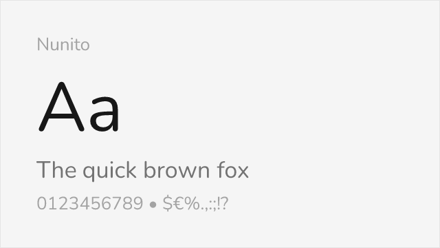
Excellent match with similar rounded terminals and geometric structure
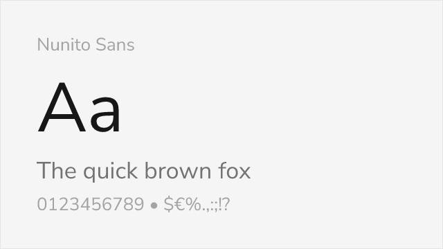
The flat-terminal Nunito — arguably the closest free read on Avenir's forms
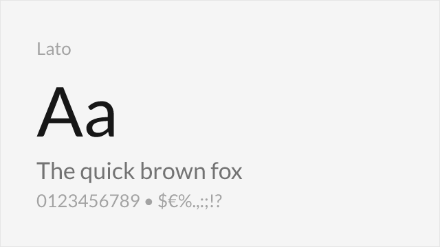
Shares the humanist warmth and professional appearance
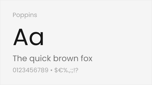
Similar geometric foundation with more uniform stroke widths
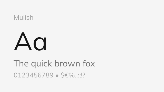
Minimalist sans with clean, low-contrast humanist-geometric forms
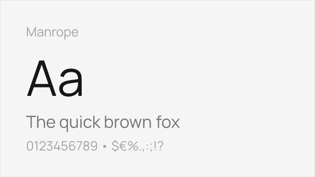
Modern semi-geometric sans tuned for screens and interfaces
Compare the alternatives
See how Avenir compares to its top alternatives — and how those alternatives compare to each other — side by side.
See where Avenir is used in the wild and swap to free alternatives live.
Install FontSwap →Replacement Summary
Source: FontAlternatives.com
Premium font: Avenir
Best free alternative: Nunito
FontAlternatives similarity score: 88%
Replacement difficulty: Low
Best for: friendly branding, healthcare, educational content, mobile apps
Notable users: Apple, Best Buy, Fjällräven
Not recommended when: Brand consistency with Apple requires exact letterforms
What is the best free alternative to Avenir?
Nunito is the best free alternative to Avenir with a FontAlternatives similarity score of 88%.
Nunito shares similar proportions, stroke characteristics, and intended use with Avenir. It is available under the OFL-1.1 license, which permits both personal and commercial use at no cost.
This alternative works particularly well for: friendly branding, healthcare, educational content, mobile apps.
Can I safely replace Avenir with Nunito?
Yes, Nunito is a high-confidence replacement for Avenir. The FontAlternatives similarity score of 88% indicates strong structural compatibility.
Licensing: Nunito is licensed under OFL-1.1, which allows commercial use without licensing fees or royalties.
Weight coverage: Most weights have close or exact matches available.
When should I NOT replace Avenir?
While Nunito is a strong alternative, there are situations where replacing Avenir may not be appropriate:
- Strict compliance: Verify that OFL-1.1 terms meet your specific legal and compliance requirements.
Weight-Matching Guide
Map Avenir weights to their closest free alternatives for accurate font substitution.
Nunito
| Avenir | Nunito | Match |
|---|---|---|
| Light (300) | Light (300) | exact |
| Book (400) | Regular (400) | close |
| Medium (500) | Medium (500) | exact |
| Heavy (800) | ExtraBold (800) | close |
| Black (900) | Black (900) | exact |
Nunito Sans
| Avenir | Nunito Sans | Match |
|---|---|---|
| Book (400) | Regular (400) | close |
| Medium (500) | Medium (500) | exact |
| Heavy (800) | ExtraBold (800) | close |
Lato
| Avenir | Lato | Match |
|---|---|---|
| Light (300) | Light (300) | exact |
| Book (400) | Regular (400) | close |
| Black (900) | Black (900) | exact |
Poppins
| Avenir | Poppins | Match |
|---|---|---|
| Light (300) | Light (300) | exact |
| Book (400) | Regular (400) | close |
| Bold (700) | Bold (700) | exact |
Mulish
| Avenir | Mulish | Match |
|---|---|---|
| Book (400) | Regular (400) | close |
| Medium (500) | Medium (500) | exact |
| Bold (700) | Bold (700) | exact |
Manrope
| Avenir | Manrope | Match |
|---|---|---|
| Book (400) | Regular (400) | close |
| Medium (500) | Medium (500) | close |
| Bold (700) | Bold (700) | exact |
Performance Guide
Production performance metrics for each alternative.
How to Use Nunito
Copy these code snippets to quickly add Nunito to your project.
CSS code for Nunito
@import url('https://fonts.googleapis.com/css2?family=Nunito:wght@100..900&display=swap');HTML code for Nunito
<link rel="preconnect" href="https://fonts.googleapis.com">
<link rel="preconnect" href="https://fonts.gstatic.com" crossorigin>
<link href="https://fonts.googleapis.com/css2?family=Nunito:wght@100..900&display=swap" rel="stylesheet">
Tailwind code for Nunito
// tailwind.config.js
module.exports = {
  theme: {
    extend: {
      fontFamily: {
        'nunito': ['Nunito', 'sans-serif'],
      },
    },
  },
}

// Usage in HTML:
// <p class="font-nunito">Your text here</p>
Next.js code for Nunito
// Using next/font (Next.js 13+)
import { Nunito } from 'next/font/google';

const nunito = Nunito({
  subsets: ['latin'],
  weight: ['100', '200', '300', '400', '500', '600', '700', '800', '900'],
});

export default function Component() {
  return (
    <p className={nunito.className}>
      Your text here
    </p>
  );
}

// Or using inline styles with Google Fonts link:
// <p style={{ fontFamily: "'Nunito'" }}>Your text</p>
Expo and React Native code for Nunito
// Install: npx expo install @expo-google-fonts/nunito expo-font
import { useFonts, Nunito_400Regular } from '@expo-google-fonts/nunito';

export default function App() {
  const [fontsLoaded] = useFonts({
    Nunito_400Regular,
  });

  if (!fontsLoaded) return null;

  return (
    <Text style={{ fontFamily: 'Nunito_400Regular' }}>
      Your text here
    </Text>
  );
}
Recommended Font Pairings
These free fonts pair well with Nunito Avenir for headlines, body text, or accent use.
Merriweather's generous proportions and sturdy serifs complement Avenir's warm geometric character for versatile editorial pairings
Libre Baskerville's refined transitional serifs add classical gravitas to Avenir's approachable modernity
Crimson Pro's elegant book-inspired serifs create a sophisticated reading experience alongside Avenir's clean sans-serif forms
Browse Alternatives by Context
Find Avenir alternatives filtered by specific use case, style, or language support.
Frequently Asked Questions
What is the best free alternative to Avenir?
Nunito is the best free alternative to Avenir with a FontAlternatives similarity score of 88%. It shares similar proportions and characteristics while being available under the OFL-1.1 license for both personal and commercial use at no cost.
Is there a free version of Avenir?
There is no official free version of Avenir. However, Nunito is available under the OFL-1.1 open-source license and achieves a FontAlternatives similarity score of 88%. It includes variable weights and supports latin, latin-extended.
What Google Font looks like Avenir?
The Google Fonts most similar to Avenir are Nunito, Nunito Sans, Lato. Among these alternatives, Nunito offers the closest match with a FontAlternatives similarity score of 88% and includes variable weights for flexible typography options.
Can I use Nunito commercially?
Yes, Nunito can be used commercially. It is licensed under OFL-1.1, which allows free use in websites, applications, print materials, and commercial projects without purchasing a license or paying royalties.
Is Nunito similar enough to Avenir?
Nunito achieves a FontAlternatives similarity score of 88% compared to Avenir. While not identical, it offers comparable letterforms, proportions, and visual style. Most designers find it works excellently as a substitute in web and print projects.
What are the main differences between Avenir and its free alternatives?
Free alternatives to Avenir may differ in subtle details like letter spacing, curve refinements, and available weights. Premium fonts typically include more OpenType features, extended language support, and optimized screen rendering. However, for most projects, these differences are negligible.
Where can I download free alternatives to Avenir?
Download Nunito directly from Google Fonts. Click the "Get Font" button on any alternative listed above to visit the official download page. Google Fonts also provides convenient embed codes for seamless web integration.