 Install FontSwap
Free Alternatives to Avenir with Geometric Style
Avenir is known for its geometric aesthetic. If you're looking for a free sans serif font with a similar geometric feel, these 6 alternatives offer comparable characteristics. We've identified 6 that are especially well-suited for this context. All are available under open-source licenses for unrestricted commercial use.
Top Picks
Comparison Table
| Font | Relevance ⓘ
How well this alternative fits the specific context (use-case or trait) of this page. Score 0–100 based on matching keywords, industries, and font characteristics. Alternatives scoring 25+ are highlighted.
| Similarity ⓘ
How visually similar this free font is to the premium original. Score 0–100 based on x-height, width, stroke contrast, use-case overlap, and language coverage.
Learn more → | Weights | Variable | License | Source |
|---|---|---|---|---|---|---|
| Nunito | 38 | 88% | Variable | Yes | OFL-1.1 | Google Fonts ↗ |
| Nunito Sans | 37 | 86% | Variable | Yes | OFL-1.1 | Google Fonts ↗ |
| Lato | 36 | 82% | 5 | No | OFL-1.1 | Google Fonts ↗ |
| Poppins | 35 | 75% | 9 | No | OFL-1.1 | Google Fonts ↗ |
| Mulish | 34 | 72% | Variable | Yes | OFL-1.1 | Google Fonts ↗ |
| Manrope | 34 | 68% | Variable | Yes | OFL-1.1 | Google Fonts ↗ |
All Alternatives (6)
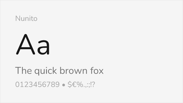
[Google Fonts] · OFL-1.1 · Variable
Excellent match with similar rounded terminals and geometric structure
Why it matches: Nunito captures Avenir's distinctive blend of geometric structure and rounded terminals. Both typefaces share the same philosophy of softening geometric forms for warmth without sacrificing modern clarity. The x-height, letter spacing, and overall friendly character closely parallel Avenir's humanist-geometric hybrid design.
friendly brandinghealthcareeducational contentmobile apps
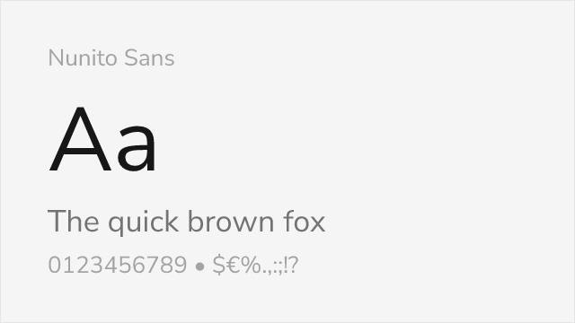
[Google Fonts] · OFL-1.1 · Variable
The flat-terminal Nunito — arguably the closest free read on Avenir's forms
Why it matches: Nunito Sans is the flat-terminal companion to Nunito, and that makes it an even closer read on Avenir than its rounded sibling. It keeps the humanist-geometric balance — open apertures, a generous but controlled x-height, subtle stroke modulation — that defines Avenir, without the soft rounded corners, landing very near the original's calm, professional tone.
corporate brandinglong-form body textinterfaces
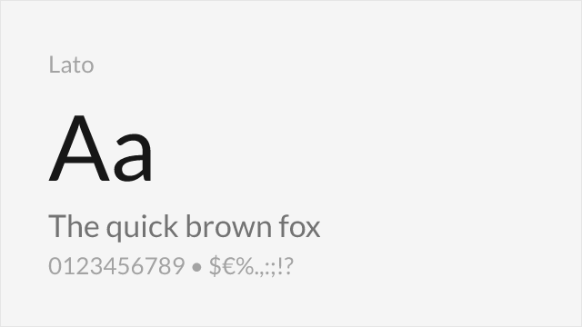
[Google Fonts] · OFL-1.1 · 5 weights
Shares the humanist warmth and professional appearance
Why it matches: Lato embodies Avenir's humanist warmth with semi-rounded letterforms and professional versatility. While lacking Nunito's fully rounded terminals, Lato achieves similar approachability through subtle curves and balanced proportions. It excels in the same corporate and editorial contexts where Avenir thrives.
corporate communicationsbody textprofessional documentsweb applications
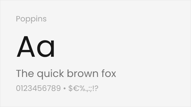
[Google Fonts] · OFL-1.1 · 9 weights
Similar geometric foundation with more uniform stroke widths
Why it matches: Poppins shares Avenir's geometric foundations while offering slightly more uniform stroke widths and rounder forms. Though less humanist than Avenir, Poppins captures the same modern, approachable aesthetic that makes Avenir popular for tech and consumer brands. Its comprehensive weight range matches Avenir's versatility.
web applicationsUI designtech brandingdisplay headlines
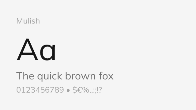
[Google Fonts] · OFL-1.1 · Variable
Minimalist sans with clean, low-contrast humanist-geometric forms
Why it matches: Mulish (formerly Muli) is a quiet, minimalist sans built on the same humanist-geometric logic as Avenir. Its even color, open counters, and restrained detailing give it Avenir's unfussy, trustworthy feel, though it is a touch more neutral and less warm than the original.
product UIdashboardsminimal branding
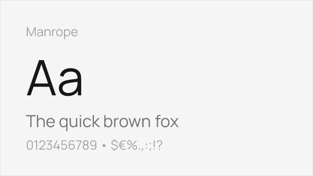
[Google Fonts] · OFL-1.1 · Variable
Modern semi-geometric sans tuned for screens and interfaces
Why it matches: Manrope is a contemporary semi-geometric sans that shares Avenir's balance of geometric structure and humanist openness, redrawn for the screen. It reads as a more current, UI-first cousin — cleaner at small sizes, with a slightly tighter, more technical feel than Avenir's softer warmth.
web and app UIstartup brandingdashboards