Free Alternatives to Museo Sans

About Museo Sans
- Foundry
- Exljbris Font Foundry
- Classification
- sans-serif
- Style
- geometric
Brands Using Museo Sans
A dependable geometric-humanist choice for approachable corporate branding
Friendly-but-professional geometric type for app and marketing surfaces
A clean, legible family for corporate decks, documents, and data-heavy layouts
Approachable, accessible typography for institutional and educational identities
 See Museo Sans live on these sites with FontSwap →
Museo Sans is the sans-serif companion to Jos Buivenga's Museo Slab, drawn at his exljbris foundry and released in the late 2000s. It is a geometric-humanist sans with low stroke contrast, a friendly rounded character, and subtle slab-like detailing carried over from its serif sibling. For years it was one of the most visible "designer" sans-serifs in corporate and brand work, and a large part of that reach came from an unusual bit of marketing: one weight was given away free.
Why Museo Sans Matters
Most premium type families ask you to pay before you can try them. Museo Sans did the opposite. Buivenga released Museo Sans 500 at no cost, and that single medium weight spread across countless websites, decks, and identities before anyone had licensed the rest of the family.
The strategy worked because the free weight was genuinely useful on its own. Museo Sans 500 sits right in the middle of the family's range, comfortable for both headlines and short blocks of text, so a designer could build a whole look on it and only reach for the paid weights when a project demanded more contrast between light and bold. That is how a lot of studios first met the typeface, and why it still turns up in brand guidelines a decade later.
Beyond the giveaway, Museo Sans matters because it captured a specific mood that a lot of brands wanted: modern and structured, but warm rather than clinical. It is geometric enough to read as contemporary and disciplined, yet its detailing keeps it from feeling as impersonal as a strict Swiss grotesque. That combination made it a natural fit for companies that wanted to look organized and approachable at the same time.
It also arrived as half of a matched pair. Because Museo Slab shares the same skeleton, teams could set headlines in the slab and body copy in the sans and get an instantly coherent system. Type families that ship a serif and a sans built on the same bones are common now; Museo was an early, well-executed example, and that pairing logic is a big part of its appeal.
Design Characteristics
Museo Sans is built on a geometric-humanist foundation, and a handful of decisions give it its recognizable, even-tempered voice:
- Low stroke contrast. The difference between thick and thin strokes is minimal, which keeps color even across a page and gives the family its calm, uniform texture.
- Geometric skeleton with humanist warmth. The bowls tend toward the circular and the proportions read as constructed, but softened terminals and gentle detailing pull it back from pure geometry toward something friendlier.
- Slab-derived detailing. Because it descends from Museo Slab, the sans keeps faint traces of that origin in its stems and joints, which is part of why it feels sturdier and more characterful than a generic geometric sans.
- Generous x-height. Tall lowercase letters improve legibility at a glance and help the medium weights hold up in interface and body settings.
- Fixed weight steps. The family ships in five weights, and it is not a variable font, so you design around 100, 300, 500, 700, and 900 rather than dialing in anything between them.
Those weights are worth naming, because they shape how you use the family. Museo Sans 100 is a hairline reserved for large display type. The 300 is a light text weight, the 500 is the workhorse medium, the 700 is a true bold, and the 900 is a heavy, poster-grade black. There is deliberately no 400 "regular" in the classic numbering, which is one reason the free 500 became the default body weight for so many people.
The overall impression is friendliness under control. Museo Sans looks designed rather than defaulted, but it never shouts.
Where Museo Sans Excels
Museo Sans is at its best wherever a brand wants to feel approachable and competent at the same time:
- Corporate and brand identity. Its geometric-humanist balance reads as trustworthy without turning cold, which suits companies that want warmth alongside order.
- Marketing and web design. The generous x-height and even color hold up well on screen for headlines, subheads, and short body passages.
- Editorial and presentation layouts. With five weights, it can carry a clear hierarchy across covers, decks, and reports without borrowing from a second family.
- Paired systems with Museo Slab. Setting display type in the slab and running text in the sans produces a cohesive voice with almost no effort, because the two share a skeleton.
- Logos and wordmarks. The rounded, characterful forms give a mark personality while staying legible at small sizes.
The through-line is tone. When the brief calls for "modern but friendly," Museo Sans tends to land it, and the free 500 weight makes it easy to prototype that look before committing budget.
Where Museo Sans Struggles
The same qualities that make Museo Sans appealing also set its limits.
The most practical constraint is the license. Only the 500 weight was ever free; a full production system needs light, bold, and black weights, and those are commercial. Teams that build a look on the free weight sometimes discover the licensing cost only when they try to scale the design, which is exactly the moment a free-family substitute becomes attractive.
It is also not a variable font. Modern workflows increasingly expect a continuous weight axis for responsive typography and fine-grained control, and Museo Sans's five fixed steps can feel restrictive next to a variable family that offers everything in between.
There is a stylistic ceiling, too. Museo Sans is friendly and characterful, which is a strength for approachable brands and a liability for anything that needs to read as strictly neutral, technical, or luxurious. Its warmth is a point of view, and not every project wants one.
Finally, the classic numbering has no true regular weight. Designers used to reaching for a 400 have to adjust to building body text on the 300 or 500, which is a small thing but a real friction the first time you set a paragraph.
How to Choose a Free Substitute
Because so many people started with the free Museo Sans 500 and then hit the paid wall, the most common question about this family is simply which free font to move to. The answer depends on how close a match you need and where the type will live. The six alternatives below are ordered from the safest structural swap to the most characterful.
Start with Nunito Sans. It is the closest overall match and the default recommendation. Nunito Sans shares Museo Sans's blend of geometric structure and humanist warmth, carries a comparable tall x-height and open forms, and ships as a variable font with a broad weight range. If you built a look on Museo Sans 500 and need the rest of the family for free, this is the first font to try.
Reach for Lato when you want a corporate, print-ready feel. Lato keeps the same neutral-in-text, warm-at-display duality that makes Museo Sans versatile, and it excels in body copy, brand communications, and printed materials. It is not a variable font, but its fixed weights map cleanly onto Museo Sans's own fixed steps.
Pick Poppins for a more overtly geometric, modern look. Poppins is rounder and more purely geometric than Museo Sans, with a full nine-weight range including a true medium. It is the flexible choice for tech branding and interfaces when you want clarity and a contemporary edge more than an exact match.
Use Quicksand when warmth is the priority. Quicksand pushes the rounded, friendly side of Museo Sans further, with circular bowls and soft terminals that shine in headlines, logos, and lifestyle branding. It is a variable font, but its playful character makes it better for display than for dense body text.
Choose Cabin when you need warmth plus text stamina. Cabin leans humanist rather than geometric, but it lands in the same friendly-yet-professional register, and its variable weight axis and true italics make it more comfortable than Museo Sans for running text and interfaces.
Consider Rubik for range and multilingual reach. Rubik keeps a geometric skeleton with slightly rounded corners and offers a wide Light-to-Black variable range, plus multi-script coverage that Museo Sans's Latin-first family cannot match. It is the pick for design systems that span display and interface type across languages.
A simple way to decide: if you want the least visible change, use Nunito Sans; if you want a variable axis, use Nunito Sans, Cabin, Rubik, or Quicksand; and if you specifically want the friendly, characterful mood over a precise structural match, Quicksand and Rubik push furthest in that direction.
Premium Font Neighbors
If Museo Sans is the right general direction but not quite the right fit, several other commercial families sit nearby and are worth knowing.
Museo Slab is the obvious first stop: the serif sibling built on the same skeleton, ideal when you want slab headlines over sans body copy in one coherent voice.
Avenir is Adrian Frutiger's refined geometric sans, a little more classical and neutral than Museo Sans but with a similar sense of order and warmth. Century Gothic is more strictly geometric and monoline, useful when you want cleaner circular forms and less humanist detailing.
Proxima Nova occupies almost the same middle ground as Museo Sans, blending geometric structure with humanist proportions, and it is one of the most widely licensed sans-serifs for web and brand work. Sofia Pro is another friendly geometric sans in the same family of moods, often chosen for approachable modern identities.
At the more geometric end, Gotham brings a confident, American geometric sans with strong, even proportions, while Futura is the historical archetype the whole geometric category descends from, more austere and classical than Museo Sans but the reference point behind its geometry.
Exploring these helps clarify what you actually want from Museo Sans: the matched serif-and-sans system (Museo Slab), the same warm-geometric balance (Proxima Nova, Sofia Pro, Avenir), or the cleaner, more purely geometric look (Century Gothic, Gotham, Futura).
FAQ
What is the best free alternative to Museo Sans?
Nunito Sans is the best all-around free alternative. It shares Museo Sans's balance of geometric structure and humanist warmth, has a comparable tall x-height and open forms, and ships as a variable font with a wide weight range. For most projects that started on the free Museo Sans 500 weight, Nunito Sans is the closest and most complete free replacement.
Why was Museo Sans so popular?
A big part of its popularity came from a deliberate giveaway: Jos Buivenga released the Museo Sans 500 weight for free. That single medium weight was useful enough on its own for headlines and short text, so designers built whole looks on it and spread the typeface widely before licensing the rest of the family. Its warm, geometric-humanist character did the rest.
Is Museo Sans free?
Only partially. The Museo Sans 500 weight was offered free, which is what drove much of its adoption, but the full family — including the light, bold, and black weights — is a commercial release from exljbris. If you need more than the single free weight without paying, a free family like Nunito Sans, Lato, or Poppins is the practical route.
Does Museo Sans have a variable font version?
No. The classic Museo Sans family ships as five fixed weights (100, 300, 500, 700, and 900) rather than a continuous variable axis. If a variable font is a requirement for your workflow, free alternatives such as Nunito Sans, Quicksand, Cabin, and Rubik all offer a variable weight axis with a similar friendly, geometric-humanist feel.
What weights does Museo Sans come in?
Museo Sans comes in five weights: 100 (a hairline for large display use), 300 (light), 500 (the medium workhorse and the weight that was offered free), 700 (bold), and 900 (a heavy black). Notably, there is no true 400 "regular" in the classic numbering, so body text is usually set on the 300 or 500.
How is Museo Sans related to Museo Slab?
Museo Sans is the sans-serif companion to Museo Slab, both designed by Jos Buivenga and built on the same underlying skeleton. The sans keeps faint traces of the slab's detailing, which is why it feels sturdier than a generic geometric sans. Because they share a structure, the two pair naturally: slab for headlines, sans for body copy, in one coherent system.
Which free alternative should I pick for a variable font and multiple languages?
Rubik is the strongest choice when you need a wide variable weight range and multi-script support. It offers a continuous Light-to-Black axis and covers Latin, Cyrillic, Hebrew, and Arabic, which Museo Sans's Latin-first family does not. For a warmer, more humanist variable option in a single script, Cabin is also a good fit.
Is Museo Sans on Google Fonts?
No, Museo Sans is a premium font from Exljbris Font Foundry and is not available on Google Fonts.
The closest Google Fonts alternative is Nunito Sans with 88% similarity. Get it free on Google Fonts ↗
Free Alternatives (6)
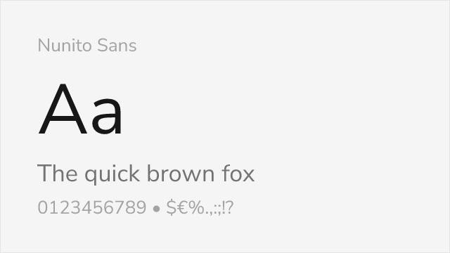
Similar proportions with comparable balance between geometric and humanist qualities
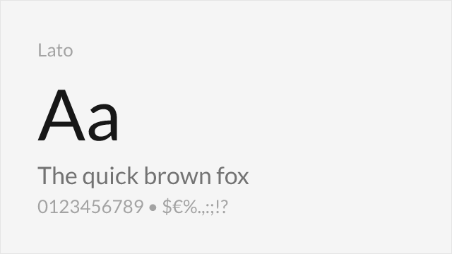
Shares the blend of geometric structure with humanist warmth
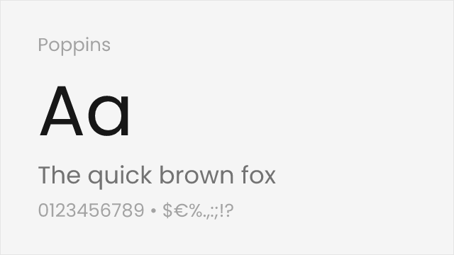
Comparable geometric foundations with slightly rounder forms
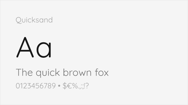
Rounded geometric sans with the friendly warmth Museo Sans is loved for
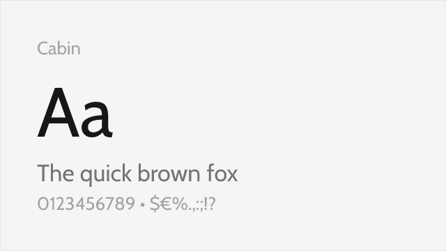
Humanist sans with a warm, screen-friendly temperament
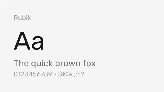
Geometric sans with softly rounded corners and a wide weight range
Compare the alternatives
See how Museo Sans compares to its top alternatives — and how those alternatives compare to each other — side by side.
See where Museo Sans is used in the wild and swap to free alternatives live.
Install FontSwap →Replacement Summary
Source: FontAlternatives.com
Premium font: Museo Sans
Best free alternative: Nunito Sans
FontAlternatives similarity score: 88%
Replacement difficulty: Low
Best for: user interfaces, SaaS applications, documentation, web applications
Notable users: Corporate & brand identity systems, SaaS & startup product branding, Reports & presentation systems
Not recommended when: Brand consistency with Corporate & brand identity systems requires exact letterforms
What is the best free alternative to Museo Sans?
Nunito Sans is the best free alternative to Museo Sans with a FontAlternatives similarity score of 88%.
Nunito Sans shares similar proportions, stroke characteristics, and intended use with Museo Sans. It is available under the OFL-1.1 license, which permits both personal and commercial use at no cost.
This alternative works particularly well for: user interfaces, SaaS applications, documentation, web applications.
Can I safely replace Museo Sans with Nunito Sans?
Yes, Nunito Sans is a high-confidence replacement for Museo Sans. The FontAlternatives similarity score of 88% indicates strong structural compatibility.
Licensing: Nunito Sans is licensed under OFL-1.1, which allows commercial use without licensing fees or royalties.
Weight coverage: Most weights have close or exact matches available.
When should I NOT replace Museo Sans?
While Nunito Sans is a strong alternative, there are situations where replacing Museo Sans may not be appropriate:
- Strict compliance: Verify that OFL-1.1 terms meet your specific legal and compliance requirements.
Weight-Matching Guide
Map Museo Sans weights to their closest free alternatives for accurate font substitution.
Nunito Sans
| Museo Sans | Nunito Sans | Match |
|---|---|---|
| 100 | ExtraLight (200) | close |
| 300 | Light (300) | exact |
| 500 | Medium (500) | exact |
| 700 | Bold (700) | exact |
| 900 | Black (900) | exact |
Lato
| Museo Sans | Lato | Match |
|---|---|---|
| 100 | Thin (100) | exact |
| 300 | Light (300) | exact |
| 500 | Regular (400) | close |
| 700 | Bold (700) | exact |
| 900 | Black (900) | exact |
Poppins
| Museo Sans | Poppins | Match |
|---|---|---|
| 100 | Thin (100) | exact |
| 300 | Light (300) | exact |
| 500 | Medium (500) | exact |
| 700 | Bold (700) | exact |
| 900 | Black (900) | exact |
Quicksand
| Museo Sans | Quicksand | Match |
|---|---|---|
| 300 | Light (300) | exact |
| 500 | Medium (500) | exact |
| 700 | Bold (700) | exact |
Cabin
| Museo Sans | Cabin | Match |
|---|---|---|
| 300 | Regular (400) | close |
| 500 | Medium (500) | exact |
| 700 | Bold (700) | exact |
Rubik
| Museo Sans | Rubik | Match |
|---|---|---|
| 300 | Light (300) | exact |
| 500 | Medium (500) | exact |
| 700 | Bold (700) | exact |
| 900 | Black (900) | exact |
Performance Guide
Production performance metrics for each alternative.
How to Use Nunito Sans
Copy these code snippets to quickly add Nunito Sans to your project.
CSS code for Nunito Sans
@import url('https://fonts.googleapis.com/css2?family=Nunito+Sans:wght@100..900&display=swap');HTML code for Nunito Sans
<link rel="preconnect" href="https://fonts.googleapis.com">
<link rel="preconnect" href="https://fonts.gstatic.com" crossorigin>
<link href="https://fonts.googleapis.com/css2?family=Nunito+Sans:wght@100..900&display=swap" rel="stylesheet">
Tailwind code for Nunito Sans
// tailwind.config.js
module.exports = {
  theme: {
    extend: {
      fontFamily: {
        'nunito-sans': ['"Nunito Sans"', 'sans-serif'],
      },
    },
  },
}

// Usage in HTML:
// <p class="font-nunito-sans">Your text here</p>
Next.js code for Nunito Sans
// Using next/font (Next.js 13+)
import { Nunito_Sans } from 'next/font/google';

const nunito_sans = Nunito_Sans({
  subsets: ['latin'],
  weight: ['100', '200', '300', '400', '500', '600', '700', '800', '900'],
});

export default function Component() {
  return (
    <p className={nunito_sans.className}>
      Your text here
    </p>
  );
}

// Or using inline styles with Google Fonts link:
// <p style={{ fontFamily: '"Nunito Sans"' }}>Your text</p>
Expo and React Native code for Nunito Sans
// Install: npx expo install @expo-google-fonts/nunito-sans expo-font
import { useFonts, Nunito_Sans_400Regular } from '@expo-google-fonts/nunito-sans';

export default function App() {
  const [fontsLoaded] = useFonts({
    Nunito_Sans_400Regular,
  });

  if (!fontsLoaded) return null;

  return (
    <Text style={{ fontFamily: 'Nunito_Sans_400Regular' }}>
      Your text here
    </Text>
  );
}
Recommended Font Pairings
These free fonts pair well with Nunito Sans Museo Sans for headlines, body text, or accent use.
Merriweather's sturdy serifs and generous proportions complement Museo Sans's balanced geometric-humanist character for web layouts
Playfair Display's high-contrast elegance creates dramatic hierarchy against Museo Sans's clean, contemporary sans-serif forms
Source Serif Pro's systematic design approach mirrors Museo Sans's structured versatility for cohesive corporate typography
Browse Alternatives by Context
Find Museo Sans alternatives filtered by specific use case, style, or language support.
By Use Case
By Style
By Script
Frequently Asked Questions
What is the best free alternative to Museo Sans?
Nunito Sans is the best free alternative to Museo Sans with a FontAlternatives similarity score of 88%. It shares similar proportions and characteristics while being available under the OFL-1.1 license for both personal and commercial use at no cost.
Is there a free version of Museo Sans?
There is no official free version of Museo Sans. However, Nunito Sans is available under the OFL-1.1 open-source license and achieves a FontAlternatives similarity score of 88%. It includes variable weights and supports latin, latin-extended.
What Google Font looks like Museo Sans?
The Google Fonts most similar to Museo Sans are Nunito Sans, Lato, Poppins. Among these alternatives, Nunito Sans offers the closest match with a FontAlternatives similarity score of 88% and includes variable weights for flexible typography options.
Can I use Nunito Sans commercially?
Yes, Nunito Sans can be used commercially. It is licensed under OFL-1.1, which allows free use in websites, applications, print materials, and commercial projects without purchasing a license or paying royalties.
Is Nunito Sans similar enough to Museo Sans?
Nunito Sans achieves a FontAlternatives similarity score of 88% compared to Museo Sans. While not identical, it offers comparable letterforms, proportions, and visual style. Most designers find it works excellently as a substitute in web and print projects.
What are the main differences between Museo Sans and its free alternatives?
Free alternatives to Museo Sans may differ in subtle details like letter spacing, curve refinements, and available weights. Premium fonts typically include more OpenType features, extended language support, and optimized screen rendering. However, for most projects, these differences are negligible.
Where can I download free alternatives to Museo Sans?
Download Nunito Sans directly from Google Fonts. Click the "Get Font" button on any alternative listed above to visit the official download page. Google Fonts also provides convenient embed codes for seamless web integration.