Free Alternatives to Sofia Pro

About Sofia Pro
- Foundry
- Mostardesign
- Classification
- sans-serif
- Style
- geometric
Brands Using Sofia Pro
A common "friendly geometric" choice for app UI and startup branding
Open apertures and rounded terminals stay legible at small UI sizes
The warm-geometric look that dominated 2010s product identities
A dependable pick for approachable, modern web and campaign work
 See Sofia Pro live on these sites with FontSwap →
Sofia Pro is a geometric sans-serif typeface designed by Olivier Gourvat of Mostardesign, created in 2009 and comprehensively redrawn in 2012. Known for its soft, approachable character and extensive weight range, Sofia Pro became popular for brands seeking a friendly yet professional appearance in both digital and print applications. The typeface represents the "friendly geometric" aesthetic that dominated app and startup design throughout the 2010s, and it remains a dependable choice for that warm, modern look today.
History and Design
Olivier Gourvat designed Sofia Pro as a contemporary geometric sans-serif that balances modernist principles with warmth and accessibility. The typeface features softly rounded terminals, consistent stroke widths, and generous spacing that contribute to its friendly personality. Unlike the cold precision of strictly geometric sans-serifs, Sofia Pro incorporates subtle humanist touches that make it feel more approachable.
The design draws from the same tradition as Futura and Avenir but adds a contemporary softness particularly suited to digital applications. The rounded stroke endings, slightly open apertures, and balanced proportions create letterforms that read clearly on screens while projecting warmth rather than clinical efficiency.
Sofia Pro's design philosophy emphasizes readability and versatility. The family includes eight weights from Ultra Light to Black, each with matching italics, providing designers with comprehensive options for hierarchical typography. The letterforms maintain clarity across sizes, from small body text to large headlines. Extended character sets support Western and Eastern European languages, making it practical for international brands.
Mostardesign positioned Sofia Pro as a premium alternative to free geometric fonts, and its refined details justified the positioning for years. The careful optical adjustments, extensive kerning pairs, and professional finish set it apart from early open-source competitors.
That positioning tells the real story of the design, and of its moment. When Sofia (later expanded to Sofia Pro) appeared, the free-font landscape was thin: Google Fonts was young, and a designer who wanted a warm, well-made geometric sans with a full weight range genuinely had to pay for one. Sofia Pro filled that gap with a professional product, and for several years it was a sensible purchase. The landscape then shifted dramatically. Poppins, Nunito, Montserrat, and a wave of other high-quality free geometrics arrived on Google Fonts, several of them so close to Sofia Pro's aesthetic that its competitive edge narrowed to fine details. Sofia Pro's history is therefore also a small case study in how the economics of type changed in the 2010s — the moment when free, professionally-made alternatives caught up with the mid-tier commercial market and reset what designers were willing to pay for.
None of that diminishes the design itself. Sofia Pro remains a genuinely well-drawn, versatile family, and the reasons it was popular — its soft warmth, its clean geometry, its comprehensive range — are all still true. It is simply that the same qualities are now available for nothing, which is exactly why a page like this one exists.
Why Sofia Pro Matters
Sofia Pro gained traction among designers for its ability to convey approachability without sacrificing professionalism. The soft geometric forms work particularly well in digital interfaces where brands want to appear friendly and modern. Its popularity in mobile app design and contemporary branding reflects this versatility.
Its significance is really as a representative of a whole movement rather than a singular landmark. Where Futura and Avenir defined the geometric sans in earlier eras, Sofia Pro was one of the faces that softened that tradition for the app age — part of the wave (alongside Circular, Brandon Grotesque, and others) that made "warm geometric" the default look of startups, fintech, and consumer tech through the 2010s. To understand Sofia Pro is to understand that moment's typographic taste: modern but not cold, confident but not corporate, friendly but still designed.
Who is it for? Consumer-facing digital brands that want to feel modern, clean, and approachable — apps, startups, fintech, e-commerce, healthcare, and lifestyle products. It is a weak choice for anything that needs gravitas, tradition, or a distinctive signature, where its friendly softness reads as generic; those want a face with more character or more authority. And because its closest free match is so close, Sofia Pro is one of the premium fonts where the free alternative is not a compromise but a genuine equal.
The rise of startup culture and app-based businesses created demand for typefaces that projected innovation without intimidation. Sofia Pro filled this niche perfectly—geometric enough to signal modernity, soft enough to feel accessible. Healthcare apps, fintech platforms, and e-commerce sites adopted Sofia Pro to appear trustworthy and user-friendly.
Design Characteristics
Sofia Pro is a textbook "friendly geometric" — geometric enough to read as modern and clean, softened enough to feel warm and approachable. Every detail nudges the strict geometry toward friendliness:
- Rounded terminals: Stroke endings are gently rounded rather than cut square, the single feature most responsible for its soft, welcoming feel.
- Near-circular geometric bowls: The
o,e, and related letters are built on clean circles in the Futura/Avenir tradition, keeping the design crisp and contemporary. - Even, near-monoline strokes: Minimal contrast gives it a smooth, uniform color that reads well on screen.
- Generous, open apertures: Clear openings keep it legible at small sizes, which is part of why it works so well in app interfaces.
- Subtle humanist touches: Small softenings and optical corrections prevent the coldness of a strict geometric, giving it accessibility without losing modernity.
- A broad family: Eight weights from Ultra Light to Black with matching italics, providing full hierarchy for brand systems.
Where Sofia Pro Excels
Sofia Pro is at its best wherever a brand wants to feel modern and friendly at once — the exact register of 2010s app and startup design:
- Mobile and app interfaces: A friendly, legible feel for consumer-facing products.
- Brand identity: A contemporary, approachable look for modern businesses.
- Packaging design: Clean, warm aesthetic for product labels.
- Advertising and marketing: An approachable tone that reads as accessible rather than corporate.
- Fintech, healthcare, and e-commerce: Sectors that want to feel trustworthy and user-friendly at the same time.
Where Sofia Pro Struggles
Sofia Pro's friendly geometry is a specific mood, and it has the limits of any warm, of-its-moment sans:
- Serious, formal, or authoritative work: Its softness reads as too casual for legal, financial-establishment, or luxury contexts that want gravitas.
- Standing out from the 2010s crowd: The friendly-geometric look became so ubiquitous that it can feel like a period default rather than a distinctive choice.
- Extended body text: Like most display-leaning geometrics, it is more comfortable in headlines, UI, and short blocks than in long-form reading.
- A near-identical free rival: Poppins is so close that Sofia Pro's licensing is genuinely hard to justify for most projects — the main practical reason to reach for the free alternatives below.
- Distinctiveness: Pleasant and versatile, it rarely gives a brand a memorable typographic signature on its own.
How to Choose a Free Substitute
Sofia Pro is one of the easiest premium fonts to replace, because the free geometric-sans category is enormous and one option is almost indistinguishable from it.
The clear first choice is Poppins, which shares Sofia Pro's geometric proportions and soft rounded forms so closely that the two are functionally interchangeable for app and branding work. For maximum rounded warmth, Nunito, Quicksand, and Montserrat Alternates get closest to the soft, friendly character; for a flexible, ubiquitous geometric with the deepest weight range, Montserrat is the safe default; and for a cooler, more classical geometric, Jost brings the Futura lineage with a full variable axis.
Because Poppins is such a close match, the honest recommendation is to start there and only look further if you want extra warmth (Nunito, Quicksand) or a specific flavor (Jost's classicism, Montserrat's ubiquity). Sofia Pro has no signature detail that a substitute must reproduce, which — as with Myriad and its free sibling — makes paying for it rather than using Poppins a hard case to make for most projects.
Premium Font Neighbors
Sofia Pro sits in the friendly-geometric corner of the sans-serif world, so its neighbors are the other warm and rounded geometrics. Futura is the archetype the whole style descends from, and Avenir is Adrian Frutiger's warmer, humanist take on geometric forms — perhaps the closest in spirit. Circular is the softer, rounded geometric that became the startup default, and Brandon Grotesque is the warm geometric that defined 2010s consumer branding. Gotham and Proxima Nova are the versatile American geometrics behind countless identities, ITC Avant Garde supplies the vintage circular-geometric look, and Museo Sans offers another contemporary, friendly geometric family adjacent to Sofia Pro's own niche.
FAQ
What is the best free alternative to Sofia Pro?
Poppins is the best free alternative to Sofia Pro, offering virtually identical geometric proportions and soft rounded forms. Designed by Indian Type Foundry and available on Google Fonts, Poppins matches Sofia Pro's friendly aesthetic and comprehensive weight range, making it perfect for apps, branding, and digital design.
Can I use Poppins commercially?
Yes, Poppins is licensed under the SIL Open Font License (OFL-1.1), permitting unlimited commercial use without licensing fees. You can use it for branding, applications, websites, print materials, and any commercial project. Attribution is only required if redistributing the font files.
How similar is Poppins to Sofia Pro?
Poppins achieves approximately 88% similarity to Sofia Pro, sharing the same geometric foundations and soft, friendly character. Both feature rounded terminals, consistent stroke widths, and similar x-heights. The letterforms are nearly interchangeable, with minor differences in specific characters like 'a' and 'g'.
What are the main differences between Sofia Pro and Poppins?
Sofia Pro has slightly more refined curves and professional finish from its commercial development, while Poppins has marginally different letter proportions in certain characters. Sofia Pro offers more stylistic alternates and OpenType features. For most design applications, these differences are subtle and unlikely to impact projects significantly.
Where can I download Poppins for free?
Poppins is available for free download from Google Fonts at fonts.google.com/specimen/Poppins. The font includes weights from Thin (100) to Black (900) with matching italics. You can embed it in websites, download for desktop applications, or access it through Adobe Fonts for Creative Cloud users. Nunito, Montserrat, Montserrat Alternates, Jost, and Quicksand are all on Google Fonts too.
Can I use these free alternatives commercially?
Yes. Poppins, Nunito, Montserrat, Montserrat Alternates, Jost, and Quicksand are all released under the SIL Open Font License, which permits unlimited commercial use without fees — websites, apps, branding, packaging, and print. Attribution is only required if you redistribute the font files themselves, which makes them safe drop-in replacements for Sofia Pro's licensed cuts.
Is Sofia Pro worth paying for if Poppins is free?
For most projects, honestly, no. Poppins matches Sofia Pro's geometric proportions and soft character so closely that few viewers could tell them apart, and it is free to embed and self-host. Sofia Pro is a well-made, professionally finished family, so there are edge cases — a brand already standardized on it, or a designer who prefers its specific optical adjustments — but if you are choosing fresh, the free alternatives deliver essentially the same result at no cost.
Is Sofia Pro good for body text?
It works for short blocks and interface text, where its clean, legible forms read well, but like most display-leaning geometrics it is more comfortable in headlines and UI than in long-form reading. For extended body copy, pair Sofia Pro (or a free stand-in like Poppins) with a readable serif, or use a humanist sans tuned for text such as Source Sans.
What fonts pair well with Sofia Pro?
A contemporary serif makes a strong counterpart — a warm serif like Lora or a sturdy one like Merriweather under Sofia Pro's soft geometric headlines gives digital editorial work reading comfort with a friendly tone. When keeping an all-sans palette, use Sofia Pro's own weights for hierarchy rather than mixing in a second geometric, since two friendly geometrics tend to blur together rather than contrast.
Is Sofia Pro on Google Fonts?
No, Sofia Pro is a premium font from Mostardesign and is not available on Google Fonts.
The closest Google Fonts alternative is Poppins with 88% similarity. Get it free on Google Fonts ↗
Free Alternatives (6)
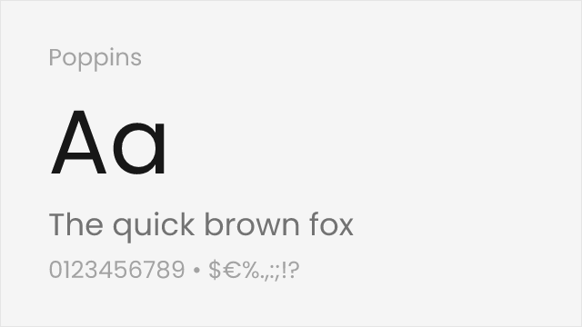
Nearly identical geometric proportions with soft rounded forms
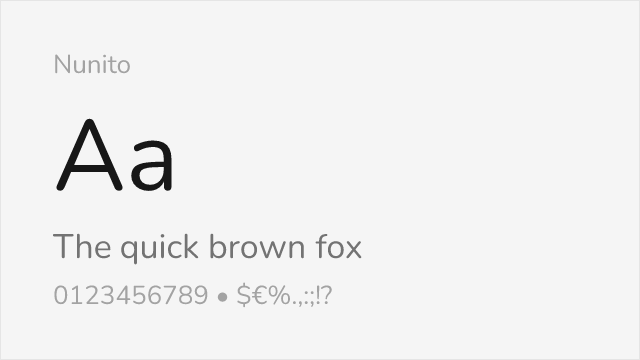
Similar friendly geometric character with rounded terminals
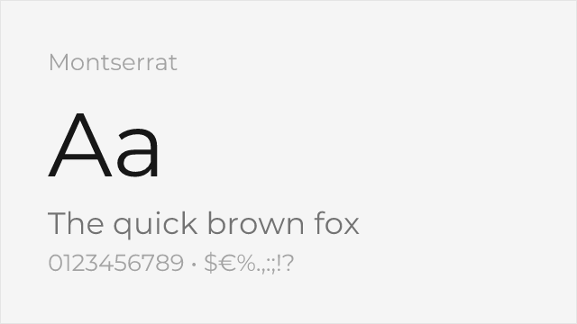
Comparable geometric structure with slightly more angular forms
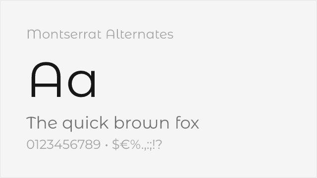
Montserrat's sister family with softer, curved alternate letterforms
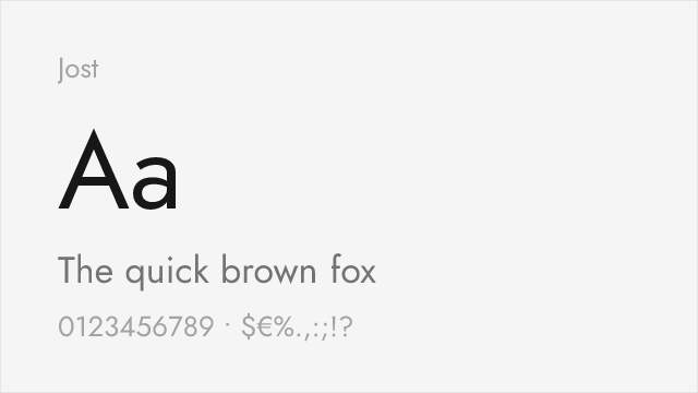
Futura-lineage geometric with a full variable weight axis
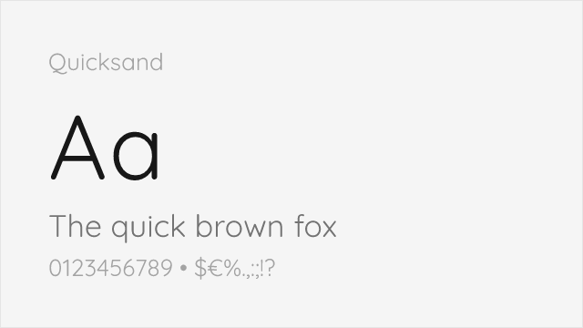
Rounded geometric with soft terminals close to Sofia Pro's warmth
Compare the alternatives
See how Sofia Pro compares to its top alternatives — and how those alternatives compare to each other — side by side.
See where Sofia Pro is used in the wild and swap to free alternatives live.
Install FontSwap →Replacement Summary
Source: FontAlternatives.com
Premium font: Sofia Pro
Best free alternative: Poppins
FontAlternatives similarity score: 88%
Replacement difficulty: Low
Best for: web applications, brand identity, display typography, multilingual projects
Notable users: SaaS & fintech apps, Mobile app interfaces, Startup & tech branding
Not recommended when: Brand consistency with SaaS & fintech apps requires exact letterforms
What is the best free alternative to Sofia Pro?
Poppins is the best free alternative to Sofia Pro with a FontAlternatives similarity score of 88%.
Poppins shares similar proportions, stroke characteristics, and intended use with Sofia Pro. It is available under the OFL-1.1 license, which permits both personal and commercial use at no cost.
This alternative works particularly well for: web applications, brand identity, display typography, multilingual projects.
Can I safely replace Sofia Pro with Poppins?
Yes, Poppins is a high-confidence replacement for Sofia Pro. The FontAlternatives similarity score of 88% indicates strong structural compatibility.
Licensing: Poppins is licensed under OFL-1.1, which allows commercial use without licensing fees or royalties.
Weight coverage: Most weights have close or exact matches available.
When should I NOT replace Sofia Pro?
While Poppins is a strong alternative, there are situations where replacing Sofia Pro may not be appropriate:
- Strict compliance: Verify that OFL-1.1 terms meet your specific legal and compliance requirements.
Weight-Matching Guide
Map Sofia Pro weights to their closest free alternatives for accurate font substitution.
Poppins
| Sofia Pro | Poppins | Match |
|---|---|---|
| Ultra Light | Thin (100) | close |
| Light | Light (300) | exact |
| Regular | Regular (400) | exact |
| Bold | Bold (700) | exact |
| Black | Black (900) | exact |
Nunito
| Sofia Pro | Nunito | Match |
|---|---|---|
| Light | Light (300) | close |
| Regular | Regular (400) | exact |
| Medium | Medium (500) | exact |
| Bold | Bold (700) | exact |
Montserrat
| Sofia Pro | Montserrat | Match |
|---|---|---|
| Light | Light (300) | close |
| Regular | Regular (400) | exact |
| Medium | Medium (500) | exact |
| Bold | Bold (700) | exact |
Montserrat Alternates
| Sofia Pro | Montserrat Alternates | Match |
|---|---|---|
| Light | Light (300) | close |
| Regular | Regular (400) | exact |
| Medium | Medium (500) | exact |
| Bold | Bold (700) | exact |
Jost
| Sofia Pro | Jost | Match |
|---|---|---|
| Light | Light (300) | close |
| Regular | Regular (400) | exact |
| Medium | Medium (500) | exact |
| Bold | Bold (700) | exact |
Quicksand
| Sofia Pro | Quicksand | Match |
|---|---|---|
| Light | Light (300) | close |
| Regular | Regular (400) | exact |
| Medium | Medium (500) | exact |
| Bold | Bold (700) | close |
Performance Guide
Production performance metrics for each alternative.
How to Use Poppins
Copy these code snippets to quickly add Poppins to your project.
CSS code for Poppins
@import url('https://fonts.googleapis.com/css2?family=Poppins:wght@100;200;300;400;500;600;700;800;900&display=swap');HTML code for Poppins
<link rel="preconnect" href="https://fonts.googleapis.com">
<link rel="preconnect" href="https://fonts.gstatic.com" crossorigin>
<link href="https://fonts.googleapis.com/css2?family=Poppins:wght@100;200;300;400;500;600;700;800;900&display=swap" rel="stylesheet">
Tailwind code for Poppins
// tailwind.config.js
module.exports = {
  theme: {
    extend: {
      fontFamily: {
        'poppins': ['Poppins', 'sans-serif'],
      },
    },
  },
}

// Usage in HTML:
// <p class="font-poppins">Your text here</p>
Next.js code for Poppins
// Using next/font (Next.js 13+)
import { Poppins } from 'next/font/google';

const poppins = Poppins({
  subsets: ['latin'],
  weight: ['100', '200', '300', '400', '500', '600', '700', '800', '900'],
});

export default function Component() {
  return (
    <p className={poppins.className}>
      Your text here
    </p>
  );
}

// Or using inline styles with Google Fonts link:
// <p style={{ fontFamily: "'Poppins'" }}>Your text</p>
Expo and React Native code for Poppins
// Install: npx expo install @expo-google-fonts/poppins expo-font
import { useFonts, Poppins_400Regular } from '@expo-google-fonts/poppins';

export default function App() {
  const [fontsLoaded] = useFonts({
    Poppins_400Regular,
  });

  if (!fontsLoaded) return null;

  return (
    <Text style={{ fontFamily: 'Poppins_400Regular' }}>
      Your text here
    </Text>
  );
}
Recommended Font Pairings
These free fonts pair well with Poppins Sofia Pro for headlines, body text, or accent use.
Merriweather's robust serifs provide grounded readability beneath Sofia Pro's soft geometric headlines for digital editorial content
Lora's contemporary serif character with brushed curves echoes Sofia Pro's friendly warmth for cohesive brand typography
Libre Baskerville's classical transitional forms create refined contrast against Sofia Pro's modern, rounded geometric shapes
Browse Alternatives by Context
Find Sofia Pro alternatives filtered by specific use case, style, or language support.
By Style
By Script
Frequently Asked Questions
What is the best free alternative to Sofia Pro?
Poppins is the best free alternative to Sofia Pro with a FontAlternatives similarity score of 88%. It shares similar proportions and characteristics while being available under the OFL-1.1 license for both personal and commercial use at no cost.
Is there a free version of Sofia Pro?
There is no official free version of Sofia Pro. However, Poppins is available under the OFL-1.1 open-source license and achieves a FontAlternatives similarity score of 88%. It includes 9 weights and supports latin, latin-extended.
What Google Font looks like Sofia Pro?
The Google Fonts most similar to Sofia Pro are Poppins, Nunito, Montserrat. Among these alternatives, Poppins offers the closest match with a FontAlternatives similarity score of 88% and includes 9 weights for design flexibility.
Can I use Poppins commercially?
Yes, Poppins can be used commercially. It is licensed under OFL-1.1, which allows free use in websites, applications, print materials, and commercial projects without purchasing a license or paying royalties.
Is Poppins similar enough to Sofia Pro?
Poppins achieves a FontAlternatives similarity score of 88% compared to Sofia Pro. While not identical, it offers comparable letterforms, proportions, and visual style. Most designers find it works excellently as a substitute in web and print projects.
What are the main differences between Sofia Pro and its free alternatives?
Free alternatives to Sofia Pro may differ in subtle details like letter spacing, curve refinements, and available weights. Premium fonts typically include more OpenType features, extended language support, and optimized screen rendering. However, for most projects, these differences are negligible.
Where can I download free alternatives to Sofia Pro?
Download Poppins directly from Google Fonts. Click the "Get Font" button on any alternative listed above to visit the official download page. Google Fonts also provides convenient embed codes for seamless web integration.