Free Alternatives to Futura

About Futura
- Foundry
- URW Type Foundry
- Classification
- sans-serif
- Style
- geometric
Brands Using Futura
Box logo and entire visual identity built on Futura Heavy Oblique
Apollo 11 commemorative plaque left on the moon
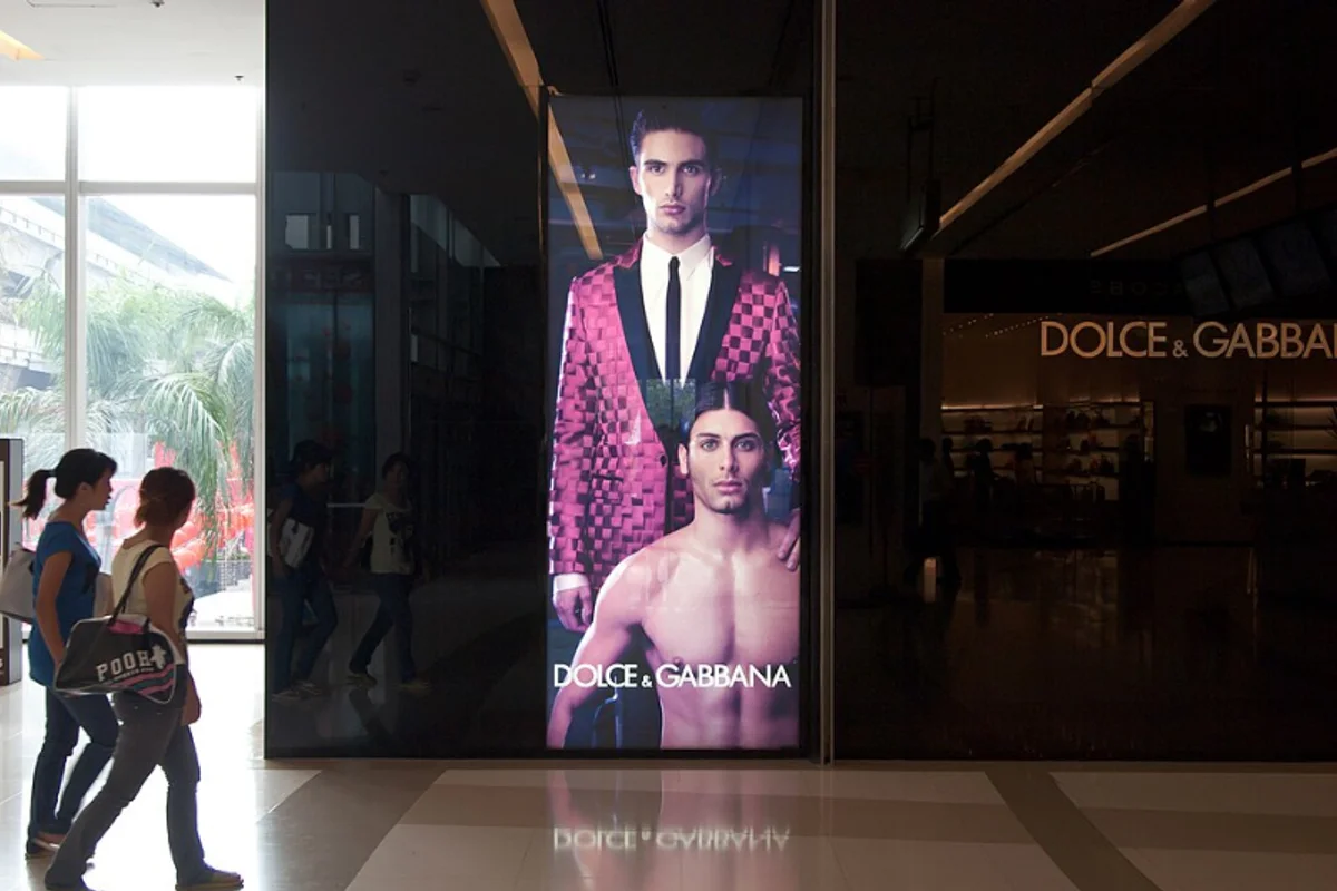
Luxury packaging, store signage, and print materials
Primary brand typeface for advertising and packaging
Supporting typeface used in marketing materials and signage
 See Futura live on these sites with FontSwap →
See Futura in the Wild


Futura is a geometric sans-serif designed by Paul Renner and released in 1927. Nearly a century later it is still the typeface designers reach for when they want to look modern — which is exactly why it turns up on everything from moon plaques to skateboards, and why so many projects end up hunting for a free version of it.
History and Design
Paul Renner drew Futura in Germany during the height of the Bauhaus, and although he never taught at the school, the typeface is the Bauhaus ideal made legible: form reduced to the circle, the triangle, and the square. He called it "die Schrift unserer Zeit" — the typeface of our time.
The geometry is the whole point. The O is very nearly a perfect circle, the A and M come to sharp unflattened points, and the lowercase a is a single-storey circle-and-stem rather than the two-storey shape most sans-serifs use. The x-height sits low, and the ascenders and descenders run long — even past the cap height — which is what gives a line of Futura its airy, elongated elegance.
What keeps it from feeling like a drafting exercise is a layer of quiet cheating. Renner thickened and thinned strokes by tiny amounts where the eye needs it, narrowed the joins, and let the apexes overshoot, so letters that look purely mechanical are in fact optically corrected by hand.
Bauer Type Foundry in Frankfurt released it, and it became one of the best-selling typefaces of the century, spawning condensed, display, and inline cuts. Today the design is fragmented across foundries — Bauer, Neufville, URW, and Monotype's own Futura Now — which is part of why licensing "real" Futura is more complicated than most people expect.
Renner himself paid a price for the era he worked in. An outspoken critic of the Nazis — he published a pamphlet attacking their cultural politics — he was dismissed from his teaching post in Munich in 1933. The irony is that the typeface born from that progressive, rationalist moment went on to become one of the most widely adopted designs in the world, embraced by the very commercial and institutional culture the Bauhaus had set out to reform.
Why Futura Matters
Futura's geometric purity has stayed fresh for almost a hundred years, and its reach runs far past graphic design.
In 1969 NASA left a Futura-set plaque on the moon: "Here men from the planet Earth first set foot upon the Moon." It is, quite literally, the typeface humanity chose to introduce itself to the universe.
Back on Earth it became a signature of taste. Supreme turned Futura Heavy Oblique into one of the most recognizable logos in fashion. Louis Vuitton and Dolce & Gabbana use it to say luxury; Wes Anderson uses it in film after film until it has become part of his authorial voice; Stanley Kubrick set the titles of 2001: A Space Odyssey in it. Futura is what modernity looks like when a brand wants you to trust its judgment.
There is a reason the same typeface can sit on a moon plaque, a skate deck, and a couture campaign. Futura doesn't belong to any one industry because it belongs to an idea — the early-twentieth-century faith that good design is rational, universal, and stripped to essentials. Brands borrow that idea every time they set their name in it.
That is who it is for: designers and brands who want to project confidence, precision, and forward motion — and who have the sizes and the space to let the geometry breathe.
Design Characteristics
A few features give Futura away instantly:
- Geometric construction — circles, triangles, and squares as the underlying grid.
- Single-storey 'a' — the signature move; more than anything else, this is how you spot Futura.
- Circular 'O' — close to a true circle, with near-uniform stroke.
- Pointed apexes — the A, M, V, and W peak sharply, with no flat.
- Low x-height with long extenders — elegant and distinctive, but the reason Futura can look small and needs generous leading.
- Low stroke contrast — even color across the line, thoroughly modern.
The single-storey a and the pointed apexes are the two details any free alternative has to get right to read as genuinely Futura-like — which is why Jost, built specifically around them, sits so far ahead of the rest.
Those long extenders deserve special mention, because they shape how you set the type. Ascenders that climb above the cap line and descenders that drop well below it need vertical room to breathe, so tight leading crushes Futura in a way it never crushes a high-x-height face like Helvetica. Give a Futura setting generous line spacing and the proportions turn graceful; starve it of space and the same letters look cramped and small. It is a typeface that rewards designers who plan their vertical rhythm before they start.
Where Futura Excels
Set it big and Futura is hard to beat.
- Brand identity and logos — the geometric character makes marks that are memorable and unmistakably modern.
- Display and headlines — striking at large sizes, where the proportions read as elegance rather than austerity.
- Fashion and luxury — it signals sophistication and restraint, which is why the luxury houses keep coming back.
- Film, titling, and posters — commanding on screen and on the wall.
- Architecture and environmental graphics — clean, legible letterforms that hold up at scale.
Streetwear is the clearest modern proof. Supreme's box logo is nothing but Futura Heavy Oblique reversed out of a red rectangle, and that single decision — geometry plus confidence, no ornament — has been imitated by thousands of brands since. It works because Futura at display size reads as certainty.
The through-line is scale and space. Futura rewards large sizes, wide letter-spacing, and confident white space; give it room and it looks timeless.
Where Futura Struggles
The same geometry that makes Futura beautiful at 72pt works against it at 12.
Its low x-height and long extenders mean that at text sizes the letters look smaller than their point size suggests, so paragraphs need extra leading and still tire the eye. Set a long article in Futura and the perfect circles start to blur into an even, monotonous rhythm — legible, but wearing.
It is also anything but neutral. Where Helvetica disappears behind the message, Futura is a message; its Bauhaus personality shows up whether or not you invited it, which makes it a poor choice when a brand needs a quiet, characterless workhorse.
Then there are the practical headaches. The authentic Futura is expensive and split across foundries with subtly different cuts, so matching an existing document can mean tracking down the exact version someone licensed years ago. And because Futura predates the screen, its native forms were never optimized for small UI text or low resolutions — a modern geometric drawn for the browser will simply render more cleanly.
One more trap worth naming: ubiquity. Futura has been used so heavily, and copied so widely, that on the wrong project it can read as a shortcut to "designery" rather than a considered choice. When nearly every startup deck and fashion lookbook reaches for the same geometric sans, the distinctiveness that made Futura special in 1927 can quietly become a cliché.
How to Choose a Free Substitute
Pick by the job, not by which specimen looks most like Futura:
- Logos, display, and anything where the shapes must read as Futura → Jost. It reproduces the single-storey a (via the
ss01stylistic set) and the geometric proportions more faithfully than anything else free, and it is variable, so you get the full weight range. - Web and app interfaces → Poppins or Montserrat. Both keep the geometric feel with far more screen polish and a complete weight range; Poppins is closer to Futura's circles, Montserrat is the safe, universally-available default.
- Friendly, approachable brands → Nunito. It captures Futura's rounded variants with softened terminals — good for products aimed at kids, wellness, or education.
- Luxury and editorial headlines → Raleway or Josefin Sans. Both lean into Futura's elegant, high-waisted display side and shine in thin and light weights.
A simple rule: if you are recreating a Futura logo, use Jost and turn on the single-storey a; if you are building something new for the screen, a rounder geometric like Poppins or Montserrat will serve you better than a strict revival.
It is also worth testing your substitute at the sizes you will actually ship. Futura's alternatives diverge most in the details — the shape of the a, the sharpness of the apexes, the length of the extenders — and those differences that look tiny in a specimen become the whole personality of a wordmark. Set your real headline, in your real weight, before you commit.
Premium Font Neighbors
If Futura is your reference, several premium typefaces sit nearby and are worth auditioning:
- Century Gothic is Futura's most direct descendant — a geometric sans with a noticeably larger x-height and wider, more uniform letterforms, easier to read at text sizes but less distinctive.
- ITC Avant Garde pushes the geometry further, with tight spacing and dramatic ligatures made for logos and headlines.
- Neue Kabel revives Rudolf Koch's Kabel, Futura's more expressive geometric contemporary, with a warmer, quirkier personality.
- Avenir softens the geometry toward the humanist side; Adrian Frutiger designed it as a more readable, less rigid take on the Futura idea.
- Brandon Grotesque and Gotham are the warmer, American cousins — geometric skeletons with friendlier detailing for branding and UI.
Trying these clarifies what you actually want from Futura: the strict Bauhaus geometry (Jost, ITC Avant Garde), the same feel but more readable (Century Gothic, Avenir), or simply a modern geometric warmth (Gotham, Brandon Grotesque).
FAQ
What is the best free alternative to Futura?
Jost is the best free alternative. Designed by Owen Earl as an open-source Futura revival, it reproduces the geometric proportions and the signature single-storey a, ships as a nine-weight variable font, and is licensed under the SIL Open Font License for unlimited commercial use. For most Futura projects it is the first font to try.
Does Jost have a single-storey 'a' like Futura?
Yes. Jost includes the single-storey a as a stylistic set. Enable it in CSS with font-feature-settings: "ss01" 1;, and you get the defining Futura detail while using a completely free font.
What's the difference between Futura and Century Gothic?
Century Gothic is a geometric sans inspired by Futura but drawn for readability: it has a noticeably larger x-height, wider proportions, and more uniform strokes, which make it easier to set at small sizes. Both share the single-storey a, but Century Gothic's taller, rounder forms give it a softer, less austere character — so for Futura's precise, elongated proportions, Jost is the closer match.
Is Futura free to use?
No. Futura is a commercial typeface, and to complicate matters it is sold by several foundries (Bauer/Neufville, URW, and Monotype's Futura Now) in subtly different versions. It is not bundled with Windows or macOS. Most people who want the Futura look use a free alternative such as Jost, Poppins, or Montserrat instead.
Why does Futura look so small in body text?
Futura has a low x-height and long ascenders and descenders, so at a given point size its lowercase letters appear smaller than those of a typeface like Helvetica. In practice you compensate by bumping the size up and adding line spacing — or, for extended text, choosing a geometric font drawn with a taller x-height, such as Poppins or Century Gothic.
Which brands use Futura?
Futura's users read like a design hall of fame: NASA (the Apollo 11 moon plaque), Supreme, Louis Vuitton, Dolce & Gabbana, and Red Bull, along with filmmakers like Wes Anderson and Stanley Kubrick. (Volkswagen's decades-long typeface, VAG Rounded, was a custom rounded Futura rather than the original — a measure of how widely Futura's forms were borrowed.) The common thread is a desire to look modern, precise, and self-assured.
What fonts pair well with Futura?
Futura's stark geometry sings against a contrasting serif. High-contrast display serifs like Playfair Display create elegant hierarchy for fashion and editorial layouts, while a traditional text serif such as Libre Baskerville warms up Futura headlines over long-form body copy. The principle is contrast: pair Futura's circles and straight lines with something that has calligraphic movement, and let each do what the other cannot.
Is Futura on Google Fonts?
No, Futura is a premium font from URW Type Foundry and is not available on Google Fonts.
The closest Google Fonts alternative is Jost with 90% similarity. Get it free on Google Fonts ↗
Free Alternatives (6)
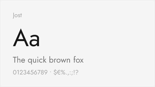
Closest free alternative with authentic geometric proportions
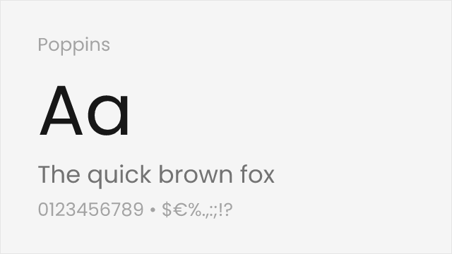
Similar geometric foundation with slightly softer appearance
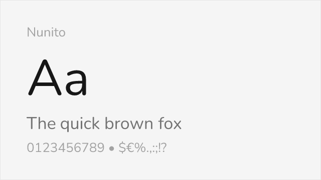
Rounded variant that captures Futura's friendly character
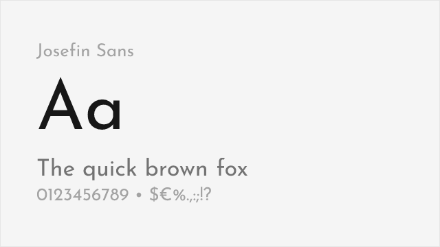
Art deco influenced geometric sans with elegant display proportions
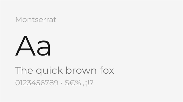
Hugely popular geometric sans with a full nine-weight variable family
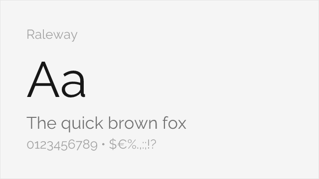
Elegant geometric display sans with a distinctive thin weight
Compare the alternatives
See how Futura compares to its top alternatives — and how those alternatives compare to each other — side by side.
See where Futura is used in the wild and swap to free alternatives live.
Install FontSwap →Replacement Summary
Source: FontAlternatives.com
Premium font: Futura
Best free alternative: Jost
FontAlternatives similarity score: 90%
Replacement difficulty: Low
Best for: branding, display headlines, fashion
Notable users: Supreme, NASA, Louis Vuitton
Not recommended when: Brand consistency with Supreme requires exact letterforms
What is the best free alternative to Futura?
Jost is the best free alternative to Futura with a FontAlternatives similarity score of 90%.
Jost shares similar proportions, stroke characteristics, and intended use with Futura. It is available under the OFL-1.1 license, which permits both personal and commercial use at no cost.
This alternative works particularly well for: branding, display headlines, fashion.
Can I safely replace Futura with Jost?
Yes, Jost is a high-confidence replacement for Futura. The FontAlternatives similarity score of 90% indicates strong structural compatibility.
Licensing: Jost is licensed under OFL-1.1, which allows commercial use without licensing fees or royalties.
Weight coverage: Most weights have close or exact matches available.
When should I NOT replace Futura?
While Jost is a strong alternative, there are situations where replacing Futura may not be appropriate:
- Strict compliance: Verify that OFL-1.1 terms meet your specific legal and compliance requirements.
Weight-Matching Guide
Map Futura weights to their closest free alternatives for accurate font substitution.
Jost
| Futura | Jost | Match |
|---|---|---|
| Light (300) | Light (300) | exact |
| Book (400) | Regular (400) | close |
| Medium (500) | Medium (500) | exact |
| Bold (700) | Bold (700) | exact |
| Extra Bold (800) | ExtraBold (800) | exact |
Poppins
| Futura | Poppins | Match |
|---|---|---|
| Light (300) | Light (300) | exact |
| Regular (400) | Regular (400) | exact |
| Bold (700) | Bold (700) | exact |
Nunito
| Futura | Nunito | Match |
|---|---|---|
| Regular (400) | Regular (400) | close |
| Bold (700) | Bold (700) | exact |
Josefin Sans
| Futura | Josefin Sans | Match |
|---|---|---|
| Light (300) | Light (300) | close |
| Regular (400) | Regular (400) | close |
| Bold (700) | Bold (700) | exact |
Montserrat
| Futura | Montserrat | Match |
|---|---|---|
| Light (300) | Light (300) | close |
| Book (400) | Regular (400) | close |
| Bold (700) | Bold (700) | exact |
Raleway
| Futura | Raleway | Match |
|---|---|---|
| Light (300) | Light (300) | close |
| Book (400) | Regular (400) | close |
| Medium (500) | Medium (500) | close |
Performance Guide
Production performance metrics for each alternative.
How to Use Jost
Copy these code snippets to quickly add Jost to your project.
CSS code for Jost
@import url('https://fonts.googleapis.com/css2?family=Jost:wght@100..900&display=swap');HTML code for Jost
<link rel="preconnect" href="https://fonts.googleapis.com">
<link rel="preconnect" href="https://fonts.gstatic.com" crossorigin>
<link href="https://fonts.googleapis.com/css2?family=Jost:wght@100..900&display=swap" rel="stylesheet">
Tailwind code for Jost
// tailwind.config.js
module.exports = {
  theme: {
    extend: {
      fontFamily: {
        'jost': ['Jost', 'sans-serif'],
      },
    },
  },
}

// Usage in HTML:
// <p class="font-jost">Your text here</p>
Next.js code for Jost
// Using next/font (Next.js 13+)
import { Jost } from 'next/font/google';

const jost = Jost({
  subsets: ['latin'],
  weight: ['100', '200', '300', '400', '500', '600', '700', '800', '900'],
});

export default function Component() {
  return (
    <p className={jost.className}>
      Your text here
    </p>
  );
}

// Or using inline styles with Google Fonts link:
// <p style={{ fontFamily: "'Jost'" }}>Your text</p>
Expo and React Native code for Jost
// Install: npx expo install @expo-google-fonts/jost expo-font
import { useFonts, Jost_400Regular } from '@expo-google-fonts/jost';

export default function App() {
  const [fontsLoaded] = useFonts({
    Jost_400Regular,
  });

  if (!fontsLoaded) return null;

  return (
    <Text style={{ fontFamily: 'Jost_400Regular' }}>
      Your text here
    </Text>
  );
}
Recommended Font Pairings
These free fonts pair well with Jost Futura for headlines, body text, or accent use.
Playfair's high-contrast serifs create elegant hierarchy against Futura's geometric simplicity
Traditional Baskerville forms balance Futura's modernist geometry for editorial layouts
Cormorant's refined details provide classical contrast to Futura's stark geometric shapes
Browse Alternatives by Context
Find Futura alternatives filtered by specific use case, style, or language support.
Frequently Asked Questions
What is the best free alternative to Futura?
Jost is the best free alternative to Futura with a FontAlternatives similarity score of 90%. It shares similar proportions and characteristics while being available under the OFL-1.1 license for both personal and commercial use at no cost.
Is there a free version of Futura?
There is no official free version of Futura. However, Jost is available under the OFL-1.1 open-source license and achieves a FontAlternatives similarity score of 90%. It includes variable weights and supports latin, latin-extended.
What Google Font looks like Futura?
The Google Fonts most similar to Futura are Jost, Poppins, Nunito. Among these alternatives, Jost offers the closest match with a FontAlternatives similarity score of 90% and includes variable weights for flexible typography options.
Can I use Jost commercially?
Yes, Jost can be used commercially. It is licensed under OFL-1.1, which allows free use in websites, applications, print materials, and commercial projects without purchasing a license or paying royalties.
Is Jost similar enough to Futura?
Jost achieves a FontAlternatives similarity score of 90% compared to Futura. While not identical, it offers comparable letterforms, proportions, and visual style. Most designers find it works excellently as a substitute in web and print projects.
What are the main differences between Futura and its free alternatives?
Free alternatives to Futura may differ in subtle details like letter spacing, curve refinements, and available weights. Premium fonts typically include more OpenType features, extended language support, and optimized screen rendering. However, for most projects, these differences are negligible.
Where can I download free alternatives to Futura?
Download Jost directly from Google Fonts. Click the "Get Font" button on any alternative listed above to visit the official download page. Google Fonts also provides convenient embed codes for seamless web integration.