 Install FontSwap
Free Alternatives to Futura with Modern Style
Futura is known for its modern aesthetic. If you're looking for a free sans serif font with a similar modern feel, these 6 alternatives offer comparable characteristics. We've identified 5 that are especially well-suited for this context. All are available under open-source licenses for unrestricted commercial use.
Top Picks
Comparison Table
| Font | Relevance ⓘ
How well this alternative fits the specific context (use-case or trait) of this page. Score 0–100 based on matching keywords, industries, and font characteristics. Alternatives scoring 25+ are highlighted.
| Similarity ⓘ
How visually similar this free font is to the premium original. Score 0–100 based on x-height, width, stroke contrast, use-case overlap, and language coverage.
Learn more → | Weights | Variable | License | Source |
|---|---|---|---|---|---|---|
| Nunito | 85 | 75% | Variable | Yes | OFL-1.1 | Google Fonts ↗ |
| Montserrat | 84 | 70% | Variable | Yes | OFL-1.1 | Google Fonts ↗ |
| Raleway | 83 | 67% | Variable | Yes | OFL-1.1 | Google Fonts ↗ |
| Poppins | 76 | 82% | 9 | No | OFL-1.1 | Google Fonts ↗ |
| Jost | 48 | 90% | Variable | Yes | OFL-1.1 | Google Fonts ↗ |
| Josefin Sans | 24 | 72% | Variable | Yes | OFL-1.1 | Google Fonts ↗ |
Most Relevant (5)
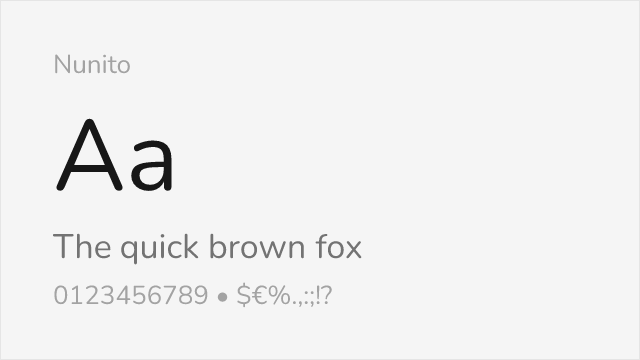
[Google Fonts] · OFL-1.1 · Variable
Rounded variant that captures Futura's friendly character
Why it matches: Nunito takes Futura's geometric foundation and adds softened terminals and rounded edges, similar to Futura's own rounded variants. The result is a warm, approachable interpretation of geometric sans-serif design.
friendly brandschildren's contenteducational
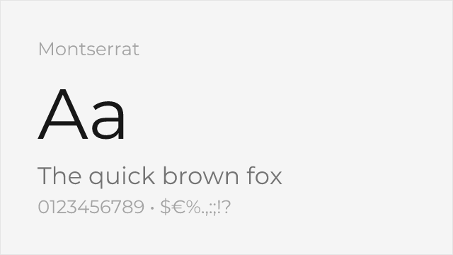
[Google Fonts] · OFL-1.1 · Variable
Hugely popular geometric sans with a full nine-weight variable family
Why it matches: Montserrat draws on the same geometric-modernist tradition as Futura — round bowls, even strokes, a clean upright axis — but was drawn from old Buenos Aires signage rather than the Bauhaus, so it carries a little more warmth. It reads as the ubiquitous, safe cousin of Futura's stricter geometry.
web and app UImarketing headlinesstartup branding
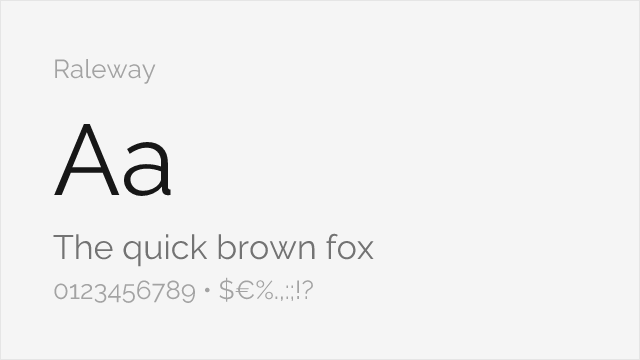
[Google Fonts] · OFL-1.1 · Variable
Elegant geometric display sans with a distinctive thin weight
Why it matches: Raleway is a geometric sans built for display, sharing Futura's circular construction and low stroke contrast but with a more refined, fashion-forward finish. Its thin and light weights capture the airy, modern elegance designers reach to Futura for in luxury and editorial work.
luxury brandingeditorial displaylarge headlines
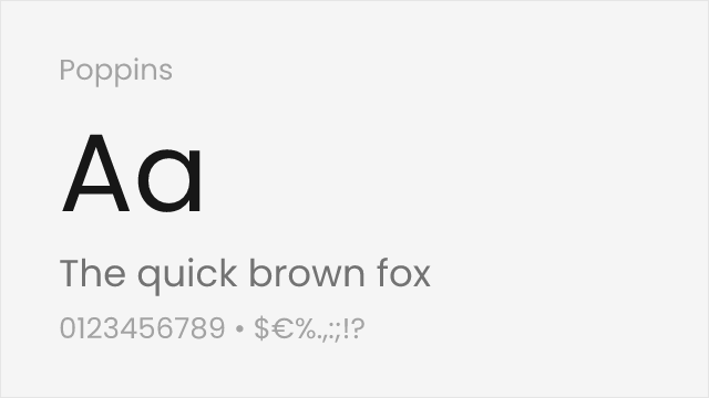
[Google Fonts] · OFL-1.1 · 9 weights
Similar geometric foundation with slightly softer appearance
Why it matches: Poppins shares Futura's geometric DNA with perfectly round 'O' shapes and triangular 'A' forms. While slightly more contemporary with softer curves, it maintains the same modernist spirit.
web designapp interfacestech branding
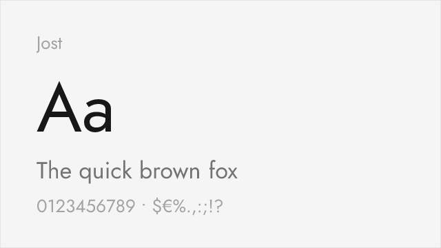
[Google Fonts] · OFL-1.1 · Variable
Closest free alternative with authentic geometric proportions
Why it matches: Jost was specifically designed as an open-source Futura alternative, replicating its geometric letterforms including the distinctive single-storey 'a'. The proportions, x-height, and overall character closely mirror the original.
brandingdisplay headlinesfashion
Other Alternatives (1)
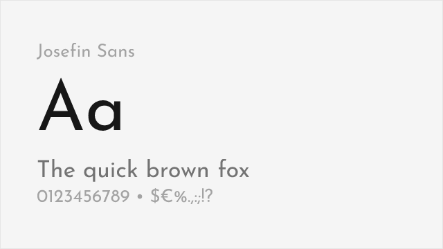
[Google Fonts] · OFL-1.1 · Variable
Art deco influenced geometric sans with elegant display proportions
Why it matches: Josefin Sans shares Futura's Art Deco heritage with its tall x-height and geometric construction. The elegant proportions make it particularly suited for display use, much like Futura itself.
display typographyart deco projectselegant branding