 Install FontSwap
Free Alternatives to Futura Supporting Cyrillic
Need a free alternative to Futura with Cyrillic script support? These 4 options include Cyrillic characters and share visual similarities with Futura. Each is licensed for free personal and commercial use.
Top Picks
Comparison Table
| Font | Relevance ⓘ
How well this alternative fits the specific context (use-case or trait) of this page. Score 0–100 based on matching keywords, industries, and font characteristics. Alternatives scoring 25+ are highlighted.
| Similarity ⓘ
How visually similar this free font is to the premium original. Score 0–100 based on x-height, width, stroke contrast, use-case overlap, and language coverage.
Learn more → | Weights | Variable | License | Source |
|---|---|---|---|---|---|---|
| Jost | 0 | 90% | Variable | Yes | OFL-1.1 | Google Fonts ↗ |
| Nunito | 0 | 75% | Variable | Yes | OFL-1.1 | Google Fonts ↗ |
| Montserrat | 0 | 70% | Variable | Yes | OFL-1.1 | Google Fonts ↗ |
| Raleway | 0 | 67% | Variable | Yes | OFL-1.1 | Google Fonts ↗ |
All Alternatives (4)
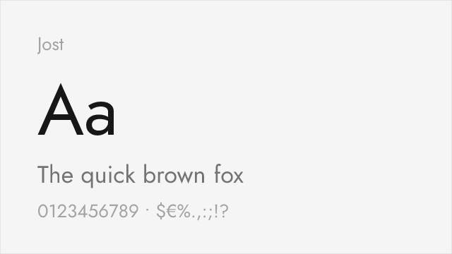
[Google Fonts] · OFL-1.1 · Variable
Closest free alternative with authentic geometric proportions
Why it matches: Jost was specifically designed as an open-source Futura alternative, replicating its geometric letterforms including the distinctive single-storey 'a'. The proportions, x-height, and overall character closely mirror the original.
brandingdisplay headlinesfashion
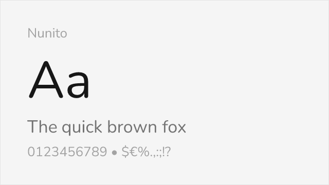
[Google Fonts] · OFL-1.1 · Variable
Rounded variant that captures Futura's friendly character
Why it matches: Nunito takes Futura's geometric foundation and adds softened terminals and rounded edges, similar to Futura's own rounded variants. The result is a warm, approachable interpretation of geometric sans-serif design.
friendly brandschildren's contenteducational
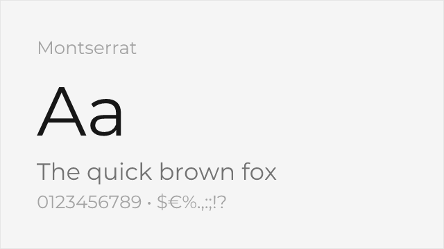
[Google Fonts] · OFL-1.1 · Variable
Hugely popular geometric sans with a full nine-weight variable family
Why it matches: Montserrat draws on the same geometric-modernist tradition as Futura — round bowls, even strokes, a clean upright axis — but was drawn from old Buenos Aires signage rather than the Bauhaus, so it carries a little more warmth. It reads as the ubiquitous, safe cousin of Futura's stricter geometry.
web and app UImarketing headlinesstartup branding
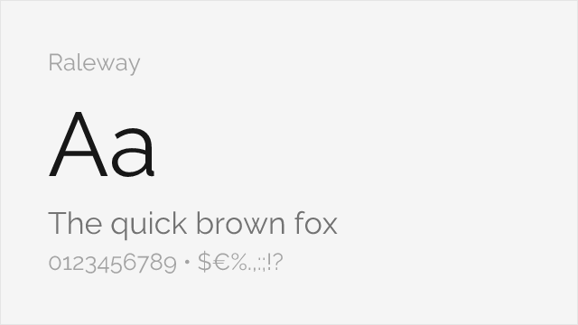
[Google Fonts] · OFL-1.1 · Variable
Elegant geometric display sans with a distinctive thin weight
Why it matches: Raleway is a geometric sans built for display, sharing Futura's circular construction and low stroke contrast but with a more refined, fashion-forward finish. Its thin and light weights capture the airy, modern elegance designers reach to Futura for in luxury and editorial work.
luxury brandingeditorial displaylarge headlines