Free Alternatives to Brandon Grotesque

About Brandon Grotesque
- Foundry
- HVD Fonts
- Classification
- sans-serif
- Style
- geometric
Brands Using Brandon Grotesque
Corporate typeface 2010-2018, promos, idents and posters
The basis for Walmart's custom "Bogle" brand typeface
Institutional identity and communications
A defining choice for hospitality and craft-goods packaging through the 2010s
 See Brandon Grotesque live on these sites with FontSwap →
Brandon Grotesque is a warm geometric sans-serif typeface designed by Hannes von Döhren and released in 2010 by the independent Berlin foundry HVD Fonts. It quickly became one of the most popular fonts of the 2010s, beloved by designers the world over for its warm, approachable character that combines geometric precision with friendly, welcoming curves. Its distinctive low x-height and versatile personality made it a go-to choice for branding, packaging, and editorial design, and it remains one of the most recognizable geometric sans-serifs of the modern era — a reference point for the whole "warm geometric" look that dominated consumer branding for a decade.
History and Design
Hannes von Döhren designed Brandon Grotesque as part of the Brandon family, which also includes Brandon Text optimized for smaller sizes and extended reading. The typeface draws deep inspiration from geometric sans-serifs of the 1920s and 30s—the golden age of geometric typography—while adding contemporary refinements suited to modern design contexts.
What distinguishes Brandon Grotesque from its geometric predecessors is the combination of a low x-height with softened, optically corrected forms. Where Futura can feel austere and mechanical, Brandon Grotesque's rounded corners and warm detailing give it a friendly, approachable personality without abandoning geometric precision. The relatively low x-height lends it an elegant, slightly vintage character that sets it apart from the taller, more utilitarian geometrics around it.
The lowercase letters feature a notably low x-height — an unusual choice for a sans-serif that gives Brandon Grotesque an elegant, slightly vintage, display-leaning character. (It is precisely this low x-height that makes the display cut less suited to small text, and the reason von Döhren later drew the higher-x-height Brandon Text for body copy.) Von Döhren incorporated subtle humanist touches throughout the design: slight variations in curve tension, softened corners, and organic refinements that prevent the typeface from feeling cold or mechanical. These details give Brandon Grotesque its characteristic warmth.
The original release included six weights from Thin to Black, plus matching italics. The family's success led to Brandon Text (2014), a companion optimized for body text with a larger x-height and heavier hairlines for improved legibility at small sizes.
Brandon Grotesque is also a landmark in the story of independent type foundries. Hannes von Döhren founded HVD Fonts in Berlin and released Brandon Grotesque as a small studio, not a legacy giant like Linotype or Monotype — and its runaway success helped prove that a single talented designer with a distinctive family could compete with, and often outsell, the established houses. It won an award from the Type Directors Club and became one of the best-selling typefaces of its generation, a commercial phenomenon that arrived just as web-font services and the design-blog ecosystem were making it easy for a great independent release to spread virally. In that sense Brandon Grotesque is both a product of its moment and a cause of it: it showed a generation of designers what an indie foundry could achieve.
Understanding that origin helps explain the design's confidence. It was not a committee product hedging its bets; it was one designer's clear, opinionated take on how to make the cool geometric tradition warm. Every softened corner and optical correction reflects a coherent point of view, which is a large part of why the face feels so consistent and so likeable across its whole range.
Why Brandon Grotesque Matters
Brandon Grotesque became one of the most sought-after fonts of the 2010s, appearing everywhere from startup logos to restaurant menus to craft product packaging. Its ability to feel simultaneously modern and nostalgic, professional and playful, makes it extraordinarily versatile.
More than most typefaces, Brandon Grotesque came to define the look of its decade. If a café, a skincare brand, or a lifestyle startup launched between roughly 2011 and 2018 with a warm-but-modern wordmark, there is a good chance it was set in Brandon Grotesque or something reaching for the same feel. That ubiquity is a testament to how precisely von Döhren judged the moment — and it is also the practical reason so many designers now seek a free stand-in, whether to avoid the licence, to escape the era association, or simply to get the same warm-geometric character without the cost.
Who is it for? Consumer-facing brands that want to feel friendly, crafted, and current — food and drink, beauty, wellness, hospitality, and lifestyle — rather than corporate-serious, technical, or minimal. It is a poor fit for contexts wanting gravitas, neutrality, or a hard contemporary-tech edge, where its rounded warmth reads as too soft.
The typeface captured a cultural moment when designers sought alternatives to the ubiquitous Helvetica and its descendants. Brandon Grotesque offered geometric clarity with personality—precision with warmth. This combination proved irresistible to brands in hospitality, retail, and lifestyle sectors where approachability is paramount.
It is worth being precise about what that warmth actually is, because it is the whole value of the design. Pure geometric sans-serifs — Futura and its strict descendants — can feel a little austere and impersonal, the typographic equivalent of a modernist building: admirable but cool. Humanist sans-serifs solve that by borrowing the warmth of handwriting, but at the cost of the crisp, constructed look. Brandon Grotesque threads the needle: it keeps the circles and clean geometry that read as modern and considered, then rounds the terminals, tightens the proportions, and softens the corners just enough to add a human touch. The result feels approachable without ever looking casual or hand-drawn, which is exactly the register consumer brands want — friendly, but still designed.
The font's popularity in restaurant and café branding became particularly notable. Its friendly character suits establishments seeking to project warmth and craftsmanship without appearing overly casual. Similarly, packaging designers embraced Brandon Grotesque for its ability to stand out on shelves while communicating quality and attention to detail. From artisan coffee bags to premium cosmetics, its warm geometry became shorthand for a product that had been thoughtfully made and carefully considered.
Design Characteristics
Brandon Grotesque's charm comes from a careful balance: it is geometric enough to feel modern and precise, but softened at every turn so it never reads as cold. Von Döhren took the 1920s geometric model and quietly humanized it, and the result is a face that looks designed and friendly at once. The details that create that effect:
- Optically corrected geometry: Near-circular forms with subtle optical adjustments, so the geometry looks even and considered to the eye rather than mathematically rigid — the craft that underpins its warmth.
- Low x-height: Short lowercase relative to the caps — an unusual, elegant choice that gives Brandon Grotesque its distinctive, slightly vintage display character, and the reason the higher-x-height companion Brandon Text exists for small sizes.
- Geometric foundation: Based on circles and geometric shapes
- Soft terminals: Gently rounded stroke endings that add warmth
- Consistent stroke width: Near-monolinear design with subtle optical corrections
- Open apertures: Clear letter openings for legibility at various sizes
Where Brandon Grotesque Excels
Brandon Grotesque is at its best wherever a brand wants to feel modern and warm at the same time — geometric enough to read as designed and current, friendly enough to feel human. That balance is its whole reason for existing, and it explains its dominance in consumer-facing branding through the 2010s:
- Brand identity: Memorable logos with friendly, approachable character.
- Packaging design: Stands out on shelves with warm, crafted appeal.
- Editorial layouts: Distinctive headlines that draw readers into content.
- Retail and hospitality: Approachable signage, menus, and wayfinding.
- Food and beverage: A natural fit for restaurants, cafés, and craft products.
- Lifestyle brands: Fashion, wellness, and consumer goods seeking warmth.
Where Brandon Grotesque Struggles
The friendly warmth that makes Brandon Grotesque so likeable also bounds where it fits, and — like most display-leaning geometrics — it has limits at text size:
- Extended body text: The display cut's low x-height and low-contrast forms tire the eye over long passages; that is what the higher-x-height companion Brandon Text was drawn to fix.
- Corporate-serious or technical work: Its friendliness reads as too soft for finance, legal, or engineering contexts that want gravitas or neutrality.
- Standing out from the 2010s crowd: Brandon Grotesque was so popular for so long that it can now read as a period piece, tying a brand to a specific era of café-and-startup design.
- Small-size UI: As a print-first display design, it is less screen-tuned than families built for interfaces.
- Licensing cost: The HVD original is commercial and licensed per use, which is exactly why the free geometric alternatives below exist.
How to Choose a Free Substitute
Brandon Grotesque sits in the busiest corner of free type — the geometric sans — so a close match is easy to find. The trait to match is its specific blend of geometric precision, low x-height, and rounded warmth.
For the closest overall match, Poppins is the clear first choice, sharing the geometric construction and friendly character with a full weight range (though Poppins has a taller x-height, so Brandon's more elegant, vintage proportion is one thing no free face fully reproduces). If you want a little more elegance and beautiful thin weights, Raleway is the pick; for maximum rounded warmth, Quicksand and Nunito get closest to Brandon's soft terminals. For flexible, neutral branding at scale, Montserrat offers the geometric feel with the deepest weight range, and for a vintage-1920s display flavor, Josefin Sans channels the same period roots Brandon draws on.
The thing to watch is character rather than a single metric. Brandon Grotesque's low x-height and softened geometry give it a specific elegance that taller, higher-x-height faces like Montserrat and Nunito do not share, so those can feel more generic and utilitarian in comparison. If that refined, slightly vintage feel is central to your design, favor Poppins for the closest geometric match or Quicksand for the roundest warmth, and test a full line at your real size to judge the overall texture.
Premium Font Neighbors
If Brandon Grotesque's warm geometric style appeals but you want to explore commercial options, its neighborhood is rich. Futura is the geometric archetype the whole style descends from, and Avenir is Adrian Frutiger's warmer, more humanist take on that idea — perhaps the closest in spirit to Brandon. Gotham and Proxima Nova are the modern American geometrics that defined 2000s and 2010s branding, while Circular is the softer, rounded geometric that became the startup default. For more character, Sofia Pro offers a contemporary geometric with warmth, Kabel brings a quirkier Art Deco geometry, and ITC Avant Garde supplies the wide, circular geometric look from the vintage end.
FAQ
What is the best free alternative to Brandon Grotesque?
Poppins is the closest free alternative, at roughly 88% similarity — it shares Brandon Grotesque's geometric construction and warm, friendly character, with a full weight range under the SIL Open Font License. For more rounded warmth try Quicksand or Nunito; for elegant thin weights, Raleway.
What Google Font looks like Brandon Grotesque?
The closest Google Fonts are Poppins (88% similarity), Raleway (82%), Nunito (75%), Quicksand (72%), and Montserrat (70%). Poppins is the best all-round match; Quicksand and Nunito capture the rounded warmth; Montserrat gives the deepest weight range for flexible branding.
Can I use these free alternatives commercially?
Yes. Poppins, Raleway, Nunito, Quicksand, Montserrat, and Josefin Sans are all released under the SIL Open Font License, which permits unlimited commercial use without fees — websites, apps, branding, packaging, and print. Attribution is only required if you redistribute the font files themselves.
Why was Brandon Grotesque so popular?
It arrived in 2010 at the moment designers were tiring of Helvetica and hunting for geometric warmth, and it hit a sweet spot: precise enough to feel modern, soft enough to feel human, and distinctive enough to feel considered in branding layouts. That made it a default for cafés, craft products, startups, and lifestyle brands throughout the decade — so much so that it came to define a whole era's look.
Is Brandon Grotesque good for body text?
The display version is better suited to headlines and branding than to long passages; its low x-height and low-contrast forms tire the eye at length. HVD drew a companion, Brandon Text, specifically for smaller sizes and extended reading. Among free alternatives, Nunito or Poppins handle body text more comfortably while keeping a similar friendly character.
What fonts pair well with Brandon Grotesque?
A warm or contemporary serif makes a strong counterpart — a transitional or soft serif for body text balances Brandon's geometric headlines with reading comfort. When using it across a whole layout, pair a lighter Brandon weight (or the companion Brandon Text) with the bolder display weights, keeping the palette restrained so its friendly geometry stays the focus.
Is Brandon Grotesque on Google Fonts?
No, Brandon Grotesque is a premium font from HVD Fonts and is not available on Google Fonts.
The closest Google Fonts alternative is Poppins with 88% similarity. Get it free on Google Fonts ↗
Free Alternatives (7)
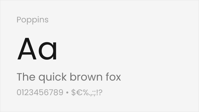
Excellent match with similar geometric shapes and friendly character
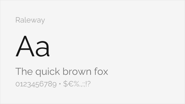
Comparable elegance with slightly more refined letterforms
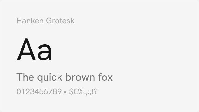
Geometric sans with a full 100-900 variable weight axis.
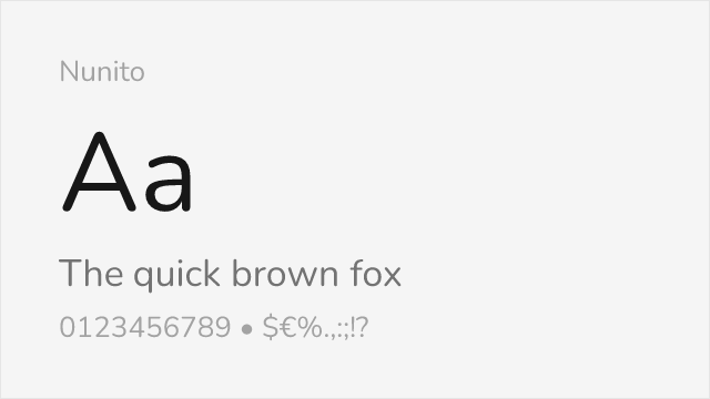
Similar warmth and rounded terminals for approachable designs
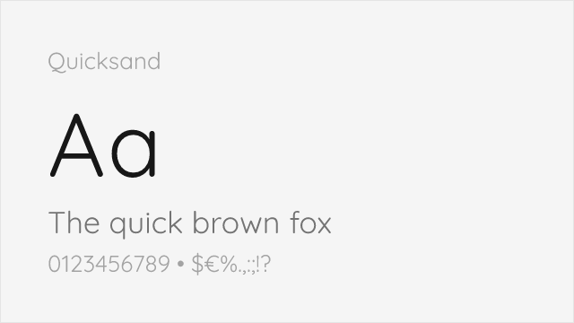
Rounded geometric with soft terminals close to Brandon's warmth
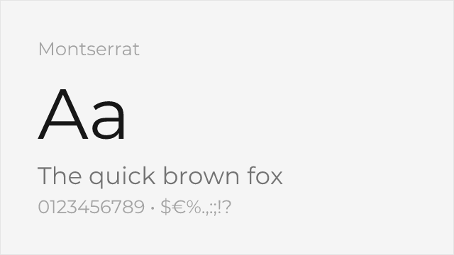
Ubiquitous geometric sans with a full weight range for branding
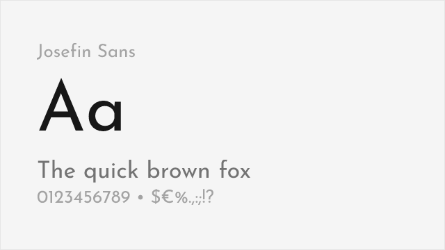
Elegant geometric with a low x-height and vintage 1920s flavor
Compare the alternatives
See how Brandon Grotesque compares to its top alternatives — and how those alternatives compare to each other — side by side.
See where Brandon Grotesque is used in the wild and swap to free alternatives live.
Install FontSwap →Replacement Summary
Source: FontAlternatives.com
Premium font: Brandon Grotesque
Best free alternative: Poppins
FontAlternatives similarity score: 88%
Replacement difficulty: Low
Best for: brand identity, packaging design, web applications, display headlines
Notable users: Comedy Central, Walmart, Brandon University
Not recommended when: Brand consistency with Comedy Central requires exact letterforms
What is the best free alternative to Brandon Grotesque?
Poppins is the best free alternative to Brandon Grotesque with a FontAlternatives similarity score of 88%.
Poppins shares similar proportions, stroke characteristics, and intended use with Brandon Grotesque. It is available under the OFL-1.1 license, which permits both personal and commercial use at no cost.
This alternative works particularly well for: brand identity, packaging design, web applications, display headlines.
Can I safely replace Brandon Grotesque with Poppins?
Yes, Poppins is a high-confidence replacement for Brandon Grotesque. The FontAlternatives similarity score of 88% indicates strong structural compatibility.
Licensing: Poppins is licensed under OFL-1.1, which allows commercial use without licensing fees or royalties.
Weight coverage: All 6 weights have exact matches available.
When should I NOT replace Brandon Grotesque?
While Poppins is a strong alternative, there are situations where replacing Brandon Grotesque may not be appropriate:
- Strict compliance: Verify that OFL-1.1 terms meet your specific legal and compliance requirements.
Weight-Matching Guide
Map Brandon Grotesque weights to their closest free alternatives for accurate font substitution.
Poppins
| Brandon Grotesque | Poppins | Match |
|---|---|---|
| Thin | Thin (100) | exact |
| Light | Light (300) | exact |
| Regular | Regular (400) | exact |
| Medium | Medium (500) | exact |
| Bold | Bold (700) | exact |
| Black | Black (900) | exact |
Raleway
| Brandon Grotesque | Raleway | Match |
|---|---|---|
| Light | Light (300) | close |
| Regular | Regular (400) | close |
| Medium | Medium (500) | close |
| Bold | Bold (700) | close |
| Black | Black (900) | close |
Hanken Grotesk
| Brandon Grotesque | Hanken Grotesk | Match |
|---|---|---|
| Thin | Thin (100) | exact |
| Light | Light (300) | exact |
| Regular | Regular (400) | exact |
| Medium | Medium (500) | exact |
| Bold | Bold (700) | exact |
| Black | Black (900) | exact |
Nunito
| Brandon Grotesque | Nunito | Match |
|---|---|---|
| Light | Light (300) | close |
| Regular | Regular (400) | close |
| Medium | Medium (500) | close |
| Bold | Bold (700) | close |
| Black | Black (900) | close |
Quicksand
| Brandon Grotesque | Quicksand | Match |
|---|---|---|
| Light | Light (300) | close |
| Regular | Regular (400) | close |
| Medium | Medium (500) | close |
| Bold | Bold (700) | close |
Montserrat
| Brandon Grotesque | Montserrat | Match |
|---|---|---|
| Light | Light (300) | close |
| Regular | Regular (400) | close |
| Medium | Medium (500) | close |
| Bold | Bold (700) | close |
| Black | Black (900) | close |
Josefin Sans
| Brandon Grotesque | Josefin Sans | Match |
|---|---|---|
| Light | Light (300) | close |
| Regular | Regular (400) | close |
| Medium | Medium (500) | close |
| Bold | Bold (700) | close |
Performance Guide
Production performance metrics for each alternative.
How to Use Poppins
Copy these code snippets to quickly add Poppins to your project.
CSS code for Poppins
@import url('https://fonts.googleapis.com/css2?family=Poppins:wght@100;200;300;400;500;600;700;800;900&display=swap');HTML code for Poppins
<link rel="preconnect" href="https://fonts.googleapis.com">
<link rel="preconnect" href="https://fonts.gstatic.com" crossorigin>
<link href="https://fonts.googleapis.com/css2?family=Poppins:wght@100;200;300;400;500;600;700;800;900&display=swap" rel="stylesheet">
Tailwind code for Poppins
// tailwind.config.js
module.exports = {
  theme: {
    extend: {
      fontFamily: {
        'poppins': ['Poppins', 'sans-serif'],
      },
    },
  },
}

// Usage in HTML:
// <p class="font-poppins">Your text here</p>
Next.js code for Poppins
// Using next/font (Next.js 13+)
import { Poppins } from 'next/font/google';

const poppins = Poppins({
  subsets: ['latin'],
  weight: ['100', '200', '300', '400', '500', '600', '700', '800', '900'],
});

export default function Component() {
  return (
    <p className={poppins.className}>
      Your text here
    </p>
  );
}

// Or using inline styles with Google Fonts link:
// <p style={{ fontFamily: "'Poppins'" }}>Your text</p>
Expo and React Native code for Poppins
// Install: npx expo install @expo-google-fonts/poppins expo-font
import { useFonts, Poppins_400Regular } from '@expo-google-fonts/poppins';

export default function App() {
  const [fontsLoaded] = useFonts({
    Poppins_400Regular,
  });

  if (!fontsLoaded) return null;

  return (
    <Text style={{ fontFamily: 'Poppins_400Regular' }}>
      Your text here
    </Text>
  );
}
Recommended Font Pairings
These free fonts pair well with Poppins Brandon Grotesque for headlines, body text, or accent use.
Merriweather's robust serifs ground Brandon Grotesque's geometric lightness for warm, readable editorial combinations
Playfair Display's high-contrast elegance creates striking hierarchy against Brandon Grotesque's friendly geometric forms
Libre Baskerville's classical refinement balances Brandon Grotesque's modern warmth for sophisticated branding layouts
Browse Alternatives by Context
Find Brandon Grotesque alternatives filtered by specific use case, style, or language support.
By Use Case
By Script
Frequently Asked Questions
What is the best free alternative to Brandon Grotesque?
Poppins is the best free alternative to Brandon Grotesque with a FontAlternatives similarity score of 88%. It shares similar proportions and characteristics while being available under the OFL-1.1 license for both personal and commercial use at no cost.
Is there a free version of Brandon Grotesque?
There is no official free version of Brandon Grotesque. However, Poppins is available under the OFL-1.1 open-source license and achieves a FontAlternatives similarity score of 88%. It includes 9 weights and supports latin, latin-extended.
What Google Font looks like Brandon Grotesque?
The Google Fonts most similar to Brandon Grotesque are Poppins, Raleway, Hanken Grotesk. Among these alternatives, Poppins offers the closest match with a FontAlternatives similarity score of 88% and includes 9 weights for design flexibility.
Can I use Poppins commercially?
Yes, Poppins can be used commercially. It is licensed under OFL-1.1, which allows free use in websites, applications, print materials, and commercial projects without purchasing a license or paying royalties.
Is Poppins similar enough to Brandon Grotesque?
Poppins achieves a FontAlternatives similarity score of 88% compared to Brandon Grotesque. While not identical, it offers comparable letterforms, proportions, and visual style. Most designers find it works excellently as a substitute in web and print projects.
What are the main differences between Brandon Grotesque and its free alternatives?
Free alternatives to Brandon Grotesque may differ in subtle details like letter spacing, curve refinements, and available weights. Premium fonts typically include more OpenType features, extended language support, and optimized screen rendering. However, for most projects, these differences are negligible.
Where can I download free alternatives to Brandon Grotesque?
Download Poppins directly from Google Fonts. Click the "Get Font" button on any alternative listed above to visit the official download page. Google Fonts also provides convenient embed codes for seamless web integration.