 Install FontSwap
Free Alternatives to Brandon Grotesque with Elegant Style
Brandon Grotesque is known for its elegant aesthetic. If you're looking for a free sans serif font with a similar elegant feel, these 7 alternatives offer comparable characteristics. We've identified 2 that are especially well-suited for this context. All are available under open-source licenses for unrestricted commercial use.
Top Picks
Comparison Table
| Font | Relevance ⓘ
How well this alternative fits the specific context (use-case or trait) of this page. Score 0–100 based on matching keywords, industries, and font characteristics. Alternatives scoring 25+ are highlighted.
| Similarity ⓘ
How visually similar this free font is to the premium original. Score 0–100 based on x-height, width, stroke contrast, use-case overlap, and language coverage.
Learn more → | Weights | Variable | License | Source |
|---|---|---|---|---|---|---|
| Josefin Sans | 73 | 65% | Variable | Yes | OFL-1.1 | Google Fonts ↗ |
| Raleway | 56 | 82% | Variable | Yes | OFL-1.1 | Google Fonts ↗ |
| Poppins | 18 | 88% | 9 | No | OFL-1.1 | Google Fonts ↗ |
| Hanken Grotesk | 16 | 78% | Variable | Yes | OFL-1.1 | Google Fonts ↗ |
| Nunito | 15 | 75% | Variable | Yes | OFL-1.1 | Google Fonts ↗ |
| Quicksand | 14 | 72% | Variable | Yes | OFL-1.1 | Google Fonts ↗ |
| Montserrat | 14 | 70% | Variable | Yes | OFL-1.1 | Google Fonts ↗ |
Most Relevant (2)
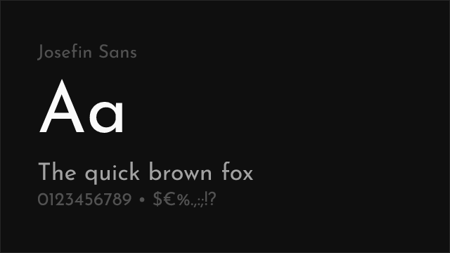
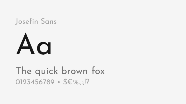
Elegant geometric with a low x-height and vintage 1920s flavor
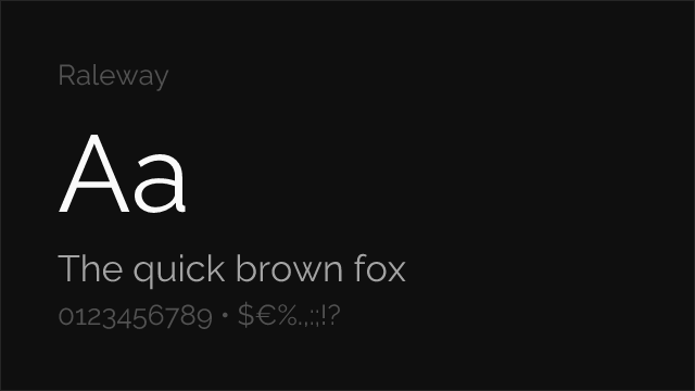
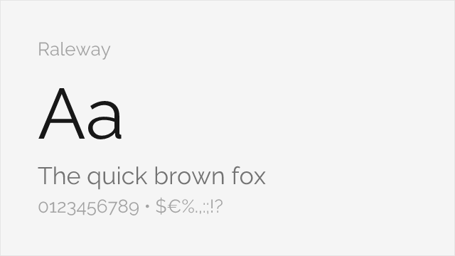
Comparable elegance with slightly more refined letterforms
Other Alternatives (5)
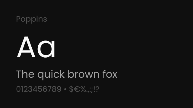
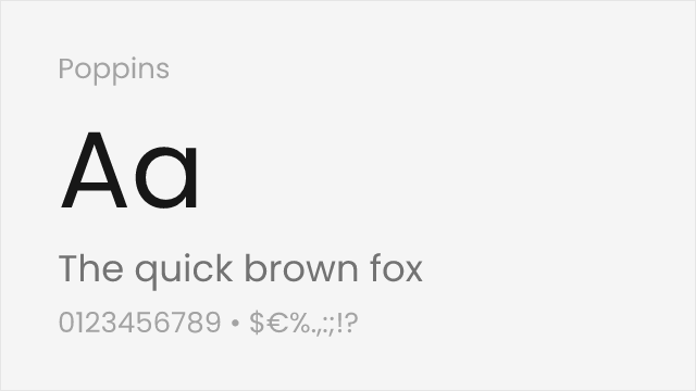
Excellent match with similar geometric shapes and friendly character
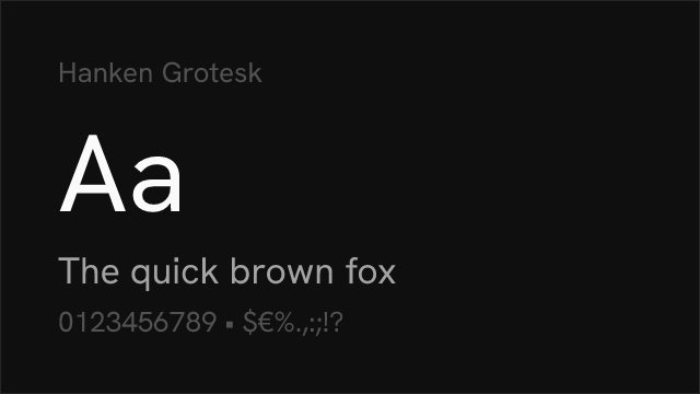
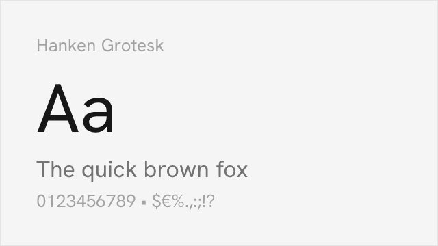
Geometric sans with a full 100-900 variable weight axis.
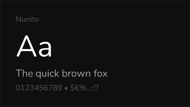
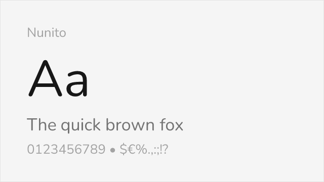
Similar warmth and rounded terminals for approachable designs
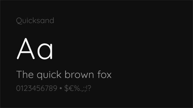
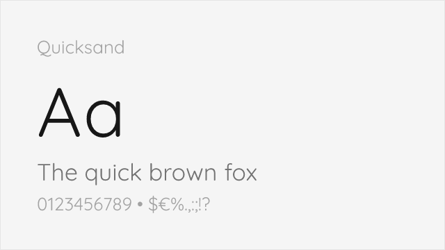
Rounded geometric with soft terminals close to Brandon's warmth
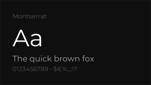
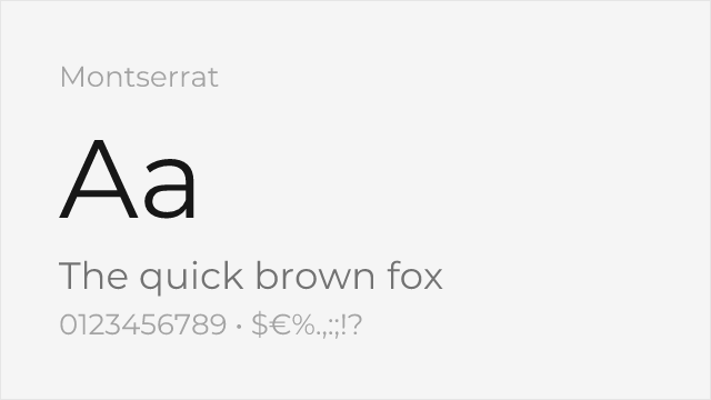
Ubiquitous geometric sans with a full weight range for branding