Free Alternatives to Brandon Grotesque for Editorial

7 alternatives | 1 highly relevant | sans serif | Best match: Raleway (82%)

Looking for a free sans serif font for editorial projects? Brandon Grotesque by HVD Fonts is a popular choice, but its licensing cost can be prohibitive. We've curated 7 free alternatives that work well in editorial contexts. We've identified 1 that are especially well-suited for this context. Each alternative is scored by visual similarity and contextual relevance, and ships under an open-source license for both personal and commercial use.

Top Picks

Comparison Table

Font Relevance Similarity Weights Variable License Source
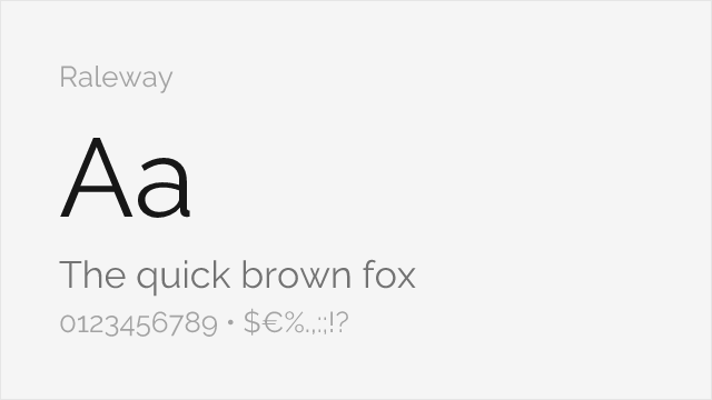
Raleway 44 82% Variable Yes OFL-1.1 Google Fonts ↗
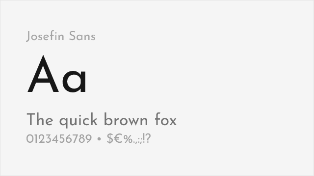
Josefin Sans 23 65% Variable Yes OFL-1.1 Google Fonts ↗
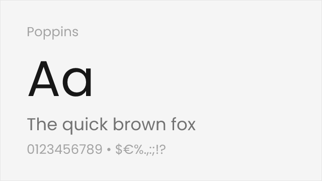
Poppins 9 88% 9 No OFL-1.1 Google Fonts ↗
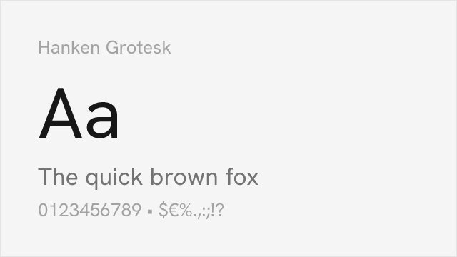
Hanken Grotesk 8 78% Variable Yes OFL-1.1 Google Fonts ↗
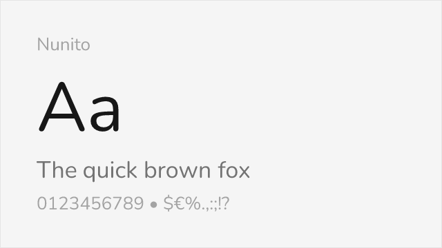
Nunito 8 75% Variable Yes OFL-1.1 Google Fonts ↗
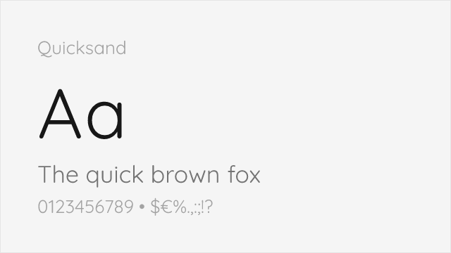
Quicksand 7 72% Variable Yes OFL-1.1 Google Fonts ↗
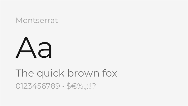
Montserrat 7 70% Variable Yes OFL-1.1 Google Fonts ↗

Most Relevant (1)

#1 Raleway 82% Relevant
[Google Fonts] · OFL-1.1 · Variable

Comparable elegance with slightly more refined letterforms

Why it matches: Raleway shares Brandon Grotesque's elegant geometric character with particularly beautiful thin weights. Both typefaces convey sophistication and modernity while maintaining approachability. Raleway's distinctive letterforms and comprehensive weight range make it suitable for similar branding and editorial applications.
fashion brandingeditorial designportfolio sitescreative projects
Get Font ↗

Other Alternatives (6)

#2 Josefin Sans 65%
[Google Fonts] · OFL-1.1 · Variable

Elegant geometric with a low x-height and vintage 1920s flavor
Why it matches: Josefin Sans draws on the same 1920s geometric tradition Brandon Grotesque references, with elegant, slightly vintage forms and tall ascenders. Its low x-height makes it a different animal for text, but for display and branding that wants Brandon's period-geometric elegance, it captures the era's spirit distinctively.
display and headlinesfashion and beautyvintage-flavored brandinglogos
Get Font ↗
#3 Poppins 88%
[Google Fonts] · OFL-1.1 · 9 weights

Excellent match with similar geometric shapes and friendly character
Why it matches: Poppins closely mirrors Brandon Grotesque's geometric construction and warm character. Both feature warm, approachable character with slightly rounded forms that soften the geometric foundation. The near-monolinear strokes and open apertures create comparable text texture in headlines and display use.
brand identitypackaging designweb applicationsdisplay headlines
Get Font ↗
[Google Fonts] · OFL-1.1 · Variable

Geometric sans with a full 100-900 variable weight axis.
Why it matches: Hanken Grotesk lands in the same geometric territory Brandon Grotesque occupies — near-circular bowls, horizontal terminals, an even and open rhythm — while offering a continuous 100-900 weight axis that Brandon's six static cuts cannot match. Where it differs is warmth: Brandon's slightly condensed proportions and softened corners give it a period quality that Hanken Grotesk, drawn much more recently, does not attempt. Pick it when you want the geometry and the range more than the nostalgia.
brandingheadlinespresentationsweb
Get Font ↗
#5 Nunito 75%
[Google Fonts] · OFL-1.1 · Variable

Similar warmth and rounded terminals for approachable designs
Why it matches: Nunito captures Brandon Grotesque's warm, friendly personality through rounded terminals and soft geometric forms. While warmer and taller in x-height than Brandon Grotesque, Nunito shares the same approachable character that makes it ideal for consumer brands, hospitality, and lifestyle applications.
friendly brandinghospitalityconsumer productsmobile apps
Get Font ↗
#6 Quicksand 72%
[Google Fonts] · OFL-1.1 · Variable

Rounded geometric with soft terminals close to Brandon's warmth
Why it matches: Quicksand is a geometric sans built on near-perfect circles with softly rounded terminals, which puts it very close to Brandon Grotesque's blend of geometric precision and friendly warmth. It is lighter and a little more playful, but for approachable branding and packaging it captures the same round, welcoming character.
friendly brandingpackaginghospitalitylifestyle products
Get Font ↗
#7 Montserrat 70%
[Google Fonts] · OFL-1.1 · Variable

Ubiquitous geometric sans with a full weight range for branding

Why it matches: Montserrat is the web's default geometric sans — clean circular forms and a complete weight range — which makes it a flexible, if more neutral, stand-in for Brandon Grotesque's geometric side. It lacks Brandon's low x-height and soft warmth, but for versatile branding and display work it delivers the same modern geometric feel with far more weights.
branding and logosheadlinesmarketing sitessocial media graphics
Get Font ↗

Related Pages