Free Alternatives to Optima

About Optima
- Foundry
- Linotype
- Classification
- sans-serif
- Style
- humanist
Brands Using Optima
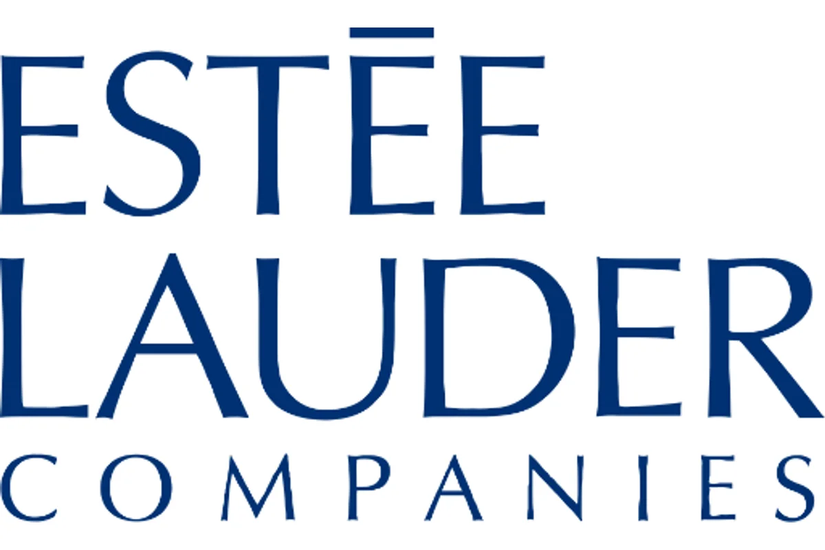
Beauty brand packaging and retail signage
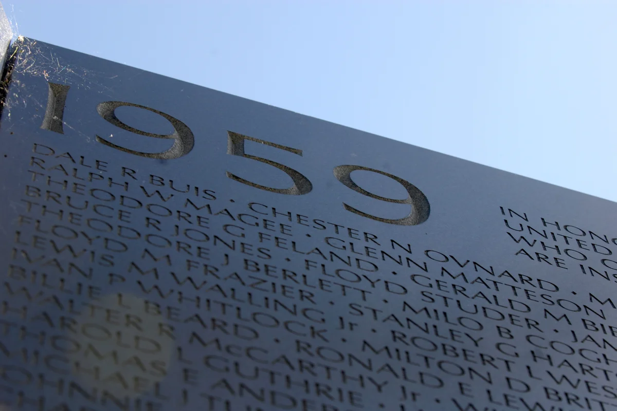
Inscribed names on the memorial wall in Washington DC
A longstanding favorite where flared strokes signal refinement without ostentation
Its carved-stone heritage makes it a natural choice for dignified commemorative lettering
 See Optima live on these sites with FontSwap →
See Optima in the Wild
Optima is a celebrated humanist sans-serif typeface designed by Hermann Zapf between 1952 and 1955 for the Stempel foundry, later licensed to Linotype. Often described as a "serifless roman," Optima blurs the line between serif and sans-serif with its distinctive flared stroke modulation inspired by classical Roman inscriptions. No other sans-serif achieves quite the same combination of clarity and classical elegance, which is why it has remained a designer's byword for understated sophistication for more than half a century.
History and Design
Hermann Zapf conceived Optima during a 1950 visit to the Santa Croce church in Florence, where he sketched the inscriptions on Renaissance gravestones. These carved letters featured subtle thicks and thins without traditional serifs—a quality Zapf sought to capture in type. He spent five years perfecting the design, creating a typeface that combined the clarity of sans-serifs with the elegance of classical letterforms.
The development process was meticulous. Zapf cut the design in three sizes to ensure it worked across different applications, a practice now called optical sizing. The stroke modulation required careful calibration—too much contrast and it would read as a serif; too little and the classical inspiration would be lost.
The name "Optima" (Latin for "the best") directly reflects Zapf's own ambition to create an optimal balance between simplicity and refinement. The subtle stroke contrast and flared terminals give each letter a sculptural quality rarely seen in sans-serif design. The flaring is most visible in the capitals, which echo the stone-carved Roman letters that inspired the design.
First released to the public in 1958 after nearly a decade of development, Optima was revised as Optima nova in 2002, a comprehensive update Zapf undertook in collaboration with Akira Kobayashi at Linotype. The revision added weights, true italics, and a condensed set, refining the family for digital use while preserving Zapf's original vision.
The Santa Croce anecdote is worth pausing on, because it explains why Optima feels the way it does. Zapf, on that 1950 visit, is said to have had no paper to hand and sketched the inscriptions on a 1,000-lira banknote — a small detail that captures how the design began not in a studio brief but in a moment of direct encounter with lettering carved centuries earlier. He was, above all, a master calligrapher, and Optima is calligraphy translated into type: the swelling and tapering of its strokes is the ghost of a broad pen and a chisel, not the output of a drawing machine. That lineage is why the face reads as humane and alive where its geometric contemporaries read as constructed.
It also helps to place Optima against Zapf's other great designs. He is the rare designer responsible for two typefaces most literate people have seen without knowing it — Palatino, the elegant book serif, and Zapf Dingbats, the symbol font on nearly every computer. Optima sits between his serif and sans instincts, borrowing the classical proportions of a Palatino while shedding the serifs, and it is often cited as the design in which his calligraphic philosophy is most purely expressed. For a typeface named "the best," it has a fair claim to being its maker's most personal statement.
Why Optima Matters
Optima occupies a unique position in typography, offering the readability of a sans-serif with the sophistication of classical type. Its stroke modulation creates a rhythm and warmth that geometric and grotesque sans-serifs cannot match. This makes it ideal for contexts requiring elegance without the formality of traditional serifs.
It matters, too, as a demonstration that a sans-serif need not be neutral. Most of the great sans-serifs of the twentieth century pursued either mechanical precision (Futura) or engineered neutrality (Helvetica, Univers); Optima went the opposite way, insisting that a sans could be warm, humane, and steeped in history. That it came from Hermann Zapf — one of the finest letterers of the century, and the designer of Palatino — gave it an authority few sans-serifs of its era could claim, and it opened a door that later humanist designs walked through.
Who is it for? Brands and projects that want elegance, warmth, and classical dignity without the weight of a serif — luxury, beauty, cultural institutions, ceremonial and memorial work, and refined editorial. It is the wrong choice for utilitarian signage, dense interfaces, or loud display, where its delicacy works against it; those want a sturdier, more neutral face, while Optima's gift is to make a page feel considered and humane.
The typeface gained solemn significance through its use on the Vietnam Veterans Memorial in Washington, D.C., where its refined character honors the fallen with dignity. The names of over 58,000 service members are carved in Optima, making it one of the most viewed instances of the typeface in America.
Beyond memorials, Optima found favor in fashion and cosmetics, where its elegant understatement signals luxury without ostentation. Estée Lauder built much of its packaging identity around Optima, and the typeface remains a staple of high-end beauty and fragrance branding to this day. The typeface projects sophistication while remaining accessible—refined without being cold.
Design Characteristics
Optima's whole identity lives in one paradox: it is a sans-serif that behaves like a Roman inscription. Zapf achieved that by borrowing the stone-carver's stroke logic rather than the pen's or the compass's, and every feature follows from it:
- Flared, tapering strokes: The stems swell subtly toward their ends rather than staying monoline — the "serifless" echo of a Roman capital's flared terminal, and the single feature that defines Optima. It is most visible in the capitals.
- Subtle stroke contrast: A gentle thick-thin variation, more than a grotesque but far less than a serif, gives the letters a calligraphic warmth without ever tipping into a serif's drama.
- Classical, humanist proportions: The letter widths follow Roman inscriptional relationships, lending a balanced, monumental dignity.
- No true serifs: For all its classical feeling, it has none of the bracketed feet of a serif face — hence the description "serifless roman."
- Sculptural, carved quality: The forms read as if chiseled rather than drawn, which is exactly why the design has always felt at home in stone and on memorials.
- Optical sizing from the start: Zapf cut it in multiple sizes so the delicate flaring would survive at different scales — a sophistication most sans-serifs of its era lacked, and a sign of how carefully the design was engineered to stay elegant from a caption to a headline.
Where Optima Excels
Optima is at its best wherever elegance and dignity are wanted without the formality of a serif — refined, calm, and quietly classical:
- Fashion and luxury: Refined elegance without ostentation, a favorite for beauty and premium branding.
- Editorial design: Sophisticated headlines and unusually elegant body text for a sans.
- Memorial and ceremonial contexts: Its carved, dignified character suits solemn settings — most famously the Vietnam Veterans Memorial.
- High-end branding: Understated luxury for premium brands that want warmth rather than coldness.
- Cultural and institutional identity: Museums, foundations, and heritage organizations wanting classical gravitas in a modern, accessible form.
Where Optima Struggles
Optima's delicacy is its whole point and also its limitation, and it is a specialist rather than a workhorse:
- Small sizes and low-res screens: The flared, tapering strokes need room and resolution; at small sizes or on poor displays the subtlety flattens out and the magic is lost.
- Signage and high-legibility uses: Despite its clarity, its refinement is not built for the brute legibility of wayfinding the way Frutiger is — it is elegant first, functional second.
- Neutral or utilitarian work: Its character is quiet but present; where you truly need an invisible, neutral sans, a grotesque does the job better.
- Bold, loud display: Optima whispers rather than shouts; for high-impact headlines its restraint reads as weak.
- Faithful free substitution: This is the honest catch — no free font reproduces the flare, so a substitute always loses the one feature that makes Optima Optima.
How to Choose a Free Substitute
Be honest with yourself first: Optima's flared, serifless-roman strokes are genuinely rare, and no open-source font reproduces them. So decide which of Optima's qualities you actually need — the elegant sans feel, the classical dignity, or the understated professionalism — because that changes the pick more than usual.
For the elegant, airy sans feel at display sizes, URW Gothic (a clean geometric) and Questrial get closest to the spacious refinement, though neither has the flare. For the classical, ceremonial spirit, lean into serifs: EB Garamond and Cormorant draw on the same Renaissance sources Zapf did and carry real dignity. And for calm, professional, humanist warmth in text and corporate work, Lato and Source Sans deliver Optima's restraint without its specific character.
If the flare is truly essential — a luxury wordmark, a memorial, anything where Optima's exact voice is the point — the honest answer is to license the original or commission custom lettering, because a free approximation will always fall short there. For everything else, pick the substitute that matches the role Optima was playing (elegant display, classical text, or professional sans) and you will get most of the way there for nothing.
Premium Font Neighbors
Optima is a one-of-a-kind design, but it has relatives among the humanist and classical faces. Frutiger and Syntax are the great humanist sans-serifs that share its warmth and legibility-first spirit, while Gill Sans is the older British humanist in the same lineage. Myriad is the modern, versatile humanist workhorse. For Optima's classical, inscriptional side, Palatino — Zapf's own celebrated book serif — is its closest sibling, and Trajan is the pure Roman-capital face carved from the same stone-lettering tradition that inspired Optima. Avenir and Univers, both by Adrian Frutiger, round out the elegant-sans neighborhood.
FAQ
What is the best free alternative to Optima?
There is no perfect free match, because Optima's flared, serifless-roman strokes are not reproduced in any open-source font. The closest picks depend on what you need: URW Gothic or Questrial for an elegant, airy sans feel; EB Garamond or Cormorant for the classical, ceremonial spirit; and Lato or Source Sans for calm, professional humanist warmth. All are available for free under open licenses.
Why is Optima hard to replace with a free font?
Because its defining feature — subtly flared, tapering strokes that echo carved Roman capitals without adding serifs — is genuinely rare. Most free sans-serifs are either monoline geometrics (Futura-style) or plain humanists; none combine Optima's specific calligraphic flare with a serifless form. A substitute can match Optima's elegance, dignity, or warmth, but not that exact sculptural stroke.
How similar is URW Gothic to Optima?
Less than it might seem. URW Gothic is a clean, monoline geometric (an Avant Garde relative) and does not share Optima's flared strokes or calligraphic contrast at all. What it does share is an elegant, spacious, refined feel, which makes it a reasonable stand-in for display and luxury work — but if the flared "serifless roman" character is what you want, URW Gothic will not supply it.
Is Optima good for body text?
Yes, unusually so for such an elegant face — it reads comfortably at text sizes and has long been used for book and editorial body text. The one caveat is small sizes on low-resolution screens, where its delicate flaring can flatten out; for screen body text specifically, a sturdier humanist like Source Sans or Lato is safer, with Optima reserved for headings.
What fonts pair well with Optima?
Optima pairs beautifully with a classical serif for contrast — a Garamond or Zapf's own Palatino underneath Optima headings gives editorial and ceremonial work a refined, coherent feel. For a sans-only palette, use Optima's own weights for hierarchy rather than mixing in a second sans, since its distinctive flare tends to clash with plainer grotesques.
Where can I download these free Optima alternatives?
EB Garamond, Cormorant Garamond, Lato, Source Sans 3, and Questrial are all on Google Fonts, each available for webfont embedding and desktop download under open licenses (mostly the SIL Open Font License), and URW Gothic is available under an open license as well. That makes it easy to trial several against your real layout — set a headline and a paragraph in each and judge which captures the role Optima was playing.
Is Optima on Google Fonts?
No, Optima is a premium font from Linotype and is not available on Google Fonts.
The closest Google Fonts alternative is EB Garamond with 72% similarity. Get it free on Google Fonts ↗
Free Alternatives (6)
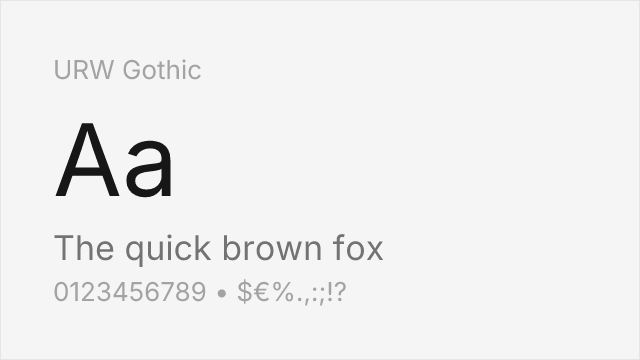
Clean, elegant geometric sans with refined, spacious proportions
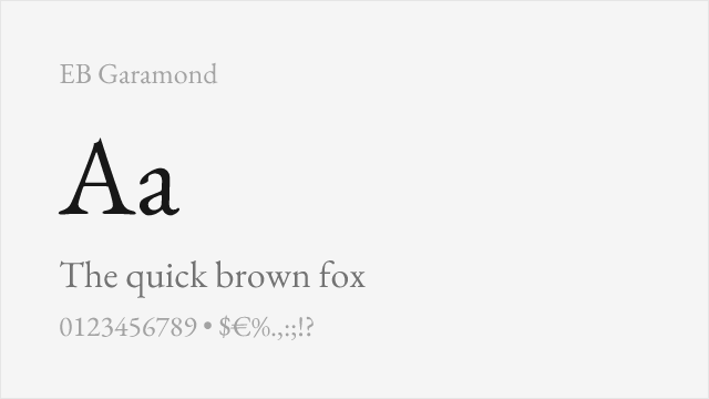
Shares classical elegance though as a serif, captures Optima's refined spirit
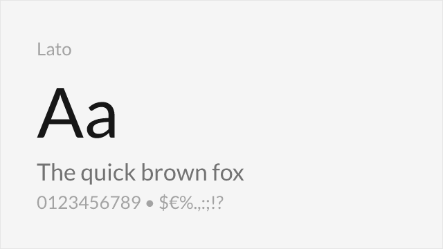
Humanist warmth with similar professional elegance
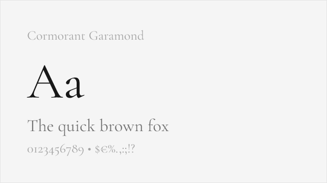
Elegant high-contrast display serif drawn from the same classical roots

Clean humanist sans for Optima's professional, understated roles
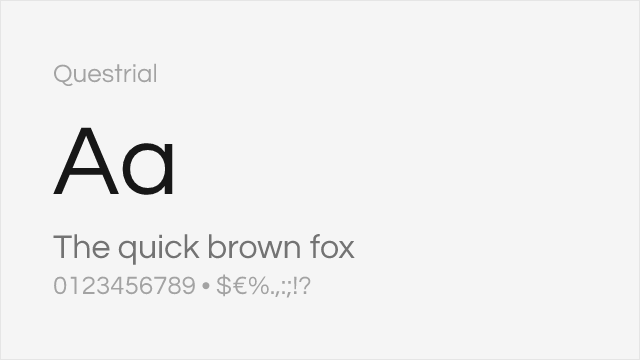
Minimal, elegant single-weight geometric sans for refined display
Compare the alternatives
See how Optima compares to its top alternatives — and how those alternatives compare to each other — side by side.
See where Optima is used in the wild and swap to free alternatives live.
Install FontSwap →Replacement Summary
Source: FontAlternatives.com
Premium font: Optima
Best free alternative: URW Gothic
FontAlternatives similarity score: 74%
Replacement difficulty: High
Best for: fashion branding, editorial display, luxury packaging, invitations
Notable users: Estée Lauder, Vietnam Veterans Memorial, Luxury cosmetics & fragrance packaging
Not recommended when: Precise optical matching is needed - URW Gothic has measurable structural differences
What is the best free alternative to Optima?
URW Gothic is the best free alternative to Optima with a FontAlternatives similarity score of 74%.
URW Gothic shares similar proportions, stroke characteristics, and intended use with Optima. It is available under the AGPL-3.0 license, which permits both personal and commercial use at no cost.
This alternative works particularly well for: fashion branding, editorial display, luxury packaging, invitations.
Can I safely replace Optima with URW Gothic?
URW Gothic can work as a replacement in many scenarios, but verify specific requirements. The FontAlternatives similarity score of 74% suggests some structural differences.
Licensing: URW Gothic is licensed under AGPL-3.0, which allows commercial use without licensing fees or royalties.
Weight coverage: Most weights have close or exact matches available.
When should I NOT replace Optima?
While URW Gothic is a strong alternative, there are situations where replacing Optima may not be appropriate:
- Optical precision requirements: URW Gothic has measurable structural differences from Optima that may be visible in precise design work.
- Strict compliance: Verify that AGPL-3.0 terms meet your specific legal and compliance requirements.
Weight-Matching Guide
Map Optima weights to their closest free alternatives for accurate font substitution.
URW Gothic
| Optima | URW Gothic | Match |
|---|---|---|
| Roman | Regular (400) | close |
| Medium | Medium (500) | close |
| DemiBold | SemiBold (600) | close |
| Bold | Bold (700) | close |
EB Garamond
| Optima | EB Garamond | Match |
|---|---|---|
| Roman | Regular (400) | close |
| Medium | Medium (500) | close |
| Bold | Bold (700) | close |
Lato
| Optima | Lato | Match |
|---|---|---|
| Roman | Regular (400) | close |
| Bold | Bold (700) | close |
Cormorant Garamond
| Optima | Cormorant Garamond | Match |
|---|---|---|
| Roman | Regular (400) | close |
| Medium | Medium (500) | close |
| Bold | Bold (700) | close |
Source Sans 3
| Optima | Source Sans 3 | Match |
|---|---|---|
| Roman | Regular (400) | close |
| Medium | Medium (500) | close |
| Bold | Bold (700) | close |
Questrial
| Optima | Questrial | Match |
|---|---|---|
| Roman | Regular (400) | close |
Performance Guide
Production performance metrics for each alternative.
How to Use URW Gothic
Copy these code snippets to quickly add URW Gothic to your project.
CSS code for URW Gothic
/* Download from: https://github.com/ArtifexSoftware/urw-base35-fonts */
@font-face {
  font-family: "URW Gothic";
  src: url('/fonts/urw-gothic.woff2') format('woff2');
  font-display: swap;
}
HTML code for URW Gothic
<!-- Download from: https://github.com/ArtifexSoftware/urw-base35-fonts -->
<link href="/fonts/urw-gothic.css" rel="stylesheet">
Tailwind code for URW Gothic
// tailwind.config.js
module.exports = {
  theme: {
    extend: {
      fontFamily: {
        'urw-gothic': ['"URW Gothic"', 'sans-serif'],
      },
    },
  },
}

// Usage in HTML:
// <p class="font-urw-gothic">Your text here</p>
Next.js code for URW Gothic
// Import the font CSS in your _app.js or layout
import '/fonts/urw-gothic.css';

export default function Component() {
  return (
    <p style={{ fontFamily: '"URW Gothic"' }}>
      Your text here
    </p>
  );
}
Expo and React Native code for URW Gothic
// Install: npx expo install expo-font
import { useFonts } from 'expo-font';

export default function App() {
  const [fontsLoaded] = useFonts({
    'URW Gothic': require('./assets/fonts/urw-gothic.ttf'),
  });

  if (!fontsLoaded) return null;

  return (
    <Text style={{ fontFamily: 'URW Gothic' }}>
      Your text here
    </Text>
  );
}

// Download font from: https://github.com/ArtifexSoftware/urw-base35-fonts
Recommended Font Pairings
These free fonts pair well with URW Gothic Optima for headlines, body text, or accent use.
Playfair Display's dramatic Didone contrast creates striking headlines that complement Optima's elegant humanist forms in luxury editorial design
Libre Bodoni's high-contrast serifs provide classical display typography that harmonizes with Optima's refined calligraphic character
Cormorant Garamond's elegant serif forms share Optima's classical inspiration, creating sophisticated pairings for fashion and luxury
Browse Alternatives by Context
Find Optima alternatives filtered by specific use case, style, or language support.
By Use Case
By Style
By Script
Frequently Asked Questions
What is the best free alternative to Optima?
URW Gothic is the best free alternative to Optima with a FontAlternatives similarity score of 74%. It shares similar proportions and characteristics while being available under the AGPL-3.0 license for both personal and commercial use at no cost.
Is there a free version of Optima?
There is no official free version of Optima. However, URW Gothic is available under the AGPL-3.0 open-source license and achieves a FontAlternatives similarity score of 74%. It includes 4 weights and supports latin, latin-extended.
What Google Font looks like Optima?
The Google Fonts most similar to Optima are EB Garamond, Lato, Cormorant Garamond. Among these alternatives, EB Garamond offers the closest match with a FontAlternatives similarity score of 72% and includes variable weights for flexible typography options.
Can I use URW Gothic commercially?
Yes, URW Gothic can be used commercially. It is licensed under AGPL-3.0, which allows free use in websites, applications, print materials, and commercial projects without purchasing a license or paying royalties.
Is URW Gothic similar enough to Optima?
URW Gothic achieves a FontAlternatives similarity score of 74% compared to Optima. While not identical, it offers comparable letterforms, proportions, and visual style. Most designers find it works excellently as a substitute in web and print projects.
What are the main differences between Optima and its free alternatives?
Free alternatives to Optima may differ in subtle details like letter spacing, curve refinements, and available weights. Premium fonts typically include more OpenType features, extended language support, and optimized screen rendering. However, for most projects, these differences are negligible.
Where can I download free alternatives to Optima?
Download URW Gothic directly from github. Click the "Get Font" button on any alternative listed above to visit the official download page. Google Fonts also provides convenient embed codes for seamless web integration.