Free Alternatives to Gill Sans

About Gill Sans
- Foundry
- Monotype
- Classification
- sans-serif
- Style
- humanist
Brands Using Gill Sans
Adopted in 1997 as the corporate typeface for many uses including the logo (partly succeeded by BBC Reith from 2017)
Adopted Gill Sans in 1929 for all posters, timetables, and publicity material
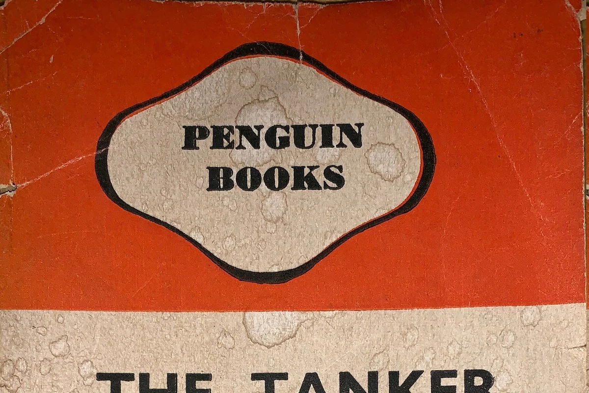
Classic book cover designs and brand identity
Basis for standard lettering after the 1948 rail nationalisation
 See Gill Sans live on these sites with FontSwap →
See Gill Sans in the Wild
Gill Sans is a humanist sans-serif designed by Eric Gill and released by the Monotype Corporation beginning in 1928. Built on the humanist skeleton of Edward Johnston's London Underground alphabet — Gill had assisted Johnston on that project — it married classical Roman proportions to the clean logic of a sans-serif, and in doing so became one of the defining British typefaces of the twentieth century.
Why Gill Sans Matters
For most of the twentieth century, Gill Sans was the sound of Britain talking to itself. It set the London and North Eastern Railway's timetables and posters, the covers of Penguin's paperbacks, and — for decades — the on-air identity of the BBC. To grow up British was to read Gill Sans constantly without ever noticing it, which is the highest compliment a workhorse typeface can earn.
What made it matter typographically was its balance. Where the German and Swiss sans-serifs of the era pursued geometric or mechanical neutrality, Gill Sans kept the hand in the letters. Its uppercase draws on the classical Roman inscriptional proportions Gill knew from stone-carving; its lowercase carries calligraphic warmth. The result reads as clean and modern without ever feeling cold — a distinctly humanist answer to the question of what a sans-serif could be.
Who is it for? Brands and projects that want to feel established, literate, and warmly British — heritage institutions, publishers, cultural organizations — rather than sharply contemporary or coolly technical. It is a poor fit for anyone chasing a neutral, invisible sans (Helvetica does that better) or a hard-edged modern look, but for approachable authority with a sense of history, few faces do it as naturally.
Design Characteristics
Gill Sans is humanist to its core — every apparently simple form carries a trace of the pen or the chisel. Gill came to type from stone-carving and calligraphy rather than engineering, and it shows: the letters look drawn by a hand that knew Roman inscriptions intimately, not calculated on a grid. That inheritance is the whole reason the face reads as warm where its geometric contemporaries read as cold. The specifics:
- Classical uppercase proportions: The capitals follow the width relationships of Roman inscriptional lettering, giving them a balanced, monumental quality rather than the uniform widths of a geometric sans.
- Calligraphic lowercase: The hand shows most in the two-story
aand the distinctiveg, whose forms come from writing rather than geometry. - Humanist stroke modulation: A subtle thick-thin variation, absent in purely geometric sans-serifs, softens the letters and aids reading.
- Generous, open apertures: Counters and openings are wide and legible, a legacy of the Johnston signage lineage.
- Distinctive details: The pointed apex of the capital
M, the tail of theR, and the curvedtare recognizable Gill signatures that make the face hard to mistake for any other. - A wide but uneven family: Gill Sans grew into many weights and widths over the decades, but it was never designed as a single coordinated system, so the weights vary in character — a Light that is elegant, a Bold that is noticeably heavier in personality.
The Eric Gill Question
Any honest account of Gill Sans has to acknowledge its designer. Eric Gill was a gifted sculptor and letterer, and he was also — by the evidence of his own diaries, made public after his death — a serial abuser of his own children. That knowledge sits uncomfortably beside a typeface still used daily around the world. It does not change the letterforms, but many designers now choose to weigh it, and some deliberately reach for an alternative of comparable quality. It is a reasonable thing to consider, and different people land in different places on it; the free and premium substitutes below all stand on their own merits regardless of where you come down.
History and Design
Gill began developing the typeface in the mid-1920s, drawing on his experience as a stone carver and lettering artist and on the Johnston alphabet he had helped create. Monotype's Stanley Morison recognized the commercial potential and shepherded it into a full metal family. When the London and North Eastern Railway adopted it in 1929 for its entire printed identity, Gill Sans gained an instant, nationwide showcase.
Penguin Books followed, and Gill Sans became synonymous with British publishing for a generation. When British Railways was formed by nationalisation in 1948 it took Gill Sans as the basis for its standard lettering, and the BBC adopted it as its corporate typeface in 1997. Gill Sans's cultural center of gravity has always been British heritage, publishing, and public life, and it remains one of the most recognizably British typefaces in the world.
The transition from metal to digital was not entirely kind to Gill Sans. The early digital versions flattened some of the subtlety of the original punch-cut sizes, and because the family had grown piecemeal over decades, the weights never sat together as neatly as a modern type system would demand. Monotype eventually addressed this with Gill Sans Nova, a comprehensively expanded and harmonized release that added weights, condensed and shadowed variants, and consistent character across the family — an attempt to give a nearly hundred-year-old design the coherence and range contemporary work expects. For most licensees today, Gill Sans Nova is the version in the type menu.
Where Gill Sans Excels
Gill Sans thrives wherever a project wants to feel both approachable and authoritative — the register of an institution that has been around long enough to be trusted but still wants to seem human. Its century of use in exactly those contexts means the associations are already there in a reader's mind, doing half the work before a single word is read. It is at its best where warmth and authority need to coexist:
- Heritage and institutional branding: The natural choice for organizations that want to feel established and trustworthy rather than trendy.
- Book and editorial publishing: Its literary associations and comfortable reading texture suit covers, headings, and text alike.
- Signage and wayfinding: The Johnston lineage shows — it is legible and calm at distance.
- Corporate identity with character: Professional without being anonymous, for brands that want a recognizable but dignified voice.
Where Gill Sans Struggles
The same accent that gives Gill Sans its charm also limits its range, and its age shows in a few practical ways. It is a specialist in a particular kind of warmth, and outside that lane there are usually better tools:
- Neutral, invisible typography: When you want the type to disappear entirely, a true neo-grotesque like Helvetica or a modern workhorse does the job better; Gill Sans always has an accent.
- Screen and small-size UI: It was drawn for metal and print, and some digital cuts feel less optimized for interface text than screen-first families like Source Sans or Open Sans.
- Uneven weights: Because the family accreted over decades rather than being designed as one system, the weights do not always feel like siblings; hierarchy can be less predictable than in a modern variable family.
- Contemporary or technical looks: Its warmth and history work against briefs that want a cool, futuristic, or engineered feel.
- The designer's legacy: As above — a consideration that, for some clients and projects, is reason enough to choose another face.
How to Choose a Free Substitute
No free font reproduces Gill Sans's specific letterforms, so match on the quality you actually need from it. If that quality is humanist warmth in branding or editorial work, start with Lato, the closest all-round match, or Fira Sans, which is a touch warmer and quirkier. If you need Gill Sans's elegance at display sizes, Raleway shines in its lighter weights. And if the job is really body text or interface work — where Gill Sans's print-era quirks become a liability — reach for the neutral, screen-tuned humanists: Source Sans and Open Sans trade character for reliability and legibility at small sizes.
One free font deserves a special mention: Cabin was drawn from the same Edward Johnston Underground alphabet that inspired Gill Sans in the first place, so it shares a genuine ancestor rather than merely a resemblance. Whichever you pick, test the capitals and the a/g/t at your real sizes — those are the letters carrying most of Gill Sans's identity, and the closest match on the page is not always the closest match in your specific layout.
It also helps to be honest about what you are replacing. If Gill Sans was chosen for its British heritage cachet, no free font will supply that association, and you may be better served by leaning into a different, well-executed voice than by chasing a near-miss. But if it was chosen for its practical humanist warmth — legible, friendly, professional — then the alternatives here get you most of the way there for nothing, and readers will never know the difference.
Premium Font Neighbors
If Gill Sans's humanist warmth appeals but it is not quite right, its closest relative is Johnston (or the modern Johnston100) — the London Underground alphabet that Gill helped draw and then built upon, the truest neighbor of all. Frutiger is the other great humanist signage sans, engineered for legibility at Charles de Gaulle airport, while Optima offers a more elegant, calligraphic take on the humanist idea. For contemporary humanist workhorses, Syntax, Myriad, and Whitney all descend from the same tradition, and Avenir and Univers round out the field with classic geometric and grotesque alternatives for when you want to cool the temperature down.
FAQ
What is the best free alternative to Gill Sans?
Lato is the best all-round free alternative, sharing Gill Sans's humanist proportions and warm, professional character. For a slightly warmer and quirkier option try Fira Sans, and for body text or interface work Source Sans and Open Sans are more screen-optimized. Cabin is a notable pick because it derives from the same Edward Johnston alphabet that inspired Gill Sans.
Can I use Lato commercially?
Yes. Lato is licensed under the SIL Open Font License (OFL-1.1), permitting unlimited commercial use without fees — websites, apps, branding, print, and products. Attribution is only required if you redistribute the font files themselves. The other alternatives here (Source Sans, Open Sans, Fira Sans, Cabin, Raleway) are all OFL as well.
How similar is Lato to Gill Sans?
Lato reaches roughly 85% similarity, sharing humanist proportions and a warm, professional tone with a generous x-height. It reads as more contemporary and rounder in its details, while Gill Sans keeps more distinctive British character — the classical capitals and calligraphic a, g, and t that no free font truly reproduces.
Why do some designers avoid Gill Sans?
Beyond typographic fit, some designers avoid Gill Sans because of its designer, Eric Gill, whose documented abuse of his own children came to light after his death. The letterforms are unaffected, but it is a factor many now weigh, and it is one reason to know that strong alternatives — free and premium — exist.
Is Gill Sans good for websites and apps?
It can work, but it was designed for metal and print, and its digital cuts are generally less optimized for small-size screen text than families built for the web. For interface and body-text roles, screen-first humanist sans-serifs like Source Sans 3 or Open Sans usually render more cleanly while keeping a comparable warmth.
What fonts pair well with Gill Sans?
Gill Sans pairs naturally with a classic serif for contrast in editorial work — a Garamond or a transitional serif underneath Gill Sans headings is a very British combination. When using it for body text, a warm slab or a humanist serif makes a comfortable companion, while keeping the overall palette restrained so Gill Sans's character stays the focus.
Where can I download these free Gill Sans alternatives?
Lato, Raleway, Cabin, Source Sans 3, Open Sans, and Fira Sans are all on Google Fonts, each available for webfont embedding and desktop download under the SIL Open Font License. That makes it easy to trial several against your real layout before committing to one.
Is Gill Sans on Google Fonts?
No, Gill Sans is a premium font from Monotype and is not available on Google Fonts.
The closest Google Fonts alternative is Lato with 85% similarity. Get it free on Google Fonts ↗
Free Alternatives (6)
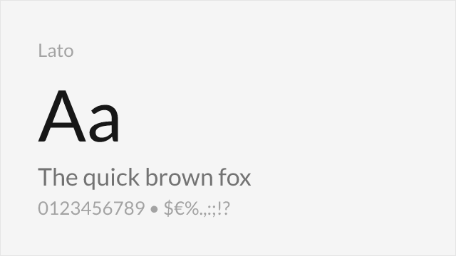
Humanist proportions with similar warmth and professional character
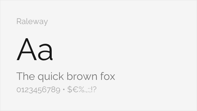
Elegant design with comparable letter shapes in lighter weights
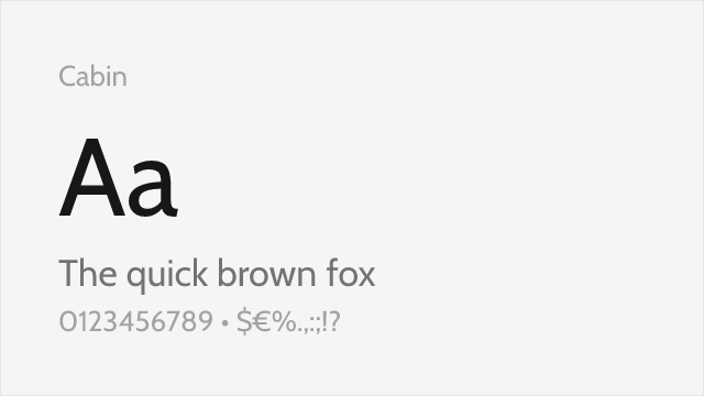
Humanist sans with similar x-height and friendly character

Adobe's clean humanist workhorse with a full variable weight range
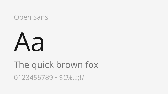
Ubiquitous humanist sans with excellent legibility and neutral warmth
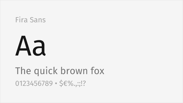
Spiekermann-studio humanist sans with warmth and a broad weight range
Compare the alternatives
See how Gill Sans compares to its top alternatives — and how those alternatives compare to each other — side by side.
See where Gill Sans is used in the wild and swap to free alternatives live.
Install FontSwap →Replacement Summary
Source: FontAlternatives.com
Premium font: Gill Sans
Best free alternative: Lato
FontAlternatives similarity score: 85%
Replacement difficulty: Low
Best for: corporate communications, branding, body text, print materials
Notable users: BBC, London and North Eastern Railway (LNER), Penguin Books
Not recommended when: Brand consistency with BBC requires exact letterforms
What is the best free alternative to Gill Sans?
Lato is the best free alternative to Gill Sans with a FontAlternatives similarity score of 85%.
Lato shares similar proportions, stroke characteristics, and intended use with Gill Sans. It is available under the OFL-1.1 license, which permits both personal and commercial use at no cost.
This alternative works particularly well for: corporate communications, branding, body text, print materials.
Can I safely replace Gill Sans with Lato?
Yes, Lato is a high-confidence replacement for Gill Sans. The FontAlternatives similarity score of 85% indicates strong structural compatibility.
Licensing: Lato is licensed under OFL-1.1, which allows commercial use without licensing fees or royalties.
Weight coverage: Most weights have close or exact matches available.
When should I NOT replace Gill Sans?
While Lato is a strong alternative, there are situations where replacing Gill Sans may not be appropriate:
- Strict compliance: Verify that OFL-1.1 terms meet your specific legal and compliance requirements.
Weight-Matching Guide
Map Gill Sans weights to their closest free alternatives for accurate font substitution.
Lato
| Gill Sans | Lato | Match |
|---|---|---|
| Light | Light (300) | close |
| Regular | Regular (400) | close |
| Bold | Bold (700) | close |
| Ultra Bold | Black (900) | close |
Raleway
| Gill Sans | Raleway | Match |
|---|---|---|
| Light | Light (300) | close |
| Regular | Regular (400) | close |
| Medium | Medium (500) | close |
| Bold | Bold (700) | close |
Cabin
| Gill Sans | Cabin | Match |
|---|---|---|
| Regular | Regular (400) | close |
| Medium | Medium (500) | close |
| Bold | Bold (700) | close |
Source Sans 3
| Gill Sans | Source Sans 3 | Match |
|---|---|---|
| Light | Light (300) | close |
| Regular | Regular (400) | exact |
| Medium | Medium (500) | exact |
| Bold | Bold (700) | exact |
Open Sans
| Gill Sans | Open Sans | Match |
|---|---|---|
| Light | Light (300) | close |
| Regular | Regular (400) | exact |
| Medium | Medium (500) | exact |
| Bold | Bold (700) | exact |
Fira Sans
| Gill Sans | Fira Sans | Match |
|---|---|---|
| Light | Light (300) | close |
| Regular | Regular (400) | exact |
| Medium | Medium (500) | exact |
| Bold | Bold (700) | exact |
Performance Guide
Production performance metrics for each alternative.
How to Use Lato
Copy these code snippets to quickly add Lato to your project.
CSS code for Lato
@import url('https://fonts.googleapis.com/css2?family=Lato:wght@100;300;400;700;900&display=swap');HTML code for Lato
<link rel="preconnect" href="https://fonts.googleapis.com">
<link rel="preconnect" href="https://fonts.gstatic.com" crossorigin>
<link href="https://fonts.googleapis.com/css2?family=Lato:wght@100;300;400;700;900&display=swap" rel="stylesheet">
Tailwind code for Lato
// tailwind.config.js
module.exports = {
  theme: {
    extend: {
      fontFamily: {
        'lato': ['Lato', 'sans-serif'],
      },
    },
  },
}

// Usage in HTML:
// <p class="font-lato">Your text here</p>
Next.js code for Lato
// Using next/font (Next.js 13+)
import { Lato } from 'next/font/google';

const lato = Lato({
  subsets: ['latin'],
  weight: ['100', '300', '400', '700', '900'],
});

export default function Component() {
  return (
    <p className={lato.className}>
      Your text here
    </p>
  );
}

// Or using inline styles with Google Fonts link:
// <p style={{ fontFamily: "'Lato'" }}>Your text</p>
Expo and React Native code for Lato
// Install: npx expo install @expo-google-fonts/lato expo-font
import { useFonts, Lato_400Regular } from '@expo-google-fonts/lato';

export default function App() {
  const [fontsLoaded] = useFonts({
    Lato_400Regular,
  });

  if (!fontsLoaded) return null;

  return (
    <Text style={{ fontFamily: 'Lato_400Regular' }}>
      Your text here
    </Text>
  );
}
Recommended Font Pairings
These free fonts pair well with Lato Gill Sans for headlines, body text, or accent use.
Libre Baskerville's transitional serifs complement Gill Sans's humanist warmth for a quintessentially British editorial pairing
Playfair's high-contrast display elegance creates striking headlines against Gill Sans's friendly body text
EB Garamond's old-style refinement pairs naturally with Gill Sans's classical humanist proportions for book and editorial design
Browse Alternatives by Context
Find Gill Sans alternatives filtered by specific use case, style, or language support.
By Use Case
By Style
By Script
Frequently Asked Questions
What is the best free alternative to Gill Sans?
Lato is the best free alternative to Gill Sans with a FontAlternatives similarity score of 85%. It shares similar proportions and characteristics while being available under the OFL-1.1 license for both personal and commercial use at no cost.
Is there a free version of Gill Sans?
There is no official free version of Gill Sans. However, Lato is available under the OFL-1.1 open-source license and achieves a FontAlternatives similarity score of 85%. It includes 5 weights and supports latin, latin-extended.
What Google Font looks like Gill Sans?
The Google Fonts most similar to Gill Sans are Lato, Raleway, Cabin. Among these alternatives, Lato offers the closest match with a FontAlternatives similarity score of 85% and includes 5 weights for design flexibility.
Can I use Lato commercially?
Yes, Lato can be used commercially. It is licensed under OFL-1.1, which allows free use in websites, applications, print materials, and commercial projects without purchasing a license or paying royalties.
Is Lato similar enough to Gill Sans?
Lato achieves a FontAlternatives similarity score of 85% compared to Gill Sans. While not identical, it offers comparable letterforms, proportions, and visual style. Most designers find it works excellently as a substitute in web and print projects.
What are the main differences between Gill Sans and its free alternatives?
Free alternatives to Gill Sans may differ in subtle details like letter spacing, curve refinements, and available weights. Premium fonts typically include more OpenType features, extended language support, and optimized screen rendering. However, for most projects, these differences are negligible.
Where can I download free alternatives to Gill Sans?
Download Lato directly from Google Fonts. Click the "Get Font" button on any alternative listed above to visit the official download page. Google Fonts also provides convenient embed codes for seamless web integration.