 Install FontSwap
Free Alternatives to Gill Sans with Humanist Style
Gill Sans is known for its humanist aesthetic. If you're looking for a free sans serif font with a similar humanist feel, these 6 alternatives offer comparable characteristics. We've identified 6 that are especially well-suited for this context. All are available under open-source licenses for unrestricted commercial use.
Top Picks
Comparison Table
| Font | Relevance ⓘ
How well this alternative fits the specific context (use-case or trait) of this page. Score 0–100 based on matching keywords, industries, and font characteristics. Alternatives scoring 25+ are highlighted.
| Similarity ⓘ
How visually similar this free font is to the premium original. Score 0–100 based on x-height, width, stroke contrast, use-case overlap, and language coverage.
Learn more → | Weights | Variable | License | Source |
|---|---|---|---|---|---|---|
| Fira Sans | 64 | 68% | 9 | No | OFL-1.1 | Google Fonts ↗ |
| Lato | 37 | 85% | 5 | No | OFL-1.1 | Google Fonts ↗ |
| Raleway | 36 | 78% | Variable | Yes | OFL-1.1 | Google Fonts ↗ |
| Cabin | 35 | 75% | Variable | Yes | OFL-1.1 | Google Fonts ↗ |
| Source Sans 3 | 34 | 72% | Variable | Yes | OFL-1.1 | Google Fonts ↗ |
| Open Sans | 34 | 70% | Variable | Yes | Apache-2.0 | Google Fonts ↗ |
All Alternatives (6)
[Google Fonts] · OFL-1.1 · 9 weights
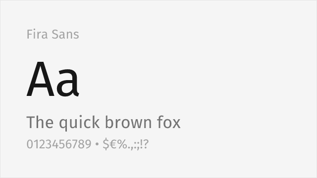
Spiekermann-studio humanist sans with warmth and a broad weight range
Why it matches: Fira Sans, drawn by Erik Spiekermann's studio for Mozilla, is a humanist sans with genuine warmth and a slightly quirky personality that gets closer to Gill Sans's spirit than most neutral alternatives. Its true italics and very broad weight range make it flexible across editorial and interface work, and its friendly, readable character suits the same approachable-but-professional brief Gill Sans is often chosen for.
editorial and brandinginterfacesmultilingual textlong-form reading
[Google Fonts] · OFL-1.1 · 5 weights
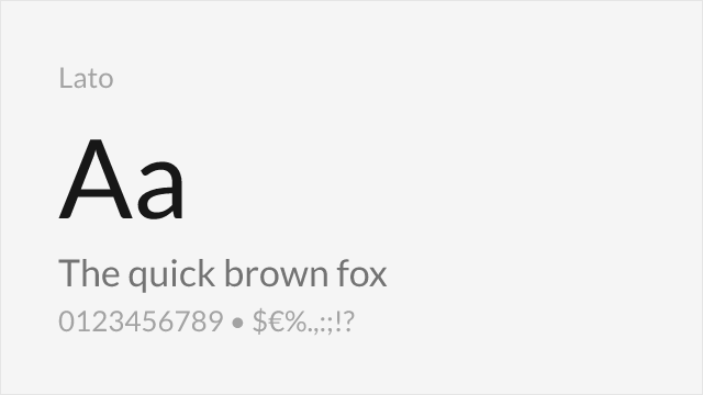
Humanist proportions with similar warmth and professional character
Why it matches: Lato shares Gill Sans's humanist proportions with similar warmth and professional character. Both feature generous x-heights and subtle stroke modulation that creates a friendly, approachable feel. While Lato has more contemporary, rounded details, it captures the same balance of elegance and accessibility that defines Gill Sans.
corporate communicationsbrandingbody textprint materials
[Google Fonts] · OFL-1.1 · Variable
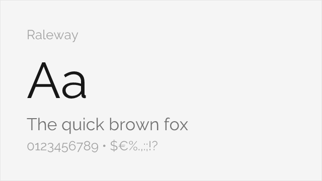
Elegant design with comparable letter shapes in lighter weights
Why it matches: Raleway captures Gill Sans's elegance particularly in lighter weights, sharing the refined character suitable for sophisticated branding. Both feature distinctive letterforms that project style and modernity. Raleway's thin weights work beautifully for display applications where Gill Sans's elegant character is desired.
fashion brandingdisplay headlineseditorial designportfolio sites
[Google Fonts] · OFL-1.1 · Variable
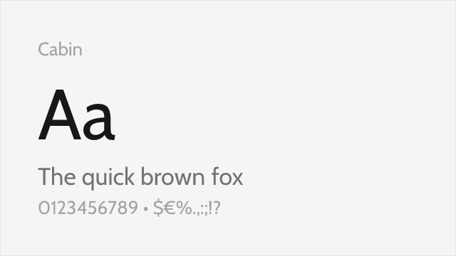
Humanist sans with similar x-height and friendly character
Why it matches: Cabin was directly inspired by the same Edward Johnston typeface that influenced Gill Sans. Both share humanist warmth, similar x-height, and British sans-serif DNA. Cabin's slightly geometric foundations with humanist touches mirror Gill Sans's unique blend of clarity and character.
brand identityapps and websiteseditorial designprint materials

[Google Fonts] · OFL-1.1 · Variable
Adobe's clean humanist workhorse with a full variable weight range
Why it matches: Source Sans is Adobe's first open-source family, a humanist sans drawn by Robert Slimbach for clarity in interfaces and long text. It shares Gill Sans's humanist skeleton and generous, readable proportions while trading Gill's calligraphic quirks for a calmer, more neutral finish. That makes it less distinctive but more versatile — a dependable free stand-in when you want Gill Sans's warmth without its personality.
user interfaceslong-form body textcorporate documentsmultilingual projects
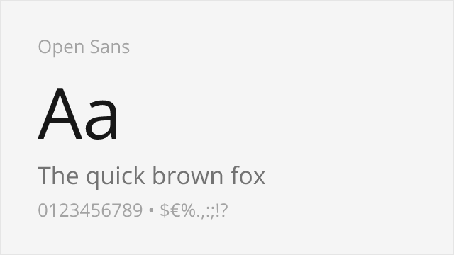
[Google Fonts] · Apache-2.0 · Variable
Ubiquitous humanist sans with excellent legibility and neutral warmth
Why it matches: Open Sans is one of the web's most-used humanist sans-serifs, and it earns that ubiquity with open forms, a tall x-height, and easy legibility at small sizes. It shares Gill Sans's humanist warmth in a more neutral, screen-first key — you lose the distinctive letterforms but gain proven reliability across every browser and device.
websites and appsbody textdashboardsaccessibility-sensitive UI