 Install FontSwap
Free Alternatives to Optima with Elegant Style
Optima is known for its elegant aesthetic. If you're looking for a free sans serif font with a similar elegant feel, these 6 alternatives offer comparable characteristics. We've identified 3 that are especially well-suited for this context. All are available under open-source licenses for unrestricted commercial use.
Top Picks
Comparison Table
| Font | Relevance ⓘ
How well this alternative fits the specific context (use-case or trait) of this page. Score 0–100 based on matching keywords, industries, and font characteristics. Alternatives scoring 25+ are highlighted.
| Similarity ⓘ
How visually similar this free font is to the premium original. Score 0–100 based on x-height, width, stroke contrast, use-case overlap, and language coverage.
Learn more → | Weights | Variable | License | Source |
|---|---|---|---|---|---|---|
| EB Garamond | 74 | 72% | Variable | Yes | OFL-1.1 | Google Fonts ↗ |
| Cormorant Garamond | 73 | 66% | Variable | Yes | OFL-1.1 | Google Fonts ↗ |
| URW Gothic | 55 | 74% | 4 | No | AGPL-3.0 | github ↗ |
| Lato | 14 | 70% | 5 | No | OFL-1.1 | Google Fonts ↗ |
| Source Sans 3 | 13 | 64% | Variable | Yes | OFL-1.1 | Google Fonts ↗ |
| Questrial | 12 | 60% | 1 | No | OFL-1.1 | Google Fonts ↗ |
Most Relevant (3)
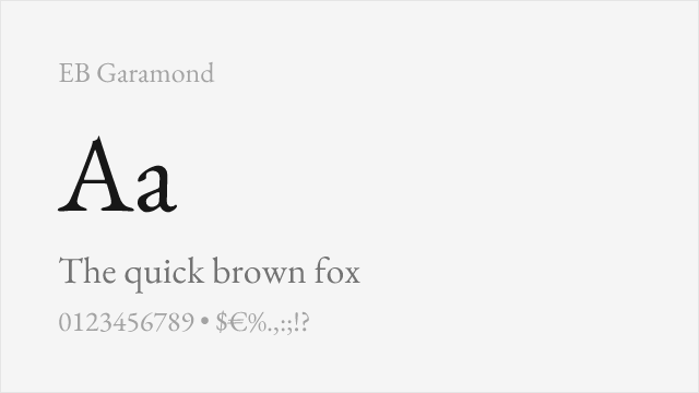
[Google Fonts] · OFL-1.1 · Variable
Shares classical elegance though as a serif, captures Optima's refined spirit
Why it matches: EB Garamond, though a serif, shares Optima's classical inspiration and refined elegance. Both draw from Renaissance sources and project sophisticated, timeless character. When Optima's specific "serifless roman" form isn't essential, EB Garamond provides comparable dignity for ceremonial, editorial, and luxury contexts.
book designceremonial documentsclassical aestheticseditorial features
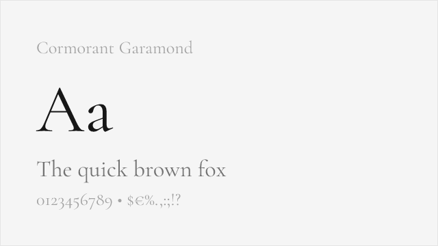
[Google Fonts] · OFL-1.1 · Variable
Elegant high-contrast display serif drawn from the same classical roots
Why it matches: Cormorant is a refined, high-contrast display serif rooted in the same Renaissance letterforms that inspired Optima. It is a serif rather than a serifless roman, but its delicate, sculptural elegance and classical proportions capture much of Optima's aspirational, ceremonial spirit at display sizes — a strong free choice when the specific sans form is not essential.
luxury and fashion brandingceremonial and weddingeditorial displayelegant headlines
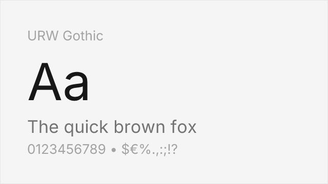
[github] · AGPL-3.0 · 4 weights
Clean, elegant geometric sans with refined, spacious proportions
Why it matches: URW Gothic (an open Avant Garde relative) does not share Optima's flared, calligraphic strokes — it is a clean monoline geometric — but its elegant, spacious, refined proportions offer some of the same understated sophistication. For fashion, luxury, and editorial display where you want an airy, high-end sans rather than a workhorse, it is a capable free option, even if it misses the specific "serifless roman" character.
fashion brandingeditorial displayluxury packaginginvitations
Other Alternatives (3)
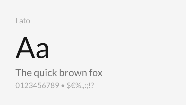
[Google Fonts] · OFL-1.1 · 5 weights
Humanist warmth with similar professional elegance
Why it matches: Lato offers humanist warmth approaching Optima's elegance in a more contemporary form. Both feature refined proportions and professional character suitable for upscale branding. While Lato lacks Optima's distinctive stroke modulation, it achieves similar sophisticated understatement for corporate and luxury applications.
corporate brandingbody textprofessional communicationsprint materials

[Google Fonts] · OFL-1.1 · Variable
Clean humanist sans for Optima's professional, understated roles
Why it matches: Source Sans is a clean, legible humanist sans that fills Optima's calm, professional, understated role even though it lacks the flare. For corporate, institutional, and text settings where you want Optima's restraint and warmth rather than its specific calligraphic character, it is a dependable, systematic free choice with a wide weight range.
corporate and institutionallong-form textuser interfacesdocumentation
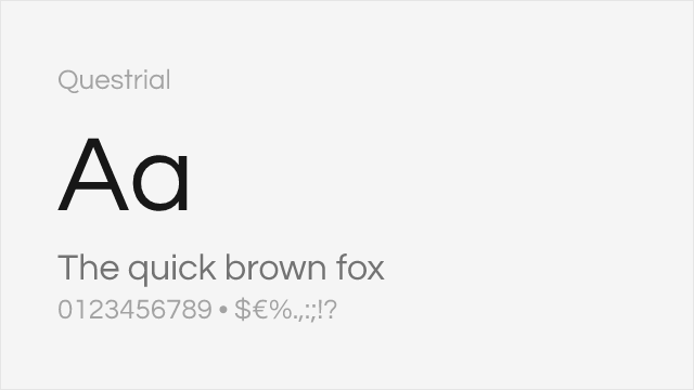
[Google Fonts] · OFL-1.1 · 1 weights
Minimal, elegant single-weight geometric sans for refined display
Why it matches: Questrial is a clean, elegant single-weight geometric sans with an airy, refined feel that echoes Optima's understated sophistication at display sizes. It is monoline and lacks the flare, and its single weight limits it to display use, but for a minimal, high-end headline it captures some of Optima's quiet elegance.
minimal display and logosluxury headlinesinvitationseditorial titling