Free Alternatives to Museo Sans for Branding

6 alternatives | 4 highly relevant | sans serif | Best match: Poppins (78%)

Looking for a free sans serif font for branding projects? Museo Sans by Exljbris Font Foundry is a popular choice, but its licensing cost can be prohibitive. We've curated 6 free alternatives that work well in branding contexts. We've identified 4 that are especially well-suited for this context. Each alternative is scored by visual similarity and contextual relevance, and ships under an open-source license for both personal and commercial use.

Top Picks

Comparison Table

Font Relevance Similarity Weights Variable License Source
Poppins 36 78% 9 No OFL-1.1 Google Fonts ↗
Cabin 35 70% Variable Yes OFL-1.1 Google Fonts ↗
Rubik 35 68% Variable Yes OFL-1.1 Google Fonts ↗
Quicksand 27 74% Variable Yes OFL-1.1 Google Fonts ↗
Nunito Sans 9 88% Variable Yes OFL-1.1 Google Fonts ↗
Lato 8 82% 5 No OFL-1.1 Google Fonts ↗

Most Relevant (4)

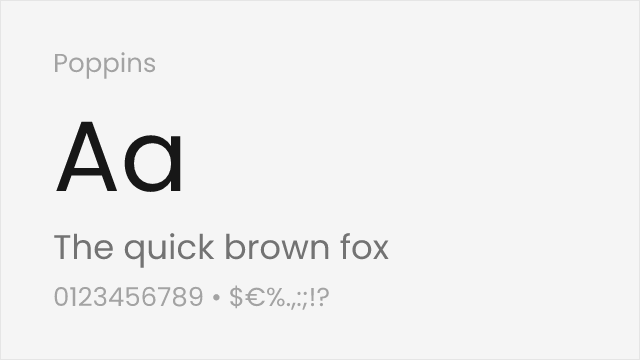
#1 Poppins 78% Relevant
[Google Fonts] · OFL-1.1 · 9 weights

Comparable geometric foundations with slightly rounder forms
Why it matches: Poppins shares Museo Sans's geometric construction with similar clean aesthetics suitable for modern branding. Both work well across interfaces and marketing. Poppins has rounder forms than Museo Sans but maintains the same professional versatility.
tech brandingweb applicationscontemporary designuser interfaces
Get Font ↗
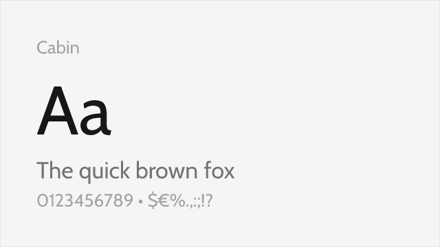
#2 Cabin 70% Relevant
[Google Fonts] · OFL-1.1 · Variable

Humanist sans with a warm, screen-friendly temperament
Why it matches: Cabin trades some of Museo Sans's geometry for humanist detailing, but the two meet on the same friendly, professional middle ground. Subtle angles in the stems and softly rounded terminals give Cabin the approachable tone Museo Sans is known for, while its tall x-height keeps text legible on screen. As a variable font with true italics, it covers uses Museo Sans's fixed weights cannot.
approachable brandingwebsite body textapp interfaceseditorial headings
Get Font ↗
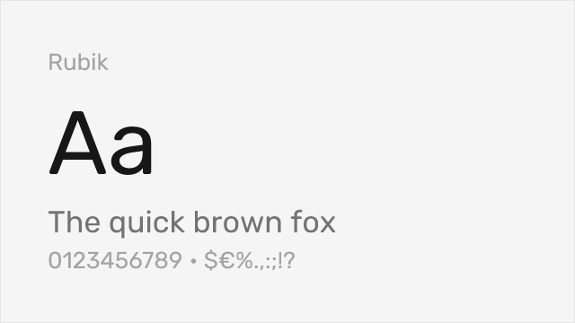
#3 Rubik 68% Relevant
[Google Fonts] · OFL-1.1 · Variable

Geometric sans with softly rounded corners and a wide weight range
Why it matches: Rubik keeps a geometric skeleton close to Museo Sans's but rounds its corners just slightly, producing a comparable blend of structure and friendliness. Its wide weight range, from Light to Black, mirrors Museo Sans's spread of display-ready extremes, and the variable font makes those weights continuous. Broad multi-script coverage is a bonus Museo Sans's Latin-first family does not match.
tech brandingmultilingual interfacesdashboards and datadisplay headlines
Get Font ↗
#4 Quicksand 74% Relevant
[Google Fonts] · OFL-1.1 · Variable

Rounded geometric sans with the friendly warmth Museo Sans is loved for

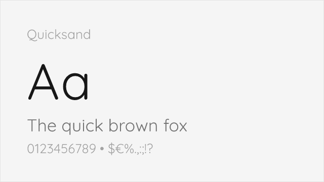
Why it matches: Quicksand echoes the soft, geometric-humanist warmth that made Museo Sans a corporate favorite. Its circular bowls, low stroke contrast, and gently rounded terminals land close to Museo Sans's approachable character, especially at display and heading sizes. It ships as a variable font, so you can tune weight across the Light-to-Bold range instead of jumping between fixed steps.
brand headlinesfriendly UIlifestyle and wellnesslogos and wordmarks
Get Font ↗

Other Alternatives (2)

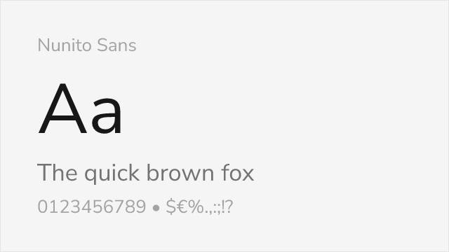
#5 Nunito Sans 88%
[Google Fonts] · OFL-1.1 · Variable

Similar proportions with comparable balance between geometric and humanist qualities
Why it matches: Nunito Sans shares Museo Sans's balance between geometric structure and humanist warmth. Both feature tall x-heights, open apertures, and versatile character suitable for interfaces and body text. Nunito Sans provides variable font support and comprehensive weight range that rivals Museo Sans's commercial offering.
user interfacesSaaS applicationsdocumentationweb applications
Get Font ↗
#6 Lato 82%
[Google Fonts] · OFL-1.1 · 5 weights

Shares the blend of geometric structure with humanist warmth

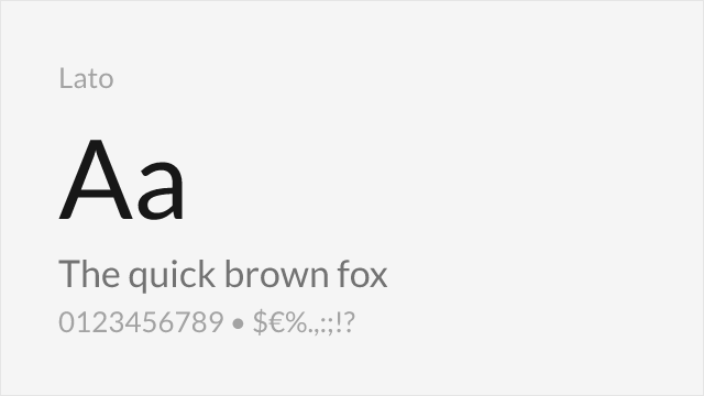
Why it matches: Lato captures Museo Sans's duality of appearing neutral in body text while revealing warm character at display sizes. Both feature humanist touches softening geometric foundations. Lato's versatility across professional and expressive contexts matches Museo Sans's adaptability.
corporate communicationswebsite body textbrand identityprint materials
Get Font ↗

Related Pages