 Install FontSwap
Free Alternatives to Helvetica Supporting Cyrillic
Need a free alternative to Helvetica with Cyrillic script support? These 5 options include Cyrillic characters and share visual similarities with Helvetica. Each is licensed for free personal and commercial use.
Top Picks
Comparison Table
| Font | Relevance ⓘ
How well this alternative fits the specific context (use-case or trait) of this page. Score 0–100 based on matching keywords, industries, and font characteristics. Alternatives scoring 25+ are highlighted.
| Similarity ⓘ
How visually similar this free font is to the premium original. Score 0–100 based on x-height, width, stroke contrast, use-case overlap, and language coverage.
Learn more → | Weights | Variable | License | Source |
|---|---|---|---|---|---|---|
| Nimbus Sans | 0 | 92% | 2 | No | GPL-2.0-with-font-exception | fontsquirrel ↗ |
| Inter | 0 | 88% | Variable | Yes | OFL-1.1 | Google Fonts ↗ |
| Liberation Sans | 0 | 84% | 2 | No | OFL-1.1 | github ↗ |
| Roboto | 0 | 80% | Variable | Yes | Apache-2.0 | Google Fonts ↗ |
| Source Sans 3 | 0 | 75% | Variable | Yes | OFL-1.1 | Google Fonts ↗ |
All Alternatives (5)
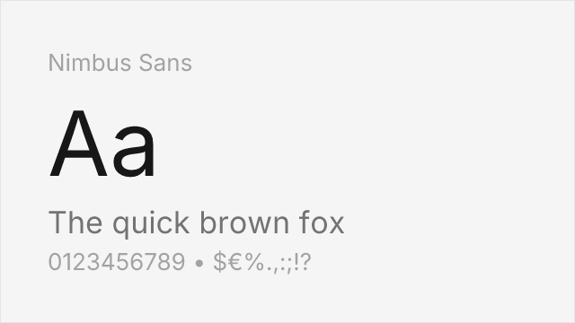
[fontsquirrel] · GPL-2.0-with-font-exception · 2 weights
Metric-compatible Helvetica clone from URW — identical character widths
Why it matches: Nimbus Sans is the closest free match to Helvetica because it is a metric-compatible clone. Character widths, kerning pairs, and line spacing are identical, so documents reflow without layout changes. The neo-grotesque forms replicate Helvetica's horizontal terminals and uniform stroke widths.
print productionPDF generationlegacy system migration
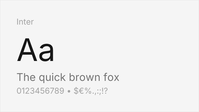
[Google Fonts] · OFL-1.1 · Variable
Modern interpretation with excellent screen optimization
Why it matches: Inter shares Helvetica's neutral, neo-grotesque character with similar x-height and letter spacing. Its open apertures and optimized curves make it highly legible on screens while maintaining Helvetica's professional aesthetic.
UI designweb applicationscorporate websites
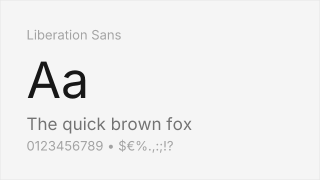
[github] · OFL-1.1 · 2 weights
Arial-metric clone; Arial itself matches Helvetica's widths, so it fits closely.
Why it matches: Liberation Sans reaches Helvetica the long way round. It was drawn to match Arial's metrics, and Arial was drawn to match Helvetica's, so the widths line up across all three. The letterforms are the least Helvetica-like part — they follow Arial's detailing, with slanted terminals and a straight `R` leg rather than Helvetica's horizontal cuts and curved leg. Choose it when metric fidelity in a document matters more than matching Helvetica's texture, and when your readers are likely to have it installed already.
documentscorporateprintsignage
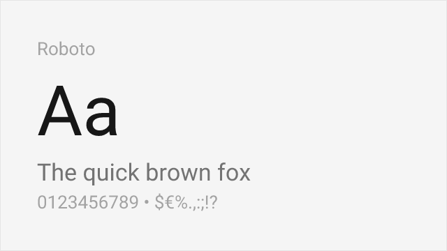
[Google Fonts] · Apache-2.0 · Variable
Similar neutral character, designed for Android
Why it matches: Roboto combines geometric forms with friendly curves, offering Helvetica-like neutrality with slightly more warmth. The similar cap height and x-height proportions make it an excellent substitute.
mobile appsMaterial DesignAndroid development

[Google Fonts] · OFL-1.1 · Variable
Adobe's humanist sans with comparable neutrality and readability
Why it matches: Source Sans Pro offers a slightly humanist take on Helvetica's neo-grotesque style. The open counters and readable lowercase make it particularly effective for extended reading.
long-form contentdocumentationeditorial