 Install FontSwap
Free Alternatives to Frutiger with Readable Style
Frutiger is known for its readable aesthetic. If you're looking for a free sans serif font with a similar readable feel, these 6 alternatives offer comparable characteristics. We've identified 6 that are especially well-suited for this context. All are available under open-source licenses for unrestricted commercial use.
Top Picks
Comparison Table
| Font | Relevance ⓘ
How well this alternative fits the specific context (use-case or trait) of this page. Score 0–100 based on matching keywords, industries, and font characteristics. Alternatives scoring 25+ are highlighted.
| Similarity ⓘ
How visually similar this free font is to the premium original. Score 0–100 based on x-height, width, stroke contrast, use-case overlap, and language coverage.
Learn more → | Weights | Variable | License | Source |
|---|---|---|---|---|---|---|
| Open Sans | 71 | 80% | Variable | Yes | Apache-2.0 | Google Fonts ↗ |
| Source Sans 3 | 71 | 78% | Variable | Yes | OFL-1.1 | Google Fonts ↗ |
| Hind | 51 | 82% | 5 | No | OFL-1.1 | Google Fonts ↗ |
| Fira Sans | 45 | 74% | 9 | No | OFL-1.1 | Google Fonts ↗ |
| Cabin | 43 | 66% | Variable | Yes | OFL-1.1 | Google Fonts ↗ |
| Lato | 34 | 70% | 5 | No | OFL-1.1 | Google Fonts ↗ |
All Alternatives (6)
[Google Fonts] · Apache-2.0 · Variable
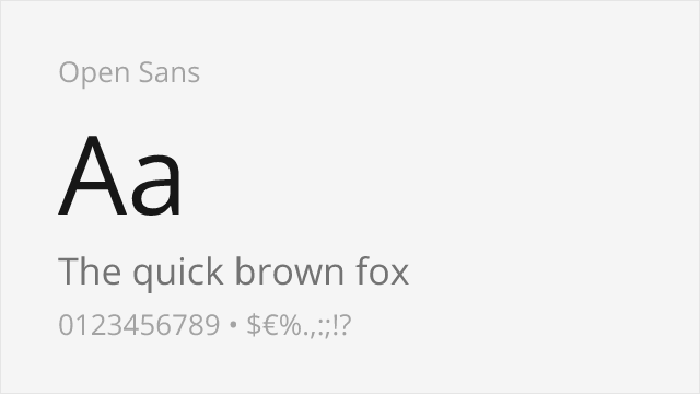
Comparable humanist proportions designed for digital clarity
Why it matches: Open Sans captures Frutiger's humanist proportions with similar emphasis on digital legibility. Both feature generous x-heights, open apertures, and neutral-yet-friendly character suitable for corporate and government applications. Open Sans's widespread adoption and extensive testing make it reliable for the professional contexts where Frutiger excels.
web applicationscorporate communicationsmultilingual projectsprint materials

[Google Fonts] · OFL-1.1 · Variable
Shares emphasis on legibility with similar stroke contrast
Why it matches: Source Sans Pro shares Frutiger's emphasis on legibility with similar humanist warmth and professional utility. Both feature open apertures and clear letterforms suitable for government and healthcare contexts. Source Sans Pro's coordination with Source Serif and Source Code provides system-building flexibility that Frutiger lacks.
government websitestechnical documentationuser interfacescorporate identity
[Google Fonts] · OFL-1.1 · 5 weights
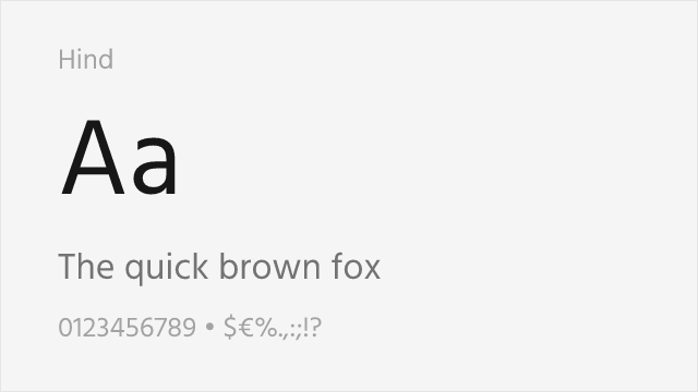
Similar open apertures and excellent legibility at small sizes
Why it matches: Hind shares Frutiger's defining quality—exceptional legibility at small sizes—achieved through similar open apertures and generous spacing. Both prioritize clarity over personality, with letterforms designed to remain distinct even when partially obscured or viewed at angles. Hind's humanist warmth echoes Frutiger's organic curves, making it suitable for the same signage and healthcare applications.
mobile applicationsbody texthealthcare applicationsmultilingual projects
[Google Fonts] · OFL-1.1 · 9 weights
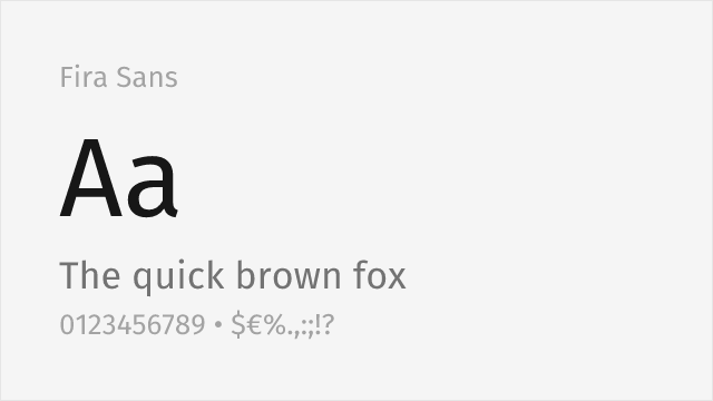
Humanist sans from Spiekermann's studio with warmth and broad weights
Why it matches: Fira Sans, drawn by Erik Spiekermann's studio for Mozilla, is a humanist sans with genuine warmth and open, legible forms that sit close to Frutiger's temperament. It shares the friendly-but-professional character and clear apertures that make Frutiger so readable, with a very broad weight range and true italics for building complete systems.
corporate and editorialinterfacesmultilingual textlong-form reading

[Google Fonts] · OFL-1.1 · Variable
Humanist sans drawn from the same signage tradition as Frutiger
Why it matches: Cabin is a humanist sans influenced by the classic signage grotesques, so it shares some of Frutiger's clean, legible, wayfinding-oriented DNA. It is smaller in range and less refined than Frutiger, but for approachable branding and interface text it captures the humanist warmth and clarity at no cost.
branding and identityapps and websitessignage mockupseditorial
[Google Fonts] · OFL-1.1 · 5 weights
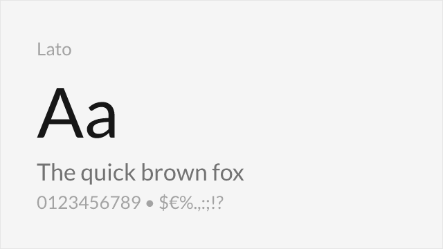
Warm humanist workhorse widely used for corporate and body text
Why it matches: Lato pairs humanist warmth with a professional, corporate-friendly neutrality that echoes Frutiger's balance of clarity and approachability. It is a shade more rounded and less signage-tuned than Frutiger, but for the corporate, government, and body-text roles Frutiger fills it is a reliable, widely deployed free stand-in.
corporate communicationsbrandingbody textprint materials