Free Alternatives to Circular Supporting Latin Extended
Need a free alternative to Circular with Latin Extended script support? These 7 options include Latin Extended characters and share visual similarities with Circular. Each is licensed for free personal and commercial use.
Top Picks
Comparison Table
| Font | Relevance ⓘ
How well this alternative fits the specific context (use-case or trait) of this page. Score 0–100 based on matching keywords, industries, and font characteristics. Alternatives scoring 25+ are highlighted.
| Similarity ⓘ
How visually similar this free font is to the premium original. Score 0–100 based on x-height, width, stroke contrast, use-case overlap, and language coverage.
Learn more → | Weights | Variable | License | Source |
|---|---|---|---|---|---|---|
| Inter | 0 | 85% | Variable | Yes | OFL-1.1 | Google Fonts ↗ |
| Nunito | 0 | 82% | Variable | Yes | OFL-1.1 | Google Fonts ↗ |
| Poppins | 0 | 78% | 9 | No | OFL-1.1 | Google Fonts ↗ |
| DM Sans | 0 | 75% | Variable | Yes | OFL-1.1 | Google Fonts ↗ |
| Jost | 0 | 72% | Variable | Yes | OFL-1.1 | Google Fonts ↗ |
| Montserrat | 0 | 70% | Variable | Yes | OFL-1.1 | Google Fonts ↗ |
| Montserrat Alternates | 0 | 68% | 9 | No | OFL-1.1 | Google Fonts ↗ |
All Alternatives (7)

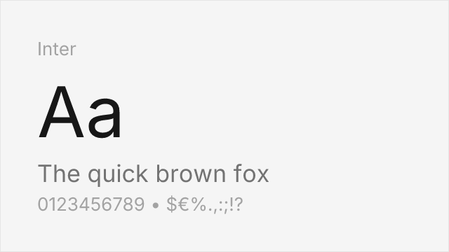
[Google Fonts] · OFL-1.1 · Variable
Similar modern aesthetic with excellent screen optimization and extensive features
Why it matches: Inter shares Circular's screen-first design philosophy with similar x-height and letter proportions optimized for digital interfaces. Both feature modern geometric sensibility, open apertures for legibility, and comprehensive weight ranges. Inter's slightly more neutral character makes it highly versatile while maintaining Circular's contemporary aesthetic.
tech productsSaaS platformsUI designweb applications


[Google Fonts] · OFL-1.1 · Variable
Comparable rounded geometric forms with friendly character
Why it matches: Nunito captures Circular's friendly geometric character through rounded terminals and warm proportions. Both typefaces share the approachable, modern aesthetic that made Circular popular with startups. Nunito's variable font support and comprehensive weight range offer similar flexibility for brand systems.
friendly brandingmobile appsconsumer productsstartup marketing


[Google Fonts] · OFL-1.1 · 9 weights
Shares geometric foundations with similar weight distribution
Why it matches: Poppins shares Circular's geometric foundations with similar letter proportions and comprehensive weight range. While slightly more geometric and less rounded than Circular, Poppins maintains the same modern, approachable aesthetic. Its excellent screen rendering and Devanagari support add practical value for global projects.
web applicationsdisplay headlinestech brandingmultilingual projects


[Google Fonts] · OFL-1.1 · Variable
Geometric-leaning sans with clean modern proportions and variable font support
Why it matches: DM Sans blends geometric construction with subtle humanist warmth in a way that approximates Circular's balanced personality. Both typefaces avoid the extreme geometry of Futura while maintaining clean, modern proportions suited to digital products. DM Sans is slightly less rounded than Circular, with more open apertures that aid small-size legibility. Its optical sizing axis provides automatic refinement at different scales, a practical advantage Circular lacks.
startup product interfacesmobile app typographypresentation deckslightweight SaaS branding
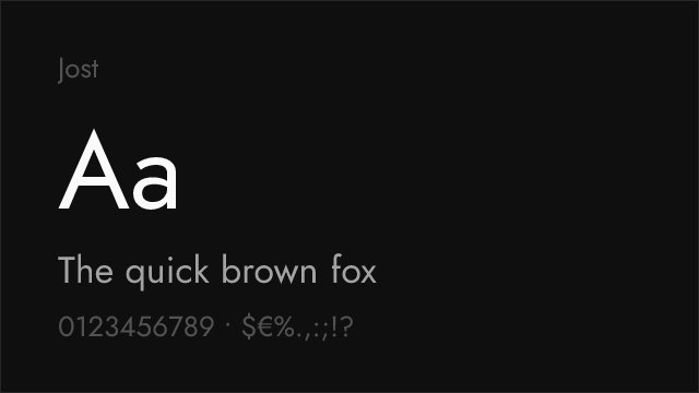

[Google Fonts] · OFL-1.1 · Variable
Futura-inspired geometric with elegant proportions and full weight range
Why it matches: Jost draws from the same geometric sans-serif tradition as Circular, both ultimately descending from Futura's circular construction. Jost's proportions are slightly more classical — taller ascenders, a more pronounced geometric purity — giving it an elegant character where Circular is warm. Both share the perfectly circular bowl construction (the 'o' is essentially a circle) and consistent stroke widths that define the geometric sans genre.
fashion and lifestyle brandingelegant display typographymodernist design systemscultural institution identities


[Google Fonts] · OFL-1.1 · Variable
Popular geometric sans with strong display capabilities and broad adoption
Why it matches: Montserrat shares Circular's geometric DNA and comprehensive weight range, both offering clean, modern sans-serif typography suitable for tech and consumer products. Montserrat's proportions are slightly more compact and its character shapes marginally more square than Circular's rounded forms. At heavy weights, both typefaces deliver strong display impact. Montserrat's extensive adoption and variable font support make it a pragmatic choice, though it lacks Circular's distinctive warmth.
general-purpose brandingweb application interfacesmarketing sites and landing pagesmultilingual design systems
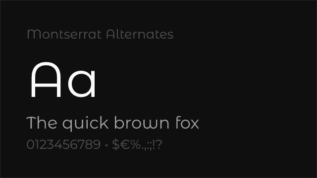
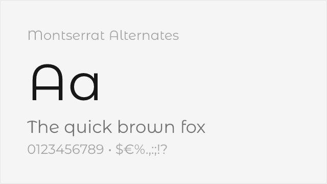
[Google Fonts] · OFL-1.1 · 9 weights
Montserrat's sister family with softer, curved alternate letterforms