Install FontSwap
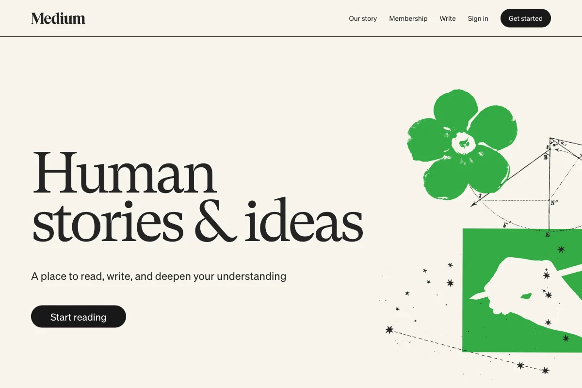
Medium Uses GT Super
"Human stories & ideas", set about as large as a headline can reasonably go, in a serif with hairlines thin enough to make a print designer nervous.
It is a confident choice for a company whose actual product is a text box.
The pairing
Medium loads two commercial families and uses them along a clean split:
GT Super — Grilli Type's high-contrast display serif — takes the wordmark and the hero headline. It is drawn in the tradition of 1970s American magazine serifs, the era of tightly-set editorial display type, and it has the thick-to-thin contrast to prove it. Look at the ampersand in the screenshot: that is a display glyph doing display work.
Söhne — Klim's grotesque — handles navigation, subheads, buttons and body copy.
The platform also declares Charter, Noe, Source Serif Pro and Source Code Pro for reading views, plus OpenDyslexic as a reader-facing accessibility option, which is a quietly good detail: the reading experience is configurable in a way the marketing page is not.
Why a display serif on a tech product
Every competitor in the publishing-tool category reaches for a neutral sans, because the product is software and software marketing has a house style.
Medium's proposition, though, isn't software. It is that writing here is reading-worthy — that the thing you publish will look like it belongs in a magazine rather than a CMS. A high-contrast editorial serif states that in the first half-second, before anyone reads a word of copy.
It also solves a real branding problem. The Medium wordmark is a word, not a symbol, and it has to work at favicon size and at billboard size. GT Super's contrast gives it a distinctive silhouette — the thin strokes create a recognisable rhythm that a grotesque wordmark simply doesn't have.
The cost is that GT Super cannot do anything else on the page. It is unusable below about 20px, where the hairlines break up. Hence Söhne underneath, and hence the discipline of never letting the serif near a UI label.
What to take from it
One display serif, set enormous, on a page that is otherwise entirely sans. The contrast does the work — not the ornamentation.
The mistake people make copying this is setting the display serif at 32px, which is neither big enough to show off the contrast nor small enough to be practical. GT Super on Medium's homepage runs well over 100px. If your display serif isn't dominating the frame, use a sans and save the load.
Free Alternatives
Playfair Display is our top match at 82% and the most direct free stand-in — transitional, high contrast, variable 400–900, with a drawn italic. It is a little heavier and less refined than GT Super, but at display sizes it makes the same argument.
Fraunces (79%) is the more flexible option. Its optical size axis runs 9–144, so the display cut is genuinely drawn for display rather than scaled, and its SOFT and WONK axes let you tune how much personality the headline carries. If you want the editorial register without committing to Playfair's specific voice, start here.
Cormorant Garamond (77%) goes further on contrast than either — the most elegant option, and the most fragile. Display only.
Libre Bodoni (75%) if you want the contrast pushed toward Didone territory rather than magazine-serif.
For the sans underneath, Inter is the closest free equivalent to Söhne.
.hero h1 {
  font-family: "Playfair Display", Georgia, serif;
  font-size: clamp(3rem, 9vw, 7rem);   /* it has to be big or it's pointless */
  font-weight: 500;
  line-height: 0.95;
  letter-spacing: -0.02em;
}

body, nav, .btn {
  font-family: "Inter", system-ui, sans-serif;
}
The tight line-height matters as much as the size. Display serifs set at 1.4 read as a paragraph that got lost; at 0.95 they read as a masthead.