Free Alternatives to GT Super

About GT Super
- Foundry
- Grilli Type
- Classification
- serif
- Style
- high-contrast
Brands Using GT Super
Primary display serif for headlines across editorial content and digital features
Supporting editorial display type in campaign materials and brand storytelling
Feature article headlines and editorial display typography
Fashion editorial headlines and cultural commentary display type
GT Super is a high-contrast editorial display serif designed by Noel Leu and released by Grilli Type. Inspired by the expressive display serifs of 1970s and 1980s magazine typography, GT Super combines retro warmth with contemporary refinement to create one of the most distinctive editorial display faces of recent years. The family includes Display, Text, and Italic variants, each tuned for different contexts but sharing the same nostalgic, fashion-forward DNA. Since its release, GT Super has become a defining typeface for contemporary editorial and fashion design.
GT Super requires a paid license from Grilli Type. Licensing follows a per-project model with separate desktop, web, and app tiers. There is no free trial or gratis tier. If your budget cannot support Grilli Type's licensing structure, this page covers the best open-source alternatives — though GT Super's distinctive retro-editorial character makes it harder to replicate than most serif display faces.
Why GT Super Matters
GT Super matters because it gave contemporary designers permission to be expressive with serif typography at a moment when restraint was the dominant aesthetic. While the design world was saturated with clean neo-grotesques and minimal sans-serifs, GT Super arrived with unapologetic personality — high contrast, round forms, and a warmth that recalled the glory days of editorial magazine design.
The typeface's significance is inseparable from the broader serif revival of the late 2010s. As brands and publications sought to differentiate themselves from the sans-serif homogeneity of the startup era, GT Super offered a specific, compelling answer: serifs do not have to be stuffy, classical, or purely functional. They can be warm, inviting, and fashion-forward. GT Super proved that a display serif could feel simultaneously nostalgic and contemporary — referencing the past without being trapped by it.
When Refinery29 adopted GT Super for its editorial headlines, the choice crystallized the typeface's positioning: this was the serif for publications that take visual culture seriously, that understand fashion as a form of editorial expression, that want their typography to convey taste and cultural awareness. AIGA's Eye on Design followed suit, using GT Super to signal that design criticism could be as visually engaging as the work it covered.
What makes GT Super's design approach distinctive is the way it softens high contrast. Unlike classical Didone display faces (Bodoni, Didot) where the contrast creates a cold, precise elegance, GT Super's contrast is warm — the thick strokes are generous and rounded, the thin strokes are gentle rather than razor-sharp, and the overall impression is inviting rather than intimidating. This warmth is what made GT Super so successful in fashion and lifestyle editorial, contexts where the typography needs to feel luxurious without creating distance.
The 1970s magazine heritage is more than aesthetic nostalgia. GT Super references an era when editorial typography was more expressive, when art directors used display type as a compositional element rather than merely a container for words. By channeling that energy through a contemporary construction, Noel Leu created a typeface that encourages designers to treat headlines as visual events rather than functional necessities.
Design Characteristics
GT Super's design reflects its position at the intersection of retro display tradition and contemporary type engineering:
- High stroke contrast with warm modulation: The dramatic difference between thick and thin strokes is GT Super's defining visual feature, but the transitions are rounded and organic rather than sharp and geometric — creating warmth where traditional Didone faces create precision
- Round, generous letterforms: The overall character width is open and generous, with rounded bowls and counters that contribute to the typeface's approachable, inviting personality
- Softened terminals and serif endings: Rather than sharp, pointed terminals, GT Super features gently rounded endings that reinforce the retro warmth and distinguish it from more clinical high-contrast serifs
- Strong vertical stress with organic inflection: The vertical emphasis follows Didone convention, but the stress transitions are smoother and more organic, reflecting brush influence rather than ruled precision
- Distinctive italic forms: GT Super's italics are particularly expressive, with swooping curves and calligraphic flourishes that make them a design feature in their own right rather than merely an emphasis tool
- Display-first engineering: The typeface is designed primarily for headline and display sizes where the high contrast and refined detailing create maximum visual impact — text-size performance is functional but not the primary design goal
- Retro-inflected proportions: Letter proportions reference 1970s-1980s phototypesetting aesthetics with wider, more relaxed spacing than the tight setting of digital-era display faces
The family ships in four weights (Light through Super) with matching italics, providing a focused range optimized for display hierarchy.
Where GT Super Excels
GT Super is at its best in fashion, editorial, and culturally aware design contexts:
- Fashion magazine headlines: GT Super's high contrast and warm personality make it a natural choice for fashion editorial, where the typography needs to convey luxury and cultural fluency simultaneously
- Editorial feature display: Feature article headlines, pull quotes, and section openers benefit from GT Super's ability to create visual drama without cold formality
- Lifestyle and beauty branding: The warm, inviting personality suits beauty, wellness, and lifestyle brands that want serif sophistication without the austerity of classical display faces
- Cultural institution materials: Museums, galleries, and performing arts organizations use GT Super to signal contemporary cultural engagement rather than historical preservation
- Creative agency self-promotion: Design studios and creative agencies deploy GT Super for their own identity and portfolio work, signaling aesthetic awareness and editorial sensibility
- Social media and digital editorial: The bold, high-contrast letterforms maintain visual impact at the reduced sizes and compressed aspect ratios of social media and mobile editorial
Where GT Super Struggles
GT Super's display-oriented DNA means it trades everyday versatility for editorial impact:
- Body text at small sizes: GT Super's high contrast causes thin strokes to disappear at small text sizes, making it unreliable for body copy below 18px — it is fundamentally a display typeface
- Conservative corporate contexts: Banks, law firms, and government agencies need serifs that convey stability and tradition, not GT Super's fashion-forward expressiveness
- News and utilitarian editorial: GT Super's personality is an asset for considered editorial design but a distraction in the rapid-turnaround, information-dense layouts of daily news production
- UI and product interfaces: Display serifs rarely work in interface design where functionality, consistency, and small-size legibility are primary requirements
- Projects requiring Cyrillic or Greek: GT Super supports Latin scripts only, limiting its use in multilingual publications
- Minimalist design systems: GT Super's inherent expressiveness conflicts with the restrained, systematic approach of minimalist brand identities — the typeface has too much personality for contexts that require typographic neutrality
- Extended reading contexts: Even at comfortable sizes, GT Super's display-optimized proportions and high contrast create reading fatigue over long texts
How to Choose a Free Substitute
When evaluating GT Super replacements, accept upfront that the specific retro warmth and softened high contrast cannot be fully replicated in any free font. Instead, prioritize these criteria:
- Display-scale impact: GT Super's primary job is creating visual events at headline sizes. Set your alternative at 48-72px and evaluate the visual drama — does it command attention and convey editorial sophistication?
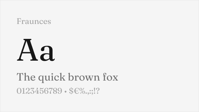
- Contrast character: GT Super's high contrast is warm and organic, not clinical. Test how your alternative handles thick-thin transitions — Playfair Display's contrast is more formal, Fraunces's is more playful. Neither matches GT Super exactly, but both deliver editorial drama
- Personality and warmth: GT Super's retro warmth is its distinguishing quality. Evaluate whether your alternative conveys warmth and approachability or reads as cold and austere — Fraunces comes closest to GT Super's inviting personality
- Fashion and editorial credibility: Will your alternative be taken seriously in fashion, lifestyle, and cultural editorial contexts? The typeface needs to signal taste and design awareness
- Pairing compatibility: GT Super pairs naturally with clean geometric and neo-grotesque sans-serifs that let it be the expressive focal point. Verify that your serif alternative creates the same kind of dynamic tension with your chosen sans-serif
Premium Font Neighbors
If GT Super's approach resonates but you want to explore adjacent options:
Cluster A: Retro-inflected editorial display serifs
- Noe Display (Schick Toikka) — shares GT Super's high-contrast editorial warmth with a slightly more classical personality; the closest premium alternative in spirit
- Reckless (Displaay) — retro display serif with more overtly 1970s character and expressive quirks; suits projects that want even more personality than GT Super
- Recife (Nikola Djurek) — high-contrast display serif with warm, rounded forms; occupies similar fashion-editorial territory
Cluster B: Contemporary editorial display serifs
- GT Sectra (Grilli Type) — GT Super's sharper, more architectural sibling; replaces retro warmth with contemporary precision
- Domaine (Klim Type Foundry) — editorial display serif with more historical grounding; less retro, more classical refinement
- Canela (Commercial Type) — bridges serif and sans-serif with soft organic forms; adjacent design-forward positioning in lifestyle and fashion contexts
- Freight Display (GarageFonts) — versatile display serif with editorial heritage; less overtly retro but similarly fashion-aware
FAQ
Is GT Super free?
No. GT Super is a premium typeface from Grilli Type with per-project licensing. Desktop licenses start around CHF 60 per style, and web licenses are priced by monthly page views. There is no free tier or trial version. For open-source alternatives, Playfair Display (82% similarity) is the closest match for display contexts.
What is the best free alternative to GT Super?
Playfair Display is the closest free alternative at 82% similarity. Both share high-contrast serif construction designed for editorial display impact. Playfair Display's transitional structure lacks GT Super's specific retro warmth, but it delivers comparable headline drama with variable font support and Cyrillic coverage. Fraunces (79%) is the next best option if retro personality matters more than structural similarity.
What makes GT Super's design unique?
GT Super's distinguishing quality is the combination of high stroke contrast with warm, rounded modulation. Unlike classical Didone display faces where high contrast creates cold precision, GT Super's transitions are organic and softened, producing a retro warmth that recalls 1970s-1980s phototypesetting-era magazine typography. This specific blend of display drama and nostalgic warmth is what makes GT Super difficult to replicate.
Who uses GT Super?
GT Super is widely used in fashion, lifestyle, and cultural editorial design. Refinery29 uses it for editorial headlines across its digital platform. AIGA's Eye on Design deploys it for design criticism and feature articles. Fashion e-commerce platforms, beauty brands, creative agencies, and cultural publications choose GT Super for its ability to convey editorial sophistication with warmth.
Does GT Super support Cyrillic?
No. GT Super supports Latin and Latin Extended scripts only. For fashion and editorial projects requiring Cyrillic, Playfair Display is the recommended alternative that offers comparable high-contrast display character with Cyrillic support.
Can I use GT Super for body text?
GT Super includes a Text variant designed for slightly smaller sizes, but it is fundamentally a display typeface. The high contrast causes thin strokes to become fragile below approximately 18px on screen. For body text in the same design system, pair GT Super Display with a robust text serif like GT Sectra Fine, or substitute a free text serif like Lora or Source Serif Pro alongside your GT Super display usage.
Who designed GT Super?
Noel Leu at Grilli Type in Zurich, Switzerland. Leu is also known for GT Sectra, GT Sectra Fine, and other Grilli Type releases. GT Super reflects his interest in historical display serif traditions reinterpreted through contemporary type engineering.
What fonts pair well with GT Super?
GT Super pairs best with clean, minimal sans-serifs that provide functional contrast without competing with its expressive display character. DM Sans, Space Grotesk, and Inter all work well as body text or navigation companions. The key is choosing sans-serifs that stay out of GT Super's way — the serif should be the visual focal point, with the sans-serif providing structure and readability.
Why is GT Super rated as "hard" to replace?
GT Super's combination of high contrast, retro warmth, and softened modulation is distinctive — no free font replicates the specific blend of 1970s magazine nostalgia and contemporary refinement. Free high-contrast serifs like Playfair Display can match the display impact, but they lack GT Super's warm, rounded personality. Free expressive serifs like Fraunces can match the warmth, but with a different flavor. The unique intersection of these qualities is what makes GT Super irreplaceable.
How does GT Super compare to GT Sectra?
GT Super and GT Sectra are siblings from Grilli Type but serve very different design purposes. GT Super is a warm, high-contrast display serif with retro editorial character, designed for fashion and lifestyle headlines. GT Sectra is a sharp, contemporary editorial serif with wedge terminals, designed for tech and cultural publication body text. GT Super looks backward for inspiration; GT Sectra looks forward. They can pair together effectively, with GT Super for display and GT Sectra for text.
Is GT Super on Google Fonts?
No, GT Super is a premium font from Grilli Type and is not available on Google Fonts.
The closest Google Fonts alternative is Playfair Display with 82% similarity. Get it free on Google Fonts ↗
Free Alternatives (7)


Closest high-contrast display match with editorial versatility

Expressive display serif with retro-inflected personality and variable axes


High-contrast display Garamond with elegant proportions and editorial presence
High-contrast Bodoni revival with display-oriented drama and authority

Elegant display Caslon with refined contrast and editorial heritage


Scholarly display serif with historical authority and extensive language coverage


Refined old-style serif with classical elegance and comprehensive weight range
See where GT Super is used in the wild and swap to free alternatives live.
Install FontSwap →Replacement Summary
Source: FontAlternatives.com
Premium font: GT Super
Best free alternative: Playfair Display
FontAlternatives similarity score: 82%
Replacement difficulty: Medium
Best for: fashion and editorial headlines, luxury brand display type, magazine cover lines, high-impact web headers
Notable users: Refinery29, Glossier, Eye on Design (AIGA)
Not recommended when: Brand consistency with Refinery29 requires exact letterforms
What is the best free alternative to GT Super?
Playfair Display is the best free alternative to GT Super with a FontAlternatives similarity score of 82%.
Playfair Display shares similar proportions, stroke characteristics, and intended use with GT Super. It is available under the OFL-1.1 license, which permits both personal and commercial use at no cost.
This alternative works particularly well for: fashion and editorial headlines, luxury brand display type, magazine cover lines, high-impact web headers.
Can I safely replace GT Super with Playfair Display?
Yes, with some considerations. Playfair Display achieves a FontAlternatives similarity score of 82%, indicating good structural compatibility for most use cases.
Licensing: Playfair Display is licensed under OFL-1.1, which allows commercial use without licensing fees or royalties.
Weight coverage: All 4 weights have exact matches available.
When should I NOT replace GT Super?
While Playfair Display is a strong alternative, there are situations where replacing GT Super may not be appropriate:
- Optical precision requirements: Playfair Display has measurable structural differences from GT Super that may be visible in precise design work.
- Brand consistency: GT Super is commonly seen in Fashion magazine headlines and cover lines contexts where exact letterforms may be required.
- Strict compliance: Verify that OFL-1.1 terms meet your specific legal and compliance requirements.
Weight-Matching Guide
Map GT Super weights to their closest free alternatives for accurate font substitution.
Playfair Display
| GT Super | Playfair Display | Match |
|---|---|---|
| Regular (400) | Regular (400) | exact |
| Medium (500) | Medium (500) | exact |
| Bold (700) | Bold (700) | exact |
| Black (900) | Black (900) | exact |
Fraunces
| GT Super | Fraunces | Match |
|---|---|---|
| Light (300) | Light (300) | close |
| Regular (400) | Regular (400) | exact |
| Bold (700) | Bold (700) | exact |
| Black (900) | Black (900) | exact |
Cormorant Garamond
| GT Super | Cormorant Garamond | Match |
|---|---|---|
| Light (300) | Light (300) | close |
| Regular (400) | Regular (400) | exact |
| Semibold (600) | Semibold (600) | close |
| Bold (700) | Bold (700) | exact |
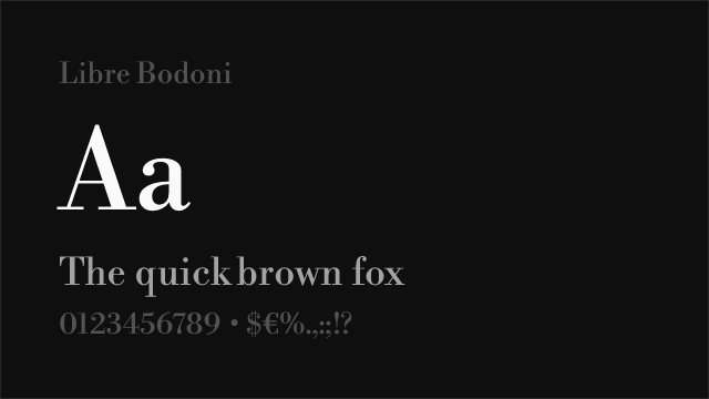
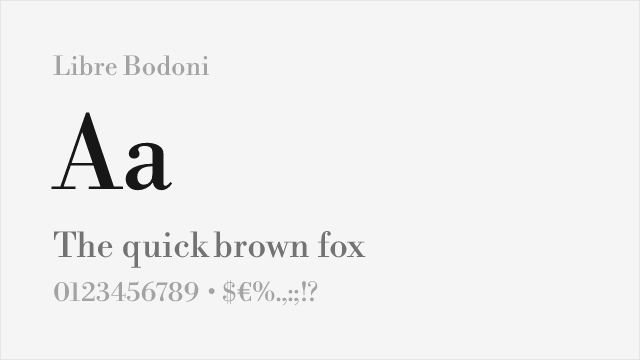
Libre Bodoni
| GT Super | Libre Bodoni | Match |
|---|---|---|
| Regular (400) | Regular (400) | exact |
| Medium (500) | Medium (500) | exact |
| Bold (700) | Bold (700) | exact |
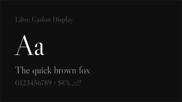
Libre Caslon Display
| GT Super | Libre Caslon Display | Match |
|---|---|---|
| Regular (400) | Regular (400) | exact |
EB Garamond
| GT Super | EB Garamond | Match |
|---|---|---|
| Regular (400) | Regular (400) | exact |
| Medium (500) | Medium (500) | exact |
| Semibold (600) | Semibold (600) | close |
| Bold (700) | Bold (700) | exact |
Crimson Pro
| GT Super | Crimson Pro | Match |
|---|---|---|
| Light (300) | Light (300) | close |
| Regular (400) | Regular (400) | exact |
| Semibold (600) | Semibold (600) | exact |
| Bold (700) | Bold (700) | exact |
Performance Guide
Production performance metrics for each alternative.
How to Use Playfair Display
Copy these code snippets to quickly add Playfair Display to your project.
CSS code for Playfair Display
@import url('https://fonts.googleapis.com/css2?family=Playfair+Display:wght@100..900&display=swap');HTML code for Playfair Display
<link rel="preconnect" href="https://fonts.googleapis.com">
<link rel="preconnect" href="https://fonts.gstatic.com" crossorigin>
<link href="https://fonts.googleapis.com/css2?family=Playfair+Display:wght@100..900&display=swap" rel="stylesheet">
Tailwind code for Playfair Display
// tailwind.config.js
module.exports = {
  theme: {
    extend: {
      fontFamily: {
        'playfair-display': ['"Playfair Display"', 'sans-serif'],
      },
    },
  },
}

// Usage in HTML:
// <p class="font-playfair-display">Your text here</p>
Next.js code for Playfair Display
// Using next/font (Next.js 13+)
import { Playfair_Display } from 'next/font/google';

const playfair_display = Playfair_Display({
  subsets: ['latin'],
  weight: ['100', '200', '300', '400', '500', '600', '700', '800', '900'],
});

export default function Component() {
  return (
    <p className={playfair_display.className}>
      Your text here
    </p>
  );
}

// Or using inline styles with Google Fonts link:
// <p style={{ fontFamily: '"Playfair Display"' }}>Your text</p>
Expo and React Native code for Playfair Display
// Install: npx expo install @expo-google-fonts/playfair-display expo-font
import { useFonts, Playfair_Display_400Regular } from '@expo-google-fonts/playfair-display';

export default function App() {
  const [fontsLoaded] = useFonts({
    Playfair_Display_400Regular,
  });

  if (!fontsLoaded) return null;

  return (
    <Text style={{ fontFamily: 'Playfair_Display_400Regular' }}>
      Your text here
    </Text>
  );
}
Recommended Font Pairings
These free fonts pair well with Playfair Display GT Super for headlines, body text, or accent use.
DM Sans's clean geometric construction provides modern contrast against GT Super's high-contrast serif drama — the minimal sans-serif body text lets GT Super headlines command full attention in fashion and editorial layouts
Space Grotesk's contemporary geometric character creates a compelling modern-meets-retro tension with GT Super's nostalgic serif forms, producing pairings that feel design-forward for creative agency and cultural publication contexts
Inter's neutral, screen-optimized precision provides the functional backbone that lets GT Super's expressive display character shine — the contrast between functional sans-serif navigation and dramatic serif headlines creates clear visual hierarchy
Browse Alternatives by Context
Find GT Super alternatives filtered by specific use case, style, or language support.
Frequently Asked Questions
What is the best free alternative to GT Super?
Playfair Display is the best free alternative to GT Super with a FontAlternatives similarity score of 82%. It shares similar proportions and characteristics while being available under the OFL-1.1 license for both personal and commercial use at no cost.
Is there a free version of GT Super?
There is no official free version of GT Super. However, Playfair Display is available under the OFL-1.1 open-source license and achieves a FontAlternatives similarity score of 82%. It includes variable weights and supports latin, latin-extended.
What Google Font looks like GT Super?
The Google Fonts most similar to GT Super are Playfair Display, Fraunces, Cormorant Garamond. Among these alternatives, Playfair Display offers the closest match with a FontAlternatives similarity score of 82% and includes variable weights for flexible typography options.
Can I use Playfair Display commercially?
Yes, Playfair Display can be used commercially. It is licensed under OFL-1.1, which allows free use in websites, applications, print materials, and commercial projects without purchasing a license or paying royalties.
Is Playfair Display similar enough to GT Super?
Playfair Display achieves a FontAlternatives similarity score of 82% compared to GT Super. While not identical, it offers comparable letterforms, proportions, and visual style. Most designers find it works excellently as a substitute in web and print projects.
What are the main differences between GT Super and its free alternatives?
Free alternatives to GT Super may differ in subtle details like letter spacing, curve refinements, and available weights. Premium fonts typically include more OpenType features, extended language support, and optimized screen rendering. However, for most projects, these differences are negligible.
Where can I download free alternatives to GT Super?
Download Playfair Display directly from Google Fonts. Click the "Get Font" button on any alternative listed above to visit the official download page. Google Fonts also provides convenient embed codes for seamless web integration.