Free Alternatives to GT Super Supporting Latin Extended
Need a free alternative to GT Super with Latin Extended script support? These 7 options include Latin Extended characters and share visual similarities with GT Super. Each is licensed for free personal and commercial use.
Top Picks
Comparison Table
| Font | Relevance ⓘ
How well this alternative fits the specific context (use-case or trait) of this page. Score 0–100 based on matching keywords, industries, and font characteristics. Alternatives scoring 25+ are highlighted.
| Similarity ⓘ
How visually similar this free font is to the premium original. Score 0–100 based on x-height, width, stroke contrast, use-case overlap, and language coverage.
Learn more → | Weights | Variable | License | Source |
|---|---|---|---|---|---|---|
| Playfair Display | 0 | 82% | Variable | Yes | OFL-1.1 | Google Fonts ↗ |
| Fraunces | 0 | 79% | Variable | Yes | OFL-1.1 | Google Fonts ↗ |
| Cormorant Garamond | 0 | 77% | 5 | No | OFL-1.1 | Google Fonts ↗ |
| Libre Bodoni | 0 | 75% | Variable | Yes | OFL-1.1 | Google Fonts ↗ |
| Libre Caslon Display | 0 | 73% | 1 | No | OFL-1.1 | Google Fonts ↗ |
| EB Garamond | 0 | 72% | Variable | Yes | OFL-1.1 | Google Fonts ↗ |
| Crimson Pro | 0 | 70% | Variable | Yes | OFL-1.1 | Google Fonts ↗ |
All Alternatives (7)


[Google Fonts] · OFL-1.1 · Variable
Closest high-contrast display match with editorial versatility
Why it matches: Playfair Display captures GT Super's high-contrast display personality with dramatic thick-thin transitions and elegant serif construction suited for editorial headlines. Both typefaces command attention at large sizes through their bold stroke contrast and refined letterforms. Playfair Display's transitional structure shares GT Super's ability to convey editorial sophistication and fashion-forward sensibility, though it lacks the specific retro warmth and rounded softness that defines GT Super's character. The variable font support with a continuous weight axis from 400 to 900 provides more flexibility than GT Super's fixed weight range.
fashion and editorial headlinesluxury brand display typemagazine cover lineshigh-impact web headers

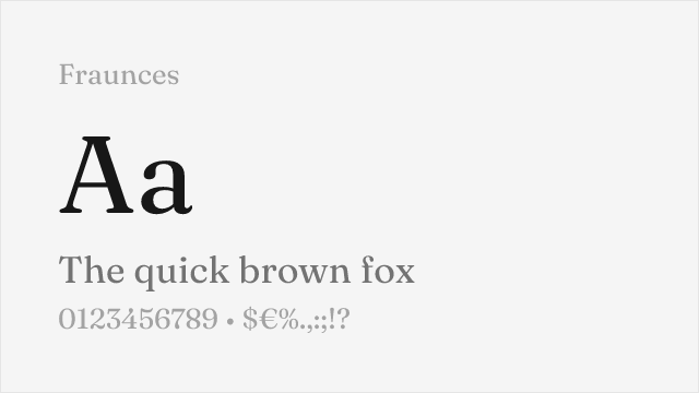
[Google Fonts] · OFL-1.1 · Variable
Expressive display serif with retro-inflected personality and variable axes
Why it matches: Fraunces shares GT Super's expressive, personality-driven approach to display serif design with a warm, retro-inflected character that feels editorial and deliberately styled rather than historically reverent. Both typefaces thrive in contexts where the typography needs to make a statement — fashion editorial, cultural content, brand storytelling. Fraunces's variable WONK axis adds a dimension of optical adjustment that GT Super lacks, and its overall warmth and expressiveness come closest to matching GT Super's distinctive blend of sophistication and nostalgia among free alternatives.
editorial display with retro characterfashion and lifestyle brandingexpressive headline typographycultural and arts publications


[Google Fonts] · OFL-1.1 · 5 weights
High-contrast display Garamond with elegant proportions and editorial presence
Why it matches: Cormorant Garamond shares GT Super's high-contrast display orientation with elegant, refined letterforms that command attention at large sizes. Both typefaces feature dramatic thick-thin transitions that create visual impact in headline contexts. Cormorant's Garamond heritage gives it a more classical personality than GT Super's retro warmth, but the display-scale impact and editorial sophistication are comparable. The extremely high contrast and refined detailing make Cormorant Garamond one of the few free serifs that can match GT Super's visual drama at headline sizes.
elegant editorial headlinesfashion and luxury display typewedding and event typographycultural publication mastheads
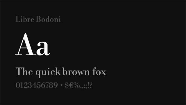
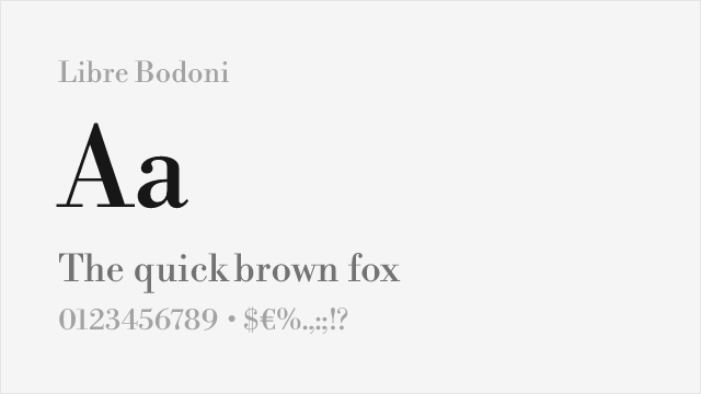
[Google Fonts] · OFL-1.1 · Variable
High-contrast Bodoni revival with display-oriented drama and authority
Why it matches: Libre Bodoni shares GT Super's high-contrast display character with dramatic thick-thin transitions and strong vertical stress that creates commanding headline presence. Both typefaces operate primarily at display sizes where their contrast ratios generate maximum visual impact. Libre Bodoni's Didone construction is more formally structured than GT Super's softer, retro-inflected forms, but in editorial and fashion contexts where high-contrast serif display type is the requirement, Libre Bodoni delivers comparable drama. The rational Bodoni skeleton provides a more authoritative, less nostalgic personality.
high-contrast editorial headlinesfashion magazine display typeluxury brand mastheadsformal display typography
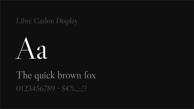

[Google Fonts] · OFL-1.1 · 1 weights
Elegant display Caslon with refined contrast and editorial heritage
Why it matches: Libre Caslon Display shares GT Super's orientation toward editorial display typography with refined contrast and elegant proportions designed for headline impact. The Caslon heritage gives it a warm, approachable personality that echoes GT Super's non-austere editorial character — both typefaces feel sophisticated without being cold or purely formal. At display sizes, Libre Caslon Display's refined detailing and contrast create the kind of editorial statement that GT Super delivers, though the specific retro inflection and rounded softness of GT Super is not replicated.
editorial feature headlinesmagazine cover linescultural event typographybook title pages


[Google Fonts] · OFL-1.1 · Variable
Scholarly display serif with historical authority and extensive language coverage
Why it matches: EB Garamond provides editorial display capability with refined contrast and elegant proportions that serve headline contexts effectively. While its personality is more scholarly and historically grounded than GT Super's retro editorial warmth, both typefaces share an intellectual seriousness at display sizes. EB Garamond's Renaissance humanist forms give it cultural gravitas comparable to GT Super's fashion-editorial authority, just expressed through a different design tradition. The extensive language support including Greek and Cyrillic significantly exceeds GT Super's Latin-only coverage.
scholarly and literary display typemultilingual editorial headlinescultural institution publicationshistorical and archival design


[Google Fonts] · OFL-1.1 · Variable
Refined old-style serif with classical elegance and comprehensive weight range
Why it matches: Crimson Pro offers refined serif construction with enough contrast to function at display sizes, providing an alternative editorial voice where GT Super's high-impact retro character is not essential. Both typefaces suit editorial and cultural contexts that require serif sophistication, though Crimson Pro operates from a more classical, understated position. The nine-weight variable range provides excellent hierarchy control that GT Super's more limited weight selection cannot match. In projects where editorial refinement matters more than display-scale drama, Crimson Pro offers a more versatile foundation.
refined editorial layoutsliterary and cultural publicationsversatile editorial design systemsscholarly and book publishing