Free Alternatives to Noe Display

About Noe Display
- Foundry
- Schick Toikka
- Classification
- serif
- Style
- high-contrast
Brands Using Noe Display
Featured extensively in editorial design showcases and design industry coverage
Editorial display typography in design-focused cultural content
Portfolio hero typography and client presentation headers across European creative studios
Editorial display typography in contemporary culture and interiors magazine
Noe Display is a high-contrast editorial serif designed by Lauri Toikka and released by Schick Toikka, the Helsinki-based type foundry. It is the display companion to Noe Text — the body copy variant designed for sustained reading — and together they form a system that handles the full range of editorial typography from dramatic headlines to comfortable long-form text. Noe Display's defining quality is its combination of sharp, angular serifs with generous, almost voluptuous curves, creating a serif that feels simultaneously precise and sensual — a tension that has made it one of the most sought-after display serifs among design-conscious publications and creative studios.
Noe Display requires a paid license from Schick Toikka. Licensing is available through the foundry's website with desktop, web, and app tiers. There is no free trial or open-source version. If your budget cannot accommodate Schick Toikka's licensing structure, this page covers the best open-source alternatives — though Noe Display's particular combination of sharp serifs and organic contrast makes it harder to replace than most editorial display serifs.
Why Noe Display Matters
Noe Display occupies a distinctive position in contemporary type: it is a serif that appeals equally to the fashion editorial world (where high contrast and visual drama are prerequisites) and the design studio world (where typographic originality and contemporary sensibility are valued above heritage). This dual appeal is rare. Most high-contrast display serifs lean either toward the classical tradition (like Bodoni or Didot) or toward contemporary reinterpretation (like GT Sectra or Canela). Noe Display manages to exist in both registers simultaneously.
When Creative Boom features Noe Display in its design showcases, or when It's Nice That uses it in editorial contexts, the typeface signals something specific: that the designer or publication is engaged with contemporary European type design and values typographic personality over neutrality. This positioning distinguishes Noe Display from the Anglo-American editorial tradition (Times, Mercury, Chronicle) and from the Swiss rationalist tradition (Suisse Works, Tiempos). Noe Display is unapologetically expressive — it has opinions about what editorial display typography should look like.
Schick Toikka, co-founded by Lauri Toikka and Tomi Saarinen, has established a reputation for typefaces that balance strong visual personality with professional utility. The foundry's Nordic design sensibility — clean but warm, sharp but organic — permeates Noe Display's construction. The sharp, triangular serifs reference the precision of Finnish design while the generous curves and warm stroke modulation connect to the sensuality of southern European typographic traditions. This cultural blend gives Noe Display a personality that feels international rather than regional.
The typeface's influence extends beyond its direct usage. Noe Display helped establish the visual vocabulary of the "editorial display serif renaissance" of the 2010s — the period when design-aware publications and brands began seeking display serifs that could compete with the dominant sans-serif culture of digital design. Where sans-serifs said "we are modern and digital," serifs like Noe Display said "we are modern, digital, and culturally sophisticated."
Design Characteristics
Noe Display's design is defined by the tension between angular precision and organic warmth:
- Sharp, triangular serifs: The most distinctive feature — serifs terminate in sharp, angular points rather than the soft brackets of traditional editorial serifs, creating an architectural quality that gives Noe Display its contemporary edge
- High stroke contrast: The difference between thick and thin strokes is dramatic, creating the visual energy that display serifs need to command headline attention — the thins are fine but not fragile, maintaining structural integrity
- Generous, organic curves: Bowls and curves in letters like
a,d,g, andohave a voluptuous quality — slightly wider and more organic than the geometric precision of the serifs, creating the signature tension between sharp and soft - Vertical stress with subtle modulation: The axis of contrast is predominantly vertical, characteristic of rational serif design, but with subtle variations that prevent the mechanical feel of pure Didone construction
- Moderate x-height: The lowercase proportions balance display impact with proportion elegance, allowing Noe Display to perform at sizes from 24px headlines to larger poster treatments
- Distinctive italic forms: The italics introduce additional calligraphic movement while maintaining the sharp serif character, providing the editorial emphasis and visual variety that magazine design requires
- Four weights from Regular to Black: The weight range focuses on the display-relevant spectrum, providing enough hierarchy for headline-deck-pullquote systems without the thin weights that would be wasted at display sizes
Where Noe Display Excels
Noe Display is at its best in design-forward editorial and cultural contexts:
- Design publication headlines: Creative Boom, It's Nice That, and similar platforms use Noe Display for editorial display where typographic personality is part of the content's value proposition
- Fashion editorial and lookbooks: The high contrast and sharp serifs align with fashion's visual language without the formality of classical Didones, making Noe Display feel current rather than historical
- Cultural institution materials: Museums, galleries, and performance venues use Noe Display for exhibition catalogues, programs, and signage where the typography must project cultural sophistication
- Creative studio brand identities: Design and architecture studios choose Noe Display for their own identities because it signals typographic literacy and contemporary sensibility
- Magazine feature headlines: The dramatic contrast and sharp personality transform headlines into visual events, creating the editorial impact that feature stories demand
- Luxury brand campaigns: The combination of sharp precision and organic warmth suits luxury contexts that need contemporary edge without coldness
Where Noe Display Struggles
Noe Display's display-focused design creates clear limitations:
- Body text at any size: Noe Display is engineered for display — at text sizes below 18px, the high contrast causes thin strokes to disappear on screen, and the tight spacing becomes uncomfortable (use Noe Text for body copy)
- Conservative institutional contexts: The sharp, angular personality reads as too avant-garde for banks, law firms, and government agencies that need typography projecting stability and tradition
- Low-resolution or degraded printing: The fine thin strokes and sharp serif points require high-resolution reproduction — newsprint, low-DPI screens, and cheap printing compromise the design's integrity
- Projects requiring broad language support: Noe Display covers Latin scripts with extended character sets but does not support Cyrillic, Greek, or non-Latin scripts
- Highly functional or utilitarian design: Data-heavy layouts, dashboards, and technical documentation need serifs with more even stroke weight and less visual personality
- Budget-constrained teams: Licensing costs across desktop, web, and app tiers can be significant for organizations with limited typography budgets, especially when Noe Text is also needed for body copy
- Variable font workflows: Noe Display ships as static files only. Schick Toikka has not adopted variable formats for their display-focused catalog, requiring manual weight selection where variable alternatives like Playfair Display and Fraunces offer responsive, continuous adjustment
How to Choose a Free Substitute
When evaluating Noe Display replacements, prioritize these criteria:
- Contrast level at display sizes: Noe Display's primary weapon is dramatic thick-thin contrast. Test your alternative at 36-72px and evaluate whether it creates comparable visual drama. Playfair Display and Libre Bodoni come closest; lower-contrast options like Alegreya will shift the editorial tone toward warmth
- Serif sharpness and character: Noe Display's angular, triangular serifs are its visual signature. Most free serifs have either bracketed (rounded) serifs or flat (Didone) serifs. None match Noe Display's specific sharpness. Accept this trade-off and prioritize overall display personality over precise serif shape
- Contemporary editorial positioning: Noe Display signals design-forward editorial sophistication. Your alternative should feel deliberately chosen rather than defaulted to. Fraunces and Cormorant Garamond both convey design intentionality; generic serifs do not
- Weight range for display hierarchy: Magazine and editorial design typically needs at least Regular, Bold, and Black for headline-subhead-pullquote systems. Playfair Display's variable range (400-900) and Fraunces' nine weights satisfy this requirement
- Pairing compatibility: Noe Display pairs naturally with clean neo-grotesque and geometric sans-serifs. Verify that your serif alternative creates dramatic contrast — the pairing of sharp serif headlines with clean sans-serif body text is fundamental to the editorial layouts where Noe Display thrives
Premium Font Neighbors
If Noe Display's editorial approach resonates but you want to explore adjacent options:
Cluster A: Contemporary editorial display serifs with strong personality
- GT Super (Grilli Type) — retro-inflected display serif with softer, more nostalgic personality than Noe Display's angular precision
- Portrait (Commercial Type) — Berton Hasebe's high-contrast display serif with fashion-editorial positioning; a direct competitor in the luxury editorial space
- Canela (Commercial Type) — bridges serif and sans-serif with organic forms; occupies adjacent design-forward territory with a gentler personality
Cluster B: High-contrast editorial serifs for refined publishing
- Freight Display (GarageFonts) — widely used display serif with classical proportions and warm editorial character; less angular than Noe Display but similarly versatile
- Heldane (Klim Type Foundry) — contemporary editorial serif with refined display variants; shares Noe Display's commitment to contemporary reinterpretation of classical forms
- Domaine (Klim Type Foundry) — shares Noe Display's contemporary editorial positioning with more overt historical roots and broader warmth
- Austin (Commercial Type) — high-contrast Scotch Roman with fashion-forward sensibility; more classical than Noe Display but serving similar luxury editorial contexts
- Miller (Carter & Cone / Font Bureau) — editorial display serif from Matthew Carter; more restrained than Noe Display but sharing its commitment to editorial excellence
FAQ
Is Noe Display free?
No. Noe Display is a premium typeface from Schick Toikka, available through their website. Desktop, web, and app licenses are priced separately. There is no free trial or open-source version. For free alternatives, Playfair Display (80% similarity) is the closest match.
What is the best free alternative to Noe Display?
Playfair Display is the closest free alternative at 80% similarity. Both share high-contrast display character and editorial authority. Playfair Display adds variable font support and Cyrillic coverage. However, Noe Display's angular, triangular serifs and the specific tension between sharp precision and organic curves cannot be replicated in any free font.
What makes Noe Display's design distinctive?
The combination of sharp, angular serifs with generous, organic curves creates a unique tension. Most high-contrast serifs are either uniformly sharp (like Didot) or uniformly smooth (like traditional old-style display faces). Noe Display's simultaneous sharpness and warmth — precise triangular serifs meeting voluptuous bowls — gives it a personality that reads as both contemporary and timeless.
What is the difference between Noe Display and Noe Text?
Noe Display is designed for headlines at 24pt and above, with maximum contrast and refined display proportions. Noe Text is the body copy companion, with reduced contrast, sturdier construction, and wider spacing for comfortable sustained reading at text sizes. They share the same design DNA but are separate designs optimized for their respective scales.
Can I use Noe Display on the web?
Yes, with a web font license from Schick Toikka. Web licenses include WOFF2 files for self-hosting, priced by monthly page views or as a flat rate depending on the licensing model. Noe Display is not available on Google Fonts or Adobe Fonts.
Who designed Noe Display?
Lauri Toikka at Schick Toikka, the Helsinki-based type foundry he co-founded with Tomi Saarinen. Toikka is known for typefaces that blend Nordic precision with warm expressiveness — a quality that defines Noe Display's character.
Does Noe Display support Cyrillic?
No. Noe Display supports Latin and Latin Extended scripts only. For editorial projects requiring Cyrillic, Playfair Display offers comparable display character with full Cyrillic support. EB Garamond provides Cyrillic, Greek, and Vietnamese coverage for multilingual editorial projects.
Why is Noe Display rated as "hard" to replace?
Noe Display's distinctive feature — the sharp, triangular serifs combined with organic curves — has no parallel in open-source type. Free high-contrast serifs can match the overall editorial display function, but the specific angular personality that makes Noe Display recognizable and that draws designers to it cannot be replicated. The cultural positioning as a European design-community serif adds another layer of specificity that generic free alternatives do not convey.
How does Noe Display compare to Playfair Display?
Both are high-contrast display serifs designed for editorial headlines. Noe Display has sharper, more angular serifs and a more contemporary European personality. Playfair Display has softer ball terminals and a more transitional character. Noe Display is slightly more distinctive but harder to license; Playfair Display is free, variable, and includes Cyrillic support. For projects where the specific angular sharpness of Noe Display is not essential, Playfair Display provides 80% of the editorial display function at no cost.
What design contexts suit Noe Display best?
Noe Display thrives in contexts where typographic personality is valued as part of the design's content: design publications (Creative Boom, It's Nice That), fashion editorial, cultural institution materials, creative studio identities, and luxury brand campaigns. It is less suited to conservative institutional, data-heavy, or purely functional contexts where serif personality would be a distraction.
Is Noe Display on Google Fonts?
No, Noe Display is a premium font from Schick Toikka and is not available on Google Fonts.
The closest Google Fonts alternative is Playfair Display with 80% similarity. Get it free on Google Fonts ↗
Free Alternatives (7)


Closest free match with comparable high-contrast display character and editorial presence


High-contrast display serif with refined proportions and classical elegance
High-contrast Modern serif with sharp display proportions matching Noe Display's drama

Contemporary serif with optical sizing and distinctive editorial character

Scholarly display serif with refined proportions and exceptional language support

Caslon-derived display serif with editorial authority for headline applications
Dynamic calligraphic serif with editorial personality and comprehensive family
See where Noe Display is used in the wild and swap to free alternatives live.
Install FontSwap →Replacement Summary
Source: FontAlternatives.com
Premium font: Noe Display
Best free alternative: Playfair Display
FontAlternatives similarity score: 80%
Replacement difficulty: Medium
Best for: editorial magazine headlines, fashion and luxury display, high-contrast editorial layouts, design-forward brand headlines
Notable users: Creative Boom, It's Nice That, Various design studios
Not recommended when: Brand consistency with Creative Boom requires exact letterforms
What is the best free alternative to Noe Display?
Playfair Display is the best free alternative to Noe Display with a FontAlternatives similarity score of 80%.
Playfair Display shares similar proportions, stroke characteristics, and intended use with Noe Display. It is available under the OFL-1.1 license, which permits both personal and commercial use at no cost.
This alternative works particularly well for: editorial magazine headlines, fashion and luxury display, high-contrast editorial layouts, design-forward brand headlines.
Can I safely replace Noe Display with Playfair Display?
Yes, with some considerations. Playfair Display achieves a FontAlternatives similarity score of 80%, indicating good structural compatibility for most use cases.
Licensing: Playfair Display is licensed under OFL-1.1, which allows commercial use without licensing fees or royalties.
Weight coverage: Most weights have close or exact matches available.
When should I NOT replace Noe Display?
While Playfair Display is a strong alternative, there are situations where replacing Noe Display may not be appropriate:
- Optical precision requirements: Playfair Display has measurable structural differences from Noe Display that may be visible in precise design work.
- Brand consistency: Noe Display is commonly seen in Design magazine feature headlines and cover typography contexts where exact letterforms may be required.
- Strict compliance: Verify that OFL-1.1 terms meet your specific legal and compliance requirements.
Weight-Matching Guide
Map Noe Display weights to their closest free alternatives for accurate font substitution.
Playfair Display
| Noe Display | Playfair Display | Match |
|---|---|---|
| Regular (400) | Regular (400) | exact |
| Medium (500) | Medium (500) | close |
| Bold (700) | Bold (700) | exact |
| Black (900) | Black (900) | exact |
Cormorant Garamond
| Noe Display | Cormorant Garamond | Match |
|---|---|---|
| Light (300) | Light (300) | close |
| Regular (400) | Regular (400) | exact |
| Semi Bold (600) | SemiBold (600) | close |
| Bold (700) | Bold (700) | exact |
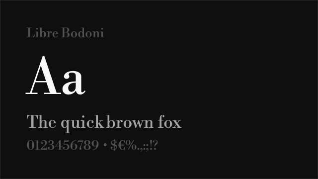
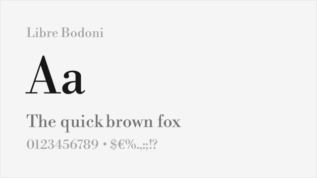
Libre Bodoni
| Noe Display | Libre Bodoni | Match |
|---|---|---|
| Regular (400) | Regular (400) | exact |
| Medium (500) | Medium (500) | close |
| Bold (700) | Bold (700) | exact |
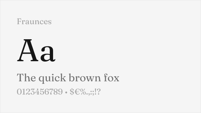
Fraunces
| Noe Display | Fraunces | Match |
|---|---|---|
| Light (300) | Light (300) | close |
| Regular (400) | Regular (400) | close |
| Bold (700) | Bold (700) | close |
| Black (900) | Black (900) | close |
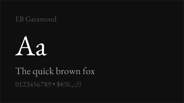
EB Garamond
| Noe Display | EB Garamond | Match |
|---|---|---|
| Regular (400) | Regular (400) | exact |
| Medium (500) | Medium (500) | exact |
| Semi Bold (600) | SemiBold (600) | close |
| Bold (700) | Bold (700) | exact |
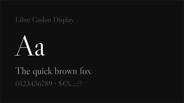
Libre Caslon Display
| Noe Display | Libre Caslon Display | Match |
|---|---|---|
| Regular (400) | Regular (400) | exact |
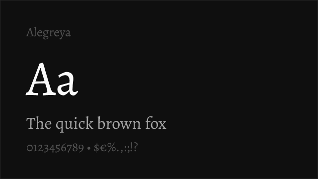
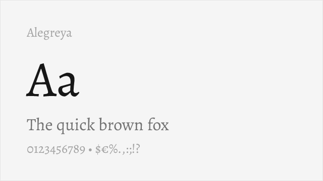
Alegreya
| Noe Display | Alegreya | Match |
|---|---|---|
| Regular (400) | Regular (400) | close |
| Medium (500) | Medium (500) | close |
| Bold (700) | Bold (700) | close |
| Black (900) | ExtraBold (800) | close |
Performance Guide
Production performance metrics for each alternative.
How to Use Playfair Display
Copy these code snippets to quickly add Playfair Display to your project.
CSS code for Playfair Display
@import url('https://fonts.googleapis.com/css2?family=Playfair+Display:wght@100..900&display=swap');HTML code for Playfair Display
<link rel="preconnect" href="https://fonts.googleapis.com">
<link rel="preconnect" href="https://fonts.gstatic.com" crossorigin>
<link href="https://fonts.googleapis.com/css2?family=Playfair+Display:wght@100..900&display=swap" rel="stylesheet">
Tailwind code for Playfair Display
// tailwind.config.js
module.exports = {
  theme: {
    extend: {
      fontFamily: {
        'playfair-display': ['"Playfair Display"', 'sans-serif'],
      },
    },
  },
}

// Usage in HTML:
// <p class="font-playfair-display">Your text here</p>
Next.js code for Playfair Display
// Using next/font (Next.js 13+)
import { Playfair_Display } from 'next/font/google';

const playfair_display = Playfair_Display({
  subsets: ['latin'],
  weight: ['100', '200', '300', '400', '500', '600', '700', '800', '900'],
});

export default function Component() {
  return (
    <p className={playfair_display.className}>
      Your text here
    </p>
  );
}

// Or using inline styles with Google Fonts link:
// <p style={{ fontFamily: '"Playfair Display"' }}>Your text</p>
Expo and React Native code for Playfair Display
// Install: npx expo install @expo-google-fonts/playfair-display expo-font
import { useFonts, Playfair_Display_400Regular } from '@expo-google-fonts/playfair-display';

export default function App() {
  const [fontsLoaded] = useFonts({
    Playfair_Display_400Regular,
  });

  if (!fontsLoaded) return null;

  return (
    <Text style={{ fontFamily: 'Playfair_Display_400Regular' }}>
      Your text here
    </Text>
  );
}
Recommended Font Pairings
These free fonts pair well with Playfair Display Noe Display for headlines, body text, or accent use.
Inter's rational neo-grotesque forms create clean, functional contrast beneath Noe Display's dramatic editorial headlines — a pairing that balances serif personality with sans-serif readability for contemporary editorial platforms
DM Sans's geometric clarity provides an approachable counterpoint to Noe Display's angular display character, creating pairings that feel modern and balanced for design-forward editorial and cultural contexts
Source Sans 3's rational, readable forms handle body text and supporting elements beneath Noe Display's commanding headlines, providing the functional typography infrastructure that display- focused serifs require
Browse Alternatives by Context
Find Noe Display alternatives filtered by specific use case, style, or language support.
Frequently Asked Questions
What is the best free alternative to Noe Display?
Playfair Display is the best free alternative to Noe Display with a FontAlternatives similarity score of 80%. It shares similar proportions and characteristics while being available under the OFL-1.1 license for both personal and commercial use at no cost.
Is there a free version of Noe Display?
There is no official free version of Noe Display. However, Playfair Display is available under the OFL-1.1 open-source license and achieves a FontAlternatives similarity score of 80%. It includes variable weights and supports latin, latin-extended.
What Google Font looks like Noe Display?
The Google Fonts most similar to Noe Display are Playfair Display, Cormorant Garamond, Libre Bodoni. Among these alternatives, Playfair Display offers the closest match with a FontAlternatives similarity score of 80% and includes variable weights for flexible typography options.
Can I use Playfair Display commercially?
Yes, Playfair Display can be used commercially. It is licensed under OFL-1.1, which allows free use in websites, applications, print materials, and commercial projects without purchasing a license or paying royalties.
Is Playfair Display similar enough to Noe Display?
Playfair Display achieves a FontAlternatives similarity score of 80% compared to Noe Display. While not identical, it offers comparable letterforms, proportions, and visual style. Most designers find it works excellently as a substitute in web and print projects.
What are the main differences between Noe Display and its free alternatives?
Free alternatives to Noe Display may differ in subtle details like letter spacing, curve refinements, and available weights. Premium fonts typically include more OpenType features, extended language support, and optimized screen rendering. However, for most projects, these differences are negligible.
Where can I download free alternatives to Noe Display?
Download Playfair Display directly from Google Fonts. Click the "Get Font" button on any alternative listed above to visit the official download page. Google Fonts also provides convenient embed codes for seamless web integration.