Free Alternatives to Noe Display with Editorial Style

7 alternatives | 6 highly relevant | serif | Best match: EB Garamond (71%)

Noe Display is known for its editorial aesthetic. If you're looking for a free serif font with a similar editorial feel, these 7 alternatives offer comparable characteristics. We've identified 6 that are especially well-suited for this context. All are available under open-source licenses for unrestricted commercial use.

Top Picks

Comparison Table

Font Relevance Similarity Weights Variable License Source
EB Garamond 59 71% Variable Yes OFL-1.1 Google Fonts ↗
Alegreya 59 68% Variable Yes OFL-1.1 Google Fonts ↗
Playfair Display 51 80% Variable Yes OFL-1.1 Google Fonts ↗
Libre Caslon Display 49 70% 1 No OFL-1.1 Google Fonts ↗
Cormorant Garamond 45 77% 5 No OFL-1.1 Google Fonts ↗
Libre Bodoni 35 75% Variable Yes OFL-1.1 Google Fonts ↗
Fraunces 15 73% Variable Yes OFL-1.1 Google Fonts ↗

Most Relevant (6)

#1 EB Garamond 71% Relevant
[Google Fonts] · OFL-1.1 · Variable

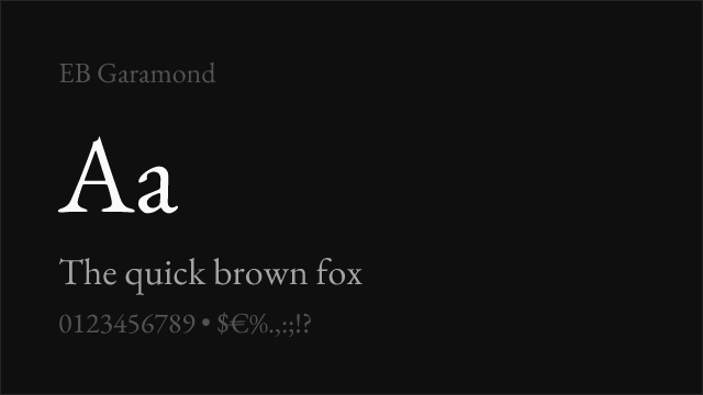
Scholarly display serif with refined proportions and exceptional language support

Why it matches: EB Garamond provides a more historically grounded alternative to Noe Display, trading contemporary sharpness for Renaissance authority while maintaining the refined display character that editorial contexts demand. Both typefaces succeed in intellectually oriented publishing where the typography must signal cultural awareness and design consideration. EB Garamond's extensive language support — including Greek, Cyrillic, and Vietnamese — significantly exceeds Noe Display's Latin-only coverage. The moderate-to-high contrast produces credible display typography, though the dramatic impact is less pronounced than Noe Display's sharper forms.
scholarly and academic publicationsmultilingual editorial projectscultural institution typographyclassical editorial contexts
Get Font ↗
#2 Alegreya 68% Relevant
[Google Fonts] · OFL-1.1 · Variable

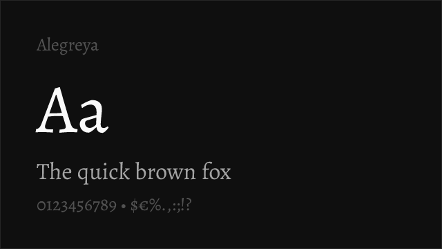
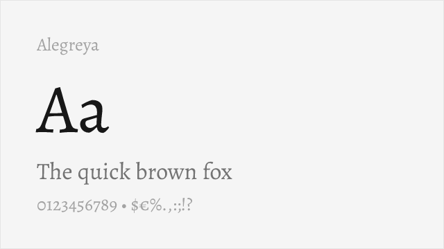
Dynamic calligraphic serif with editorial personality and comprehensive family

Why it matches: Alegreya brings a more calligraphic, dynamic approach to editorial serif display than Noe Display's controlled sharpness, but both typefaces share a commitment to personality-driven editorial typography. Where Noe Display achieves its distinctive character through angular precision and high contrast, Alegreya achieves it through calligraphic movement and organic rhythm. The comprehensive family — including Alegreya Sans and Alegreya SC (small caps) — provides a typographic system that Noe Display's display-only focus cannot match. For editorial contexts where warmth and calligraphic energy can substitute for sharp contemporary elegance, Alegreya offers a versatile, characterful alternative.
literary and narrative editorialcultural publications with personalitybook and chapter display typographyeditorial systems with companion sans
Get Font ↗
#3 Playfair Display 80% Relevant
[Google Fonts] · OFL-1.1 · Variable

Closest free match with comparable high-contrast display character and editorial presence

Why it matches: Playfair Display shares Noe Display's core identity — a high-contrast serif designed for editorial display contexts where the headline must command attention and signal design sophistication. Both typefaces feature dramatic thick-thin contrast, refined proportions optimized for large sizes, and a personality that reads as both classical and contemporary. Playfair Display's transitional-to-Didone construction creates a slightly different flavor than Noe Display's sharper, more angular approach, but the overall editorial function — elegant, commanding, unmistakably display — is comparable. Variable font support and Cyrillic coverage add practical advantages that Noe Display's static files cannot match.
editorial magazine headlinesfashion and luxury displayhigh-contrast editorial layoutsdesign-forward brand headlines
Get Font ↗
#4 Libre Caslon Display 70% Relevant
[Google Fonts] · OFL-1.1 · 1 weights

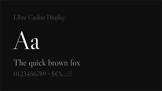
Caslon-derived display serif with editorial authority for headline applications

Why it matches: Libre Caslon Display shares Noe Display's display-specific design philosophy — both are designed exclusively for large sizes, with proportions and contrast levels that deteriorate at body text scales. This display-first commitment means Libre Caslon Display's refined details and generous contrast can approximate the visual quality that Noe Display brings to editorial headlines. The Caslon heritage gives it a warmer, more traditional personality than Noe Display's contemporary edge, but for editorial contexts that value refined display serif character over specific stylistic modernity, Libre Caslon Display serves well. The single-weight limitation is significant for editorial hierarchy.
editorial feature headlinessingle-weight display applicationspull quotes and display excerptsclassical editorial display
Get Font ↗
#5 Cormorant Garamond 77% Relevant
[Google Fonts] · OFL-1.1 · 5 weights

High-contrast display serif with refined proportions and classical elegance

Why it matches: Cormorant Garamond brings a level of contrast and display refinement that places it among the few free serifs capable of approximating Noe Display's headline presence. Both typefaces feature high contrast that creates drama at display sizes, and both maintain enough structural integrity to avoid the fragility that plagues extreme high-contrast faces. Cormorant Garamond's Garamond heritage gives it a warmer, more humanist character than Noe Display's contemporary sharpness, but the editorial function — transforming headlines into visual events through typographic contrast and refinement — is comparable. The five-weight range provides adequate hierarchy for most editorial applications.
literary and cultural publicationsrefined editorial displayclassical luxury brandingexhibition and gallery typography
Get Font ↗
#6 Libre Bodoni 75% Relevant
[Google Fonts] · OFL-1.1 · Variable

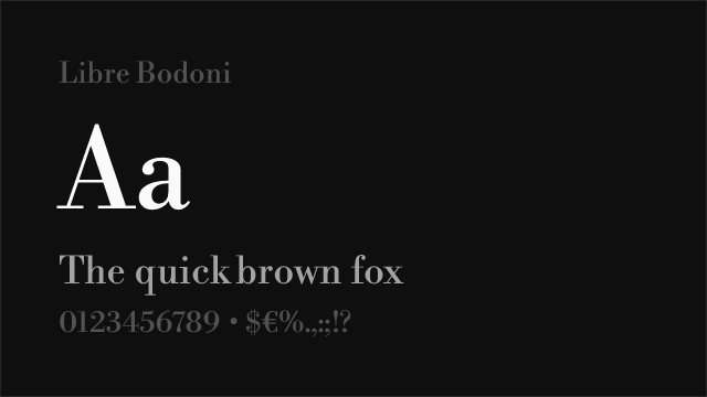
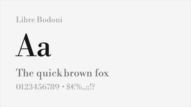
High-contrast Modern serif with sharp display proportions matching Noe Display's drama

Why it matches: Libre Bodoni shares Noe Display's commitment to extreme contrast at display sizes — both typefaces use the dramatic difference between thick and thin strokes as their primary visual weapon. The Bodoni heritage gives Libre Bodoni vertical stress and unbracketed serifs that create a sharper, more austere impression than Noe Display's slightly warmer, more contemporary character. In fashion and luxury editorial contexts, where high-contrast serifs are the visual lingua franca, Libre Bodoni and Noe Display serve similar functions. The variable font support and three-weight range (Regular, Medium, Bold) provide adequate display hierarchy.
fashion editorial and lookbooksluxury brand display typographyhigh-contrast headline treatmentsformal display contexts
Get Font ↗

Other Alternatives (1)

#7 Fraunces 73%
[Google Fonts] · OFL-1.1 · Variable

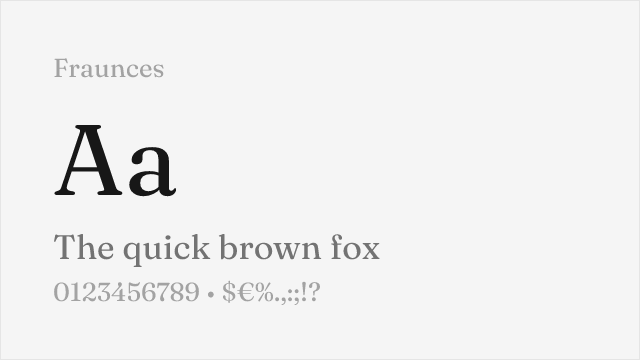
Contemporary serif with optical sizing and distinctive editorial character

Why it matches: Fraunces shares Noe Display's position as a contemporary serif that reinterprets classical display traditions for modern design contexts. Both typefaces project personality and visual interest beyond what conventional serifs provide — Noe Display through its angular sharpness and Fraunces through its "wonky" optical variations and organic contrast. The optical sizing axis gives Fraunces automatic adjustment between display and text use, and the "WONK" axis adds a dimension of visual expression that no other free serif provides. For design-forward editorial contexts where Noe Display's personality is valued over its specific sharp character, Fraunces offers a compelling contemporary alternative.
contemporary editorial designcreative brand identitiesdisplay typography with personalitydesign-forward cultural publications
Get Font ↗

Related Pages