Install FontSwap
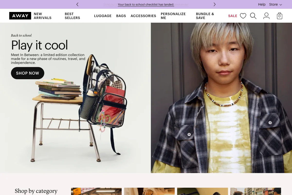
Away Uses Graphik
Away sells suitcases, and its typography does the thing most direct-to-consumer brands attempt and fewer pull off: it looks like a magazine that happens to have a checkout.
Two typefaces, two jobs
The site loads two commercial families, and the division between them is unusually disciplined.
Graphik — Commercial Type's grotesque, drawn by Christian Schwartz — handles everything functional. The AWAY wordmark. The navigation: NEW ARRIVALS, BEST SELLERS, LUGGAGE, BAGS, ACCESSORIES. Product copy, buttons, prices, the whole retail apparatus.
Lyon Display — Kai Bernau's, also Commercial Type — handles everything expressive. The italic "Back to school" eyebrow, the "Play it cool" headline, the "Shop by category" section heads.
Nothing crosses over. Graphik never carries a headline; Lyon never labels a button.
Why this pairing works
The instinct in DTC branding is to pick one characterful typeface and use it everywhere, which produces a site that looks great in a moodboard and becomes exhausting by the third product page.
Away's split solves a real tension. A luggage brand needs to sell aspiration — travel, escape, a particular kind of tasteful adulthood — and it also needs to tell you the dimensions in inches and whether the battery is removable. Those are different registers, and asking one typeface to do both means compromising on at least one.
Graphik is nearly perfect for the second job. It is a grotesque with slightly warmer proportions than Helvetica, drawn with a wide weight range and no strong accent of its own — the sort of face that disappears into a spec table without making it feel like a spreadsheet.
Lyon Display does the first job. It is a high-contrast text-serif family with real editorial credibility — Lyon Text has been used in serious publications — and set in italic at large sizes it carries exactly the note Away wants: considered, slightly literary, not shouting.
The italic choice specifically is what makes it work. A roman serif headline over a product photo reads as traditional retail. The italic reads as a magazine caption, which is the register the whole brand is reaching for.
What to take from it
The transferable idea is not "use Graphik and Lyon." It is: decide which typeface is allowed to have a personality, and do not let the other one develop one.
Most two-font systems fail because both fonts are interesting. Pick one to be the voice and one to be the plumbing, then hold the line — including in the places where it's tempting to let the display face into a product card because the layout looks a bit flat.
Free Alternatives
For the Graphik half, our ranking puts Inter first at 88%, and it's the right call for the functional layer — neutral, screen-optimised, variable 100–900, and completely happy in a spec table.
Work Sans (85%) is the better match if you want a little of Graphik's warmth. It has slightly more humanist proportions than Inter and holds a mid-size heading better.
Libre Franklin (76%) is worth a look for a different reason: it descends from Franklin Gothic, an American grotesque tradition adjacent to the one Graphik draws on, so it carries a similar retail-signage confidence.
For the Lyon Display half, the closest free options are display serifs with genuine contrast:
Playfair Display — variable 400–900, high contrast, and its italic is drawn rather than sloped. The nearest free stand-in for what Away is doing in the headline.
Instrument Serif — single weight, unapologetically display, and closer to Lyon's refinement than Playfair's slightly heavier presence. Use it large.
Fraunces — if you want the editorial register with more warmth. Its optical size axis (9–144) means the display cut is genuinely drawn for display rather than scaled up.
:root {
  --font-ui: "Inter", sans-serif;              /* the plumbing */
  --font-display: "Playfair Display", serif;   /* the voice */
}

.eyebrow,
.hero h1 {
  font-family: var(--font-display);
  font-style: italic;    /* the whole trick is in the italic */
}

nav, .product-card, .price, button {
  font-family: var(--font-ui);
}