 Install FontSwap
Font Inspiration
Page 2 of 2
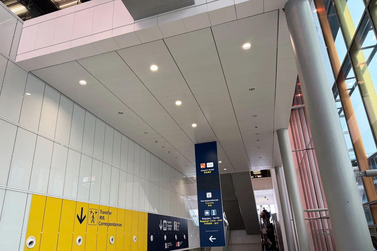
Frutiger was literally born here -- Adrian Frutiger designed the typeface specifically for Charles de Gaulle Airport, making it the birthplace of modern wayfinding typography
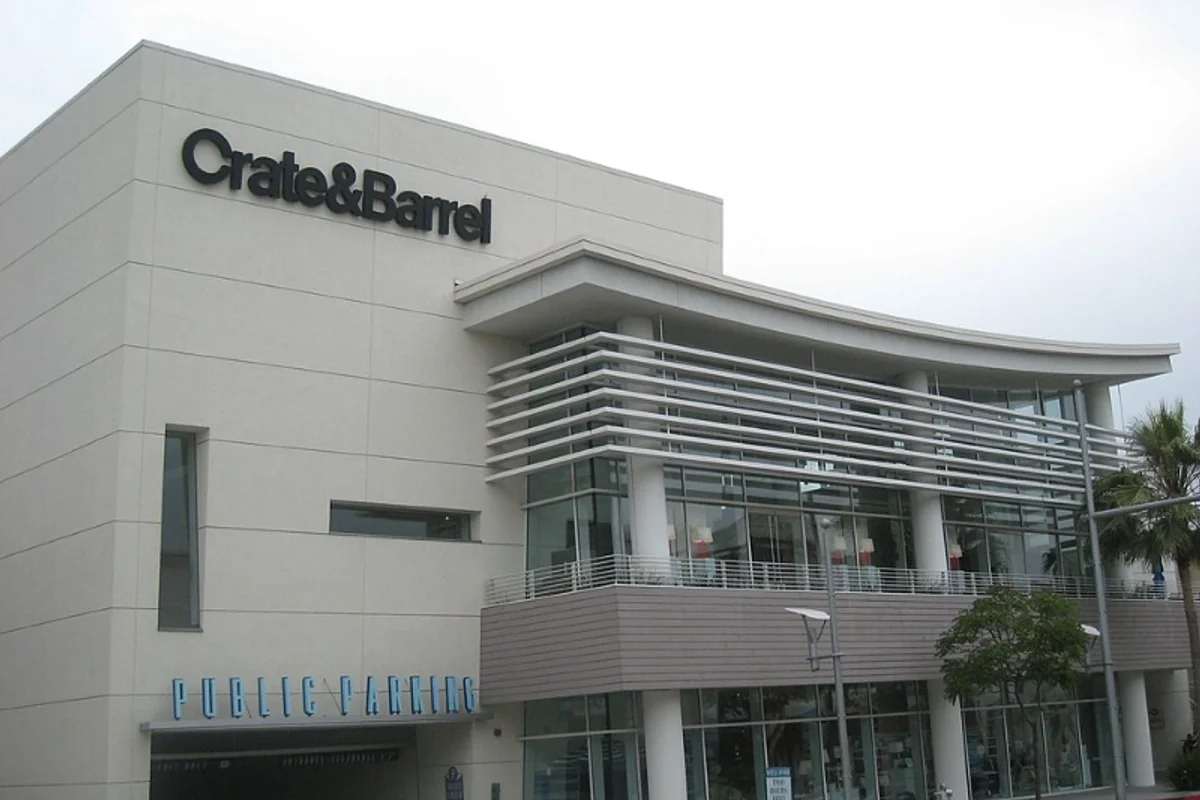
Helvetica Bold with a custom circular C — one modified letter turned a generic wordmark into a proprietary mark
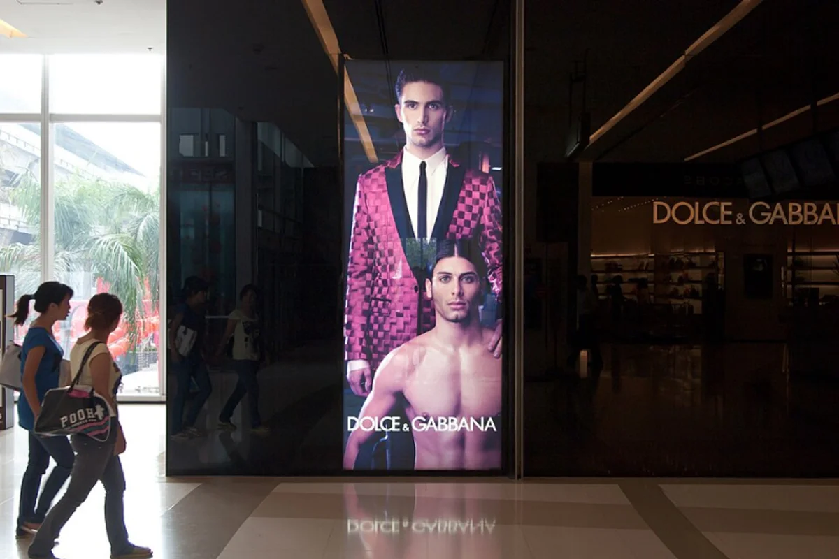
Italian luxury house uses a slightly modified Futura DemiBold for its wordmark, campaigns, and packaging
Optima's calligraphic warmth has defined Estée Lauder's luxury beauty identity for over five decades
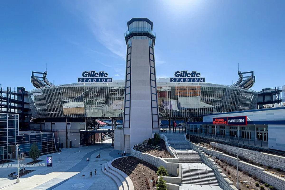
Gillette's wordmark uses Futura Extra Black with a razor-cut design slicing through the G and I
Didot gave Harper's Bazaar its razor-edged masthead — haute couture expressed in hairline serifs
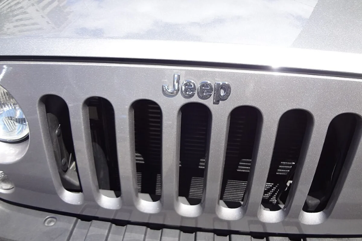
Helvetica Bold with a subtly modified J — four letters that read the same covered in mud or polished on a showroom floor
Massimo Vignelli chose Helvetica for Knoll's entire identity — the furniture company became a monument to modernist type
Edward Johnston's 1916 typeface for the London Underground was one of the first custom transit faces ever commissioned — and it still defines the city
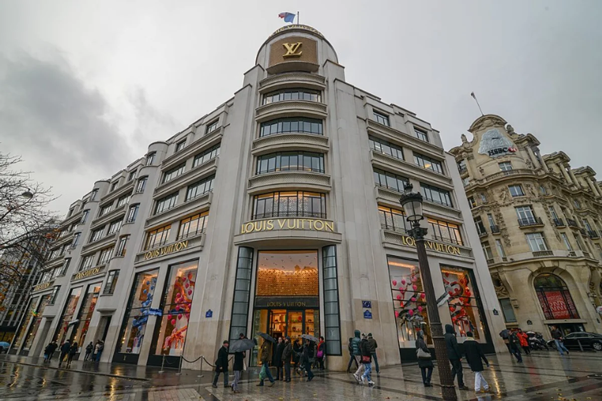
Futura Medium powers the LV wordmark, packaging, and store signage — geometry as luxury code
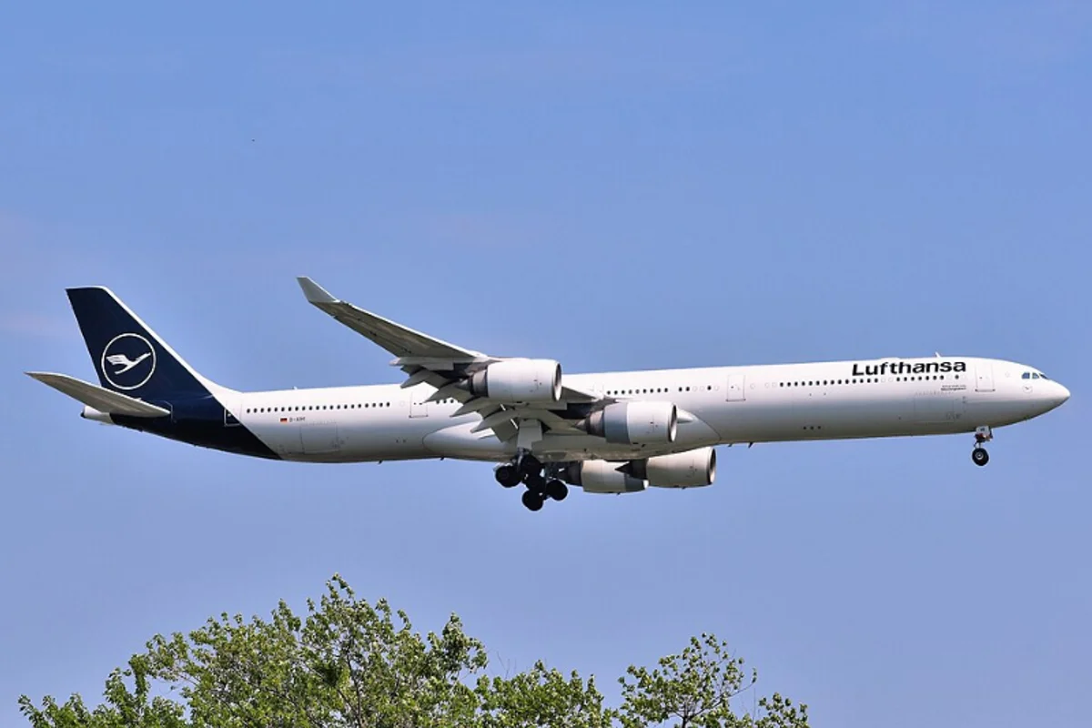
Otl Aicher chose Helvetica for Lufthansa in 1962, building one of the first total corporate identity systems — it lasted 56 years
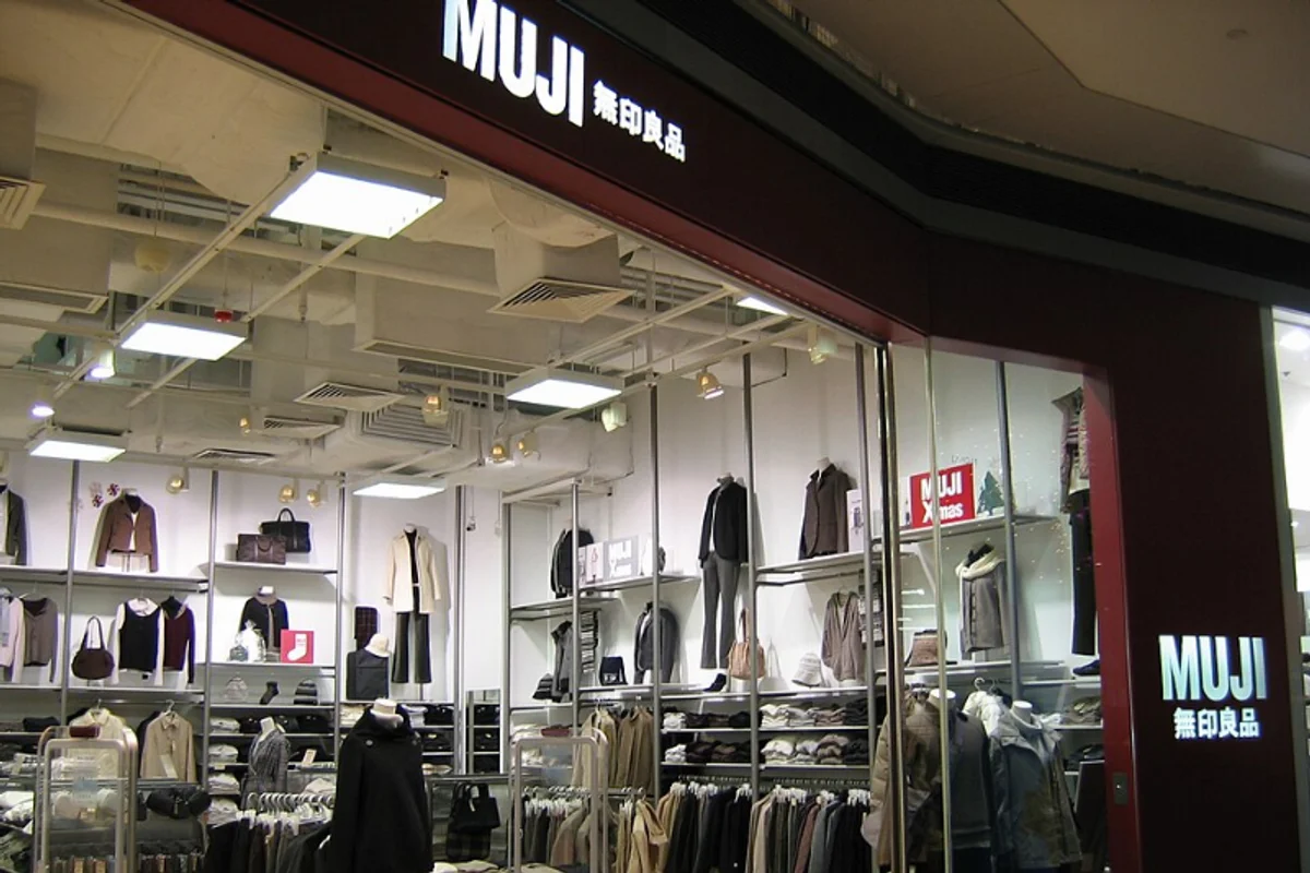
Helvetica Neue for a brand built on emptiness — typography that points at the product by refusing to speak
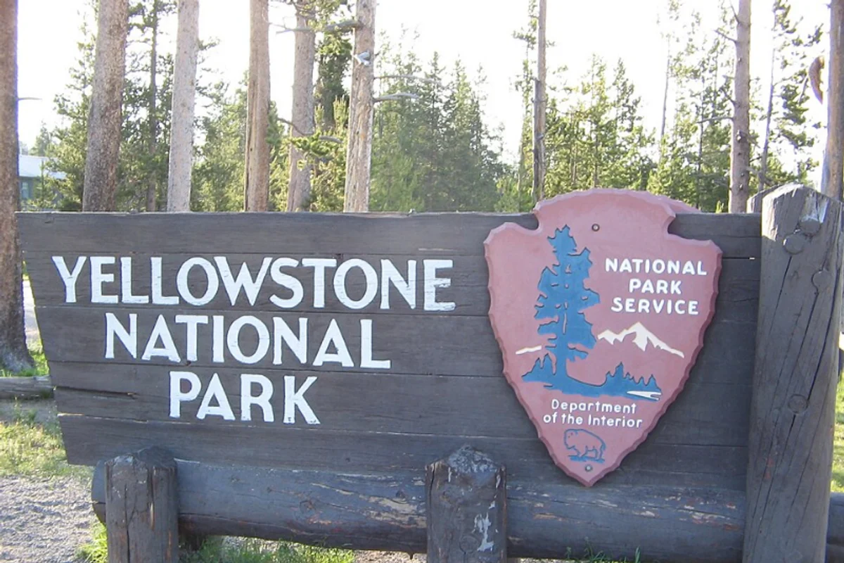
Frutiger guides visitors through America's national parks, anchoring the Unigrid system that Massimo Vignelli designed to bring order to NPS communications
Frutiger ensures clarity in the UK National Health Service's patient-facing communications — because in healthcare, legibility is literally a health issue
Helvetica Bold beneath the half-dome — David Alcorn's 1971 logo paired Swiss precision with wilderness ambition
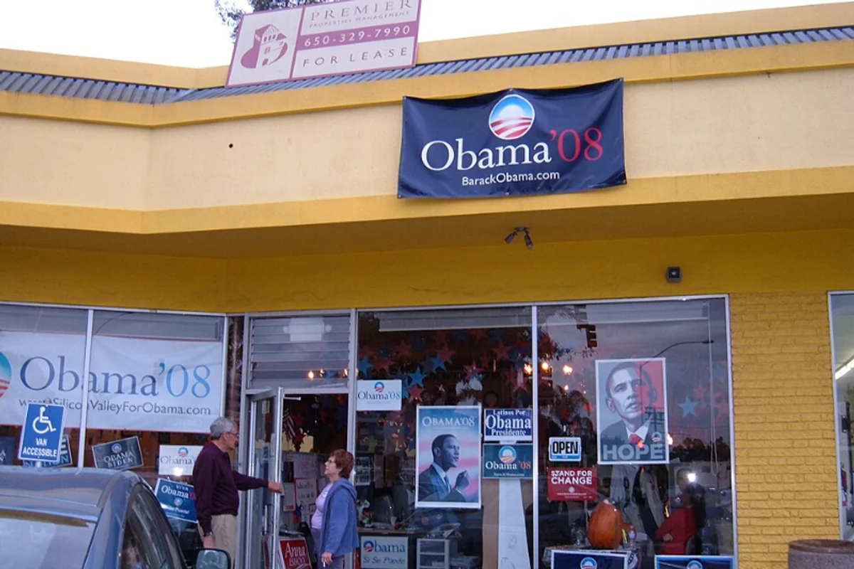
Gotham became the typeface of Hope and Change — the 2008 Obama campaign turned a font into a political movement's visual identity
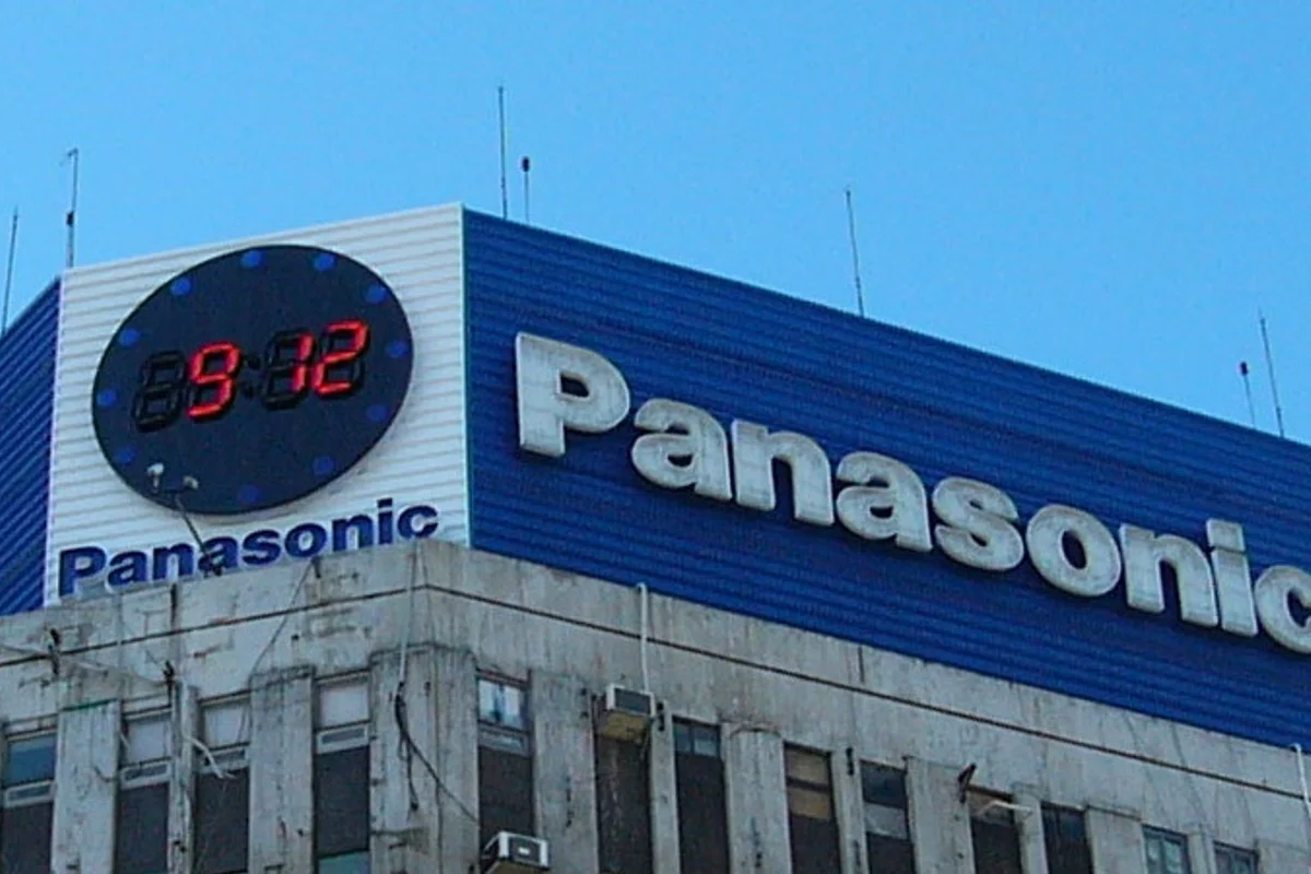
Helvetica Black in Panasonic Blue — nine letters engineered to read identically in Osaka, Oslo, and Omaha
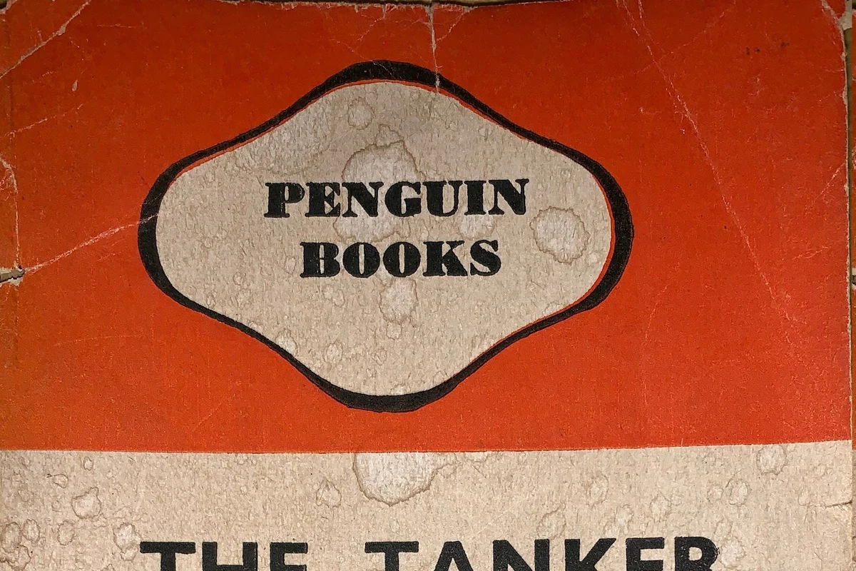
Gill Sans on Penguin's iconic three-band paperback covers helped democratise good design and affordable literature simultaneously
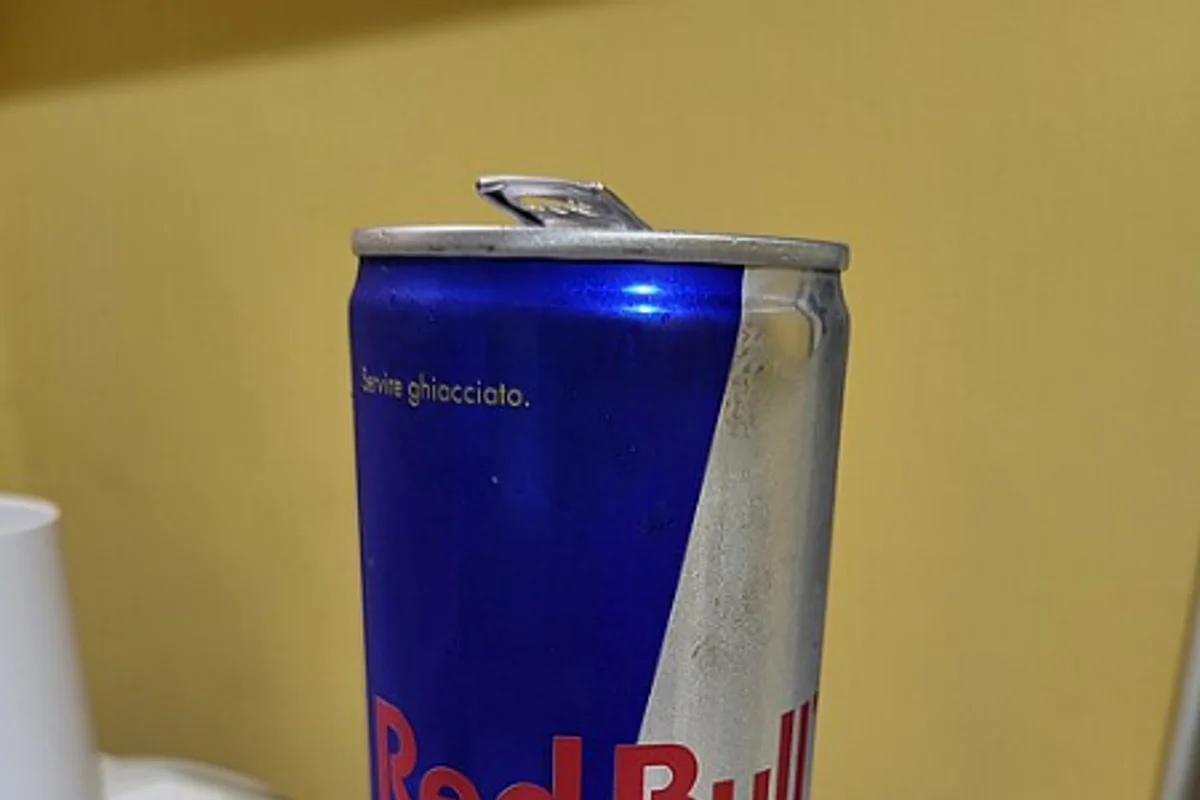
Red Bull's wordmark is built on Futura DemiBold with custom-modified R and B characters
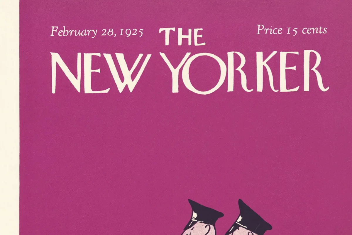
Caslon anchors The New Yorker's famous body text — literary sophistication in every column

Franklin Gothic's bold condensed headlines have made TIME Magazine covers instantly recognizable for nearly a century
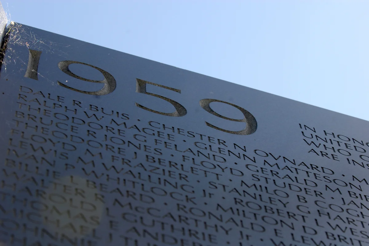
58,318 names carved in Optima on black granite — the Vietnam Veterans Memorial is the most solemn use of a typeface in American history
The defining serif of fashion publishing — Bodoni has crowned the Vogue masthead for over half a century
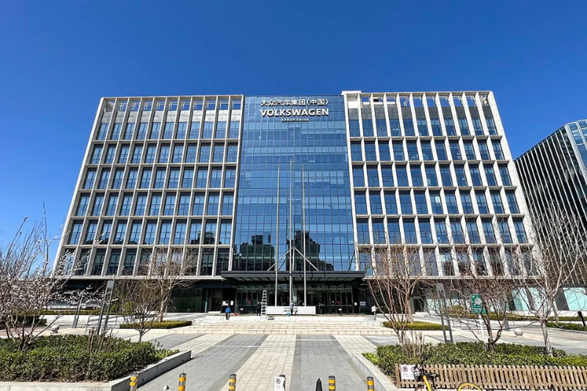
Corporate typeface for 18 years — a customized Futura built by Erik Spiekermann powered every VW communication from 1997 to 2015